Category Archives: Signet Classics

June 18, 2023

9. Faulkner: The Unvanquished

009-UNVANQUISHED

CD9, 50¢, August 1959. Cover artist unknown. 192 pp.

Set against the backdrop of the chaos of the Civil War, this is the magnificent story of the proud Sartoris family, who lived with violence in order to survive. But it is particularly the account of how young Bayard Sartoris, well tutored in killing, found the wisdom to decide that there had been enough bloodshed, and the courage to face the enemy alone — and unarmed.

This is one of the most powerful works of America’s Nobel Prize-winning author, one which lends insight into his other books and illuminates Faulkner’s credo: “Man is tough. Nothing — war, grief, hopelessness, despair — can last as long as man himself can last; man himself will prevail over all his anguishes, provided he will make the effort to stand erect on his own two feet by believing in hope and in his own toughness and endurance.”

With a Foreword by Carvel Collins


Vanquished, finally. Only took me a year.

One sees it said that this book makes a perfect introduction to Faulkner, because (to quote from this edition’s foreword) “the central idea of the novel is obvious, its style relatively simple.”

Thus encouraged, I began. To my dismay I found that the central idea of the novel was not obvious and the style was rather difficult.

No matter how carefully I parsed the ostentatiously roiling sentences (these, the ones I read, the only ones) which carried in defiant repose the stubborn insignia of that uncertainty which marks every sorrowful recoil of comprehension, every insistence that these, the sentences we are reading, are the ones, the ones of which we’ve heard old men speak but never read for ourselves, except that their voices (the voices of the old men) were only voices, echoes of some forgotten calumny no more real than General Lee, once as solid as the land over which he ranged, furious in retreat, is real (to us, to me), now just a whisper, an insinuation.

Ahem. I was saying: No matter how carefully I parsed the ostentatiously roiling sentences, the book as a whole remained mysterious, a sequence of peculiarly overwritten events of no clear import. I could tell that something insistently Southern was playing out behind a scrim of prose, but I couldn’t pick up any guiding scent of tone or plot. Uh-oh, sounds like a classic case of Faulkner after all.

Yet when I went opinion-gathering, it seemed like every Goodreads Moe and YouTube Larry was blithely reporting that this was a GOOD BOOK ABOUT A BOY WHO GRWOS UP, ITS EXCITING, I LIKED IT. The discrepancy made me uneasy.

I crawled all the way to the middle of the last chapter, and then life happened to break my rhythm and the book was set aside with about twenty pages remaining. When I picked it up a few months later, it was oddly clear and simple. Apparently I hadn’t really read any of it yet, because I hadn’t known how, whereas now I was ready to read it properly. So I started over, and found that it had become a whole other book, about a boy who grwos up, in which the central idea was obvious and the style was relatively straightforward. And I enjoyed and admired it. Somewhat.

I think the problem boiled (and, I daresay, boils) down to this:

There are seven chapters, of which the first six were originally written as middlebrow magazine stories: five for The Saturday Evening Post and one for Scribner’s. These stories were always intended to be serial and cumulative, but they don’t give the impression of having been planned to form a novelistic whole. Faulkner was fictionalizing episodes from his grandfather’s childhood, and he seems to have been following a biographical sequence rather than a literary one. Only in the fifth and sixth stories does a “central idea” start faintly to suggest itself.

In the final chapter, newly written for book publication, he does a remarkable job of retroactively crystallizing the preceding stories into a novel, by casting them all as prologue to the coming-of-age that plays out in the last few pages. That’s how bildungsroman works, and once you get there, he does seem, in retrospect, to have written one. I can’t deny that I closed the book feeling that I’d read something good after all, something of genuine literary power. But it’s this element of retroactive intent that, to me, made the book less rewarding to read than to have read. Only through the lens of the last few pages does the book seem coherent and purposeful and straightforward; until you get there, you’re swimming in crosscurrents. I think that may mean it’s a trick.

In addition to adding the last chapter, Faulkner tried to backdate his ambition by touching up the preceding stories, mostly by inserting new passages of conspicuously higher literary tone. This creates a strange effect. Intellectual heavy weather incongruously clouds your view of The Saturday Evening Post on some pages but not others.

Example. Here’s the opening paragraph as it appeared in The Post:

Behind the smokehouse we had a kind of map. Vicksburg was a handful of chips from the woodpile and the river was a trench we had scraped in the packed ground with a hoe, that drank water almost faster than we could fetch it from the well. This afternoon it looked like we would never get it filled, because it hadn’t rained in three weeks. But at last it was damp-colored enough at least, and we were just about to begin, when all of a sudden Loosh was standing there watching us. And then I saw Philadelphy over at the woodpile, watching Loosh.

“What’s that?” Loosh said.

And here it is in The Unvanquished, having been thoroughly sprayed with silly string:

Behind the smokehouse that summer, Ringo and I had a living map. Although Vicksburg was just a handful of chips from the woodpile and the River a trench scraped into the packed earth with the point of a hoe, it (river, city, and terrain) lived, possessing even in miniature that ponderable though passive recalcitrance of topography which outweighs artillery, against which the most brilliant of victories and the most tragic of defeats are but the loud noises of a moment. To Ringo and me it lived, if only because of the fact that the sunimpacted ground drank water faster than we could fetch it from the well, the very setting of the stage for conflict a prolonged and wellnigh hopeless ordeal in which we ran, panting and interminable, with the leaking bucket between wellhouse and battlefield, the two of us needing first to join forces and spend ourselves against a common enemy, time, before we could engender between us and hold intact the pattern of recapitulant mimic furious victory like a cloth, a shield between ourselves and reality, between us and fact and doom. This afternoon it seemed as if we would never get it filled, wet enough, since there had not even been dew in three weeks. But at last it was damp enough, damp-colored enough at least, and we could begin. We were just about to begin. Then suddenly Loosh was standing there, watching us. He was Joby’s son and Ringo’s uncle; he stood there (we did not know where he had come from; we had not seen him appear, emerge) in the fierce dull early afternoon sunlight, bareheaded, his head slanted a little, tilted a little yet firm and not askew, like a cannonball (which it resembled) bedded hurriedly and carelessly in concrete, his eyes a little red at the inner corners as Negroes’ eyes get when they have been drinking, looking down at what Ringo and I called Vicksburg. Then I saw Philadelphy, his wife, over at the woodpile, stooped, with an armful of wood al­ready gathered into the crook of her elbow, watching Loosh’s back.

“What’s that?” Loosh said.

Clearly he’s trying to install an upgrade. No longer a mere Saturday evening story: now it’s a LITERARY NOVEL! Possessing even in miniature that ponderable though passive recalcitrance of prose which outweighs readers.

I’m of two minds about this sort of stuff. The thoughts themselves are generally worth something — I like the image of make-believe as “a cloth” that children deliberately hold up between themselves and frightening things (devised to foreshadow a literal hiding-behind-granny’s-skirts situation later in the chapter, but I appreciate it in its own right) — and Joyceanisms like “sunimpacted” have a clean rhythm that give the scene some feeling of dimension. But what are we to make of the other rhythm, the rhythm of excess? All the needless reiterations (“appear, emerge”) and parentheticals (“which it resembled”) and barrages (“recapitulant mimic furious”)?

What the extra verbiage conveyed to me, when it conveyed anything, was a sense of desperate paddling, the constant struggle to keep above the onrushing waters of truth and memory and experience and life and so on. “It’s all too much, it’s all so overwhelming and nameless, but I am trying, trying, trying to keep it in order, trying to at least name it, to know it, these, the things, comma, comma, gasp, comma, this, these.” And I can find that moving. In the end I did find the book moving in just that way.

But that frame, where being alive means being knocked back by a great wave of strange poetry, coexists very oddly with bits of Saturday Evening Post local color comedy a la Twain, about how Granny oh she was quite a character, let me tell you, get a load of this. Is life conventional and cozy, or esoteric and unknowable? Some combination, of course, and I like the idea that art embraces both at once. But I didn’t feel like Faulkner was truly managing that tension for me as an artist. He seemed to be simply operating in different modes as his moods and ambitions fluctuated.

Even having come this distance, I retain my initial impression of a peculiar vagueness in the dimensions of plot and tone. What would you say is the tone of the passage above? Thought has been lavished on a moment, this is clear, but what is the temper of that thought? Within what feeling does this work emerge? What is this guy into?

As I often say in these posts: art is a social encounter. There’s somebody there. This book was an encounter with someone who was talking a great deal yet never making eye contact. His speaking style was quite florid and intense, but his voice didn’t actually sound particularly emotional and he gave no indication of knowing that anyone was listening to him. It was, for me at least, not socially normal. Perhaps he was drunk. (And indeed perhaps he was, yes?)


Faulkner returns over and over to the device of having the characters fall asleep without realizing it, right in the middle of a paragraph. Time and reality become suddenly muddled and they have to sort it back out. This is indeed a defining experience of childhood and I understand its attraction to him, as a way of reinforcing the premise of his style: the twisty prose is all in that spirit of perceptual defamiliarization, of “who what and where am I, again?” That said, it did seem conspicuous to me that in every single chapter our narrator “must have fallen asleep because I was picturing trees and then Ringo was shaking me awake” etc. etc. The evocation of existential mystery ought not to be so conveniently repeatable.


Oh, the book? Eh, it’s sort of Gone With the Wind does A Portrait of the Artist as a Young Man, and then when it finally finds its story footing in the last act, there are shades of The Godfather — about the grim family culture of vengeance, cavalleria rusticana, and the young man who may or may not manage to shake it off. The prose is sometimes brilliant and forceful, sometimes tangled and rhythmless and underedited. Sometimes both.

It had a distinctive aroma to it. Not a particularly fresh or appetizing one — some rot and barnyard notes — but a striking one all the same, and one I can still call up in memory. And despite my frustrations with the reading experience, I think that has to count as artistic success. What are we here for if not to expand our store of aromas?


And that’s all I have to say about that! I broke protocol and proceeded to the next book before finishing this post; it’s now been months since I read it and there other books piled up in the rear view, yet to be addressed. So this is plenty. Onward!

Onward, that is, after the dessert. IT’S COVER TIME!


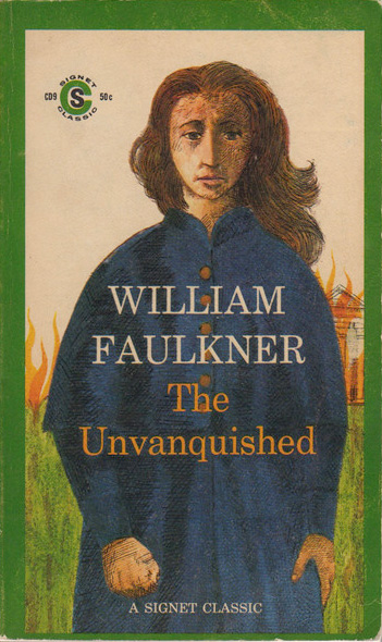
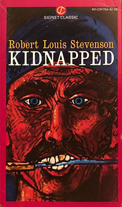
Once again, the artwork apparently had to be re-photographed and recolored after the first few printings. (Points of issue: the right side of the burning house is cropped out of the first printing, visible on later printings; the divide between the flaps of the coat runs between the “L” and “A” of CLASSIC on the first printing, straight down through the “C” on later printings.)

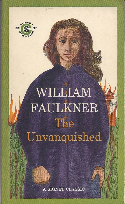
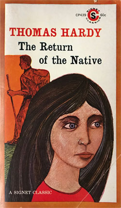
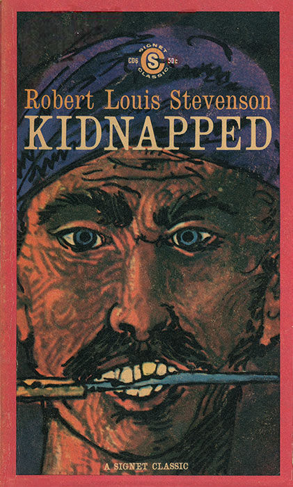
This is the last of the shoddy anonymous illustrations that characterized the very first batch of Signet Classics. Next time we’ll have some properly skilled draftsmanship by an illustrator who actually signed his work.

For now… what exactly are we looking at here? There are only two female major characters in the book, Granny and Drusilla, so this must be one of them, and yet it is assuredly neither of them. Given the burning house in the background, I think it must be intended as Granny, but so poorly conceived and executed that she is unrecognizable in terms of appearance, age, costume, or demeanor. Even without reading the book, you’ll agree that the character “Granny” probably doesn’t look like this, right? And is that a fist clenched in unvanquished determination, or just a passing muffin? Are those eyes glowing fiercely with the will to survive, or are they just ants on an almond? Is that hair blowing in the wind or… okay you get it: it’s not a good drawing.

As for future redesigns, there are none: I find no evidence of any Signet Classic edition of The Unvanquished after the fifth printing of this edition in September 1962. That’s a longer survival than the single printing of Adolphe & The Red Notebook, but still a pretty poor showing. Why was it dismissed? What did it do wrong? I’m really not sure. You might guess that someone decided Faulkner was insufficiently “classic”, but this seems not to be the case: in 1964, after The Unvanquished had already been cancelled, a different Faulkner novel was added to the line, and in 1968 five more.

Perhaps there was some sensitivity to sales numbers (later relaxed on behalf of the long tail), and it just wasn’t performing as well as Animal Farm et al? Or perhaps it was set aside for reissue under another product line that never actually came to pass? (Adolphe did eventually reappear as a “Meridian Classic,” though not until years later.) For now these are my only guesses. Readers may submit additional, superior guesses below.

However, there is a PAST redesign! The Unvanquished had already been a Signet before it became a Signet Classic. Perhaps this will bring the marketing experiment of “Signet Classics” more into focus. Between 1952 and 1959, picture this on the paperback rack instead:

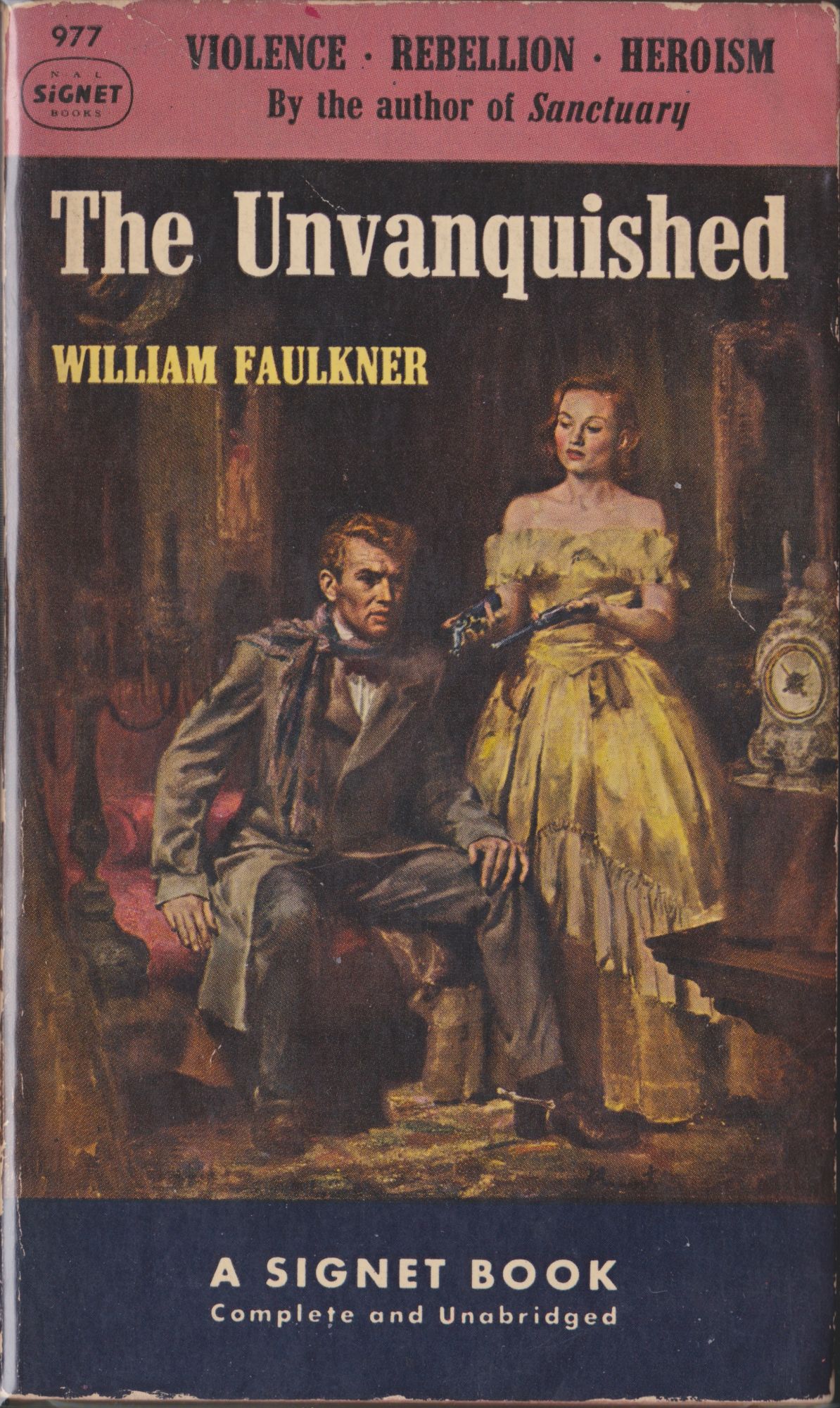
Is The Unvanquished an effete art-school stencil-colored line-drawing CLASSIC… or is it a red-blooded bare-shouldered gun-toting oil-painted pulp about VIOLENCE, REBELLION, HEROISM? Great question! We’ll leave it to the consumer to decide.

This time the woman is unambiguously not Granny; it’s Drusilla, in the final chapter, transformed into the seductive incarnation of The South itself, urging Bayard to embrace the way of the pistol. They didn’t look anything like this in my imagination (and probably didn’t in Faulkner’s either), but sure, I grant they could look this way in someone’s well-built fantasy. The painting is not a betrayal of the letter of the text. Aesthetically, though…

I have no problem with the supposed “cheapening” of the work — the pulp sensibility is as legitimate as any other if it can be made to fit the subject — but is this illustration actually inviting? Does it draw you in and make you want to read to find out what’s going on behind that fellow’s troubled stare? To my eye it’s muddy and static; it makes me dubious about the entertainment value of this book. Like so many covers of the 40s and 50s, it looks like something fundamentally dull and awkward has been quickly and carelessly dressed up by the department store studio photographer as something exciting, look over here, say cheese, great, next.

And yet real craft went into this forgotten thing. The more I look at it, the more it intrigues me as a painting, if not as a book. The uncanny cheesecake stasis has an eerie bite to it if you stare long enough. The artist is James Avati (1912-2005), a notable and prolific purveyor of exactly this. His valuation seems to be on the rise of late, as the old low transmutes into the new high. This particular painting doesn’t seem to have made any public appearances since 1952, but who knows, it may turn up at auction any minute.

Here’s a somewhat interesting album of images collected by the author of the book on Avati. I’m not sure whether Avati ever did any Signet Classics proper, but we’ll certainly get to consider more of his work as other pre-Classic Signets make their way into the series.

And finally, here’s the real cover of the real book:

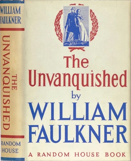
A similar grouping of two figures, but baring decidedly less flesh, probably because of all those dangerously sharp serifs.

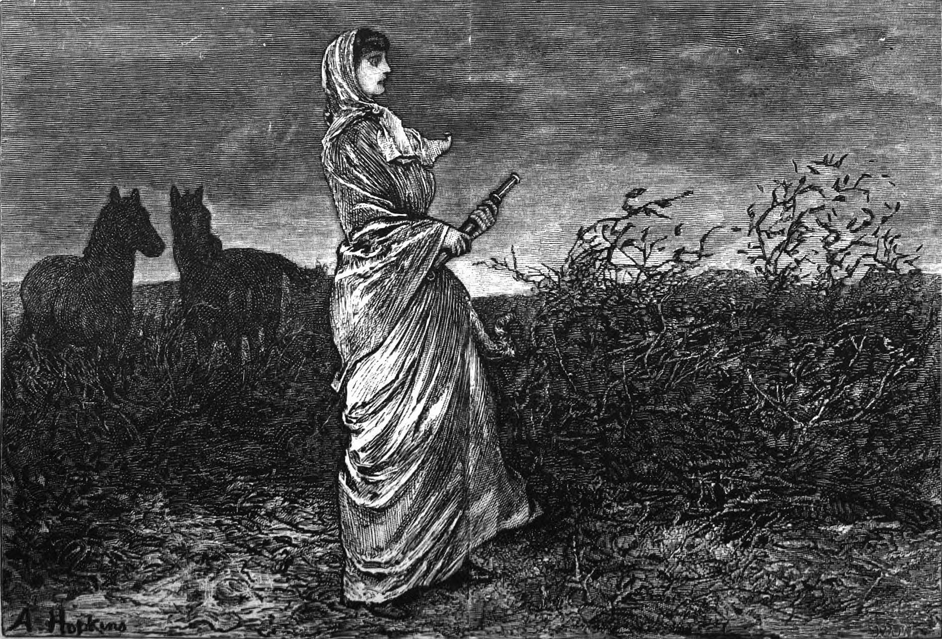
I think Edward Shenton’s illustrations in the first edition suit the novel nicely: stark-edged and boldly styled first, emotional second. Here’s how he pictured the exact moment painted by Avati. It too has nothing of the actual flavor of the prose, but it has an analogous spiritual architecture, as it were, and I could imagine it helping to ground the reading experience.

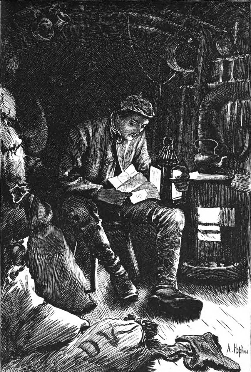
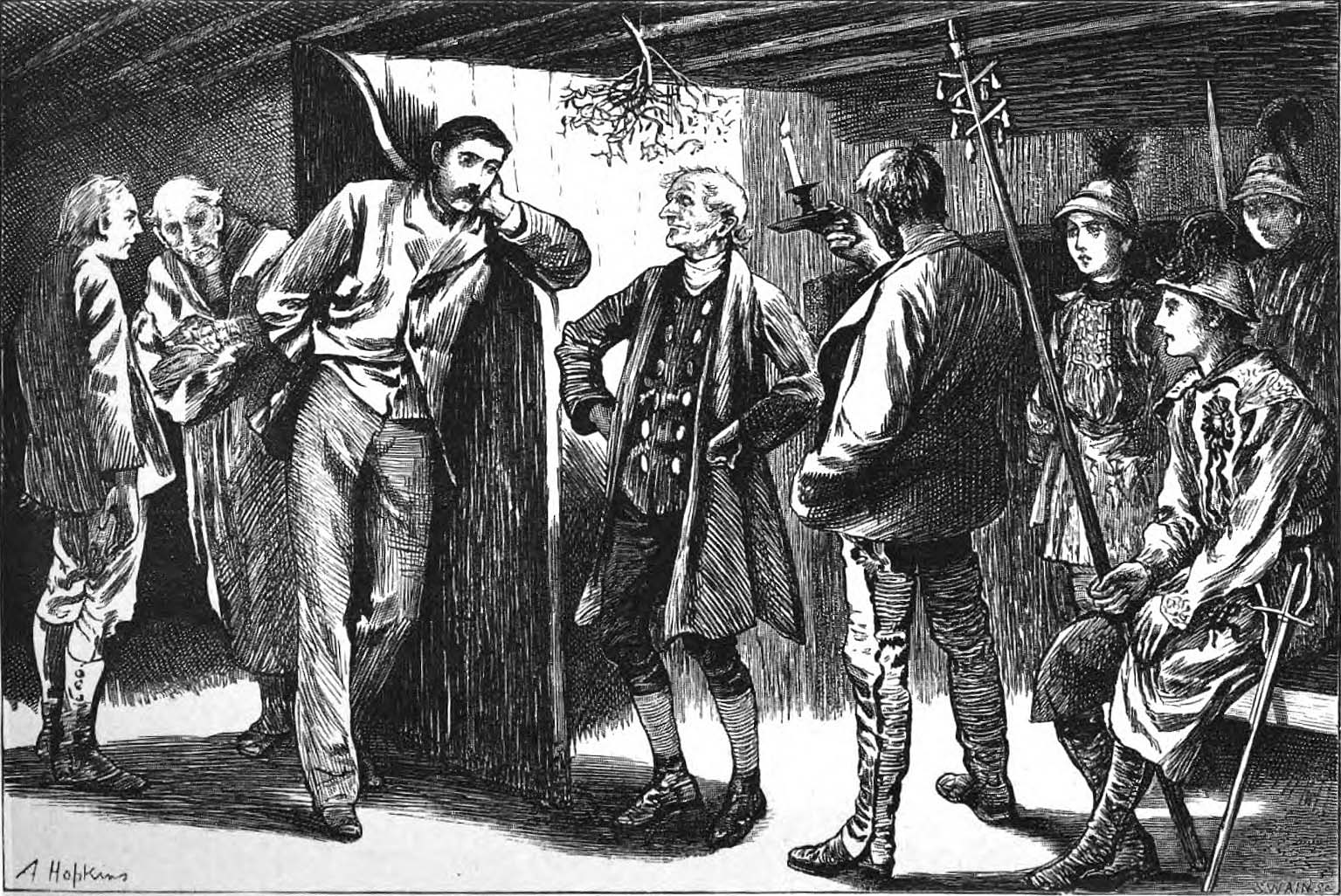
Shenton had also illustrated the original magazine publications, in a suitably lighter-lined style. And hey look, they could be yours to own! Act now!

November 3, 2021

8. Hawthorne: The Scarlet Letter

CD8, 50¢, August 1959. Cover artist unknown. 254 pp.

An ardent young woman, her cowardly lover and her aging, vengeful husband — these are the central characters in this stark drama of the conflict between passion and convention in the harsh, Puritan world of seventeenth-century Boston. Tremendously moving, rich in psychological insight, this tragic novel of shame and redemption reveals Hawthorne’s concern with the New England past and its influence on American attitudes. From his dramatic illumination of the struggles between mind and heart, dogma and self-reliance, he fashioned one of the masterpieces of fiction. “The one American literary work which comes as near to perfection as is granted a man to bring his achievements.” — Arnold Bennett

With a Foreword by Leo Marx


A book whose genuine greatness has been nearly eclipsed by its status as a classroom staple. In some ways this is as hard a work to “see” as the Mona Lisa.

There’s no mystery why it’s a fixture of the curriculum: it’s short, direct, thematically “American” on many levels, very famous, and it exhorts the reader to engage in interpretation. It casts itself as an icon, a prompt, which is just what English teachers love. Discussing the meanings of any and all aspects of The Scarlet Letter seems to be exactly what The Scarlet Letter wants. This is what it’s for, right?

Yes, in a certain sense. But I suspect this actually makes it less suitable for didactic use, because that certain sense is inevitably obscured in the classroom, where “interpretation” isn’t a spontaneous impulse of the spirit, it’s an institution and a duty. (And a perspicacity competition. Raise your hand if you understand what I meant by that.) Hawthorne’s explicit appeals to symbolical feeling can be all too easily mistaken for just another homework-happy grownup assigning essays by edict of the Supreme English Department — just the sort of thing the book is supposed to be about escaping from.

Glancing through The Scarlet Letter‘s thousands of Goodreads reviews, I find that there’s a pretty broad teenage consensus. Namely: the story’s all well and good, but the writing is EYE ROLL UGH STOP. The most “liked” reviews are mockery of Hawthorne’s supposed longwindedness: how much pointless description there is, how many needless words recounting how things looked and what people did even when it so obviously doesn’t matter and obviously nobody cares JUST GET ON WITH IT OMG THIS BOOK I LITERALLY CAN’T.

That came as a surprise to me! But I think I know what they’re responding to, beyond just underexposure to 19th century diction. The story is fundamentally a miniature, a tale, whose “natural” size is really very short, yet Hawthorne has treated it at full length. The question is the nature of that treatment. If you’re only reading it to pass a quiz, indeed, you might feel a bit ill-used, because most of the prose clearly won’t be on the quiz. Most of what makes the book worthwhile isn’t quizzable.

Hawthorne’s tone of address is subtly a wonder. It’s what makes the book a glowing masterpiece. He’s never entirely telling the story: he is meditating on it and within it, and his meditation takes the form of writing it. The unspoken premise is that he stumbled across this thing whole in his imagination, and now he’s marveling at it just as we are. (The in-book premise is that he stumbled across it in an attic, which amounts to the same thing.) Just having access to the tale is itself miraculous to him; he’s like someone magically transported into a painting, able to see the backs of the heads, reporting wryly on it all. The events float by with the portent and symmetry of a lucid dream.

Or the inverse metaphor: he turns each scene over and over in his hands. A great deal of what he wants to put across is that this is a tale, a small gleaming thing, to be pored over in its every detail exactly because it is small and perfect. Each aspect of the story is framed as an appeal to knowing recognition: yes, it would have to be just so, wouldn’t it. The book is simultaneously the stained-glass window and the tourist fascinated by it.

I think in his view, the stained-glass window is Olde New England: a mysterious historical past with a forbidding and opaque character, which he’s trying to penetrate but can never claim to truly know. But he’s haunted by this particular past because he has ancestral roots in it, which gives it a vital sense of dread for him. He fears to see himself reflected in it, and/or scorned by it. The dream of this story is initiated by asking himself “who am I? what am I?” So his relationship with local history is inseparable from his relationship with his own psychological attic and the images he finds there.

This is his relationship with “tales” generally. He frequently addresses the reader as though talking to a fellow writer, assuming that we share his capacity to take pleasure in being simultaneously outside and inside a fiction, to relish the sculptural quality of the work as it takes shape under the chisel, and/or as it emerges unbidden.

All Hawthorne’s writing is an extension of his notebooks in which he jotted down hundreds of fleeting inspirations about as-yet-unwritten stories, in which this or that symbolic thing might happen, e.g.

Meditations about the main gas-pipe of a great city,–if the supply were to be stopped, what would happen? How many different scenes it sheds light on? It might be made emblematical of something.

Some very famous jewel or other thing, much talked of all over the world. Some person to meet with it, and get possession of it in some unexpected manner, amid homely circumstances.

To poison a person or a party of persons with the sacramental wine.

An old looking-glass. Somebody finds out the secret of making all the images that have been reflected in it pass back again across its surface.

A woman to sympathize with all emotions, but to have none of her own.

Half the pleasure of each inspiration is pondering the fineness of the hypothetical story qua story. Wouldn’t it be wonderful for there to be such a story! Within The Scarlet Letter Hawthorne says “isn’t it wonderful to participate in the working-out of such a story?” And then: “And isn’t that part of the story, in a way? Aren’t these characters themselves participating?”

The question of whether the reader knows Reverend Dimmesdale’s secret is a prime example. Hawthorne never tells; nor does he engineer any real deception. His deadpan is so utter that it constitutes announcement by omission, to the sophisticated reader to whom Hawthorne addresses himself, but not to “the reader” as an abstraction. The notion of “does the reader know yet?” is something Hawthorne wants to share with us; it’s part of the wonder of stories, part of their worship. He draws out the deadpan indefinitely, because the idea of the hidden, the unspoken, is part of what he venerates. It’s the essence of stained glass.

The book is really about what he’s doing: encountering this book. It worked out marvelously for his purposes that it turns out to be, of all things, The Scarlet Letter, a timeless classic that everyone knows. What a coup!


Hester is burdened with a symbol that becomes open-ended, and then its open-endedness itself becomes the burden. Perhaps the scarlet letter means a transcendental thing that contradicts its societal meaning? Or perhaps the concept of “sin” somehow loops all the way around, and the moral scheme perceived by the Puritans is the grand scheme, even as it works in mysterious ways? Or perhaps perhaps perhaps perhaps any number of other things suitable for discussion in Mrs. Fleming’s fourth period English class? Hawthorne suggests a great many “perhaps”es — for the sake of “perhaps,” the pleasure of “perhaps.”

The thing he seems to actually believe is that fiction is an expression of philosophical reality precisely because it is a twilight realm in which “symbols” and “moral systems” are revealed as mere semiotic objets to be shuffled around and delectated under the rubric of “perhaps.” This freedom of the writer and the reader is the true reality, which Hawthorne allows his characters to perceive dimly as the ineffable truth hiding behind and beyond their fate-ridden fairy-tale paradigm, and endlessly complicating it. The irreducibility is what Hawthorne finds beautiful, the eternal incompleteness of taking two-dimensional moral slices of a three-dimensional universe. And this is his rebuttal to his Puritan ancestors: it’s not that you were wrong, it’s that being right isn’t possible; it’s not the nature of life, and you were in denial about that.

At the very end he muses: “It is a curious subject of observation and inquiry, whether hatred and love be not the same thing at bottom,” because both are forms of passionate dedication. Unspoken but implicit is the even broader reflection on good and evil, both of which are expressions of a moral order. Good and evil are both the business of the town. There’s no name for what goes on in the woods, i.e. in art, i.e. in life.

Hawthorne’s lengthy autobiographical introduction — another thing teenagers hate — tends to be treated as an inessential appendage; I’ve seen several prefaces that outright advise the reader to skip it. But I think that’s wrong. The work takes its meaning in relation to the real world, and in the introduction Hawthorne explicitly gives us a point of departure for that relation. I was grateful for the added dimension it gave to my reading.

He frames the whole thing as his fantastical way of grappling with his feelings about his stultifying “The Office” day job, surrounded by dullards to whom he can’t relate, despite sharing a hometown and a heritage. They’re the types of everyday ordinaries who perceive themselves to be, at best, characters in some drama — perhaps occasionally aware of the power and ambiguity of a mysterious symbol, but never once considering the fourth wall. They believe in the painting. Whereas Hawthorne can see the backs of the heads. Whatever lonely religion that is, it’s what he’s preaching.


I don’t need to talk about what goes on. It’s The Scarlet Letter, obviously.


Detective Kinsey Millhone takes on her toughest case yet, in a quaint New England village where everyone’s a suspect — even the handsome young preacher. She thinks she’s got the investigation in the bag, but when local law enforcement turns against her, and then an old lover with a secret suddenly turns up at her doorstep, Kinsey’s forced to admit that this time… she might be in over her head.


Here’s a passage. Dimmesdale goes to the scaffold of shame in the middle of the night when no one can see, and by astounding coincidence Hester and Pearl happen to pass by. He asks them to join him, and they all stand together on the platform, holding hands in the darkness.

“But wilt thou promise,” asked Pearl, “to take my hand, and mother’s hand, to-morrow noontide?”

“Not then, Pearl,” said the minister, “but another time!”

“And what other time?” persisted the child.

“At the great judgment day!” whispered the minister,—and, strangely enough, the sense that he was a professional teacher of the truth impelled him to answer the child so. “Then, and there, before the judgment-seat, thy mother, and thou, and I, must stand together! But the daylight of this world shall not see our meeting!”

Pearl laughed again.

But, before Mr. Dimmesdale had done speaking, a light gleamed far and wide over all the muffled sky. It was doubtless caused by one of those meteors, which the night-watcher may so often observe burning out to waste, in the vacant regions of the atmosphere. So powerful was its radiance, that it thoroughly illuminated the dense medium of cloud betwixt the sky and earth. The great vault brightened, like the dome of an immense lamp. It showed the familiar scene of the street, with the distinctness of mid-day, but also with the awfulness that is always imparted to familiar objects by an unaccustomed light. The wooden houses, with their jutting stories and quaint gable-peaks; the doorsteps and thresholds, with the early grass springing up about them; the garden-plots, black with freshly turned earth; the wheel-track, little worn, and, even in the marketplace, margined with green on either side;—all were visible, but with a singularity of aspect that seemed to give another moral interpretation to the things of this world than they had ever borne before. And there stood the minister, with his hand over his heart; and Hester Prynne, with the embroidered letter glimmering on her bosom; and little Pearl, herself a symbol, and the connecting link between those two. They stood in the noon of that strange and solemn splendor, as if it were the light that is to reveal all secrets, and the daybreak that shall unite all who belong to one another.

This is an obvious special effect, but that’s my point: Hawthorne makes no disguise of the fact that a special effect is now being applied, because of course it must, because the tale-image demands it, and he knows the reader can see that as well as he. “It was doubtless caused by one of those meteors” — ha ha, wink wink, “doubtless,” because of course we know that it was really caused by PARABLE ITSELF. The actual lighting effect is thrillingly worked out — “black with freshly turned earth” seals it wonderfully — but the real strength is the feeling of inevitability, of intrinsic image-necessity that can be bent by neither Hawthorne nor the characters nor the gods. “And there stood the minister” — of course! Implicit in “and there stood” is “of course.”

And this “of course” becomes the actual flash of “unaccustomed light” for the reader. Here is the symbol; gaze on it. Just picturing it gives it power; it is and must be reckoned with. That’s how symbols work.

Try to find something phony or vague to pick apart in this image! You can’t. It is iron. Nearly the whole book is iron.


Cover time. I think we can all agree this is the good part.

CP650, 75¢, 1974.
CQ910, 95¢, 1976.
CY1067, $1.25, 1977.
CW1188, $1.50, 1979.

70s rebranding of the 1959 cover. As with many of the other Signet launch titles thus far, this has some graphic charm but as an illustration is… not great. (Pop quiz, kids: what’s missing from this picture of Hester? Hint: it has to do with her clothes, which, while we’re on the subject, are not supposed to be purple.) As usual, the illustration had to be recreated after the first print run, seen at the top of this post. (First edition points: her index finger is extended; her hair does not show inside the “R” of “LETTER”).

The introduction by Leo Marx is very nicely done and would be a fine handrail for a standard high school reading of the book, though it assumes the reader knows the entire plot already and doesn’t mind it spoiled. It really ought to be an afterword.

CW1232, $1.50, 1979.
CE1431, $1.75, 1981.
CW1652, $1.50, 1982? (price drop!)

Five years later and finally someone notices that they forgot to remove “A SIGNET CLASSIC” from the bottom when they added it at the top. Meanwhile, someone from PBS apparently has lunch with someone from Signet and this banner ends up getting slapped on some copies. (Sounds like the TV version may actually have been pretty good. It’s not available online.)

CW1652, $1.50, 1983?
CE2350, $1.75, 1988?
CE2522, $1.95 (later $2.25), 1991?

The 80s revamp, starring Mrs. Elizabeth Freake. I generally like the 80s covers, but this one doesn’t quite satisfy. Yes, the painting offers a sense of authenticity and touches on several of the keywords, and I do enjoy the weight and mystery that the dark background puts across. But there’s no getting around the uncanny awkwardness of the early American style, which ends up being the dominant impression. Sure, Hawthorne writes about the Puritans with an eye to their uncanniness, but ultimately he’s the painter of this book, not they, and his point is certainly not that they were haunted-house people with inscrutable ghost eyes. To the contrary.

Furthermore: this wealthy blond woman with her wealthy blond baby, in cheery unlettered clothing, is clearly not Hester Prynne. The best she can be is a gesture in the direction of the aisle in which you’ll find Hester Prynne, if we have any in stock.

The title type seems to be a custom job, like the one on Kidnapped. The mildly gothic feeling is about right, but it seems like the treatment wasn’t designed around this image, which has crunched it unfortunately small and made the T-ligature look pretty weird.

CE2522, $2.95 (later $3.95), date unknown (prior to 1995!)

The 90s: now with new, less deformed Hester! There seems to be a misapprehension about what a “letter” is — some type of robe, maybe? — but at least this woman is plausible casting. Though, honestly, I don’t buy it: Hester is all feeling, whereas this woman has the vacant look of a professional model posed and painted by a technician with no real dramatic sense. The 19th century was rife with those guys.

What painter am I panning here? Good question! Signet doesn’t identify the image, but I found it: this is Fabiola by Jean-Jacques Henner (1829-1905).

(Or so says “Superstock,” anyway. I usually like to get a more authoritative source than that, but this particular painting is in private hands and very poorly documented online. Complicating matters is the fact that not only did this artist churn out year after year of variations on the same subject, one of them actually became a sort of folk icon and was copied by countless amateurs. It turns out the world is absolutely swimming in Fabiolas a la Henner. Choose wisely!)

Jean-Jacques Henner should feel free to take this as a compliment: I think his painting from 120 years ago is too modern and photo-realistic and slick for this book. Oh well.

On the subject of oh well: title typeface is Charlemagne; author typeface is Berkeley Old Style.

(The major motion picture being touted is of course the 1995 Demi Moore version.)


2608, $3.95, 1999.

New introduction by Brenda Wineapple.

3135, $3.95, 2009.

The 21st century pounces. No more people, no more history; no more time, no more place. Never again! From here on out it’s just design, baby! Perfectly smooth and clean and empty, to suit your perfectly smooth and clean and empty lifestyle. We know what the customer wants: a rectangle that they can sort into a rainbow with their other rectangles, on their rectangle-shelf.

As for the actual design: it’s the easy way out, but I’m sort of relieved they finally got around to it. I’m not sure why it’s butterflying together out of little fragments (or are those supposed to be a digital-age take on the cracked surface of an ancient leather-bound volume?) and I don’t think it’s quite right by Hawthorne for it to be an asymmetrical blackletter character. But all in all: yeah, a big red A. You got it.

(Note that at some point they squeezed an “s” into the logo cartouche and turned “Signet Classic” to “Signet Classics.” After 35 years. It probably ought to have been that way all along.)

New afterword by Regina Barreca. Typeface is Garamond.


3135, $4.95, 2021

Oh-ho! What’s this? The 2020s covers have begun to arrive!

It turns out these are momentous times for the Signet Classics. The catalog has been culled — both Kidnapped and The Return of the Native have gone out of print since I wrote about them — and the remaining titles are apparently being given makeovers to try to actually meet the market.

Both this one and the one for Animal Farm (see below for update) are by Kaitlin Kall. I can and will snark at these covers in a minute, but there’s no denying that they’re far more suave and graphically intelligent than the 2008-9 versions were. Those looked like someone cranked them out in 30 minutes apiece in Photoshop and their editor said “fine.” These look like they went through an actual design process, over a couple days, with thoughts and discussion and revision and an eye for balance, impact, etc. Way to go!

And, hey, look up in the corner! They’ve re-instituted the 70s logo after 40 long years in exile. I entirely endorse that choice, and I feel almost moved by it. It’s incredibly rare for a brand to simply bring back something old: not self-consciously milk it for nostalgia, or make a big defensive show of “updating” it, just put it back to work because it was perfectly good and still is. Taste is not actually a forward march, and it’s okay to acknowledge that! Wow! What a great feeling.

[Edit: Oh, I guess that logo had still been hanging out on the spine this whole time. I forgot about that. Okay, nevermind. Not a Christmas miracle after all.]

As for the cover: the A in the title becoming the A on Hester’s chest is such a natural conceit that I’m surprised I’ve never seen it done before, so kudos to Kaitlin. But then the rest, sigh, is a wishful lie. That The Scarlet Letter is actually primitivo brutale, an ominous crayon drawing by a child who saw a Babadook. We live in a bipolar time where our entertainments are alternately primal horrors or infinite digital escapes. Nobody cares about mere passion anymore; nobody even really believes in the possibility. Everything’s either the fucking red pill or the blue pill. The Scarlet Letter probably falls on the dark side of center, right? So hooray, that’s a green light: go ahead and make it be a demon-scratched totem from a pre-civilized culture!

(Probably the actual idea is supposed to be that 17th-century America was a rough-hewn society, and that the novel is about the uneasy relationship between human ideals and the untamed moral wilderness. But look at those faceless silhouettes! Look at the corroded text! I’m not imagining this.)


Meanwhile it turns out that Animal Farm is chick lit! Who knew? Adorbs.

Of course, Kaitlin had her reasons. Like I said, I have to grant these covers their professionalism. But the game is unabashedly about selling pigs in pokes; it really doesn’t matter what’s actually between the covers, or whether the buyer wants it: the poke is the product. And the customer basically knows it! We enter this contract willingly.

It’s like the old saying: “a book sucks but not gonna lie its cover lowkey slaps.”

October 13, 2019

7. Hardy: The Return of the Native

007-RETURNOFTHENATIVE

CD7, 50¢, August 1959. Cover artist unknown. 413 pp.

The rural tranquility of the heather-covered English countryside is the setting for this moving novel of conflicting aspirations and tragic destiny. Clym Yeobright returns from Paris to the village of his birth, idealistically inspired to improve the life of the men and women of Egdon Heath. But his plans are upset when he falls in love with a passionately beautiful, darkly discontented girl, Eustacia Vye, who longs to escape from her provincial surroundings. Their stormy marriage explodes in a violent tragedy which eventually frees Yeobright to pursue his dream of service. A book of classic dimension and heroic design, The Return of the Native is the forerunner of the twentieth-century psychological novel — poetic, compassionate, vivid in its associations, universal in its meanings.

With an Afterword by Horace Gregory


I found The Return of the Native artistically confusing. Is this good writing or bad? Is Hardy’s outlook broad or narrow? What am I dealing with, here?

You tell me. Let’s go straight to the excerpt. This is the introductory portrait of Eustacia Vye, who isn’t quite “our heroine” but certainly has top billing. (Viewable here in the original ink.)

She was in person full-limbed and somewhat heavy; without ruddiness, as without pallor; and soft to the touch as a cloud. To see her hair was to fancy that a whole winter did not contain darkness enough to form its shadow — it closed over her forehead like nightfall extinguishing the western glow.

Her nerves extended into those tresses, and her temper could always be softened by stroking them down. When her hair was brushed she would instantly sink into stillness and look like the Sphinx. If, in passing under one of the Egdon banks, any of its thick skeins were caught, as they sometimes were, by a prickly tuft of the large Ulex Europœus — which will act as a sort of hairbrush — she would go back a few steps, and pass against it a second time.

She had pagan eyes, full of nocturnal mysteries, and their light, as it came and went, and came again, was partially hampered by their oppressive lids and lashes; and of these the under lid was much fuller than it usually is with English women. This enabled her to indulge in reverie without seeming to do so — she might have been believed capable of sleeping without closing them up. Assuming that the souls of men and women were visible essences, you could fancy the colour of Eustacia’s soul to be flamelike. The sparks from it that rose into her dark pupils gave the same impression.

The mouth seemed formed less to speak than to quiver, less to quiver than to kiss. Some might have added, less to kiss than to curl. Viewed sideways, the closing-line of her lips formed, with almost geometric precision, the curve so well known in the arts of design as the cima-recta, or ogee. The sight of such a flexible bend as that on grim Egdon was quite an apparition. It was felt at once that the mouth did not come over from Sleswig with a band of Saxon pirates whose lips met like the two halves of a muffin. One had fancied that such lip-curves were mostly lurking underground in the South as fragments of forgotten marbles. So fine were the lines of her lips that, though full, each corner of her mouth was as clearly cut as the point of a spear. This keenness of corner was only blunted when she was given over to sudden fits of gloom, one of the phases of the night-side of sentiment which she knew too well for her years.

Her presence brought memories of such things as Bourbon roses, rubies, and tropical midnight; her moods recalled lotus-eaters and the march in Athalie; her motions, the ebb and flow of the sea; her voice, the viola. In a dim light, and with a slight rearrangement of her hair, her general figure might have stood for that of either of the higher female deities. The new moon behind her head, an old helmet upon it, a diadem of accidental dewdrops round her brow, would have been adjuncts sufficient to strike the note of Artemis, Athena, or Hera respectively, with as close an approximation to the antique as that which passes muster on many respected canvases.

This is either intolerable or pretty good. I read the whole book and I still can’t say for sure which it is. Perhaps it’s both.

First the intolerable. The prose is relentlessly self-indulgent; Hardy writes like a retired professor amusing himself. He’s constantly adding twists to the syntax that feign to increase precision but actually have the opposite effect. “To see her hair was to fancy that a whole winter did not contain darkness enough to form its shadow.” Really? Simply to see her hair WAS to fancy this convoluted fancy? There was no alternative? And you’re telling me the fancy isn’t about the hair per se but about the hair’s shadow?

In Hardy’s mind it’s always charmingly high-toned to add more clauses. “Assuming that the souls of men and women were visible essences, you could fancy the colour of Eustacia’s soul to be flamelike. The sparks from it that rose into her dark pupils gave the same impression.” Oh my god. What he means is “Eustacia’s soul was the color of flame, and its sparks rose into her dark pupils,” but he can’t help sloshing his sherry all over the sofa on the way there. The extra words are manner rather than thought, and their music is designed to keep the reader lulled in a cocoon of self-satisfaction while he pages through the story at his gentlemen’s club.

Hardy also has a tic of constantly adding words like “seemed” and “appeared” so that he can try to get credit for “show don’t tell” without actually doing the work: he’s very fond of telling that things were shown. It happens on every page. “Her countenance seemed to signify that she concealed some suspicion.” Determining what such a countenance would actually look like is left as an exercise for the reader. His comfort zone is “one might have fancied that…” It gives the impression of subtlety without containing any.

And let me not forget to roll my eyes at: the random displays of erudition! Which aren’t just restricted to needless manspreading like “the cima-recta, or ogee”; they can get quite grotesque in their smarmy defiance of the book’s milieu. A naive little rural kid isn’t sure whether to stay or go because either might anger Eustacia; Hardy comments: “Here was a Scyllæo-Charybdean position for a poor boy.” Oh bra-vo, Mr. Hardy. What purpose does this learned allusion serve other than to specifically resist the character’s frame of reference? It’s like he’s ashing his cigar on the kid’s head.

Finally, the last and most significant intolerable thing about the passage above: it’s a character sketch that clearly aspires to be specific and careful and nuanced, and yet it’s unabashedly made out of fashionable cliches. It reads like a Pinterest board; comparing a character to “Bourbon roses, rubies, tropical midnight, the ebb and flow of the sea, a viola” is basically just collecting “style inspirations” for 1878. (Here’s the march from Athalie for all you wonderfully stormy and pouty ladies to resemble! With flashing eye!)


Now to the “pretty good.” Despite the reliance on cliche, the intention to be specific and careful and nuanced is real, and has its own value. Hardy’s energetic dedication to the business of description is rewarding in itself. I can’t deny taking pleasure in the shameless excess of detail-work dedicated to the sculptural cut of her lip, or in the sneering, catty description of Germanic mouths “like the two halves of a muffin” (English, presumably). Am I taking pleasure in substance, or style, or what? Is this sort of thing cheap or inspired? I honestly don’t know.

I don’t for a second buy that Eustacia would actually double back to deliberately brush her hair against the Ulex Europœus — it’s sheer Victorian cheesecake — and yet it still contributes to an overall complexity of portraiture, of which the ends seem to me more mature than the means. Despite all the corny objectification in the details, the passage as whole is effective at sketching a kind of petulant sensualism that is not itself wholly a cliche. This image of her restless hunger for all the world to be petting and grooming her (even the prickly gorse on the heath, imagine that!), is tacky and implausible, but I can still respect his taking the time to invent it and feed it into his loom.

When I first read these paragraphs I took them to be a standard-issue “she was entrancingly beautiful” passage. But it turns out that Hardy does not traffic in “she was entrancingly beautiful,” at least not at the level of plot. None of his characters have charmed lives or charmed souls. “She had pagan eyes, full of nocturnal mysteries” sounds like a swoon, but in the long run he seems pretty clear on the distinction between a woman actually being full of nocturnal mysteries and just being drawn that way. What Eustacia is actually full of is irritable discontent and a compulsion to self-mythologize, which end up being unfortunate for her and everyone around her. The Pinterest board is indulged as a kind of game, but its implications are not ultimately endorsed.

And taken as a game, the passage becomes rather charming: description as sheer sport. I’m not going to say his tongue is in his cheek, but there is perhaps a very faint note of deadpan being sounded, which, once I perceive it, suddenly seems to redeem and excuse all the excess. Why not join him in the gentlemen’s club after all?


Then again… is that faint note of deadpan actually there? Have I fallen for an illusion? Or perhaps an excuse invented after the fact? What’s this guy’s real attitude?

Truly, who can say?

I experienced Hardy as evasive. He shows himself technically capable of building rich and complicated feelings, situations, characters… and yet… is that really what he likes, deep down? Is it who he is?

The storytelling frequently lapses into triteness and contrivance, or bogs down in stasis. Then when he finally gets the motor running again, he always seems to say “Oh, rest assured, I meant to do that! That was important.” And I would fall for it, because his authoritative tone could be quite convincing. But thinking back on it all, I can’t shake the feeling that I was witnessing a genuine struggle for clarity and direction. The prose winds its way through the fields, between the characters, around rooms, always making a show of being discerning, of making a skillful attempt to come to terms with things. When will the work of coming to terms be done? It is never done. And perhaps nothing is really being come to terms with; it’s just his chosen demeanor, and a good smokescreen.

I suppose it’s worth keeping in mind that The Return of the Native was originally a serial in 12 installments. The serial form invites unevenness; it almost demands it. Taking stock of this book feels like taking stock of a whole season of a television show. Not all episodes are equal. Not all choices end up sticking. Shows have to find themselves as they go.


In Jane Smiley’s introduction to the 1999 Signet edition she describes Hardy’s works as “an unpredictable mix of the timeless and timely, conservative and radical.” Indeed! It’s strangely disorienting for a novel to be “unpredictable mix” of anything: good and bad, retrograde and progressive, clear and muddled. Hardy does not have a single and reliable temperament, and his head is full of a mishmosh of contradictory attitudes. Some days at his writing desk he leans one way, some days another. Some pages are satisfyingly strong on exactly the terms by which others are irritatingly weak.

That really throws me off! A fundamental pleasure of reading a novel is supposed to be that it is unitary — it is one thing, about which I can say “it,” in the singular. “I read it.” “It was pretty good.” It’s irksome to be denied that.

Smiley also writes:

“It is easy to find fault with Hardy, and readers and critics always have. A salient feature of his career, in fact, is the universal disagreement about what makes this great novelist great. Some critics fault his style; some, his vision; some, his detachment; some, his depiction of women; and some, the way he attacks or upholds certain features of Victorian life.”

Yes, exactly. As I’ve been saying, almost any dimension of the writing could just as easily be faulted as praised.

It seems to me that Hardy straddles two outlooks at once, an old and a new, and manages to frustrate the aesthetic and philosophical expectations of both. Either the book is a conventionally overheated melodrama, “alas alack” and all that, but told in a strangely sedate, dispassionate mode… or else it’s an artistically serious attempt to “realistically” capture a certain rustic milieu and certain psychological drives, but one that falls back constantly on hackneyed dramatic exaggerations. Either way, it refuses to feel natural and whole.


This has all been to say: it’s very difficult for me to say how the book was. But I can say what it was: it was a 19th-century novel!

And that’s probably the best answer to Jane Smiley’s question about what makes Hardy great: he’s great because he took the time to write 19th-century novels, in full, with all the characters and situations and themes and whatnot. A significant and honorable labor, not to be taken for granted.

The book has, as Signet’s blurb says, “classic dimension and heroic design.” Note that this is praise for form rather than content. But praise for form can be real praise. Is not the 19th-century novel as genre, as sheer form — with all the characters and situations and themes and whatnot — a great artistic achievement in itself? All cathedrals are built on pretty much the same plan, after all. Here are some nice ones. Are some of the cathedrals on that list less than masterpieces, architecturally? Do some of them have flaws and inconsistencies? In some sense, sure — but what sort of horrible spoilsport must you be to fixate on that sense? Did you get your damn narthex? Your transept? Then just say “thank you very much.”

Thank you very much, Mr. Hardy!

The things that make The Return of the Native great, in whatever sense “great” applies, are its artistic premises rather than its specifics. I come away from with my strongest impression being just how eagerly and wholeheartedly its author participates in “the project of the novel”: the vision of life as consisting of CHARACTERS in a SETTING dealing with PROBLEMS — of human affairs as a tapestry thickly woven from many individual threads, which it is our sacramental obligation to OBSERVE and DESCRIBE. The novelistic outlook is very truly his outlook, or at least it’s one in which he has distinctly devout faith.

That kind of devoutness is a gift to the reader. It feels good, much the way that it feels good simply to sit in a clean and well-decorated restaurant, regardless of the food. It is, indeed, rare enough, and rewarding enough, that I can understand why some people love this book.

But I am not one of them.


Having read the excerpt you’ll probably agree that 25-year-old Catherine Zeta-Jones was excellent casting, unlikely to be improved upon. (The movie overall looks just like it should if you turn the sound off; as soon as you turn it on you’ll see that the acting and directing are terrible.)

Speaking of which, I want to note that the original serial was illustrated! As usual, the illustrations have never been reprinted. It continues to seem wrong to me that these things, which are born as twins with the novel, can fall so far into obscurity. In this case they’re quite good, too.

The artist is Arthur Hopkins and he clearly had a thing for lighting effects. Can you blame him? I’ve extracted and sharpened the images; here are four attractive non-spoilery ones (click to enlarge):

RotN-02 RotN-03

RotN-06 RotN-05

I think these help immensely to place the action in a world of consistent and inviting tone and shadow; I wish I had been looking at them while reading.

Overall, I think encountering the novel in “Belgravia: A London Magazine” in 1878 is the ideal way to read it. Alongside The World Well Lost by E. Lynn Linton, By Proxy by James Payn, and The Haunted Hotel by Wilkie Collins (which FYI has a floating head in it).

You’ll notice that none of them were too proud to carry the serial illustrations into the book editions. Maybe get over yourself, Thomas Hardy.


I realize I’ve said next to nothing about the actual substance of the book, its events and characters and setting. Well, that’s an honest reflection of my reading experience. The contents felt secondary to the overall question of authorial manner, which I was never satisfactorily able to resolve. I read all the words of the story, but apart from a stray scene here and there, I couldn’t figure out how to dream it. And that’s that.


Also I’m sorry to report that every time I picked up the book, I thought of this. Which can’t have helped matters.


Enough talk. Here’s what we really came for: all the covers.

007-A
CP439, 60¢, 1969.

Same layout as the original above. Yet again, the first printing has subtly different art from all subsequent printings (point of issue: the triangle of grass goes all the way down to the bottom border on the first printing only).

As for the art: the rendering of Eustacia’s dark and sensual beauty is, shall we say, underwhelming. Meanwhile, seeing as he’s been tinted red, the guy in the background is most likely Diggory Venn the reddleman. His juxtaposition with Eustacia in this composition could not be more meaningless and arbitrary.

(By the way, J.K. Rowling surely lifted the name “Diggory” from this character. Throughout my reading I had the impression that J.K. had been down this road at some point; her fondness for twisty interpersonal entanglements + rustic local color feels very Hardian.)

Typeface is Clarendon.

007-B
CT625, 75¢, 1973?
CQ722, 95¢, 1974.
CY869, $1.25, 1976?
CW1091, $1.50, 1978.
CE1252, $1.75, 1979?
CE1492, $2.25??, 1982?
??1664, $?.??, ????.

70s branding. They centered the title, which is probably a good choice, though now it’s too close to the author’s name.

007-C
CJ1796, $1.95, ????.

The centered logo.

007-D
CE1974, $2.25, 1985?
??2307, $?.??, ????
CE2471, $2.95 (later $3.50), 1990?

80s redesign; I read from one of these. Painting by Constable. Given that this book could bear having nearly any landscape painting on its cover, a bit odd that they chose this wonky-looking shmeary one. Almost every other painting by Constable is more attractive than this. Not to mention that the subject matter, and the attitude, is wrong: there are no scenic ruins in the landscape of the novel, and the romance of decay isn’t really the ethos.

Typeface is Latin 725 Bold, I think, or a very close relative. (It’s a rip-off of Méridien to begin with.)

007-E
2738, $5.95, 1999.

With a New Introduction by Jane Smiley

This painting was seen at auction in 1993 and apparently entered an image library from there, though it seems to have been pulled since. The artist is the little-known Jules-Alexis Muenier. The theatrics in his work seem a bit phony and sentimental, but his use of color is rather good. Say I. The scene here depicted doesn’t specifically correspond to anything in the book, but it still feels like a spiritual match. I’ll let them have it.

Typeface is Engravers Roman BT.

007-F
3112, $6.95, 2008.

With a New Afterword by Jeffrey Meyers

Painting is by Pál Szinyei Merse, which means that these two lovebirds are actually picnicking somewhere in Hungary, in a hayfield — but whatever.

Typeface is still Engravers Roman BT.


The original cover(s). Usually I say “original and correct,” reflecting my feeling that packaging is part of the identity of a book and really ought to be retained in perpetuity. But when a book predates the practice of printing the title on the front cover, I’m less inclined to consider its design aesthetically relevant. Like most books in 1878, this one’s design is just trying to put across “book.” Not to say the lettering isn’t nicely done.


While we’re on the subject, here are some other paintings that have appeared on the cover of this book over the years:

James Aumonier (1832–1911): The Silver Lining of the Cloud (1890) (Penguin, various times — sometimes they use the left side, sometimes the right side)
Frederick Brown (1851–1941): Hard Times (1886) (Oxford, early 90s. They later thought better of it and moved this painting over to their Jude the Obscure)
John Middleton (1826–1856): A Landscape With a Horseman (ca. 1850) (Bantam, 80s and 90s)
Artist unknown: Storm on the Heath (Penguin. The result of a Bridgeman search for “Heath,” surely.)
George Inness (1825–1894): Medfield, Massachusetts (Barnes & Noble)
John Constable (1776–1837): Old Sarum (1829) (Reclam, 1989)

Some of these paintings are attractive but none seems quite honest about the book. I think those original Hopkins illustrations get something right about “the heath” that is misrepresented by all the editions of this book that put beautiful unpeopled landscapes on the cover. Despite all the words Hardy expends in describing Egdon Heath — the entire first chapter, and many other passages besides — it is absolutely and truly a backdrop, not a secret ur-subject.

“Really ultimately the book is about the heath itself” seems to me a very 20th-century, cheap way of reading, and a fairly ubiquitous one these days. Maybe it’s a post-Freudian anxiety: we’re so suspicious of “the subconscious,” of any thought that isn’t clearly foregrounded, that we can no longer have our attention directed to a background without believing that we’re being asked to promote it.

It’s as true for me as anyone! I have an embarrassingly hard time making sense of a passage that explicitly says “I’m going to go on at some length now about the background” and really means it. I needed to see that Hopkins illustration of Eustacia standing on the heath, actually, for it to click: background is background.

A picture of some raw mushrooms and onions and sausages would make a fine cover illustration for a pizza; a picture of a pizza crust with nothing on it would not.

With that excellent and valuable analogy, I can at long last bid this entry adieu.

March 5, 2019

6. Stevenson: Kidnapped

006 KIDNAPPED

CD6, 50¢, August 1959. Cover artist unknown. 239 pp.

This glorious passport to romance and high adventure has delighted generations of readers. It is the story of young David Balfour, an orphan, whose miserly uncle cheats him out of his inheritance and schemes to have him kidnapped, shanghaied, and sold into slavery. But justice triumphs — after a spirited odyssey which includes a shipwreck, a hazardous journey across Scotland with a daredevil companion, intrigues, narrow escapes and desperate fighting. Rich in action and characterization, this exhilarating novel was considered by Stevenson to be his finest work of fiction. Henry James called Kidnapped, “Stevenson’s best book.”

With an Afterword by Gerard Previn Meyer


Audiobooks of Kidnapped average around eight hours. It took me approximately ten months to read it. Not busy months, either.

Part of it is simply that my attention is currently very poor. A substantial portion of my brain is constantly flitting around like a moth. After picking up a book I often end up setting it back down after only a few sentences because the moth is spoiling the experience.

Another part of it is that I started Kidnapped three times: the first time getting about halfway, and the second time nearly finishing — maybe three feet! But each time my rhythm was interrupted by some event. This is the kind of book that wants to be read in one continuous burst of fantasy, so picking up in the middle after an extended absence seemed inappropriate. Whereas of course the prospect of having to begin again — and then yet again — was intrinsically untempting, and a certain amount of willpower needed to be accumulated first. Thus delay begat delay and here we are.

So it took me all year, but don’t let that dissuade you from reading it. It really will only take eight hours, and they’ll be eight hours spent in very fine company.


The first half of Treasure Island is my gold standard for prose storytelling. It’s like Mozart: so pure and perfect that children can take it for granted. Everything is simply the way it has to be — “and why wouldn’t it be?” Its naturalness is so complete that one forgets it’s an achievement. All seems equally innocuous, unlabored, unfussy, unremarkable — all the power flows back to the root, to storytelling itself, to the enchantment. It is ordinary and magical.

Kidnapped showed me that it wasn’t luck; it’s all craft. Stevenson writes like a master film editor. He has excellent intuition for the choreography of attention, its rhythms and patterns and tendencies. We never notice the ship being steered; we simply see next what we ought to see next. I made a point of visualizing a movie version as I went, directing each shot in my head, taking the text to be a continuous voiceover. The pacing of the prose allowed for this, where most wouldn’t — witness for example Signet’s next at bat, Thomas Hardy, who switches from 78 RPM to 33 RPM willy-nilly — and this speaks to exactly what I’m admiring: all Stevenson’s moves are the real moves of a living, active, youthful mind. Dipping from surface to depth and back again in graceful, unselfconscious motions, casting an eye around a room and then to the face of the person speaking and then inward and then out, etc. etc. He experiences the story in time and space, he breathes its air and sees what it sees.

Treasure Island is wonderful, but an adult reader with an overcomplicated adult brain may find the tempo too brisk to fully register. It’s been written for children, who experience weight and time in everything, no matter how fleeting. Kidnapped feels distinctly more grown-up; the style thinks a bit more, observes a bit more. Jim Hawkins is about 13 or 14 (isn’t he?) whereas David Balfour is 17, and the book is accordingly that much further toward maturity. But Stevenson has an idea of “maturity” that does not in any way repudiate or supersede youth and innocence. This is to be admired.

In the afterword by Gerard Previn Meyer, there’s a quote from Stevenson that I found inspiring:

The true realism, always and everywhere, is that of the poets: to find out where joy resides, and give it a voice far beyond singing. For to miss the joy is to miss all. In the joy of the actors lies the sense of any action. That is the explanation, that the excuse.

He expands on this in the full essay from which it comes (which I think is worth reading in its entirety): any notion of “realism” that opposes it to so-called distortions of Romantic emotionality is not just an aesthetic failure but a philosophical one. Emotion-infused experience is real and emotionless experience is not real. We should not call the elimination of emotion “clarity” when really it’s just a form of fear. This philosophy comes through in the writing. David Balfour’s naivete, and his experience of the world as sensation first and foremost, is depicted as putting him constantly at risk — but this risk is embraced, and celebrated. The risk is the joy, in the telling of a story like this! (Look at the title!)

This is an outlook I endorse and aspire to. An innocent stumbles out into the world and is horribly misused and endangered and beset by pain and suffering… and it’s all terrifically worthwhile because the world is splendid. Innocents are foolish but innocents are also right. That’s as worthy and evergreen a philosophy as can be put in a book, isn’t it? I think full and capable commitment to this principle qualifies Stevenson as a great artist. Again: there’s something of Mozart to it.


Kidnapped only strengthened my impression that Huckleberry Finn is deeply flawed. What was Twain trying to achieve with his characters if not this? What do Twain’s admirers want to claim for him if not this? But put these authors side by side and tell me which is the more true. Stevenson takes the open-eyed, sensation-hungry worldview of a boy and lets its gaze occasionally pass over glimpses of depth, until a full adult world can be sensed looming; whereas Twain takes the jaundiced worldview of a cynical adult and tries to leaven it with dollops of childlike sensation, retrieved from a jar.


Alan Breck, David’s companion through most of the book, very much stands out as a an author’s subject, a project, a portrait bust. Stevenson set himself the task of painting a man on the page, the way a “high” author like Henry James would — but James would use 10,000 brush strokes and make the reader wait. Stevenson’s technique for character is of a piece with his technique for story: convey whatever a boy would take in, and when he would take it in; no more and no less. The individual strokes may seem broad, theatrical, but the balance of their combined placement is a really fine achievement. Alan’s vanity and resourcefulness and pettiness and generosity, Alan as big brother and Alan as foreigner, etc. etc. Long John Silver is a similar achievement, because he’s a similarly mixed bag, but he’s ultimately a character for Jim to overcome, whereas Alan is a character for David to embrace (with reservations), so his dimensionality is that much more significant to the reader. Television writers ought to study him. They ought to study Stevenson in general. This was “real art in a commercial mode” exactly in the way that the best TV is.

I found the ending very strongly affecting in the emotional truth of its abruptness. No winding down for form’s sake! Stevenson’s sincere feeling for the characters has guided him this far, and as soon as the feeling has crested, the story stops itself because it knows as well as you that what’s done is done. We reach a long-foreseen wistful inevitability… “and so it came to pass, and to yammer on about lesser things now would be in poor taste, so let’s stop.” The final sentences are superb, a hand-closing-the-storybook-at-the-end-of-the-Disney-movie gesture done as well as I can imagine it being done.


I’m sure this all sounds highly enthusiastic, so I must now admit: I probably wouldn’t have had the patience for this book as a child, because of all the time and attention given to Scottish ways and Scottish sights and Scottish lore and Scottish history and Scottish politics and all manner of Scottish color, for which I would have had no framework of interest. And even now it seems to me somewhat to the side of the book’s real strengths.

Plus I continue to find written-out dialect to be an aesthetic error, almost a vice. It’s a trap for writers: when you’re trying to turn human observation into words, it might seem like the purest expression of your art would be accurate transcription of the quirks of how people talk. But, alas, that’s nae the way! Wheesht, man! I cannae tell ye it any clearer! The difference between the narrator’s idiom and the idiom of the characters becomes a conspicuous gap, implicitly skeptical; it can’t help but make the author seem more aloof and the dialogue less immediate, and who needs that?

At least Stevenson’s indulgence is far milder than Twain. And to be fair, given the setting, some dialect was obviously inevitable. My distaste is just for stuff that feels like it goes beyond the inevitable, that excitedly pursues dialect as an end in itself. It’s something for which the printed word is intrinsically ill-suited and so should be handled with appropriate delicacy.


David becomes very ill at least three times, and dangerously exhausted several times as well; there is a definite emphasis on depicting the experience of mentally and physically compromised states. That’s the sort of thing of which Pincher Martin was composed almost exclusively — and I note a striking resemblance, perhaps more than coincidental, between that book and the episode here in which David is stranded on a tiny island (so he believes), sleeping on a stone, battered by the rain, and eating nauseating shellfish to survive.

For our excerpt I’ve decided to go with one of these sorts of passages; it’s the sturdy, eager fascination with hardship that I think is so distinctively healthy about this book. Here’s David immediately after having been konked on the head and, spoiler alert, kidnapped:

I came to myself in darkness, in great pain, bound hand and foot, and deafened by many unfamiliar noises. There sounded in my ears a roaring of water as of a huge mill-dam; the thrashing of heavy sprays, the thundering of the sails, and the shrill cries of seamen. The whole world now heaved giddily up, and now rushed giddily downward; and so sick and hurt was I in body, and my mind so much confounded, that it took me a long while, chasing my thoughts up and down, and ever stunned again by a fresh stab of pain, to realize that I must be lying somewhere bound in the belly of that unlucky ship, and that the wind must have strengthened to a gale. With the clear perception of my plight, there fell upon me a blackness of despair, a horror of remorse at my own folly, and a passion of anger at my uncle, that once more bereft me of my senses.

When I returned again to life, the same uproar, the same confused and violent movements, shook and deafened me; and presently, to my other pains and distresses, there was added the sickness of an unused landsman on the sea. In that time of my adventurous youth, I suffered many hardships; but none that was so crushing to my mind and body, or lit by so few hopes, as these first hours on board the brig.

It’s about suffering and nausea and utter despair, but notice that it’s also about the neverending thrill of sensation. “The thundering of the sails!” In my imagined movie version such stuff was depicted as simply and accurately as possible; no Romantic exaggeration is necessary to find the power in it. Sails really do make that thundering sound, and you really could hear it even if you were lying in a state of pain and terror in the hold.

I take this as a kind of primer on how to experience suffering: with such clarity and vigor that a boy would enjoy reading about it.


All the covers.

CP553, 60¢, ~1971.

First price bump, design unchanged from the original seen above. Once again it seems like the layout had to be reconstructed after the first print run: in the first edition the fellow has more or less white teeth; in all subsequent appearances he has one obviously gold tooth (see below).

Hey, speaking of the fellow with the gold tooth: this is pretty clearly a cover illustration by someone who didn’t read the book. “It’s about pirates, right?” Unscrupulous sailors do appear in Kidnapped, but they’re only in a couple chapters and hardly represent the book as a whole. And they’re just described as run-of-the-mill workaday badmen; they don’t have bandannas or knives in their mouths or gold teeth. They’re not pirates. This cover is, frankly, wrong. Didn’t stop them from using it for 25 years.

Typeface is Century.

006-B
CT744, 75¢, 1974.
CQ881, 95¢, 1976.
CY1035, $1.25, 1978.
CW1194, $1.50, 1979.
??1602, $?.??, ????.

70s branding. Looks like Miss Cross’s copy is one of these.

006-C

CW1754, $1.50, 1982?

The “centered logo” phase.

006-D

CJ1972, $1.95, 1985?
CE2333, $?.??, 1987?
CE2504, $3.95, 1991?

The 80s cover: detail from a painting apparently called North Sea Passage, by one Henry Redmore, an unstoppable producer of this sort of thing. A dull choice but it cannot be denied that there is a ship in this book! To be fair: if you’re restricted to stock artwork, Kidnapped is a pretty tough assignment — there are plenty of enticing paintings of the Scottish highlands, but they’re generally serene and uninhabited, and of course the cover needs to suggest action. A ship on a choppy sea sort of solves the problem. It’s just awfully generic.

Typeface isn’t Ludovico or Zapf Chancery or Catull or El Greco; I can’t figure out what it is. The lowercase “p” is extremely distinctive. Let me know. (I suppose it’s possible that this isn’t from a published font, and is just assembled from a calligraphic alphabet found in some book. But more likely it’s a typeface that never made it to digital and is now effectively defunct. Damn you Macintosh!)

006-E

2768, $3.95, 2000.

With a new introduction by John Seelye

Here they bite the bullet and accept that no stock artwork can better the famous Wyeth illustrations, which entered the public domain in 1988. Certainly this is a wonderful illustration… but maybe not the best choice for a cover. “What’s going on here?” one might well ask. “What kind of character is that guy in the coat and how am I supposed to feel about him?”

Plus Signet has made sure to present it in the least flattering possible context: a yellow parchment texture that makes the painting look washed-out, and a distracting “angled rip” framing that spoils the composition. Presumably the intention is to suggest that an EXCITING PIRATE has whipped out his sword, avast ye!, and SLICED THRILLINGLY through the parchment to reveal this illustration beneath. All that and a little shell design because why not. No, that’s not a logo, it’s just a little shell design. To fill space. That’s all.

The Seelye intro is passably relevant but awfully academic in tone.

Typeface is Baskerville.

006-F

3143, $4.95, 2009.

With a New Afterword by Claire Harman

“Oh what’s that you say? You say we should give it a rest with the pirate stuff? Well just for that we’re gonna put goddamned BLACKBEARD on this cover! Yeah, you heard us! Kidnapped is about BLACKBEARD THE PIRATE now, and there’s nothing you can do about it!”

It’s a near-certainty that they found this painting by typing “pirate” into an image service search engine. Oh well. At least it’s colorful.

Typeface is Windlass. You know, for pirates.

March 20, 2018

5. Twain: Adventures of Huckleberry Finn

005 HUCKLEBERRY FINN

CD5, 50¢, August 1959. Cover artist unknown. 288 pp.

He has no mother, his father is a brutal drunkard, and he sleeps in a hogshead. He’s Huck Finn, a homeless waif, a liar and thief on occasion and a casual rebel against respectability. But on the day that he encounters another fugitive from trouble, a runaway slave named Jim, he also finds for the first time in his life love, acceptance and a sense of responsibility. And it is in the exciting and moving story of these two outcasts fleeing down the Mississippi on a raft, that a wonderful metamorphosis occurs. The boy nobody wants becomes a human being with a sense of his own destiny and the courage to choose between violating the code of the conventional and betraying the person who needs him most. Rich in color, humor and the adventurous frontier experience of the Mississippi, this great novel vividly recreates the world, the people and the language that Mark Twain knew and loved from his own years on the riverboats. “All modern American literature comes from one book by Mark Twain called Huckleberry Finn.” — Ernest Hemingway

With an Afterword by George P. Elliott


Let me be clear at the outset: as someone who was assigned this book in high school and failed to read most of it, and has since felt a pang of shame whenever this book is mentioned — and, as books go, it’s mentioned pretty often — I am now pleased and relieved to be able to say truthfully: I, a literate American, have of course read and attended to every word in Huckleberry Finn. I live in virtue.

Okay. Sacrilege follows.


The standard take is that Tom Sawyer is a children’s book, but Huckleberry Finn is a masterful novel, a work on a whole other plane.

My counter-take: Huckleberry Finn is the sequel to Tom Sawyer.

In fact, it’s the second book in the Tom Sawyer YA series. In its final pages it sells its sequel, Hardy Boys-style, explicitly indicating that it will soon be followed by Huck Finn and Tom Sawyer Among the Indians. (… though after writing a few chapters of that work Twain abandoned it. Later he published Tom Sawyer Abroad and Tom Sawyer, Detective, and then worked for a while on Tom Sawyer’s Conspiracy but left it incomplete.) The final sentence, in which Huck says he soon intends to “light out for the Territory,” has become an idiom, lovingly invoked for its supposed resonance and depth (“ah, in a sense, don’t we all inwardly light out toward our own private frontiers,” that sort of thing) — when in fact it’s the equivalent of “but we’d soon find ourselves caught up in The Shore Road Mystery.” To me this is emblematic of the tradition of stubborn overreading that burdens this book.

Huckleberry Finn is indeed somewhat more philosophically expansive than Tom Sawyer, but that’s because it was written with even less of a plan and even less of a specific flavor or character. It’s not more ambitious, it’s just less narrow because it doesn’t have the focus that comes with being purposeful. It’s riff after riff, a totally inconsistent sequence of disorderly invention, some of which is trenchant and striking and memorable, and some of which is utterly tedious. It’s frankly a big mess. It’s untamed, and I would never deny that that can be a thrill — sometimes it feels like you’re getting a glimpse of stuff that doesn’t “belong” in a book, stuff that’s been smuggled in — but recklessness is different from bold vision. My impression with Tom Sawyer was that Twain was wandering aimlessly through his own dreamscape, on instinct, and that impression is only deepened here. It’s a thing, it’s an interesting thing, but it’s not what “great novel” means to me.


So: Jim. This is a great American character? For this Mark Twain is hailed as a profound humanist? I’m no minstrel show expert but surely the noble clown, the pitiable clown, the pathos of the clown, was a part of that tradition as it is of every clown tradition. Right? And this is surely a minstrel show. It boggles my mind that when Twain has Huck struggle briefly and ostentatiously with the fact that Jim’s a person after all, or has Jim, in the middle of his one-dimensional clowning, say a few “noble” things, the cultural establishment is eager to call out a unique literary moment of transcendent human insight. Yuck! Self-important minstrelsy is still minstrelsy. The question of slavery and indeed of racism itself ought not be one of whether we’re willing to shed tears for a poor, simple, noble-hearted slave — or more to the point, whether we’re willing to shed tears for a white boy coming to the realization that a black man is a human being. Tears too can be smug.

I’m not saying it isn’t done with panache. “All right I’ll go to hell” is indeed a striking moment — clearly calculated to have a big booming self-righteous impact — but let’s not miss the forest for the one tree, decorated with Christmas ornaments though it may be.

The infamous word that is on every page of this book is not there by coincidence, nor is it part of a unique authorial scheme of edgy boldness. It simply is because it was. This book is the kind of irredeemably 19th-century product that in EVERY OTHER INSTANCE has been relegated to controlled laboratory study and banished from the actual cultural sphere. Yet this one somehow got through. I’m hardly here to argue that it should have been more censored — if anything, I think we should be less censorious of old stuff in general, across the board — I’m just saying I question the rationale by which this exception has been made.

I’m inclined to attribute it in no small part to Ernest Hemingway’s “All modern American literature comes from one book by Mark Twain called Huckleberry Finn,” a load-bearing quotation if ever there was one. Does anyone really believe this is remotely true? It’s just an example of what we now call a “hot take.” Hot takes don’t have shelf lives; they’re supposed to die immediately after being uttered. And since when does anyone care what Ernest Hemingway said about anything? I defy the Huckleberry Finn establishment to break up with this quote. It’s a codependent relationship; it’s unhealthy. The time has come. Go ahead, sell a copy of the book without the quote on the back. I dare you. You’ll be better for it. You’ll see yourself more clearly.


Okay, next gripe: The dialect narration is an obnoxious and disingenuous ploy. It’s more minstrelsy, Huck being a kind of minstrel too. The whole enterprise is fundamentally exploitative condescension: “Listen to the way simple folk talk! Listen to the way simple folk think! Warms your heart and stirs your spirit, don’t it?” Plus I have no patience left for the “holy fool” conceit by which authors get to moralize by aw shucksing it all into the irrefutable mouths of babes. “If you don’t like my cranky opinions, just take it from this folksy puppet! Life is like a box of chocolates!”

Verisimilitude is a transparently weak excuse for writing an entire novel in ostentatious and labored dialect; he’s clearly unconcerned with verisimilitude in a thousand other ways. Only along certain axes. This dimension, this “ah lack the way you talk!“-speak is a fixture that appealed to him in the Sears catalog and he bought it. He saved his money elsewhere but this he went ahead and bought. I reckon it ain’t ’cause he was a stickler for accuracy, no sir. Why, I seen plenty o’ them book authors who’d sooner eat a live skunk than waste their time writin’ a heap of dialect. But this here Mister Mark Twain, well, somehow it sat right with him. If you ask me it ain’t but the sign of a bad upbringing, to go around imitatin’ and imposteratin’ every little syllabus a body’s likely to pronunciate, but all the time be fillin’ them characters’ mouths with a bunch of unnatural mistakes and malaporpoises that I reckon are sposed to be sweet and funny and make all the ladies coo and simper like, when any fool knows them characters would’ve never said nuthin’ of the kind! It’s a damned shame when a growed man like that don’t have the common decency to write his own words in his own pen, and admit what’s his and what’s real, and what he just made up to satisfy his own confounded fancy.

Furthermore the map, he’s all over it. He’ll do whatever gets him through each paragraph with a sense of pride. We’re told that Tom Sawyer “lifts his hat ever so gracious and dainty, like it was the lid of a box that had butterflies asleep in it and he didn’t want to disturb them.” Lovely, but, come on, is that really Huck talking? There is no Huck.


Over the course of several weeks of increasingly slow reading, I grew to feel that I was humoring an extremely self-involved acquaintance who wanted constantly to be showing off, doing voices, making fun of things he thought were dumb, making pronouncements, and generally holding court, and that I was going along mostly because I was afraid he’d unleash tetchy fire on me if I didn’t.

I’m glad to be done and out of his company. And I came away with more sympathy for my high school self than I expected.


Once again, illustrations are woven into the fabric of the original edition, Twain personally approved them (some of them enthusiastically), and their omission from future editions continues to seem to me extremely unfortunate. I read from a scan and am glad I did. (I suppose some might argue that I probably would have thought more highly of the book if I had read a “standard” non-illustrated edition. But that’s exactly because the “standard” reading is a wishful, revisionist one.)


All this said, I can’t deny that Twain can turn a sentence now and again. Here’s our rather famous excerpt, the showpiece passage from part of the book that everyone actually likes:

Next we slid into the river and had a swim, so as to freshen up and cool off; then we set down on the sandy bottom where the water was about knee deep, and watched the daylight come. Not a sound anywheres — perfectly still — just like the whole world was asleep, only sometimes the bullfrogs a-cluttering, maybe. The first thing to see, looking away over the water, was a kind of dull line — that was the woods on t’other side; you couldn’t make nothing else out; then a pale place in the sky; then more paleness spreading around; then the river softened up away off, and warn’t black any more, but gray; you could see little dark spots drifting along ever so far away — trading scows, and such things; and long black streaks — rafts; sometimes you could hear a sweep screaking; or jumbled up voices, it was so still, and sounds come so far; and by and by you could see a streak on the water which you know by the look of the streak that there’s a snag there in a swift current which breaks on it and makes that streak look that way; and you see the mist curl up off of the water, and the east reddens up, and the river, and you make out a log-cabin in the edge of the woods, away on the bank on t’other side of the river, being a woodyard, likely, and piled by them cheats so you can throw a dog through it anywheres; then the nice breeze springs up, and comes fanning you from over there, so cool and fresh and sweet to smell on account of the woods and the flowers; but sometimes not that way, because they’ve left dead fish laying around, gars and such, and they do get pretty rank; and next you’ve got the full day, and everything smiling in the sun, and the song-birds just going it!

The tonal deadpan at “but sometimes not that way, because they’ve left dead fish laying around” is humor somewhere midway in the process of transmutation into serious aesthetics. For me, a gesture like that is as stimulating as literature gets — bracing! — and when Twain’s at his very best, he’s there. Only some of this book is his very best, but indeed some of it is. I’ll try to be grateful for that.


CP597, 60¢, 1972.

One more with the original design. Remember how at one point in the 80s they tried to get away with dropping the The from The Adventures of Tom Sawyer? It’s because of the mismatch in the two titles. Cover designers hate inconsistency. Here in their first round of covers they tried to resolve the problem the other way, by sticking a The on to Huck. Forgivable but wrong.

005 B
CT694, 75¢, 1974.
CQ953, 95¢, 1977.
CY1075, $1.25, 1979.
CW1317, $1.50, 1980.
CE1434, $1.75, 1981.

70s branding.

005 C

CW1673, $1.50, 1982. (price drop!)

The brief “centered logo” period ushers in this attractively dauby new painting. Huck seems a little young maybe, but what can I say, I like the textures. This seems to precede the Tom Sawyer illustration from the same artist, whose identity remains unclear. With no further information available, my wild guess of “Robert Lapsley” still stands.

[2022 edit: Confirmed! The “Lapsley” signature is in fact visible in the extreme lower left corner of CW1673; the copy above just happens to be creased there. It’s cropped out of all subsequent reprints.]

(“The” disappears from both titles at once. Good try but now you’ve gone too far.)

005 D005 D2

CE1912, $1.75, 1983?
CJ2373, $1.95, 1987?
CE2373, $2.95, date unknown.

Second rebranding. The “100th anniversary” burst seems to have been applied to a couple years’ worth of printings there (later CE1912s and maybe all CJ2373s?) The first edition was published in 1884.

005 E
2650, $4.95, 1997.

With a New Introduction by Padgett Powell

Damn 90s. The painting is another Winslow Homer to match the Tom Sawyer cover of the same era. Period and spirit correct, but actual subject matter not really.

The Powell intro is one of those “I don’t really want to write this so I’ll make it about my personality instead” deals, but I respect where he ends up: that the best case for the book is in the flair and force of the prose itself. Agreed.

005 F
3094, $5.95, 2008.

With a New Afterword by Jayne Anne Phillips

Oh man, here we go again.

Isn’t “Huck” holding that apple rather oddly? Whatever could he be thinking? If you remember our investigations into the matching Tom Sawyer cover, you probably won’t be surprised to learn what’s really going on here. $34,375! That may seem steep, but then again, who can really put a price on beauty? On expression, spontaneity, mastery of the human form? Especially on that hand, good god.

Let’s be clear: this loathsome little newsie is not Huckleberry Finn. No way, nohow. And even a cover designer who had never read a word of the book should have been able to see that.


[The original and correct cover]

December 5, 2017

4. Conrad: Heart of Darkness & The Secret Sharer

004 HEART OF DARKNESS

CD4, 50¢, August 1959. Cover artist unknown. 160 pp.

(This cover, like Tom Sawyer’s, seems to have been painstakingly traced and redone at some point in its first couple of years. Compare. In this case the above is the first version; subsequent editions (see below) use the recreated illustration.)

The dark places of the human soul — this is the region that Joseph Conrad so brilliantly explores. In the steaming jungles of the Congo or the vast reaches of the sea, it is man’s capacity for good and for evil that is his enduring theme.

Heart of Darkness tells of a powerful European, Kurtz, who reverts to awful savagery in an isolated native trading post.

The Secret Sharer describes the terrible conflict of a young captain who is torn between his duty to his ship and his loyalty to a young officer with whom he identifies himself after the murder of a mutinous crew member.

Compelling, vivid, exotic, suspenseful, these are among the half-dozen greatest short novels in the English language. “To make you hear, to make you feel, above all to make you see” — this was first and last, the aim of Conrad.

With an Introduction by Albert J. Guerard


I was assigned both of these in or around 10th grade, and read them in my trademark style, bounding over the text like a stone over water. A lot of description? Skip it. Somehow I was never properly taught how to read descriptive passages. My instincts told me that attempting to achieve visual effects in prose was futile, and I wished authors would know better than to try.

Here’s your first excerpt, the opening paragraph of The Secret Sharer:

On my right hand there were lines of fishing stakes resembling a mysterious system of half-submerged bamboo fences, incomprehensible in its division of the domain of tropical fishes, and crazy of aspect as if abandoned forever by some nomad tribe of fishermen now gone to the other end of the ocean; for there was no sign of human habitation as far as the eye could reach. To the left a group of barren islets, suggesting ruins of stone walls, towers, and blockhouses, had its foundations set in a blue sea that itself looked solid, so still and stable did it lie below my feet; even the track of light from the westering sun shone smoothly, without that animated glitter which tells of an imperceptible ripple. And when I turned my head to take a parting glance at the tug which had just left us anchored outside the bar, I saw the straight line of the flat shore joined to the stable sea, edge to edge, with a perfect and unmarked closeness, in one leveled floor half brown, half blue under the enormous dome of the sky. Corresponding in their insignificance to the islets of the sea, two small clumps of trees, one on each side of the only fault in the impeccable joint, marked the mouth of the river Meinam we had just left on the first preparatory stage of our homeward journey; and, far back on the inland level, a larger and loftier mass, the grove surrounding the great Paknam pagoda, was the only thing on which the eye could rest from the vain task of exploring the monotonous sweep of the horizon. Here and there gleams as of a few scattered pieces of silver marked the windings of the great river; and on the nearest of them, just within the bar, the tug steaming right into the land became lost to my sight, hull and funnel and masts, as though the impassive earth had swallowed her up without an effort, without a tremor. My eye followed the light cloud of her smoke, now here, now there, above the plain, according to the devious curves of the stream, but always fainter and farther away, till I lost it at last behind the miter-shaped hill of the great pagoda. And then I was left alone with my ship, anchored at the head of the Gulf of Siam.

No way would I have read any of these words, as a 10th-grader. I would just let my eyes drift down it, waiting to be stopped by the subliminal sparkle of an active verb — like looking for Waldo. He’s not here! Onward. And I still feel that temptation sometimes, to rush past the painting and get to the acting. But it turns out that when I force myself to stop, move very slowly word by word, and paint, I enjoy the task.

I think what I was never given the opportunity to learn is just how slow that work can be, compared to other reading. It’s counter-intuitive, after all, since in reality, imagery is taken in very quickly whereas action is intrinsically time-consuming. In prose nearly the opposite. Elementary school students ought to be given the assignment of reading passages like this and then actually drawing everything that’s described. (For all I know, maybe I was given that task, and then later decided on my own that it would be preferable to outrun it. Oops.)

Conrad limits large-scale paintings like the above to a few choice spots, but he’s not shy about taking the brush in hand. In addition to the visual effect I think it also creates an important psychological impression: the overabundance of words demanded by each picture suggest a narrative anxiety. Conrad and his narrators are overthinkers, in environments that give them plenty of space to run. When I was a kid, excess of detail felt like a miscalculation, but now that I’m an anxious adult I recognize the mental mode from which it springs: overdescription is what it feels like when too much conscious thought crowds each moment. All that noticing is a burden, even as it notices well and with pleasure, and in a sense, the weight and quality of that burden is what Conrad’s work is really about. What’s it like to be a man of the world, a man at sea, but be thinking and feeling all the damn time? It’s hard.

I went in a bit wary that Conrad might be a zone of masculinity in some off-putting, puffed sense — and indeed there is a marked “manliness” of both style and substance, but it never grates because he comes by it honestly, and also clearly has profound reservations about the whole package. Running silently through both of these stories was the subliminal implication that being a man is more or less the same thing as being traumatized. That, I think, is how biography, subject matter, and style ultimately link up. Heart of Darkness ends on this note: women wrongly believe that life is good and meaningful, but the prospect of actually destroying that illusion is too much, too depressing, for a man to go through with. Of course the woman and the man are both in his head.

Heart of Darkness seems to be a rendering of the most traumatizing experience of Conrad’s life, and it is indeed a masterpiece. I’m with the consensus on this one. For the first half of my reading I felt prepared to call it an “absolute masterpiece”; in the second half I had the sensation of there being some lumps in the pudding, and some burned bits. But that’s really a quibble. The scope of what Conrad takes on, here, and the ability to construct the thing so that it does in fact take it on, is to marvel at: nothing less than the equation of politics with philosophy with psychology, made concrete and harrowing, fully modern in 1899. Its grip is very firm.

“The horror! The horror!” is generally interpreted as being Kurtz’s report on a cosmic vision, his judgment on the soul of man and the nature of existence and all that; it’s all “a horror.” Sure. But I propose that he might equally and equivalently be describing an actual emotion, particular to him. An underlying horror is the impulse that has driven him in all his amorality, now finally laid bare to his self-awareness. And the deep resonance of the story, for its mesmerized witness Marlow/Conrad, is his own persistent inner sense of horror. That is, I’m again saying: there’s a whiff of PTSD here. “I felt I was becoming scientifically interesting.” A wonderful phrase for a sad thing, from someone who knows.

The Secret Sharer pales in this company — it’s much smaller-scale, and simpler in technique and intent — but it’s still a forceful little story with a striking premise. It comes first and makes for a suitable opening act.

The two works are linked by psychological elements that I can’t help but note are also recurring themes in my Twilight Zone entries: the doppelgänger-projection of a detached inner self; the implicit menace of the world, of society, of one’s fellow man in all his unknowability. Rod Serling, as a soldier, had also been a bit traumatized. For what it’s worth.

Guerard’s introduction pushes a psychological interpretation, pretty similar to mine; it seems like the idea of pairing these two items into one volume might have been his. I felt his sale was maybe a little strong-armed for an introduction — hey, let us make up our own minds! — but it’s well-written enough.

Okay, since there were two works here, we’ll do a second excerpt too, from Heart of Darkness. Marlow has just arrived at a Belgian station in Congo and has found a chaotic scene of pointless activity, broken equipment, and brutality.

You know I am not particularly tender; I’ve had to strike and to fend off. I’ve had to resist and to attack sometimes — that’s only one way of resisting — without counting the exact cost, according to the demands of such sort of life as I had blundered into. I’ve seen the devil of violence, and the devil of greed, and the devil of hot desire; but, by all the stars! these were strong, lusty, red-eyed devils, that swayed and drove men — men, I tell you. But as I stood on this hillside, I foresaw that in the blinding sunshine of that land I would become acquainted with a flabby, pretending, weak-eyed devil of a rapacious and pitiless folly. How insidious he could be, too, I was only to find out several months later and a thousand miles farther.

That nearly gave me chills, when I read it. These days I spend more than enough time contemplating the flabby, pretending, weak-eyed devil of rapacious and pitiless folly; I felt and knew exactly what he was talking about before he put the excellent words to it.


004 B
CP523, 60¢, 1972.
CT824, 75¢, 1975.
CQ1004, 95¢, 1977.
CY1221, $1.25, 1979.
CE1429, $1.75, 1980?

New branding and 70s typography to match.

004 C
CW1668, $1.50, 1982? (price drop!?)

Centered logo.

004 D
CW1668, $1.50, 1983?
CE1893, $1.75, 1983
CE2072, price unknown, 1986?
CE2321, $3.95, 1989?

Once again, a tasty 80s revamp. The terrifically atmospheric image (which wraps around, by the way) is credited in the book as “cover painting by Fritz Trupp,” but Fritz Trupp turns out to be not a painter but an anthropologist. I think there must have been some sort of miscommunication from the art department; surely what we’re looking at here is a photograph rather than a painting, presumably one extracted from Trupp’s book The Last Indians: South America’s Cultural Heritage, published in 1983, that same year.

In other words: it’s the wrong jungle. But that’s okay. It’s cinematic and it looks the part.

004 E
2657, $4.95, 1997

That was a great cover, but guys, we’ve got a problem: it’s too mysterious and engaging. How can we put a damper on that? I know, dump the palette, and blot out most of the visual interest with a big rectangle. There we go, now it looks dull as can be; in fact you can hardly even tell what you’re looking at anymore. Perfect.

Another late-90s downgrade. Joyce Carol Oates shows up to try to compensate, but to no avail: her comments are shallow and unenthusiastic; she doesn’t seem to like Conrad all that much. The only part where she perks up — distastefully so, to my mind — is when she goes through the motions of giving him a pointless drubbing for his supposed crimes against PC. She seems to really relish that. “I’m bringing all my scholarly skills to bear, here, so listen up: when you really break it down, this story is awfully Eurocentric in its worldview, tsk tsk tsk.” NO SHIT, CAROL! THAT’S THE STORY! I’m rolling my eyes just typing this.

004 F
3103, $4.95, 2008 (Now OOP)

This is simultaneously bland and garish, and is clearly just a tacky Photoshop manipulation of a bit of stock imagery, but let’s admit it: it could be worse. At least it’s trying to entice us. New piece by Vince Passaro is unpretentious and on point; as with Tom Sawyer, the most recent commission was the most rewarding to read. A pleasant surprise, that!

November 24, 2017

3. Orwell: Animal Farm

003 ANIMAL FARM

CD3, 50¢, August 1959. Cover artist unknown. 128 pp.

This remarkable book has been described in many ways — as a masterpiece… a fairy story… a brilliant satire… a frightening view of the future. A devastating attack on the pig-headed, gluttonous and avaricious rulers in an imaginary totalitarian state, it illuminates the range of human experience from love to hate, from comedy to tragedy. “A wise, compassionate and illuminating fable for our time… The steadiness and lucidity of Orwell’s wit are reminiscent of Anatole France and even of Swift.” — NEW YORK TIMES

With an Introduction by C.M. Woodhouse


Yeah! A classic that you can read in two hours! In and out!

This is a brilliant conception, cleanly executed. But it’s not half as timeless as people want to believe. The fabulist trappings seem to imply that a universal truth is being illustrated, but really it’s just a big political cartoon: the pigs could be wearing block-letter captions that say “Marx,” “Trotsky,” “Stalin.” So now that Stalin is long dead, what’s really the message for a modern reader? Does the book make the case that such pigs will always arise? Or just that one did, in that instance? We find in it what we want to find. One so wants it to be about the inevitable decay of revolution into tyranny… despite the fact that the way it’s constructed, it’s not about inevitabilities; it’s about personalities.

And even that only superficially. Why is Napoleon the Stalin-pig such a thoroughgoing tyrant? Why all the self-serving lies, the paranoia? What drives him? And what could have been done about it? The book doesn’t go there. Orwell’s intentions are more political than philosophical; he’s too furious about the state of affairs to really investigate the questions of porcine nature that ought to drive the thing. His purpose is just to call something out. “Hey, pay attention, everybody: this can happen, and in fact has happened.” Bigger claims aren’t made because it’s not at all clear that he would have wanted to make them. Everyone remembers that the book is anti-Stalinist but I think people tend to forget that it’s also more or less pro-socialist — as Orwell was. The whole thing hinges on a fundamentally Marxist metaphor, after all: that the working classes are to the bourgeoisie as farm animals are to farmers. Once you’ve nodded at that you’re already pinko.

I was very much with it, thrilling to the slow creep of tragedy, right up until the moment when Napoleon/Stalin emerged from the shadows, seized power and violently drove out Snowball/Trotsky. Suddenly the tragedy was no longer inevitable or cautionary: there was a shameless villain on the scene, on whom all future degradations could be blamed. I wanted to see ideals get eroded from within; I wanted to be shown that revolutions are psychologically insufficient, that the injustices of the social order cannot simply be opposed and conquered, because they continue to live deep inside the minds and expectations of the people. Instead I just got to see what happens when a bad guy takes over. I already knew what happens.

Not to say it wasn’t scary reading, at this particular historical moment. Oh, it’s scary, all right. I know I’m pretty resolutely anti-political on this blog, but let it not be thought that I’m so oblivious as to be able to read Animal Farm now without certain stuff coming to mind. People have been talking about 1984 seeming eerie and prescient and apropos, but this book seems to me even closer to what we’re watching on the news. The ruling monsters aren’t a massive techno-conspiracy; they’re sloppy and stupid and paranoid and shortsighted, a bunch of pigs driven by the pettiest vanities, playing with things they don’t understand, covering their asses in only the most absurd, infantile ways. And it seems to be working out for them.

I read this as a kid because the premise appealed so strongly. As did the tone of unrelenting deadpan. Charlotte’s Web as Lord of the Flies — of course I wanted to read that. But I remember the actual experience being frustrating. The book starts and ends as it should, I felt, but the stuff in between left me cold. Now I see that it’s because I didn’t know Russian history. I would have been incredibly dismayed to learn that it was a prerequisite. I guess I still find it disappointing. Couldn’t he have aimed higher and wider?

The book I imagined, the one I was hoping for — the one I think most people forcibly extract from this one and remember this one to be — is a better book. That book doesn’t quite exist. I can’t imagine that American public schools would be nearly so quick to assign this if they really thought it through and recognized it for what it is: a tract by and for Western socialists. But of course since it only takes two hours to read, it’s not too hard to hold on to the imaginary book you want it to be, as the real one zips by. Before you know it you’re alone with your imagined book again, undisturbed by Mr. Orwell. He mostly plays along, after all.


Excerpt:

Suddenly, early in the spring, an alarming thing was discovered. Snowball was secretly frequenting the farm by night! The animals were so disturbed that they could hardly sleep in their stalls. Every night, it was said, he came creeping in under cover of darkness and performed all kinds of mischief. He stole the corn, he upset the milk-pails, he broke the eggs, he trampled the seedbeds, he gnawed the bark off the fruit trees. Whenever anything went wrong it became usual to attribute it to Snowball. If a window was broken or a drain was blocked up, someone was certain to say that Snowball had come in the night and done it, and when the key of the store-shed was lost, the whole farm was convinced that Snowball had thrown it down the well. Curiously enough, they went on believing this even after the mislaid key was found under a sack of meal. The cows declared unanimously that Snowball crept into their stalls and milked them in their sleep. The rats, which had been troublesome that winter, were also said to be in league with Snowball.

Napoleon decreed that there should be a full investigation into Snowball’s activities. With his dogs in attendance he set out and made a careful tour of inspection of the farm buildings, the other animals following at a respectful distance. At every few steps Napoleon stopped and snuffed the ground for traces of Snowball’s footsteps, which, he said, he could detect by the smell. He snuffed in every corner, in the barn, in the cow-shed, in the henhouses, in the vegetable garden, and found traces of Snowball almost everywhere. He would put his snout to the ground, give several deep sniffs, and exclaim in a terrible voice, “Snowball! He has been here! I can smell him distinctly!” and at the word “Snowball” all the dogs let out blood-curdling growls and showed their side teeth.

The animals were thoroughly frightened. It seemed to them as though Snowball were some kind of invisible influence, pervading the air about them and menacing them with all kinds of dangers.

Yup!


Progression of the Signet edition. Note that this section is particularly long because this baby, along with 1984, was Signet’s bread and butter for decades. The book isn’t in the public domain, and the Signet edition is more or less the preferred edition, certainly for schools. Selling this thing in quantity was undoubtedly a vital part of the New American Library business model. Hence the careful attention to its pricing over the years, evidenced by these many many incrementally inflated new editions:

CP121, 60¢, 1962.
CT304, 75¢, 1965.

First a couple more prices still with the cover design as above.

003 B
CQ605, 95¢, 1972.
CY749, $1.25, 1974.
CW1028, $1.50, 1977.
CE1469, $1.75, 1980.
CJ1679, $1.95, 1982?

The same design with minor adjustments for the new branding.

003 C
CJ1801, $1.95, 1982?

In the early 80s all the covers get overhauls; this is one of the only instances where the new cover retains the illustration from the old cover. Good call! That illustration is iconic and, I think, pretty much unimprovable. And the new stencil type is inspired. This is what a tasteful update looks like.

003 D
CJ1801, $1.95, 1983?
CE1900, $2.25, 1983?
CE2087, $2.50, 1986?
CE2156, $2.95, 1988?
CE2230, $3.50, 1989?
CE2466, $4.95, 1990?
CE2536, price unknown. 1991?

Then soon afterward the series branding is redone, so the design is rejiggered into this version. This lasts most of the 80s and 90s and is probably the most abundant at used bookstores. The copy I read was a CE2156 that looked like this. I approve. This was and remains an excellent book cover, and it well deserves its ubiquity. (The fence looks better with wider boards, don’t you think?)

003 E1
2634, $5.95, 1996.

Uh-oh, it’s the 90s, mom, and as usual that’s bad news for book covers. The venerable 1959 illustration is being given a none-too-subtle hint that it’s kind of starting to feel “in the way,” if you know what I mean, no offense, and maybe might want to think about looking into one of those nice retirement homes, just a thought. But isn’t it so great that it’s still with us. Yes. Lifetime achievement awards all around.

Meanwhile it’s time to spice things up with a new piece of prefatory material (added to the old), this time by Russell Baker. It’s well done, though it dates itself by asserting as fact that the extreme pessimism of 40s-era literary prognostications about totalitarianism, like 1984, turned out to be “ludicrously wrong” — which he attributes to the authors having far overestimated the efficiency and intelligence of the regimes. How very 1996 of him! I mean, I’d still like to agree with “wrong,” but in this future year 2017, “ludicrously” is starting to sound a little overly brash. We’re still waiting and seeing, I think.

003 E2
2634, $6.95, ~2000?

50th Anniversary has come and gone.

003 F1
2634, $7.95, 2004.

Well, they had a nice run, but good old donkey and pig have finally been let go. Because it’s the 21st century and you know what that means: time to take the “classic” out of “Classics.” Now you’re waking up strapped to an operating table after a rough night at Fight Club, you can’t quite remember what happened, and a serial killer is holding a toy in your face. It’s millenial; it’s edgy; it’s raw. It’s Animal Farm, baby.

003 F2
2634, $9.99, recent.

Okay, we made your book a little taller, because that’s the style these days. That’ll be 2 dollars, ma’am.


[The original and correct cover]

November 21, 2017

2. Twain: The Adventures of Tom Sawyer

002 TOM SAWYER MERGED

CD2, 50¢, August 1959. Cover artist unknown. 224 pp.

[Compare the above to this. The design is exactly the same, but if you look closely you’ll see that it’s all been redone from scratch! Whatever screw-up necessitated the redo, it seems to have happened early on: the linked image is the only one I can find online of what I guess must be the original version.]

Here is a light-hearted excursion into boyhood, a nostalgic return to the simple, rural Missouri world of Tom Sawyer and his friends Huck Finn, Becky and Aunt Polly. It is a dreamlike world of summertime and hooky, pranks and punishments, villains and desperate adventure, seen through the eyes of a boy who might have been the young Mark Twain himself. There is sheer delight in Tom Sawyer — even at the darkest moments affection and wit permeate its pages. For adults it recreates the vanished dreams of youth. For younger readers it unveils the boundaries of tantalizing horizons to still to come. And for everyone, it reveals the mind and heart of one of America’s greatly loved writers.

With an Afterword by George P. Elliott


Sure sure, Tom Sawyer. But wait… what is that, exactly? It turns out to be a very odd thing: a memoir-fantasy. Apart from Wes Anderson, I’m not sure I can think of any other works in the genre. This is a book where the author’s memories of real life and of make-believe life are treated as equal. Tom and Huck quixotically get it in their heads that they should dig around town for buried treasure, “as boys will”… and then lo and behold they find buried treasure. It’s like the authorial hand of god keeps reaching in to give his younger self every crazy thing he ever dreamed of, curious to see how he’ll react. Autobiography as ant farm.

It’s common in therapy to ask the adult to comfort the child it remembers once having been: time-travel communion for healing long-ago wounds. Mark Twain is stumbling his way around something similar here, on instinct — but he doesn’t seem interested in healing. All wounds remain untouched. There are strange blurry omissions throughout this book and Twain is committed to keeping his gaze averted. (What, for example, happened to Tom’s parents?) His agenda is more like a benediction: I have decided that it is good that it was thus, and so I am bestowing upon my past the greatest gift I can think of, which is for it to be rendered in the register of a kitschy magazine story with wry observations sprinkled throughout. Amen.

Apparently he originally set out to write a kind of bitter Remembrance of Things Past, a “before and after” in which remorseless time would devour all the promise of youth… but then somewhere in the middle of the writing process decided that “before” might just as well stand alone. An absurd creative decision that I think qualifies as an emotional stroke of genius. Clearly all he ever really wanted to do was take a sentimental journey; he just felt the need to rationalize it as part of something angry and adult. Then once it was underway the rationalization fell away as inessential. A lesson there for all of us. Perhaps.

However: the other shoe, which never drops, is still implicit. The whole book has an evasive, unsettled quality; heartfelt reverie shades into pat sentimentalism, which shades into snark, and then back again. Plus occasional spurts of real horror. This is not a carefully composed work with a clear vision; rather it’s fairly direct access to the inner world of a complex personality, working it all out as he goes. It’s an improvisation at every level, a formless bedtime story he’s telling to hypnotize himself. It obviously all has intense personal significance; and that’s a kind of force. But the force isn’t contained or focused.

For these reasons and others, kids shouldn’t be assigned this book. This is one of the books that, in 5th or 6th grade, taught me to read badly. Rereading it now brought back a sense memory from those days: the words on the page felt slippery, refusing to hold my gaze. My eyes would involuntarily drift down the page looking for the meat, eliding entire paragraphs, pages. The memory came back because the sensation arose again: the author isn’t being quite straight with the reader or with himself; I want to get to the part where he really means what he says. The problem of it is that he doesn’t want to get there. He’s got other fish to fry: beautiful dream-fish fished out of the dream-river on a homemade pole, sitting shoeless side by side with his imaginary friends. That’s all well and good but it’s not a story. As with Adolphe, the intentions aren’t actually literary.

Really none of this book is a story: it’s a collection of dream-images. Teaching it to kids as though it constitutes a story is bad education. There’s a reason Aesop is about animals and not people: kids need to be clearly cued to distinguish between a tableau and a true event, because they’re going to read everything as event anyway.

Here are the sounds of other fish frying: Ain’t it just darling; ain’t it just so. Ain’t that just the way. Don’t it just go to show. And when you think about it ain’t we all a bit like that.

That’s the crackle of non-story.

Also I consider it to be a point of moral principle that children ought never be encouraged to fantasize about being splendidly childlike. Any reading experience is inevitably a fantasy; a book wherein young boys dream of being pirates and ho ho ho yum yum yum isn’t that just marvelous is a much less wholesome object of investment, for a child, than a book about actual pirates.

(And I’m not going to even attempt to address the many problems with assigning kids to read about Injun Joe — who, in addition to stabbing a man dead right in front of Tom’s eyes, and later dying an incredibly agonizing death of starvation, at one point announces his plans to mutilate the widow Douglas: “You slit her nostrils — you notch her ears like a sow!” Good god! Did I really read that in 5th grade? The answer, probably, is that my eyes drifted past it, always questing for something better, more real.)

Now, of course, I’m an adult and free of the tyranny of being instructed by every book I read. So how are these, as dream-images go? They’re not bad. They have some depth, some draw. I found the reading experience gradually became compelling, as I worked my way through the various disjointed episodes and came to develop an intuition for the weird, unsteady rhythm of the thing, for the man behind the curtain.

“The man behind the curtain” is a pretty good point of reference, actually. Professor Marvel is pulling these strings exactly because he’s afraid that his nostalgia is actually all humbug. Similarly it arrives only at a tentatively hopeful confusion: quintessentially American. “And if you ever go looking for your heart’s desire… something something… um… there’s no place like home. Right? Right?”

At the end, when Tom and Becky lose themselves in a fantastical maze of caves, first wandering deeper and deeper through caverns of undiscovered wonders, and then alone and starving for three days in absolute darkness… I was strangely moved. It was so tonally incongruous that it felt significant: like the dreamer had stumbled on something within himself, an unexpected pocket of fear and loneliness in the dreamlife of nostalgia. Maybe at its heart.

This is a weird and fascinating text. It has real aesthetic value; I got something out of it. It’s also misshapen, overwhelmingly personal, inescapably of its time, and not entirely sympathetic. It ought not to be a childhood classic, but what can you do.


Excerpt. Here’s Mark Twain closely resembling a thing that he will elsewhere mock and parody. But as long as the others are still asleep and can’t see him, his heart will sing, with all the woodland creatures. Like Snow White. I think this passage is sweet, because I can tell he means it and feels it. But would HE be able to tell? I think he’d be far more suspicious of such stuff. The book is an uneasy attempt to reckon with the memory of joy. Here’s some of the joy, expressed as best he could figure out how.

When Tom awoke in the morning, he wondered where he was. He sat up and rubbed his eyes and looked around. Then he comprehended. It was the cool gray dawn, and there was a delicious sense of repose and peace in the deep pervading calm and silence of the woods. Not a leaf stirred; not a sound obtruded upon great Nature’s meditation. Beaded dewdrops stood upon the leaves and grasses. A white layer of ashes covered the fire, and a thin blue breath of smoke rose straight into the air. Joe and Huck still slept.

Now, far away in the woods a bird called; another answered; presently the hammering of a woodpecker was heard. Gradually the cool dim gray of the morning whitened, and as gradually sounds multiplied and life manifested itself. The marvel of Nature shaking off sleep and going to work unfolded itself to the musing boy. A little green worm came crawling over a dewy leaf, lifting two-thirds of his body into the air from time to time and “sniffing around,” then proceeding again — for he was measuring, Tom said; and when the worm approached him, of its own accord, he sat as still as a stone, with his hopes rising and falling, by turns, as the creature still came toward him or seemed inclined to go elsewhere; and when at last it considered a painful moment with its curved body in the air and then came decisively down upon Tom’s leg and began a journey over him, his whole heart was glad — for that meant that he was going to have a new suit of clothes — without the shadow of a doubt a gaudy piratical uniform. Now a procession of ants appeared, from nowhere in particular, and went about their labors; one struggled manfully by with a dead spider five times as big as itself in its arms, and lugged it straight up a tree-trunk. A brown spotted lady-bug climbed the dizzy height of a grass blade, and Tom bent down close to it and said, “Lady-bug, lady-bug, fly away home, your house is on fire, your children’s alone,” and she took wing and went off to see about it — which did not surprise the boy, for he knew of old that this insect was credulous about conflagrations, and he had practised upon its simplicity more than once. A tumblebug came next, heaving sturdily at its ball, and Tom touched the creature, to see it shut its legs against its body and pretend to be dead. The birds were fairly rioting by this time. A catbird, the Northern mocker, lit in a tree over Tom’s head, and trilled out her imitations of her neighbors in a rapture of enjoyment; then a shrill jay swept down, a flash of blue flame, and stopped on a twig almost within the boy’s reach, cocked his head to one side and eyed the strangers with a consuming curiosity; a gray squirrel and a big fellow of the “fox” kind came skurrying along, sitting up at intervals to inspect and chatter at the boys, for the wild things had probably never seen a human being before and scarcely knew whether to be afraid or not. All Nature was wide awake and stirring, now; long lances of sunlight pierced down through the dense foliage far and near, and a few butterflies came fluttering upon the scene.


The old Signet afterword by George P. Elliott is chatty and shallow. Shallow in a ballsy sort of way; you can imagine him confidently cranking it out in an hour, off the top of his head, without bothering to do any research. Yeah, yeah, Tom Sawyer.

The 1876 first edition of this book was published with hundreds of lovely illustrations by True Williams, of which Mark Twain heartily approved. It’s frankly indefensible that they are not generally retained in reprints. (The Modern Library edition and the University of California edition are the only ones I found that currently offer the illustrations.) No offense to Signet, but this is really how this book ought to look. Since puzzling out the spirit of this performance is such an important part of the reading experience, the packaging matters.


Future of the Signet edition:

002 B
CD2, 50¢, ~1970.
CP747, 60¢, 1974.
CT845, 75¢, 1975.
CQ978, 95¢, 1978.
CY1165, $1.25, 1979.
CW1337, $1.50, 1981.

The original design is tweaked to accommodate the new series branding.

002 C
CW1337, $1.50, 1982?
CE1962, $1.75, 1985.
CE2355, $2.25, 1988.

Somewhere around 1982 the branding is redone again, and this new cover illustration is commissioned. I like it. (Huckleberry Finn got a matching one.)

It’s unsigned and no artist is credited. I tried hard to identify the painter. After a lot of digging, my best guess — ultimately based on the signature on Pudd’nhead Wilson cover from around the same time — is that I guess it’s maybe Robert Lapsley?

[2022 edit: Confirmed! The “Lapsley” signature is in fact visible in the corner of the very first such printing of Huckleberry Finn, but cropped out in all subsequent print runs.]

Should they be allowed to get away with dropping the word “The” from the title? I’m not sure. The important thing is that they did. They got away with it.

002 D
2653, $4.95, April 1997.

With a New Introduction by Robert Tilton (replacing the Elliott afterword).

Yikes, 1997, that’s a pretty hard drop down! From a lavish original illustration to a white cover with a cramped inset of an over-familiar painting. At least we got the “The” back, now gripped in place with little brackets, to make sure it doesn’t get lost again.

002 E
3093, $4.95, May 2008. Currently out of print.

With a New Afterword by Geoffrey Sanborn (and retaining the Tilton introduction. I read both of these, by the way. The Tilton is a bit stiff, but inoffensive. The Sanborn I thought was actually quite good; definitely the best of the three Signet-commissioned pieces.)

This cover is embarrassing too, for different reasons. First of all the DISTORTION VERY MUCH PLAYFUL TYPOGRAPHY SUCH AS IN STYLE OF CHILDLIKE HUMAN, ALSO PLEASE TO READ AUTHOR’S NAME AT BOTTOM. LOVE, PHOTOSHOP. Second of all “Tom” himself: what exactly is he doing? The answer may surprise you.

You can understand the designer’s excitement at stumbling across the work at of John George Brown. This has GOT to be the spot, right? It’s scamp city! It’s ragamuffin central! Surely, SURELY one of these hundreds of hateful little fuckers can be Tom Sawyer. Just can’t be too poor or too black or too urban or be, um, doing anything in particular. Or be with a goddamn doggie… Hm. Harder than you’d think. Okay, well, fine, this one, if we crop it down, he looks like maybe he’s… I dunno, about to grab a canary or something. He’s about to get up to mischief, right? And “mischief” is one of my keywords! Done. Print.


[The original and correct cover]

October 21, 2017

1. Constant: Adolphe & The Red Notebook

001 ADOLPHE MERGED DARKER

CD1, 50¢, August 1959. Cover artist unknown. 160 pp.

Back cover:

In these two remarkable works, a brilliant, vain, long-suffering Frenchman describes the first twenty years of his life and their culmination in a tortured love affair with an older, possessive woman of the world. Benjamin Constant attempted to conceal the fact that these two books were autobiographical. But to his familiars, it was clear that he himself was Adolphe. And in the intimate account of his strange liaison with Ellénore, he may well have been protesting against his inexorable bondage to his fiery, demanding mistress, Madame de Staël. Constant was an able parliamentarian, a champion of liberalism and the author of the History of Religion. But posterity remembers him as the man who bared the anatomy of a destructive passion in the story of Adolphe.

With an Introduction by Harold Nicolson

I was at The Strand and found a used copy (requiescat in pace Eve Auchincloss) of not the Signet itself but the 1948 edition which the Signet reprints in its entirety. Unlike nearly ever other title in the Signet Classics catalog, this one was never reissued as such, though it seems to have appeared briefly in 1986 as a “Meridian Classic” from the same publisher. (No cover available online.)


I like a little book that grabs one’s attention between its teeth, shakes it roughly a bit, very soon loses interest, puts it down and trots off. A book like an animal wrote it. Benjamin Constant is much too raw and needy to concern himself with any aspirational tedium that would waste my time. He’s got axes to grind; he’s writing as therapy, not for art. He can’t be bothered to pad this thing out. Good, say I.

This is a fine example of a familiar but unheralded genre: real-life confessional self-absorption shamelessly passed off as literary fiction. Examples are submitted daily as “my novel” to uneasy writing teachers the world over. I guess officially we’re supposed to shake our heads at such stuff, but maybe let’s all admit something: when you’re not stuck in a writing class with the author, and don’t have to give reader feedback — or even reader tact — navel-gazing myopia can actually be quite compelling. (“So, yeah, Marcel, I really liked it! Some of the dialogue was really funny! I just… I guess… I would have maybe liked to get a little more information about… the, um, narrator character?”)

Benjamin Constant isn’t really asking for affection, just attention. Fair. And it’s not a marathon, just a novella; it can afford to be one-note. It’s a very peculiar note, so it feels natural that it should get a whole volume to itself — a nicely slim volume. His anti-heroic self-obsession has its own distinctive flavor; it felt new to me, though I guess Knausgaard had a similar quality: he plumbs self-disgust with an ease and confidence that seem quietly to contradict it.

Lord Byron: “it leaves an unpleasant impression.” Indeed it does. In an engaging way. It’s like a piece of sour candy. My genuine thrills of “my god! Adolphe, c’est moi” alternated throughout with “oh for crying out loud.” That kind of alternation is queasy; the line it crosses is a sensitive one for anyone. And so it felt obscurely edifying, even if I have to admit that in retrospect I come away fairly unedified.

People out there will summarize Adolphe by saying that unlike the many books about being in love, this is one of the very few books about being not in love. That’s okay as far as it goes but it sort of misses the point: the book catalogs a series of emotional states in a way that is too agonizingly fine-grained to allow for comfortable application of the concept of “love,” one way or the other. It charts the psychological territory differently.

I’d be interested to read psychoanalyses of Constant. Seems like he would have been interested too. The book is more or less begging for it. And his vaguely Proustian psychological comments seem to me strikingly ahead of their time.

Reading Adolphe I honestly did think I had found something strangely c’est moi more than others. Then “The Red Notebook” — essentially an abandoned memoir draft — recasts the same foibles as a different kind of cringe comedy: an avalanche of absurd profligacy, which made me chuckle and squirm more confusedly. Is this in any way moi? Can I recognize myself in this mirror? Not as readily. God I hope not. “The Red Notebook” seems to be much less often reprinted than Adolphe — it’s really just a fragment — but I found it equally compelling.

Excerpt will be the one I’ve already typed up for several people. But now I type it up for me:

In my father’s house I had adopted, in regard to women, a rather immoral attitude. Although my father strictly observed the proprieties, he frequently indulged in frivolous remarks concerning affairs of the heart: he looked on them as excusable if not permissible amusements, and considered nothing in a serious light, save marriage. His one principle was that a young man must studiously avoid what is called an act of folly, that is to say, contracting a lasting engagement with a person who is not absolutely his equal in regard to fortune, birth and outward advantages; he saw no objection — provided there was no question of marriage — to taking any woman and then leaving her; and I have seen him smile with a sort of approbation at this parody of a well-known saying: It hurts them so little and gives us so much pleasure!

It is not sufficiently realized how deep an impression can be made in early youth by sayings of this sort, and to what extent, at an age when every opinion appears dubious and unsettled, children are amazed at finding the clear rules they have been taught contradicted by jokes which win general applause. In their eyes those rules cease to be anything but banal precepts which they parents have agreed upon and which they repeat to children out of a mere sense of duty, whilst the jokes appear to hold the real key to life.

I also want to bank this splendid phrase: “With the furious courage of a coward in revolt.”

Thumbs up.


PS. Laying this out now for future reference:

In 1948, the American office of Penguin Books separated from its British parent company and became an independent publisher called New American Library. They called their fiction imprint “Signet,” their non-fiction “Mentor” (corresponding to Penguin’s division between “Penguin” and “Pelican”).

The Signet Classics series wasn’t launched until 1959. It received an independent numbering system, beginning here with “CD1.” The C is of course for “Classics” — they’re all gonna start with that — and the “1” is the number of this issue within the Classics series.

The “D” refers to the pricing scheme: back when Signet started out, standard Signets were 25¢ and a few special double-width editions were twice that. Seems like the “D” for “Double” stuck around meaning 50¢ even after inflation had eliminated the 25¢ base price. We’ll also see T for 75¢ and Q for 95¢, which follow similar logic. But then over the years there will eventually also be P for 60¢, Y for $1.25, W for $1.50, J for $1.95, and finally E for all other prices. If anyone has good guesses for what those might stand for, bring ’em.

October 16, 2017

The list is dead long live the list!

Hello broomlet lovers and hate-readers alike.

I am proud to announce that after nearly 11 years in service (and, of late, more than two years of worrying silence), the “Western Canon” reading list project is being repealed and replaced.

Need I explain why? I think I needn’t. Quite simply: The American people deserve better.

For those of you who were curious: the final, incomplete assignment was Baudelaire’s Fleurs du mal. Which, from what I’ve read of it, isn’t bad. I need you to understand that this divorce is not your fault, Baudelaire. Let’s be very clear: it’s Harold Bloom’s fault. He betrayed our trust.

“But you knew I was a snake when you picked my lisssssst!” Well, it’s true, what the man says. I need to accept some blame here too. We all do, in a sense. But let’s move beyond that. Healing is more important right now.


That’s repeal. Replace is:

The Signet Classics!

If you can’t beat the mass market, join it. Take that, Harold.