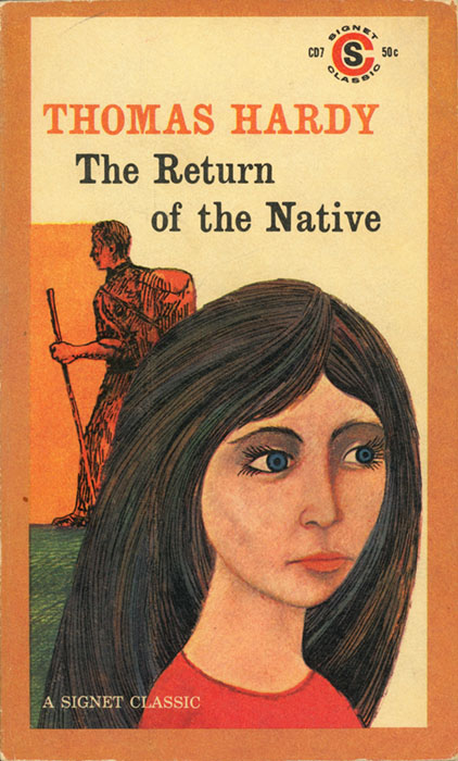
CD7, 50¢, August 1959. Cover artist unknown. 413 pp.
The rural tranquility of the heather-covered English countryside is the setting for this moving novel of conflicting aspirations and tragic destiny. Clym Yeobright returns from Paris to the village of his birth, idealistically inspired to improve the life of the men and women of Egdon Heath. But his plans are upset when he falls in love with a passionately beautiful, darkly discontented girl, Eustacia Vye, who longs to escape from her provincial surroundings. Their stormy marriage explodes in a violent tragedy which eventually frees Yeobright to pursue his dream of service. A book of classic dimension and heroic design, The Return of the Native is the forerunner of the twentieth-century psychological novel — poetic, compassionate, vivid in its associations, universal in its meanings.
With an Afterword by Horace Gregory
I found The Return of the Native artistically confusing. Is this good writing or bad? Is Hardy’s outlook broad or narrow? What am I dealing with, here?
You tell me. Let’s go straight to the excerpt. This is the introductory portrait of Eustacia Vye, who isn’t quite “our heroine” but certainly has top billing. (Viewable here in the original ink.)
She was in person full-limbed and somewhat heavy; without ruddiness, as without pallor; and soft to the touch as a cloud. To see her hair was to fancy that a whole winter did not contain darkness enough to form its shadow — it closed over her forehead like nightfall extinguishing the western glow.
Her nerves extended into those tresses, and her temper could always be softened by stroking them down. When her hair was brushed she would instantly sink into stillness and look like the Sphinx. If, in passing under one of the Egdon banks, any of its thick skeins were caught, as they sometimes were, by a prickly tuft of the large Ulex Europœus — which will act as a sort of hairbrush — she would go back a few steps, and pass against it a second time.
She had pagan eyes, full of nocturnal mysteries, and their light, as it came and went, and came again, was partially hampered by their oppressive lids and lashes; and of these the under lid was much fuller than it usually is with English women. This enabled her to indulge in reverie without seeming to do so — she might have been believed capable of sleeping without closing them up. Assuming that the souls of men and women were visible essences, you could fancy the colour of Eustacia’s soul to be flamelike. The sparks from it that rose into her dark pupils gave the same impression.
The mouth seemed formed less to speak than to quiver, less to quiver than to kiss. Some might have added, less to kiss than to curl. Viewed sideways, the closing-line of her lips formed, with almost geometric precision, the curve so well known in the arts of design as the cima-recta, or ogee. The sight of such a flexible bend as that on grim Egdon was quite an apparition. It was felt at once that the mouth did not come over from Sleswig with a band of Saxon pirates whose lips met like the two halves of a muffin. One had fancied that such lip-curves were mostly lurking underground in the South as fragments of forgotten marbles. So fine were the lines of her lips that, though full, each corner of her mouth was as clearly cut as the point of a spear. This keenness of corner was only blunted when she was given over to sudden fits of gloom, one of the phases of the night-side of sentiment which she knew too well for her years.
Her presence brought memories of such things as Bourbon roses, rubies, and tropical midnight; her moods recalled lotus-eaters and the march in Athalie; her motions, the ebb and flow of the sea; her voice, the viola. In a dim light, and with a slight rearrangement of her hair, her general figure might have stood for that of either of the higher female deities. The new moon behind her head, an old helmet upon it, a diadem of accidental dewdrops round her brow, would have been adjuncts sufficient to strike the note of Artemis, Athena, or Hera respectively, with as close an approximation to the antique as that which passes muster on many respected canvases.
This is either intolerable or pretty good. I read the whole book and I still can’t say for sure which it is. Perhaps it’s both.
First the intolerable. The prose is relentlessly self-indulgent; Hardy writes like a retired professor amusing himself. He’s constantly adding twists to the syntax that feign to increase precision but actually have the opposite effect. “To see her hair was to fancy that a whole winter did not contain darkness enough to form its shadow.” Really? Simply to see her hair WAS to fancy this convoluted fancy? There was no alternative? And you’re telling me the fancy isn’t about the hair per se but about the hair’s shadow?
In Hardy’s mind it’s always charmingly high-toned to add more clauses. “Assuming that the souls of men and women were visible essences, you could fancy the colour of Eustacia’s soul to be flamelike. The sparks from it that rose into her dark pupils gave the same impression.” Oh my god. What he means is “Eustacia’s soul was the color of flame, and its sparks rose into her dark pupils,” but he can’t help sloshing his sherry all over the sofa on the way there. The extra words are manner rather than thought, and their music is designed to keep the reader lulled in a cocoon of self-satisfaction while he pages through the story at his gentlemen’s club.
Hardy also has a tic of constantly adding words like “seemed” and “appeared” so that he can try to get credit for “show don’t tell” without actually doing the work: he’s very fond of telling that things were shown. It happens on every page. “Her countenance seemed to signify that she concealed some suspicion.” Determining what such a countenance would actually look like is left as an exercise for the reader. His comfort zone is “one might have fancied that…” It gives the impression of subtlety without containing any.
And let me not forget to roll my eyes at: the random displays of erudition! Which aren’t just restricted to needless manspreading like “the cima-recta, or ogee”; they can get quite grotesque in their smarmy defiance of the book’s milieu. A naive little rural kid isn’t sure whether to stay or go because either might anger Eustacia; Hardy comments: “Here was a Scyllæo-Charybdean position for a poor boy.” Oh bra-vo, Mr. Hardy. What purpose does this learned allusion serve other than to specifically resist the character’s frame of reference? It’s like he’s ashing his cigar on the kid’s head.
Finally, the last and most significant intolerable thing about the passage above: it’s a character sketch that clearly aspires to be specific and careful and nuanced, and yet it’s unabashedly made out of fashionable cliches. It reads like a Pinterest board; comparing a character to “Bourbon roses, rubies, tropical midnight, the ebb and flow of the sea, a viola” is basically just collecting “style inspirations” for 1878. (Here’s the march from Athalie for all you wonderfully stormy and pouty ladies to resemble! With flashing eye!)
Now to the “pretty good.” Despite the reliance on cliche, the intention to be specific and careful and nuanced is real, and has its own value. Hardy’s energetic dedication to the business of description is rewarding in itself. I can’t deny taking pleasure in the shameless excess of detail-work dedicated to the sculptural cut of her lip, or in the sneering, catty description of Germanic mouths “like the two halves of a muffin” (English, presumably). Am I taking pleasure in substance, or style, or what? Is this sort of thing cheap or inspired? I honestly don’t know.
I don’t for a second buy that Eustacia would actually double back to deliberately brush her hair against the Ulex Europœus — it’s sheer Victorian cheesecake — and yet it still contributes to an overall complexity of portraiture, of which the ends seem to me more mature than the means. Despite all the corny objectification in the details, the passage as whole is effective at sketching a kind of petulant sensualism that is not itself wholly a cliche. This image of her restless hunger for all the world to be petting and grooming her (even the prickly gorse on the heath, imagine that!), is tacky and implausible, but I can still respect his taking the time to invent it and feed it into his loom.
When I first read these paragraphs I took them to be a standard-issue “she was entrancingly beautiful” passage. But it turns out that Hardy does not traffic in “she was entrancingly beautiful,” at least not at the level of plot. None of his characters have charmed lives or charmed souls. “She had pagan eyes, full of nocturnal mysteries” sounds like a swoon, but in the long run he seems pretty clear on the distinction between a woman actually being full of nocturnal mysteries and just being drawn that way. What Eustacia is actually full of is irritable discontent and a compulsion to self-mythologize, which end up being unfortunate for her and everyone around her. The Pinterest board is indulged as a kind of game, but its implications are not ultimately endorsed.
And taken as a game, the passage becomes rather charming: description as sheer sport. I’m not going to say his tongue is in his cheek, but there is perhaps a very faint note of deadpan being sounded, which, once I perceive it, suddenly seems to redeem and excuse all the excess. Why not join him in the gentlemen’s club after all?
Then again… is that faint note of deadpan actually there? Have I fallen for an illusion? Or perhaps an excuse invented after the fact? What’s this guy’s real attitude?
Truly, who can say?
I experienced Hardy as evasive. He shows himself technically capable of building rich and complicated feelings, situations, characters… and yet… is that really what he likes, deep down? Is it who he is?
The storytelling frequently lapses into triteness and contrivance, or bogs down in stasis. Then when he finally gets the motor running again, he always seems to say “Oh, rest assured, I meant to do that! That was important.” And I would fall for it, because his authoritative tone could be quite convincing. But thinking back on it all, I can’t shake the feeling that I was witnessing a genuine struggle for clarity and direction. The prose winds its way through the fields, between the characters, around rooms, always making a show of being discerning, of making a skillful attempt to come to terms with things. When will the work of coming to terms be done? It is never done. And perhaps nothing is really being come to terms with; it’s just his chosen demeanor, and a good smokescreen.
I suppose it’s worth keeping in mind that The Return of the Native was originally a serial in 12 installments. The serial form invites unevenness; it almost demands it. Taking stock of this book feels like taking stock of a whole season of a television show. Not all episodes are equal. Not all choices end up sticking. Shows have to find themselves as they go.
In Jane Smiley’s introduction to the 1999 Signet edition she describes Hardy’s works as “an unpredictable mix of the timeless and timely, conservative and radical.” Indeed! It’s strangely disorienting for a novel to be “unpredictable mix” of anything: good and bad, retrograde and progressive, clear and muddled. Hardy does not have a single and reliable temperament, and his head is full of a mishmosh of contradictory attitudes. Some days at his writing desk he leans one way, some days another. Some pages are satisfyingly strong on exactly the terms by which others are irritatingly weak.
That really throws me off! A fundamental pleasure of reading a novel is supposed to be that it is unitary — it is one thing, about which I can say “it,” in the singular. “I read it.” “It was pretty good.” It’s irksome to be denied that.
Smiley also writes:
“It is easy to find fault with Hardy, and readers and critics always have. A salient feature of his career, in fact, is the universal disagreement about what makes this great novelist great. Some critics fault his style; some, his vision; some, his detachment; some, his depiction of women; and some, the way he attacks or upholds certain features of Victorian life.”
Yes, exactly. As I’ve been saying, almost any dimension of the writing could just as easily be faulted as praised.
It seems to me that Hardy straddles two outlooks at once, an old and a new, and manages to frustrate the aesthetic and philosophical expectations of both. Either the book is a conventionally overheated melodrama, “alas alack” and all that, but told in a strangely sedate, dispassionate mode… or else it’s an artistically serious attempt to “realistically” capture a certain rustic milieu and certain psychological drives, but one that falls back constantly on hackneyed dramatic exaggerations. Either way, it refuses to feel natural and whole.
This has all been to say: it’s very difficult for me to say how the book was. But I can say what it was: it was a 19th-century novel!
And that’s probably the best answer to Jane Smiley’s question about what makes Hardy great: he’s great because he took the time to write 19th-century novels, in full, with all the characters and situations and themes and whatnot. A significant and honorable labor, not to be taken for granted.
The book has, as Signet’s blurb says, “classic dimension and heroic design.” Note that this is praise for form rather than content. But praise for form can be real praise. Is not the 19th-century novel as genre, as sheer form — with all the characters and situations and themes and whatnot — a great artistic achievement in itself? All cathedrals are built on pretty much the same plan, after all. Here are some nice ones. Are some of the cathedrals on that list less than masterpieces, architecturally? Do some of them have flaws and inconsistencies? In some sense, sure — but what sort of horrible spoilsport must you be to fixate on that sense? Did you get your damn narthex? Your transept? Then just say “thank you very much.”
Thank you very much, Mr. Hardy!
The things that make The Return of the Native great, in whatever sense “great” applies, are its artistic premises rather than its specifics. I come away from with my strongest impression being just how eagerly and wholeheartedly its author participates in “the project of the novel”: the vision of life as consisting of CHARACTERS in a SETTING dealing with PROBLEMS — of human affairs as a tapestry thickly woven from many individual threads, which it is our sacramental obligation to OBSERVE and DESCRIBE. The novelistic outlook is very truly his outlook, or at least it’s one in which he has distinctly devout faith.
That kind of devoutness is a gift to the reader. It feels good, much the way that it feels good simply to sit in a clean and well-decorated restaurant, regardless of the food. It is, indeed, rare enough, and rewarding enough, that I can understand why some people love this book.
But I am not one of them.
Having read the excerpt you’ll probably agree that 25-year-old Catherine Zeta-Jones was excellent casting, unlikely to be improved upon. (The movie overall looks just like it should if you turn the sound off; as soon as you turn it on you’ll see that the acting and directing are terrible.)
Speaking of which, I want to note that the original serial was illustrated! As usual, the illustrations have never been reprinted. It continues to seem wrong to me that these things, which are born as twins with the novel, can fall so far into obscurity. In this case they’re quite good, too.
The artist is Arthur Hopkins and he clearly had a thing for lighting effects. Can you blame him? I’ve extracted and sharpened the images; here are four attractive non-spoilery ones (click to enlarge):
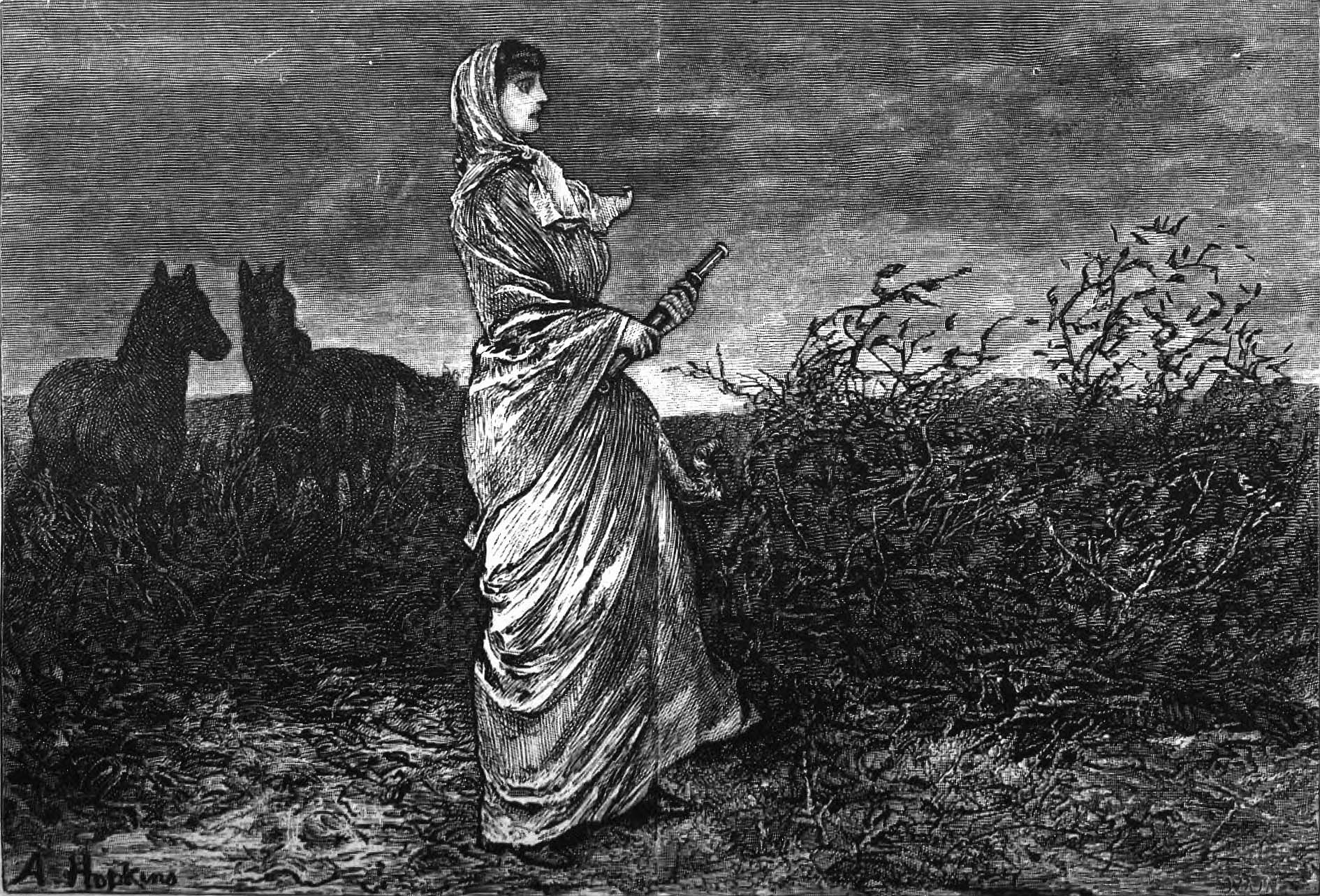
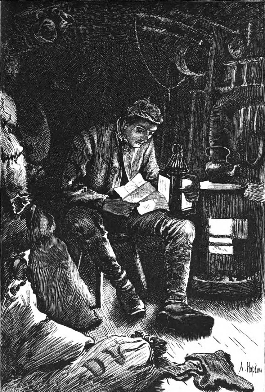

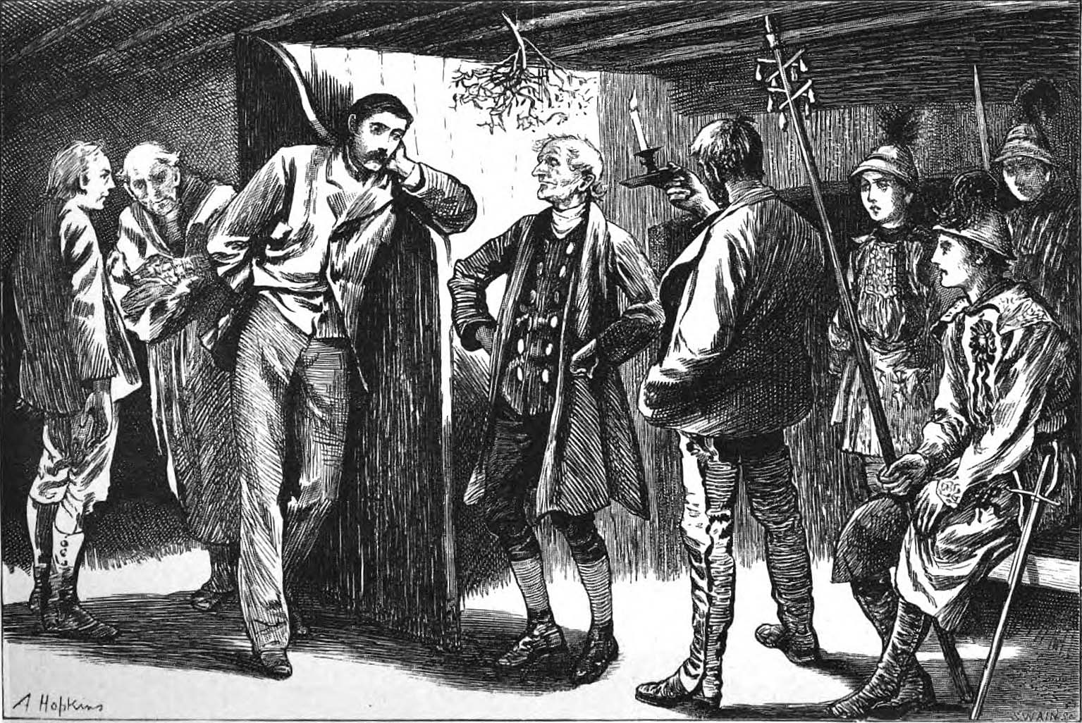
I think these help immensely to place the action in a world of consistent and inviting tone and shadow; I wish I had been looking at them while reading.
Overall, I think encountering the novel in “Belgravia: A London Magazine” in 1878 is the ideal way to read it. Alongside The World Well Lost by E. Lynn Linton, By Proxy by James Payn, and The Haunted Hotel by Wilkie Collins (which FYI has a floating head in it).
You’ll notice that none of them were too proud to carry the serial illustrations into the book editions. Maybe get over yourself, Thomas Hardy.
I realize I’ve said next to nothing about the actual substance of the book, its events and characters and setting. Well, that’s an honest reflection of my reading experience. The contents felt secondary to the overall question of authorial manner, which I was never satisfactorily able to resolve. I read all the words of the story, but apart from a stray scene here and there, I couldn’t figure out how to dream it. And that’s that.
Also I’m sorry to report that every time I picked up the book, I thought of this. Which can’t have helped matters.
Enough talk. Here’s what we really came for: all the covers.
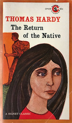
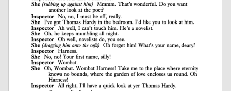
CP439, 60¢, 1969.
Same layout as the original above. Yet again, the first printing has subtly different art from all subsequent printings (point of issue: the triangle of grass goes all the way down to the bottom border on the first printing only).
As for the art: the rendering of Eustacia’s dark and sensual beauty is, shall we say, underwhelming. Meanwhile, seeing as he’s been tinted red, the guy in the background is most likely Diggory Venn the reddleman. His juxtaposition with Eustacia in this composition could not be more meaningless and arbitrary.
(By the way, J.K. Rowling surely lifted the name “Diggory” from this character. Throughout my reading I had the impression that J.K. had been down this road at some point; her fondness for twisty interpersonal entanglements + rustic local color feels very Hardian.)
Typeface is Clarendon.
CT625, 75¢, 1973?
CQ722, 95¢, 1974.
CY869, $1.25, 1976?
CW1091, $1.50, 1978.
CE1252, $1.75, 1979?
CE1492, $2.25??, 1982?
??1664, $?.??, ????.
70s branding. They centered the title, which is probably a good choice, though now it’s too close to the author’s name.

CJ1796, $1.95, ????.
The centered logo.
CE1974, $2.25, 1985?
??2307, $?.??, ????
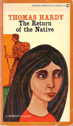
CE2471, $2.95 (later $3.50), 1990?
80s redesign; I read from one of these. Painting by Constable. Given that this book could bear having nearly any landscape painting on its cover, a bit odd that they chose this wonky-looking shmeary one. Almost every other painting by Constable is more attractive than this. Not to mention that the subject matter, and the attitude, is wrong: there are no scenic ruins in the landscape of the novel, and the romance of decay isn’t really the ethos.
Typeface is Latin 725 Bold, I think, or a very close relative. (It’s a rip-off of Méridien to begin with.)
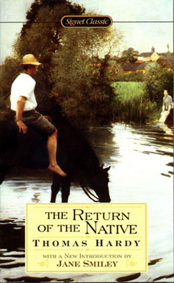
2738, $5.95, 1999.
With a New Introduction by Jane Smiley
This painting was seen at auction in 1993 and apparently entered an image library from there, though it seems to have been pulled since. The artist is the little-known Jules-Alexis Muenier. The theatrics in his work seem a bit phony and sentimental, but his use of color is rather good. Say I. The scene here depicted doesn’t specifically correspond to anything in the book, but it still feels like a spiritual match. I’ll let them have it.
Typeface is Engravers Roman BT.
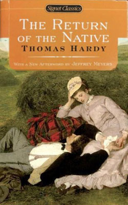
3112, $6.95, 2008.
With a New Afterword by Jeffrey Meyers
Painting is by Pál Szinyei Merse, which means that these two lovebirds are actually picnicking somewhere in Hungary, in a hayfield — but whatever.
Typeface is still Engravers Roman BT.
The original cover(s). Usually I say “original and correct,” reflecting my feeling that packaging is part of the identity of a book and really ought to be retained in perpetuity. But when a book predates the practice of printing the title on the front cover, I’m less inclined to consider its design aesthetically relevant. Like most books in 1878, this one’s design is just trying to put across “book.” Not to say the lettering isn’t nicely done.
While we’re on the subject, here are some other paintings that have appeared on the cover of this book over the years:
James Aumonier (1832–1911): The Silver Lining of the Cloud (1890) (Penguin, various times — sometimes they use the left side, sometimes the right side)
Frederick Brown (1851–1941): Hard Times (1886) (Oxford, early 90s. They later thought better of it and moved this painting over to their Jude the Obscure)
John Middleton (1826–1856): A Landscape With a Horseman (ca. 1850) (Bantam, 80s and 90s)
Artist unknown: Storm on the Heath (Penguin. The result of a Bridgeman search for “Heath,” surely.)
George Inness (1825–1894): Medfield, Massachusetts (Barnes & Noble)
John Constable (1776–1837): Old Sarum (1829) (Reclam, 1989)
Some of these paintings are attractive but none seems quite honest about the book. I think those original Hopkins illustrations get something right about “the heath” that is misrepresented by all the editions of this book that put beautiful unpeopled landscapes on the cover. Despite all the words Hardy expends in describing Egdon Heath — the entire first chapter, and many other passages besides — it is absolutely and truly a backdrop, not a secret ur-subject.
“Really ultimately the book is about the heath itself” seems to me a very 20th-century, cheap way of reading, and a fairly ubiquitous one these days. Maybe it’s a post-Freudian anxiety: we’re so suspicious of “the subconscious,” of any thought that isn’t clearly foregrounded, that we can no longer have our attention directed to a background without believing that we’re being asked to promote it.
It’s as true for me as anyone! I have an embarrassingly hard time making sense of a passage that explicitly says “I’m going to go on at some length now about the background” and really means it. I needed to see that Hopkins illustration of Eustacia standing on the heath, actually, for it to click: background is background.
A picture of some raw mushrooms and onions and sausages would make a fine cover illustration for a pizza; a picture of a pizza crust with nothing on it would not.
With that excellent and valuable analogy, I can at long last bid this entry adieu.