This has been accruing. Might as well dump it out now. There’s nothing very good here, but since when has that ever stopped the log? It keeps on rolling.
Okay, so, last two games of Humble Indie Bundle 9, purchased 9/23/13.
• Rocketbirds: Hardboiled Chicken (2011): Ratloop Asia (Singapore) [4 hrs]
This was the commercial upscaling of an in-browser Flash game. A browser is like an itsy-bitsy proscenium, a little Punch and Judy stage with red curtains at the side. The format brings different expectations; not everything can scale. The Punch And Judy Movie remains to be made for good reason. The essence of Punch and Judy is that they’re a miniature vulgar version of real, full-scale drama. So by definition they can’t be real full-scale drama. This felt a little like The Punch And Judy Movie.
The packaging weighed more than the game. Not to say there weren’t a few actual gameplay ideas here, but none of them remotely justified the dimensions of the production. This wanted to be in a browser, or on a phone. Or the back of a cereal box.
• A Virus Named TOM (2012): Misfits Attic (San Francisco, CA) [played for 4 hrs]
Simple stuff, overworked and overproduced. A modest little indie game invested with too many hopes. Basically it’s just the pipe rotation/networking puzzle that I first encountered as “Series of Tubes” by Wei-Hwa Huang in 2006 or so (I don’t know if there’s an earlier precursor), combined with the Pac-Man maze/evade mechanics of so many early 80s arcade games. That’s it. They add some minor novelties to try to keep it varied as you progress. But who asked for variety, anyway? At heart this isn’t really a puzzle game, notwithstanding that the designers opted to build some puzzles with it. It’s basically just an arcade game; it probably ought to have had randomly generated playfields and continuous play. It’s okay for such things to be monotonous; that’s the draw, in fact. Say I, anyway. Of course, I only played the single-player content — there’s some cooperative and head-to-head stuff in there too, and maybe that sits better. I promise never to find out.
As for the package, the strenuously professional attempt to keep things lively and generate charm is self-defeating, and misjudged. Maybe if the music were in fact charming, and not ha-ha hardcore as-if, the whole experience would be reframed. Oh well. At least it’s short. Though I abandoned before the end because the last few levels were pointlessly, punishingly hard.
10/21/13: Humble Weekly Sale: Hothead Games. Pay what you want for these three games. I pay $1 because I’m faintly curious about the first game below. Faint to the tune of $1.
• DeathSpank (2010): Hothead Games (Vancouver, BC) [13 hrs]
Bought it because it was by Ron Gilbert of Monkey Island fame and seemed to have some adventure elements. At heart it’s actually exactly the sort of thing I usually whine about: a pure tedium of armor and weapons and potions and combos and currency and shops and configuration; phony inflationary “leveling-up” instead of substantive progression; a plot consisting entirely of fetch quests and padding. I wrote off Torchlight and Bastion as a waste of my time. Yet this I played to fullest completion. Why? 1) I happened to be in the mood to embrace the meditation of an empty task-chain. 2) When it comes to emptiness, packaging is everything, and where Torchlight‘s package was genuine refried D&D, and Bastion‘s was preening emo junk, DeathSpank is a cheerfully stupid pop-up book. This I can use. I picked up thousands and thousands of little coins that went ding simply because that’s what one does in a pop-up book, and it seemed like a pleasant place to hang out for a couple days.
• DeathSpank: Thongs of Virtue (2010): Hothead Games (Vancouver, BC) [played for 1.5 hrs]
Only a few months later in 2010, this “oh oops here’s the rest of DeathSpank” game was released. Seems like they were developing content for a single game and at some point realized it was too much, too long, too bloated, and then instead of cutting back they bulked it up further so that they could split it into two separate products. That’s all well and good for them, but what about me, the player? I started in cheerily enough but after an hour had to have a reckoning: am I really going to spend another 13 hours hanging out clicking on things that go ding in this same pop-up book? What if there were THREE iterations of this game? What if there were SIX? Would I really play them all? If they’re just going to make more and more of it, at some point it’s on me to say it’s been enough. Okay, then: I say it’s been enough. This second one might be marginally more interesting in some superficial ways but screw it. I already had this experience. It’s cute! I’m not complaining. But I’m ready to move on. If, say, in fifty years, when I’m in my late 80s, I have a profound nostalgic desire to return to DeathSpank, what a treat I’ll have in store! A whole brand new game! But for now, I’ve got plenty of other inane non-places to be.
• Penny Arcade Adventures: On the Rain-Slick Precipice of Darkness: Episode One (2008): Hothead Games (Vancouver, BC) [played for 1.5 hrs]
Penny Arcade is a longstanding webcomic about two unpleasant nerds who play videogames, constructed as a charisma fantasy in which there’s something wry and snappy and authoritative about being unpleasant nerds who play videogames. It’s self-congratulation very thinly veiled as self-deprecation and it’s always rubbed me the wrong way. Nonetheless I thought maybe I could get through one episode of their game. But the game is an RPG, so, as I said above, the packaging is going to be the entire value. And the packaging here is smarmy overwritten trope-clusterbomb gobbledygook, i.e. “geek culture.” Strictly for people who think “Chthulhu plushie” is always and ever intrinsically hilarious no matter the ubiquity. That’s not me so I’m out. Also the design is full of 2008 clumsiness, with way too much clicking necessary to get from one non-event to the next.
Like I said, I only put in a dollar for this bundle because of DeathSpank. This just hitched a ride and I never wanted it in the first place. But I gave it its 90 minute due.
11/5/13: The Humble WB Games Bundle. I “beat the average” by spending $5 for six games, one of which I already have; a week later three more games are added, making a total of eight new games. I purchased this solely for Batman: Arkham City and Scribblenauts. From my point of view the other six games are completely incidental. But here we go!
Here we go, sort of. See, the thing is…
• F.E.A.R. (2005): Monolith (Kirkland, WA) [played for 2 hrs]
Okay, well, I can see that this is a class act, really I can, but it’s basically a machine purely for making the player tense, and I don’t need that at the moment. In fact perhaps it’s enlightened to say that I don’t ever need it. I passed on Dead Space for the same reason. Of the two, if I had to pick a horror movie to be stuck in, I’d pick this one, which as you can see from the trailer is basically The Ring done as an “evil lab” story. Not my favorite but I’ll take it over outer space fleshmonsters any day. But isn’t a lovely thing about life that one doesn’t have to pick a horror movie to be stuck in?
Really, it’s mostly a gunfight game, with a horror wrapper. But gunfights make me just as tense, if not tenser, as the vengeful spirits of little dead psychic girls, so that’s no relief. I played two hours, killed a whole bunch of guys, got jump-scared a whole bunch of times, and decided I get the drill. It seems like a pretty good drill but I think I’d rather stay away from drills.
There are some expansion games that came with it. I won’t be playing those.
Which brings us to:
• F.E.A.R. 2: Project Origin (2009): Monolith (Kirkland, WA)
• F.E.A.R. 3 (2011): Day 1 Studios (Chicago, IL + Hunt Valley, MD)
Right, so, the sequels were in the bundle too and naturally I’m not going to play them either. For the time being. And I expect the time being to continue being for a good long while.
Next!
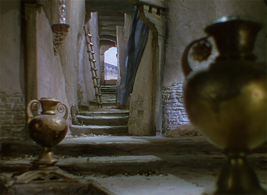
• The Lord of the Rings: War in the North (2011): Snowblind (Kirkland, WA) [played for 2 hrs]
A big-budget mediocrity, one among thousands. Games like this are the reason you can’t just go out and buy every game that looks like it might be good. Because chances are it’s not that great. The brand tie-in is done well enough, and I’ll admit that the scenery looks pretty nice, but ultimately it’s all just tinsel. The actual playable area is usually a big rectangle, in which you just stand and fight hordes of bad guys. It’s a glum slog. The writing, the design, the gameplay — everything about this is professional, expensive, and worthless. Games are the new Hollywood, baby!
I put in two hours trying to see some variety but the game insisted on denying it to me. I quit when I noted that I had gotten to level one, part 19, and saw that it was just going to be another fight against the same bunch of bad guys I’d been fighting for the past 18 parts. What a drag. There’s so much better out there and my time deserves it. Shame about all those nice castles and mountains and things that they built. If only there’d been something to do in them.

 2010:
2010: 