Category Archives: Older Stuff

July 9, 2008

Indiana Jones and the Kingdom of the Crystal Skull (2008)

directed by Steven Spielberg
screenplay by David Koepp
story by George Lucas and Jeff Nathanson
based on characters created by George Lucas and Philip Kaufman

Short review: “It could so easily have been so much better but oh well.”

Very long not-review:

Somewhere in some press release or other, Steven Spielberg said something like “Indiana Jones really belongs to the fans now, so we owe it to them to get it right.” I made up that quote entirely but I swear he did say something much like that.

I’ve never read any of those Star Wars or Indiana Jones “novels,” but I’ve played a licensed video game or two in my time, and I know what they’re like – they expend an enormous amount of their creative energy on the task of being “on brand.” But a brand – a vague collective notion, a thing that by its nature really does “belong to the fans,” and is therefore the principal resource mined by franchising – can have a life of its own. The brand derived from a movie continues to mutate and evolve as culture chews and rechews the cud, while the original movie sits inert. Raiders of the Lost Ark is never going to change, but the specific cultural memory of it, as of everything, is always in flux.

Over the past twenty years, the only forces at work on the Indiana Jones brand have been nostalgia, imitations and knock-offs, franchise stuff like the video games, and (most nefarious of all) geeky fandom, that slow rock tumbler made of millions of obsessive minds, which can eventually convert any cultural object into a shiny nugget of aesthetic abstraction, suitable for fetish purposes. What I am going to say in a couple paragraphs, after a digression on this last notion, is that the new Indiana Jones movie has no particularly authentic connection to the previous movies – after all these years, they made a movie of the brand rather than the character. But first those paragraphs I mentioned.

I just read this book about nerds and the author, I think, neglects an important nerd-related mental phenomenon: the process of fetishization. The author of the nerd book says that nerds are drawn to models of reality that are rigidly rule-based and logical (which are appealingly manageable to those who have poor social intuition). To me this is the social-skills variety of a more general mental phenomenon, available to all but more important to nerds. This phenomenon, which I guess I’m calling fetishization for now, consists of always seeking out the more refined version of an aesthetic stimulus. Aesthetic rationalization I suppose you could call it. “Cognitive focusing,” the guy who eavesdropped on me in a restaurant told me it’s called.

Okay, here’s a way I can talk about this. I read an article once about research into sexually attractive features on animals, explaining why things like antlers evolve to become more and more exaggerated. The reason is that apparently, to the brain, if antlers = good, then big antlers = more good. I may be misremembering the study, but as I remember it, it was saying that this is not necessarily because big antlers actually connote greater health than small antlers, but rather because the brain always responds this way to pre-programmed sensory stimuli. The more intensely “on model” the stimulus is, the more intense the brain’s response. And apparently the brain rates a bigger version of a thing as more intense, as being more truly that thing. Likewise a version of a thing with fewer other distracting features – a purer version of the thing is more intensely the thing. The article that I remember (Discover magazine maybe?) went on to say that this accounts for the tendencies of human pornography to caricature sexual features. If breasts provoke a response in the brain, impossibly giant breasts may well provoke that response more particularly and intensely. Preposterous exaggerations and simplifications get not just a pass but an endorsement from the brain, because the brain is looking for particular forms on their own terms.

Of course, people are susceptible to this in different degrees and on different fronts. Certain nerds, it seems to me, are generally more interested than most in obtaining the purest, most refined, most inflated form of their aesthetic stimuli. But certainly everyone is subject to this desire to want their next hit of something to be a little stronger, a little more on the sweet spot. And, if I haven’t made it clear already, in my philosophy it’s a desire that we should fight against, because it’s the desire for the world to be a set of products designed for us rather than the other way around; it is a desire that draws us away from things as they are.

Chasing that sweet spot means people – again, certain nerds, mostly – end up preferring their culture with breast implants and huge antlers, all in the name of being truer to their memory of the original stimulus. To them it will always feel like a sincere pursuit of the ideal, or at least like a pursuit of the bigger, better, next thing. This is all by way of saying that the brand of Indiana Jones has made room over the years for a slicker, pared-down, more intense notion of what goes on in Indiana Jones movies.

Before I finally talk about the movie, let me note that at the screening, we saw a preview for Star Wars: It’s Come To This, a completely computer-animated super-slick Saturday-morning-cum-video-game thing coming to theaters this whenever. This is a perfect example of what I’m talking about. 31 years of cumulative fetishization have rendered this into this.

Okay, so finally to the point of all this. When Mr. Spielberg says it belongs to the fans now, this is what he means. The movie he made in 1980 is less important to his new project than the millions of memories it engendered. Which is to say that this is an Indiana Jones movie that could have been made by any schmuck. As with Star Wars: Episode Colon: Attack of the Star Wars et al. – the problem is that it was made by people whose ownership of the property is still a legal reality but no longer an artistic one. Sadly, all it would have taken for them to regain artistic ownership would be for them to believe that it was theirs. But they don’t; they’re now just like any lowly franchise video-game designer, putting all their energy into making sure it’s Indiana Jones-y enough, whatever that might mean. That means that their work falls flat open for us to critique as a mere series of choices because it has no internal confidence of its own. That’s the main sad thing here. The other is that many of those choices are super super stupid.

The stuff in this movie is all new age Time-Life Mysteries of the Unknown crap with dubious associations at best. Crystal power and alien pyramids have no pedigree, no class. That’s awe for morons, just one step away Indiana Jones and the Chain Letter of Death. So that right there is a bad choice. When video games make similar choices, you think, “oh well, they don’t know their business like the movies.” Well, neither do the movies anymore.

Dialogue was clonky and styleless. Terrible “riddles” were spouted, solved, and forgotten in the same breath; the screenwriter had no sense at all for how to handle mystery so that the audience can savor it. Tone was erratic to the point of making one uncomfortable. Jokes were unfunny and often confused. Computer effects were, as always, a sore thumb – the CGI people were delegated more than anyone should have to chew in some of the later sequences. A sense of danger or tension was almost entirely lacking. The bad guy spends most of the movie hanging out and chatting amiably with our heroes. At the end I wasn’t sure the movie was even going to kill her, since she seemed so essentially decent. But it killed her anyway, as per the Formula.

The movie didn’t have any energy left over to get that stuff right because its heart and soul had already been committed to the task of BEING ON BRAND. In the most superficial ways, yes, it was undeniably on brand. But I think that that would have come for free with the costume, frankly. If the original idea was to make this like a 50s pulp sci-fi movie, they should have been unafraid and gone all-out; the character, I promise, could take it. Instead they clung desperately to their playbook while they tried to force a few square pegs through the Formula. Check it out, everyone: This time we’re using square pegs!

It felt like we were watching Indiana Jones himself – because hey look! that’s him, the very same guy from those other movies! – being somehow compelled to say and do dumb stuff. That’s much, much better than can be said for Star Wars: The Phantom Clones in which it seemed that we were watching Natalie Portman herself, being somehow compelled to stand in front of a green screen. In fact, it’s good enough for me to walk away without any bile in my throat. Did they make another Indiana Jones movie? No question. Good. Fine. Score one for nostalgia and let’s try not to think about the details.

The second movie is bad too; for less depressing reasons, certainly, but bad all the same. So there’s a precedent here and I’m perfectly happy – truly – to let this one slide. If they want to make another one I’ll go see it. Maybe having gotten this out of their systems, they’re ready to make one that has its own reason to exist.

Probably not though.

The score was just like the movie – A for effort toward being on brand (well, B for effort, anyway), but what an awkward thing to have to attempt. Why not aim higher – or lower? Or aim where you aimed the first time rather than aiming at the first time? The preceding sentence says what this whole entry is saying, but better. Oh well.

I am, however, very happy to report that I ate a special Indiana Jones-themed Snickers bar (with coconut, to evoke jungle adventure), several boxes of Indiana Jones-endorsed Corn Flakes, and one special purchase of Indiana Jones-endorsed Frosted Flakes. As a result, I am now the proud owner of an Indiana Jones Adventure Spoon. If you Google “Adventure Spoon” you’ll see that I am hardly the only person to be pleased by this item. Mine is the one with the skull on it.

And how can I stay mad at a movie that gives me that? Did I mention that the spoon lights up?
July 9, 2008

Brahms: Variations on a Theme by Paganini, Op. 35 (1862-63)

Johannes Brahms (1833-1897)
Opus 38: Variations on a Theme by Paganini
composed: 1862-3 (age 29-30)
published: 1866
first performance: Zürich, November 25, 1865 (Johannes Brahms, piano)

Scores are here: Book I and Book II.

Remember how we were listening to The Essential Canon of Classical Music a year ago? Yes, we’re still doing that. I just haven’t kept up with it. Number 312 on the list. We were listening to it exactly a year ago this month.

This is an interesting case.

Dubal quotes James Huneker telling us that the variations “are also vast spiritual problems.” This seemed silly to me while listening. The piece was obviously a basically technical proposition, for the composer as well as the performer.

But then when the variations started turning up in isolation on my iPod’s shuffle – each one is individually tracked in the Kissin recording – they began to come to life as distinct pieces, extremely tiny though they each are. The through-line of the variation form became something wistful and nostalgic – because each little piece that whips by while I’m on the subway is tied poignantly to something else, something not contained in itself, and none of them quite embodies it completely (or consummates it completely, in whatever sense it might).

Heard in series, their proximity to one another (and to the theme) detracts from their individuality. This is a bit of a paradox of variation form. By inserting some arbitrarily long hiatuses between them, I’ve been able to hear them as something more than technical. Maybe they’re not “vast spiritual problems,” but I can sympathize with the sentiment – there is, at least, something yearning and pained about them. There is the sense that they have put up some resistance, some struggle, in their irreversible journey away from the theme toward their individual selves, but that they’ve reached a bittersweet acceptance.

Still, the slower, more tender variations remain more interesting than the fastest, most difficult ones, many of which have an aridity to them that I don’t think can be performed away. Let me mention that this set is exceedingly – I daresay excessively – difficult. I usually like to play through any piano piece to get a little closer to it, fudging the hard parts, but this piece resisted even the roughest stumbling through – it’s ALL hard parts. I could see what everything was, but frequently couldn’t even make a noise that reminded me of it. The demands in terms of leaping and strength are maybe the highest I’ve ever encountered. And for what? It’s fair for a composer to take pride in the sophistication of his work, but the raw difficulty is, if anything, a count against him – a better composer could have found a more idiomatic way of creating effectively the same sounds. Difficulty is only of value to the show-off performer, and even then, only if it actually appears difficult. This piece sounds easier than it is; what could possibly justify that?

If Brahms’s principal objective here was to investigate technical possibilities for the piano, I’m not at all impressed – his devices are extremely inefficient. Compared to someone with an actual gift for pianistic technical invention, like Rachmaninoff, he’s downright clumsy – elsewhere as much as here, but here he puts that clumsiness nakedly on display. If his objective was to compose music that just happened to be technically challenging, I think he got the proportions wrong. That said, there’s still definite musical value here – it just took me a little while to feel it.

Speaking of Rachmaninoff, his more famous variations on the same theme share with the Brahms an emphasis on brilliance, but otherwise the pieces go in very different directions. On the whole, Brahms’s are rather more serious, but only a seriousness addict would say that his is the better work. Of course, classical music is a bastion for seriousness addicts and it’s often their opinions that influence the formation of would-be canons like this one. Rachmaninoff’s all-around better-made crowd-pleaser is on the list too, of course.

I know, just because the pieces on the same theme doesn’t make this comparison fair.

Dubal suggests:
Bachauer: Mercury 434340-2
Michelangeli: Arkadia 903
Biret: Naxos 8.550350
Rodriguez: Elan 2200

Four suggestions! Nope, didn’t hear any of those. We heard Michelangeli, on the second of his “Great Pianists of the Twentieth Century” sets, but I gather this isn’t the same as the recommended recording. It’s not complete either, and he shuffles the order. Also heard the Evgeny Kissin recording, which is, no question, excellently played, and is the recording that was kind enough to break the variations into tracks so that I could think about them individually. But as a whole I felt he made the whole thing seem too easy and smooth to attract much attention. The most immediately satisfying recording, though I only listened a couple times, was the Julius Katchen recording, which had a bit more drama to it.

Grove’s Dictionary says:

By comparison with almost every other keyboard work of Brahms, the Variations on a Theme by Paganini (op.35) place an emphasis on extreme virtuosity. (Clara Schumann called them ‘witch variations’ and regretted they were beyond her capacity.) The more didactic nature of the set is suggested by its principal title: ‘Studies for the Piano’. As with the études of other great composers, however, including Schumann, Chopin, Liszt, and Debussy, technique is always allied with powerful and widely ranging musical expression.

Yeah, they’re obligated to say that last bit. But trust me, these are no Chopin Etudes. I just don’t feel like this was Brahms’s game. His strengths were elsewhere.

June 28, 2008

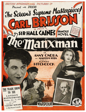
The Manxman (1929)

written by Eliot Stannard
after the novel by Hall Caine (1895)
directed by Alfred Hitchcock

Another one on the subway. Hitchcock’s last silent.

manxmanposter.jpg The Ring felt foward-looking and bold in some ways; less so The Manxman, which was pretty much just a typical weepy melodrama for the Mrs. Zero crowd. Both are “two guys one girl” love triangle movies – and in both movies, one of the two guys is played by Carl Brisson – but The Manxman is much soapier and stagier. Odd in fact to see Mr. Brisson’s acting style seemingly regress here in terms of cornball emoting. Though I guess I’m projecting a historical bias in seeing naturalism as progress. His makeup, in contrast to his performance, is actually more naturalistic in this later movie. In The Ring, Brisson has been more touched up with lipstick and eyeliner than his rival; in The Manxman it’s the other way around. I tried to figure out what the “lipstick and eyeliner” look was supposed to connote back then, character-wise, but couldn’t. In both movies, Brisson is the younger and more naive of the two men. In The Ring our sympathies are pretty much entirely with him; in The Manxman they are more divided – all the better to jerk your tears with! So anyway, I don’t know what 20s audiences saw in that look, but I’ll tell you what I see: a guy wearing lipstick and eyeliner.

The cinematography is very prettily done for what it is, especially when it gets at a landscape. In both movies, Hitchcock creates a few striking setups with very small figures in a large space. On reflection, I guess that kind of image recurs in his famous movies too, but here, in silent black and white, it had greater impact. There’s really only one showy trick: a dissolve that turns the ocean into ink in an inkwell. You can only pull that one off in black and white!

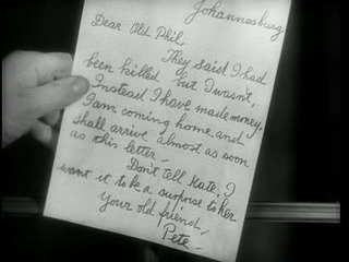
Rather than summarize the plot I will simply offer a single screenshot and leave the rest as an exercise for the reader:

manxmanstill.jpg

I was interested to note how much dialogue is left up to lip-reading and deduction, in both The Ring and The Manxman. Intertitles (and stuff like the above) are used extremely sparingly. I approve; title cards just make silents seem like deaf talkies. Solutions that do without them are more elegant. But doing without titles requires more concentration, and flatters the intelligence.

I’ll tell you one word in particular that never appears in this movie: “Manxman.” I kept waiting to find out what it meant and then the movie was over. So I looked it up online. It just means someone from the Isle of Man. Oh. Now I’m trying to figure out which of the two men was the titular Manxman. Not clear; might have to read the novel to find out. This is not going to happen.

The attached piano score on this DVD, presumably again by Xavier Berthelot, was much better than the one for The Ring. The slower pace and broader emotions here are an easier assignment, but he also just seemed more in tune with what was going on.

The movie was a little half-hearted in some ways, but markedly enthusiastic about giving us close-ups of the pretty girl. She was cute, and if I know anything about Hitchcock, that may well have been the whole point of the movie. Is Anny Ondra (= Ondráková]) the first “Hitchcock blonde”? Maybe, but I’m not sure that’s a particularly interesting distinction. Somewhat more interesting is that she later married Max Schmeling and hung out with Hitler, making Eva Braun jealous. Here are some photo cards for your private albums, kids.

You know, a few days having passed, the movie seems a little more enjoyable in retrospect. It was at least a schlock tragedy rather than a mere schlock romance, and within the bounds of a dated formula, it had its own kind of dignity. Or maybe it’s just that watching it on the subway made it seem like my own private friend and I feel loyal to it as a result.

June 18, 2008

The Ring (1927)

written and directed by Alfred Hitchcock

I got an iPod that can play videos! Now I can watch movies while I’m on the subway!

For my first commute movie I watched The Ring, the first selection in that DVD set of early Hitchcock movies I picked up at Barnes & Noble for Beth on a whim a few months ago. We haven’t watched a one of them yet.

But now I have! ON THE SUBWAY!

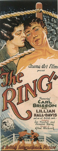
ringposter.jpg

My headphones are great and all, but a silent is a good choice for the subway. This version has an improvised-sounding piano score a la the good old days, which is (so far as I can tell) totally uncredited on this DVD set. Following these particular transfers back through their “StudioCanal” logos, however, I presume that this is the soundtrack from the 2005 French DVD release, which was credited to one Xavier Berthelot. He seems to be playing on a synthesized piano rather than a real one, and frequently when he Mickey-Mouses the action it becomes clear that the sync is off by a second or two. That’s no good. For the most part, the score meanders as though the pianist hasn’t seen the movie yet, and focuses on the superficial at the expense of the underlying significance. That may well be historically accurate, at least for a lesser movie house in 1927, but the style of the music itself wasn’t, and once real authenticity went out the window, the music might as well have been better and smarter. Several times I wanted to turn it off so I could get a better sense of what was really going on, but that wouldn’t have been satisfying either.

The movie is a very rudimentary melodrama – two boxers fight for one girl, known as “The Girl” – but the filmmaking holds up very well. The technique seems ahead of its time; particularly so, in fact, when contrasted with the dated substance of the story. The performances are quite relaxed and tasteful compared to the wide-eyed knuckle-biting that one might expect from a movie like this, and it’s very well shot. Hitchcock pulls all sorts of clever artsy tricks out of his sleeve that stylistically fall somewhere in between Murnau’s Sunrise (from the same year) and the trademark Hitchcock visual style of the later movies. Several scenes ended with sardonic visual “winks” that I think I would have been able to recognize as Hitchcock without any help.

But the movie is far more memorable as a string of cinematic ideas than as any kind of emotional experience. Because of the care and attention to detail, at first you might think that it’s a nuanced elaboration on the typical melodramatic love triangle, but the nuances don’t tally up properly and it all ends as patly as any other forgettable formula flick. Hitchcock the writer doesn’t fare as well as Hitchcock the director, but I get the impression that the writer was mostly interested in setting the director up with things he wanted to shoot visually.

I particularly liked a shot of a boxing match, framed as though the viewer has just entered at the back of a large audience and is not quite able to see the boxers over the silhouetted heads of the crowd. Also a startling effect when the camera takes the POV of a drunk and the image smears as the camera begins to tilt queasily downward. The whole movie builds up to – surprise! – a boxing match, and the finale is a very laudable attempt to make a high-tension scene of action. It’s not nearly as polished as the action sequences that Hitchcock would later achieve (and which would go on to engender a whole realm of filmmaking in themselves) but it’s smart and looks good. When the camera pushes in on each of the boxers in turn as they approach each other, it feels like we’re seeing the future of movies. TCM could totally put that shot in a promo.

Anyway. Naomi Watts was pretty good as “The Girl” in the American remake but the rest of the story got a little muddled. Jack Black was miscast in my opinion. And when Doris Day screams it’s not as scary as in the Japanese version.

But that’s Hollywood for ya!

May 27, 2008

Bunch of movies I’ve seen in the past few months

High Plains Drifter (1973)
directed by Clint Eastwood
written by Ernest Tidyman

Thanks, TCM.

This movie simply does not make sense, morally or otherwise. I’m not going to enumerate the problems. It has only two things going for it to distinguish it from other bleak westerns, and they’re the two reasons I watched it through to the end.

One is that Clint, in the role of false idol, makes the wicked people of Wickedville undertake a series of absurd tasks (painting the town red to look like hell, preparing a picnic welcome for their enemies) purely for grim ironic value. Awfully theatrical, would-be-literary stuff for the genre, especially dissonant when the rest of the movie has such a cheap, exploitative flavor. That kept me watching, just to see if they were really going to paint it red. Yup, they did.

Two is that the Clint character is so unbelievably steely that the movie ultimately has to suggest that he is not a real person but rather some kind of avenging ghost – that is, the character follows its Clint Eastwood-ness into a cul-de-sac of impossibility, from which the only escape is a supernatural explanation. Those mannerisms turn out not to be any real cowboy dude – his character is officially explained as having been no more and no less than the essence of his mannerisms.

I’m not saying I didn’t enjoy myself watching it. But only because “it was on.” I’m glad I didn’t rent it and set aside time to watch it; I would have enjoyed it much less. I am surprised to note that this is #546 of the 1001 Movies You Must See Before You Die, which series of lists I’ve taken an interest in lately. I don’t think you must see this.

The Simpsons Movie (2007)
directed by David Silverman
written by James L. Brooks, Matt Groening, Al Jean, Ian Maxtone-Graham, George Meyer, David Mirkin, Mike Reiss, Mike Scully, Matt Selman, John Swartzwelder, Jon Vitti, and others

The lack of any consistent attitude toward its own characters has rendered The Simpsons far less interesting than it once was, years ago. Where once the show was about a family, now the show is about The Simpsons, and the writers are keen to let us know that they think the whole idea of The Simpsons is ridiculous. The only way they can redeem the tedious task of coming up with more shit for The Simpsons to do, they want us to know, is by heckling themselves and getting to be class clown in their own classroom. This is then immediately followed by the shit they dutifully came up with, which claims to be of actual interest as a plot, or as an emotional situation. But after being repeatedly reminded that The Simpsons is just another damn franchise and can you believe you’re watching a damn movie of it, and can you believe how ridiculous this plot is – in fact, we intentionally made it the most ridiculous thing we could think of! – you can’t help but feel detached. Thin soup compared to the days where the Simpsons were handled like characters and not just action figures. The only possible metric now is whether each discrete joke is good. Check plus! Check minus! Check! Check minus! An hour and a half of that.

If that’s going to be your game, Airplane at least is both giddy and deadpan; The Simpsons is neither.

A reasonable number of the jokes were reasonably good.

Final grade: check.

Meshes of the Afternoon (1943)
written by Maya Deren
directed by Maya Deren and Alexander Hammid

18 minutes, avant-garde classic. I swear I made this movie on video, starring my sister, when I was 12. I’m not sure how I was aware that films like this existed, but I was absolutely making fun of them / indulging in their tropes with our video camera as a kid. And then again in high school, I put a good deal of time into making a silly surreal short that takes place in a dream, very much in the spirit of this movie. I must have been imitating something I had seen, but it couldn’t have been this, because I only saw this for the first time a month ago. So at some level, somewhere in our culture, clearly this has been influential.

It looks cheap and loose, but I don’t think that can possibly have been avant-garde chic; it was just made on the cheap. Ms. Deren is apparently supposed to be playing that tried and true character “A Woman,” but her appearance reveals her immediately not to be a generic person at all, but in fact some sort of artsy eccentric, the kind of person who might make this movie but would never have been cast in it if it had been made by anyone else. This gives the movie the feeling of being an amateur, backyard affair. That too, is no chic – it’s just the truth. Nonetheless the vibe is right for the material – dreams and visions are themselves a loose, backyard business.

The dreamily cyclical construction is strong and artful and the most interesting thing here. The images are of various qualities – some of them you have to do the work on their behalf. The mirror-face creature was neat. But, unlike my teenage parody-homage efforts in this genre, this seemed have a specific intended meaning, and it seemed to be a very rudimentary and melodramatic feminism, and I didn’t care for that. An evocation of dreams is all well and good, but if you have something to say, say it. Ms. Deren, do you have something you want to share with the class?

Avant-garde techniques are obviously legitimate. It’s when the avant-garde purports to be addressing social wrongs that it becomes deserving of ridicule. An experience that is esoterically refined is unlikely to be an experience with enough direct force to create social change, and vice versa. The only thing that social responsibility and esoteric refinement have in common is that they are both ways artists can justify their work – when an artist grabs at both rings at once, it’s time to call them out as pretentious – or, what’s more generous (and more common), as having insufficient clarity of purpose.

Meshes of the Afternoon was a little pretentious but I’m glad I saw it. 1001 Movies You Must See Before You Die #157.

Juno (2007)
written by Diablo Cody
directed by Jason Reitman

In the end, a cute enough movie, but Diablo Cody should not have won an Oscar for this. The script is larded with her personal knickknacks, a barrage of affectations apparently meant to charm us but too scattershot in execution to even gather any coherent force of personality. Which is to say her dialogue is like a MySpace page. Luckily, about halfway through, her zeal for making every sentence sassy starts to wane as she gets bogged down by the plot that she has to make work out, and she finally steps aside to let us just see the movie. That’s a good move because the movie itself has been made by pros.

The most interesting thing about the movie for me, for which I suppose Diablo Cody deserves credit, is that after establishing that in the movie’s worldview, Jennifer Garner’s character is a joke and not to be approved of, the movie slowly and quietly goes about approving of her. Even though she represents the sort of square person who would think that the dialogue in this movie is sophomorically self-indulgent. Maybe, the movie says by the end, that’s a more grown-up thing to think. Of course that doesn’t redeem the script entirely. But it did help me leave with a more pleasant taste in my mouth than when I had begun.

I don’t know if this is a socially irresponsible movie or what but it didn’t bother me. While I was watching it, anyway. I guess kids probably shouldn’t see a movie that makes teen pregnancy look like hip, cozy fun.

Now that I think about it, maybe this was a bad movie. But in the moment, I felt otherwise, so I’m going to go with that.

Breaking Away (1979)
written by Steve Tesich
directed by Peter Yates

1001 Movies You Must See Before You Die #647. That’s three down right here!

Mom’s been telling me to see this for and years years, but I think I might have waited too long. Right before I finally saw it, she actually said, “well, we liked it when we saw it 30 years ago; I don’t know what it will seem like now.” Yeah. It seemed dated. I could recognize that it was warm-hearted and unassuming, and could imagine what it might have been like when it wasn’t dated. But now it is. It plays like an after-school special, somehow both too earnest to take seriously and too silly to take seriously. There is the slight impression that it is all being read to us by a school librarian. It’s all about spending time with the characters, but the characterizations are RL4. Everything in the plot is standard fare, so it’s gotta be all about the particular atmosphere, and I think I just came too late to this party to develop any attachment to it; my childhood warm 70s atmosphere movies were other movies, and I seem to have outgrown the ability to instantly experience atmosphere emanating from everything – the saddest part of leaving childhood, frankly. I don’t have any problem with this movie or its fans; I just don’t know what it can be worth to me at this point; the goods themselves seemed to me very obviously unexceptional in every respect. I would be interested to hear an argument as to why this is an enduring classic rather than just a movie that felt heartwarming to people in 1979.

So, I just now googled around to find people saying why they love it, and the gist seems to be that it perfectly captures the feeling of being adrift in life after high school. To me it all felt rather blunt. Hanging out at the quarry and talking about whether or not to get a job is pretty on the nose, no? I think the bar for average mimetic subtlety in films, which has been steadily on the rise since the Great Train Robbery days, has gone up significantly even since 1979. Even the dumbest piece of Hollywood crapola these days has a fairly refined sense of how to polish a filmic moment; and on the other hand an artsy contemporary film that eschews polish is, you can be sure, going to offer a more sophisticated model of human experience than did Breaking Away.

So maybe, I’m hearing in what I’m saying, the answer was, I needed to watch this as a period piece, just as I would watch a Mary Pickford movie or something similarly stage-icated. Whereas I just watched it looking for a cute movie that might look like the 70s but would otherwise speak to me “directly.” It’s a little upsetting to think that a movie made more or less within my lifespan – a good movie, one that you must see before you die – is now so dated as to require historico-aesthetic distance to appreciate. Well, I guess all movies do, a little, once they’re more than a couple years old. But usually I just find myself latching on intuitively and playing my mental part with no difficulty, without conscious effort. Maybe the problem here was that Breaking Away now lies just on the cusp between movies that are “on average, contemporary in style” and movies that are “on average, dated in style” and so my instincts got confused and failed me.

Or maybe it just hasn’t aged so well, plain and simple. I don’t know; you tell me. It may also be that I don’t care that much about cycling. But I thought nobody did!

October 26, 2007

The Deptford Trilogy

by Robertson Davies

Fifth Business (1970)
The Manticore (1972)
World of Wonders (1975)

Fifth Business
Taking a break between the heftier tasks of my Western Canon reading with something pleasant that goes down smooth. This presented itself for entirely circumstantial reasons – it had just been given to Beth as a gift and was on the kitchen table – but turned out to be perfect.

I had read nothing by Davies and had heard his name but not these titles, even though Fifth Business, I now see, is fairly prominent. I won’t say anything about what these books are about because my great delight in reading them has been to have absolutely no idea what I’m reading, and I wish the same to you.

Reading a lot of chew-before-swallowing dense stuff, I had forgotten what it was like to drink a tall cool glass of sheer storytelling. I don’t think this could have been more refreshing. And that’s not to say it’s frivolous; there’s an intelligence behind it – or rather in it, present on the surface – that keeps it feeling wholesome and worthy. A tall cool glass of fresh tomato juice. Or something Canadian that’s more apropos. My attention was kept wholly, but not because it was tied up in contemplating the mild symbolical underworld of the book – simply because it was being told a story, and with great ease. The book is a page-turner despite having no clear goal and seeming essentially like an improvisation. In fact it was exactly that improvisatory, story-spinner quality that drew me onward; the rhythmical alternation of exposition with development drove continuously like a skipping stone. It really hardly mattered what the book was about; stories are themselves interesting. This is, not coincidentally, the meaning of the book itself, more or less: life is a story, and stories are marvelous. Fifth Business is not the only book I’ve read with that spirit and message, but it was the book where the combined skill and attitude of the author seemed most appropriate to conveying it. In a very mild, good-natured, Canadian way.

I’ve used the word “mild” a couple times here, but “congenial” is the word that kept coming to mind while I was reading. Davies is professorial in the coziest way; the text is as thoughtful as intelligent dinner-table conversation, and underneath it are some things perhaps a bit more thoughtful yet, but we are only exposed to that layer in deft, shallow swoops. This feels like both a form of mystery and a form of, for want of a better word, good manners.

The Manticore
Can’t be as wholeheartedly enthusiastic about this one, even though I did basically enjoy it. Our eccentric professor author indulges at greater length his own particular blend of theological who’s-to-say and imprecise glancing back and forth from real life to myth, under the all-too-explicitly-stated auspices of Jungian analysis. The whole thing careens unnervingly toward pedantic flakiness several times and there are serious lapses in “show-don’t-tell.” Furthermore the elegant relationship between form and content in the previous book now becomes a liability – it’s remarkably easy to point out the ways that a man’s real life reveals eternal mythic themes when that man is in a book that you are writing. Also, while the first book packaged its endless stream of narrative into a fairly minimal bookend device, this one keeps cheerfully jumping in and out of its devices as though it’s perfectly likely that someone might, if prompted, actually speak or write a long, long, long book-like narrative. That might be part of the point but I wish it hadn’t been. Still and all, the strengths of the previous book are all here, in company with the new weaknesses, and much of it is still excellently readable. I was even willing to humor the man his Jungian talk, for the most part, so long as he kept it lively. Which he didn’t always.

This is a sequel in the Back to the Future Part II vein; it riffs on the preceding book by running in almost-but-not-quite parallel to its events. That in itself is fun, and is a satisfying extension of the best aspects of the first book – I coasted through the lesser passages on the momentum of my satisfaction with the overall conception.

World of Wonders
Even the overall conception falters a few times on the way to the finish line. The idea that a mystery from the first book is left hanging(ish) through to the end of the third seems more like a nagging back-burner responsibility for the author rather than any kind of natural motivating force. This book is also a Back to the Future Part II on the first book (rather than a Back to the Future Part III), even more directly so, and it mostly sidesteps the second one. All three main narratives are in parallel. This time the telling is staged sort of as an after-party, where the characters, who no longer seem to have any capacity to be involved in real conflict, chat it up amiably about the past. The flimsy pretexts for the storytelling are again subjected to too much attention, and the whole thing feels phonified. A bit like Back to the Future Part II. And again, maybe that’s part of the point. Anyway, the storytelling itself that makes up the bulk of the book is still delightful as ever. The Dickensian depictions of various antiquated forms of showbiz (I’m not really giving anything away there – look at the covers!) are really enthralling. Then at the end an unimpressive loose-end-tying ceremony is tacked on, at which point I was perfectly ready to go home.

But my having happily read all 820 pages in 11 days – 11 busy days – has to be taken as some kind of recommendation.

I suspect I will begin to forget the entire contents rather quickly now. Fun while they lasted though. I’ll certainly remember the tone and flavor of it – or the flavor of the reading experience, really, which was my real pleasure here, above and beyond the book. After some time has passed I’ll be pleased to pick up another by Robertson Davies, who seems like he was a right character, with an excellent flair for drama and storytelling, if not necessarily novels per se.

But not right now. Back to the Western Canon. By the way, this is being reported entirely out of order. I actually read The Deptford Trilogy this month, whereas I’m many months (I think four books?) behind in posting about the Western Canon reading. Should get around to it soon.

Before I go, let’s take an exhaustive look at the covers. That sounds fun, right?

first FB.jpg first TM.jpg first WOW Canada.jpg first WOW US.jpg
First editions, released several years apart. World of Wonders seems to have had a different cover in the US, seen at right. The orange lettering seems to be a running theme even though these are otherwise unrelated. Fifth Business is certainly unattractive; I don’t mind the concept, vague as it is, but couldn’t it have been made to look at all good? The Manticore has a “gimme” cover design built in – this image is described in the text, functions metaphorically, and explains the title. So of course pretty much every edition actually shows a manticore on the cover. The green light is a little unnecessarily creepy. The Canadian World of Wonders, with its mechanical dove (? or is it a dove made out of pocket-knives?), is superficially surrealist in a way that has more to do with 1975 than with the book. Art by David Craig. The US edition is a dull attempt at period, which makes sense enough for the content but would probably make the book feel more boring than it is. At least to me. The face in the middle is unhelpful. Realistic character faces are generally much too leading; if they’re there, we’re going to believe in them. If that’s what’s intended, I’m all for it, but it’s rarely what’s intended. Outside children’s books.

1971 Signet FB.jpg
An early Signet edition. As Beth said, the Signets of that era all look the same, and having read the book I can tell you that this cover is laughable. Not only is it cliche, but it runs almost directly against the spirit of the story; in fact the story rather specifically calls this sort of hero-centrism into question. This particular formula lives on in movie posters of the Drew Struzan variety, or at least it did well into the 90s. On the other hand the cliche allows the cover to be easily ignored; reading a Signet is psychologically as close as possible to reading a stripped book.

1975 FB.jpg1975 TM.jpg1975 WOW.jpg 1975 TRILOGY.jpg
The first matching set, paperbacks from the mid-70s. At right is a slipcase box in which they could be bought together. Each has one clear iconic image, more decorative than illustrative, and heavy emphasis on the type design. I like all of that. Very 70s choices in the typefaces but I enjoy them and don’t think they detract at all. Also, it’s kind of cool that they chose to have the styles of the three images be different from one another.

Unknown TM.jpg 1977 WOW.JPG
The one on the right I know is the 70s UK paperback, published by W.H. Allen; I’m not sure when this Manticore is from so I’m sticking it here. The Manticore is badly laid out, has bad color design, and an ugly, off-putting illustration. World of Wonders is really crazy – that sculpted head, if I understand what I’m seeing, is an object that figures in Fifth Business and isn’t really mentioned in World of Wonders, and over its shoulder seems to be a little manticore face, also not mentioned in World of Wonders. I can’t tell what that is over the other shoulder. Anyway, I don’t think this illustrator read the book. Furthermore, this cover is totally freaky and looks like it’s going to be about the occult, or lost treasure, or ideally both.

1979 TM.jpg1979 WOW.jpg
These are, I believe, W.H. Allen hardcover editions from the late 70s. These are much too trippy/Dali for almost any book that isn’t extreme fantasy, and they give very much the wrong impression. The artist seems to have chosen the skeleton, which if I recall is just a dream image mentioned in passing, because it suited his style rather than because it suited the cover. Can’t find the Fifth Business equivalent.

1980 FB.jpg1980 TM.jpg1980 WOW.jpg
Circa 1980. These seem to have inherited some details from the prior Penguin set, but of course the overall effect is very very different. These have not dated well, which is not to say they’re not still appealing in their own way; but they would be a serious distraction from the text, putting a very particular “period” slant on it. I was actually struck by how undated the books felt in the reading; this kind of Yellow Submarine meets Pac-Man thing would sour that. Also – even at the time, I imagine – these play up the childish, fanciful side of things a bit too much. The books aren’t as candy-like as this.

1983 FB.jpg1983 TM.jpg1983 WOW.jpg 1983 TRILOGY.jpg 1983 TRILOGY B.jpg
1983 or so they got these new covers by Anne “Bascove” Bascove, whose style is very familiar, though I’m not sure whether I’ve actually been seeing her work for years, or whether she’s just one of a school of illustrators that I blend together. Or whether she is the original and has spawned a school of imitators. Anyway, someone at Penguin seems to have felt that she had nailed the Robertson Davies vibe, because she did the first edition covers for his subsequent books, and for the reissues of pretty much his entire output. I tend to agree; the balance between children’s-book mystery and dignity (and what I might call “business casual” sensuality – you know, like in coffee shops and Barnes & Noble) is a fine match for Davies’ style. The designs are also sensitive to the content; they are intelligent – the surreal touches correspond to the meanings of the books, rather than to details plucked for their design value – and generous to the reader in that they neither give away anything nor pose real riddles. They are bold as designs and images, and aesthetically astute, and yet extremely soft-spoken in terms of pre-emptive meaning. The more I think about it the more impressed I am with what these accomplish.

80s FB.jpg80s TM.jpg
Redesigns. I can’t figure out how these relate chronologically to the versions above; can’t find the World of Wonders equivalent, either. These look nice enough but I think the previous editions are better overall; the type design on the author’s name isn’t actually ugly here but it takes up more attention than it’s worth, as do the borders. The gray editions were a bit more to the point, to my eye. These read as “deluxe” editions of some kind, and maybe that’s what they are.

1992 FB.jpg1992 TM.jpg1992 WOW.jpg 1992 TRILOGY.jpg
Redo of the Bascove covers circa 1992, with a new illustration for the combined edition. I know I shouldn’t like these as much, what with the addition of press quotes and the pointless boxes, but circa 1992 was a formative time for me in terms of book-browsing, book-purchasing, and book-cover-noticing, and these are very solidly of that time, design-wise, so I feel comfortable with them. They look the way that I expect books to look, still.

1996 Australia FB.jpg1996 Australia TM.jpg1996 Australia WOW.jpg 90s TRILOGY.jpg
Mid-90s editions, from Australia I think, maybe UK too. As you can sort of see, these are designed to fit together somewhat, a secret surprise that I generally enjoy although in this case it doesn’t look like it would yield that much satisfaction. The conception here, of whimsical primitivistic iconographic “cuttings” at play in abstract art space, is standard fare for, among other soulful things, CDs sold at Starbucks, and generally annoys me. Unfortunately I have to concede that it’s more than appropriate here, and perhaps encapsulates everything I found tiresome in the latter two volumes. Had it had this cover maybe I wouldn’t even have liked the first volume as much. A little too conceptually exposed, just like the books.

The combined edition at right isn’t part of this set but it’s more or less contemporary with it. I don’t mind that cover at all; I think a little marble and quasi-heraldic pomp is suitably noncomittal (it goes without saying that 800 pages deserves pomp) and a good enough backdrop for the book itself, which is earthy enough to stand out against it but fantastical enough to sympathize with it.

Penguin FB 1.jpg Penguin FB 2.jpg Penguin FB UK.jpg
Here are a few stand-alone editions of Fifth Business. The first one here (and its direct descendant in the middle, soon superceded by a new original painting, see below) is the only example in this whole survey of the pre-existing-painting school of book cover design. I love original book cover illustrations and designs, so I feel odd saying this, but I find stock art covers, when they’re well-chosen, to be extremely effective. Since one knows that the image is not an intentional illustration of the book, one is more able to carry its aesthetic world over to the book as much or as little as one chooses; it prettifies and adds to the book as a cover should without inserting its nose too far into the author’s business, which as I keep saying is always a risk with covers. On the other hand stock art covers can be, and often are, too timid. I think this one is. It’s a Canadian town, no doubt, but that’s about it, and this is a particularly unassertive painting to begin with. While we’re on the subject, I think that the people at the Modern Library Classics series have really mastered the art of the stock image cover design. Gabrielle Bordwin, I salute you.

The third version here is a UK cover very much in keeping with the current ones below; my comments there.

2005 UK FB.jpg2005 UK TM.jpg2005 UK WOW.jpg
Current UK editions. These are stylish in themselves but the sense of obliqueness, and of chill, is unsuited to the spirit of the books. Also, the relevance of the first one to the content of the book would not be apparent to the reader for a long time, which to my mind is a mistake; the cover always comes first for a reader and it should be designed to function that way. For the designer to intentionally throw down his own enigma at the outset is presumptuous overreaching; things like that make me feel quietly aware, while reading, that I am excluded from the club of those who have finished the book and actually know what the cover means, and that sense of exclusion can poison the reading experience. The Manticore has a face, which as I’ve said is generally a bad idea, but in this case it’s clear that this photograph of a face is not meant to actually be the character; it’s a post-post-modern (?) reference to the idea of the character, and to the idea of people in general, and their faces. Well, that’s not helpful either.

2006 US FB.jpg2006 US TM.jpg2006 US WOW.jpg 2006 US TRILOGY.jpg
Current US editions. Lest it be said that I think book covers are getting worse, I like these a lot and I admire the choice to commission this particular painter because the style seems very nicely matched to the books. However, the spookiness factor is way, way too high on that first one. I like that this manticore is clearly a symbolic, expressionist manticore. And the supersized head on World of Wonders creates a nice atmosphere like a children’s book, though it might not be as obvious to a reader that this too is expressionistic and there will not be any supersized head in the story.

The combined edition here at right is what I actually held in my hands and read. The artist has done similar paintings for current editions of the two other “Trilogies” by Davies. Having read the book I can say that this (and his style in general) is a touch too shadow-and-sparkle mysterious for this book written in, as Davies calls it, “The Plain Style.” But the idea of an empty stage with lush curtains is an excellent cover concept, totally suited to the subject matter, and I think its perpetually unresolved sense of foreboding was helpful in pushing me forward as I read. So maybe it’s actually a good thing that the cover is more mysterious than the book; at any rate it accomplishes something. Unfortunately the type design is cloddish and seriously mars the atmosphere. But all in all I was pleased holding the book, and pleased by how it looked and what it seemed to promise. Maybe something a little more childish than what it actually contained.

October 15, 2007

Beethoven: Concerto in D Major for Violin and Orchestra, Op. 61 (1806)

Ludwig van Beethoven (1770-1827)
Opus 61: Violin Concerto

composed: 1806 (age 36)
published: 1808
first performance: Vienna, December 23, 1806 (Franz Clement, soloist; the composer conducting the Theater an der Wien orchestra)
dedicated to Stephan von Breuning

145. This is the biggest cultural gorilla so far, and I’m ashamed to say I’d never heard the whole thing before. No, wait, not ashamed. Just not proud.

Beethoven’s music, in my experience, is for the most part not superficially very attractive. To enjoy it I must travel inward, and that takes repeated listening. During which slow process I had many conflicting thoughts about the piece, most of them inane. The best one I think was this:

Beethoven gets credit for plumbing the depths with music that feels totally unadorned, made up of very simple materials. The bareness puts us directly in the presence of the mystery of all music, a mystery that we can more easily gloss over when music is busier and provides more distraction. Beethoven harnesses the inherent strangeness of melody and harmony, of all musical sound. “Strangeness” is here interchangeable with “profundity.” That fact is interesting in itself.

They say that Beethoven’s music expresses the aspirations of the human spirit, and it certainly seems like Beethoven himself thought of it that way, but to me the emotional impulse in a piece like this is as abstract as the beauty of architecture. Musical elegance might remind one of life, but the principal appeal is the mystery of its non-signification, of elegance being its own reward. Elegance detached from being. As I said here, the peculiar status of musical things that are neither objects nor signifiers of other objects. Beethoven – especially in this piece – dispenses with most gestures toward human life and language, and leaves us alone in the room with only the unblinking sphinx face of musical beauty itself.

This could be said about Bach, too, but the beauty in Bach is of intricate woven patterns, like a geometric tessellation. Beethoven has nothing particularly geometrical about him; he superficially seems always to be saying fairly childish human things. Except that humans would never actually say them. In this piece, who could possibly be initiating that queasy four-note figure that follows the first melody? Certainly not a person; not even some personification of “fate.” The notes sound to us like real fate, like an actual message from the universe, because they are music and music never quite seems to come from people, when we are given the room to reflect on it. Beethoven’s skill is for leaving the room, for stepping aside.

I say all this as a partial explanation of what people seem to find in Beethoven, but I myself don’t always find it. Often the simplicities sound to me exactly like things humans would say, particularly humans around 1810 with bad senses of humor and no social skills. Sometimes I feel rather uncharitable indeed toward Mr. Beethoven. Maybe all this glorious sphinx-faced profundity is just the unintentional result of a composer with a striking lack of natural talent applying himself with incredible intensity to sterile materials. But beside the fact that that’s near-sacrilege, it’s also hard to reconcile with Beethoven’s increasing knack for achieving that “deep” effect as he matured. It would seem that he did in fact know what he was achieving. Nonetheless there is a mysteriously fine line between sphinx-like universality and cloddish sterility, and it is not always immediately obvious to me which side of that line I’m listening from. We are presented, in liner and program notes, with the fact that the Violin Concerto was not considered successful during Beethoven’s lifetime, that it was criticized for being bland and repetitive, as one of those “just goes to show how wrong people can be” tidbits. For my part, I can hear exactly what Beethoven’s hopelessly history-bound contemporaries were talking about. It’s an awfully repetitive piece with a lot of conventional busywork for the violin. I can also hear that it is potentially compelling in a certain expansive, sepiatone way. On rare occasions I can even hear it as profound. At least the first and second movements. But that impression is still a relatively rare and fragile one, susceptible to being sneezed away. Considering the scope of this piece’s reputation – the most noble of all concerti, or whatever – I still feel like I haven’t quite made contact. But I’ve listened many times.

I think Beethoven is a great deal less universal than the guidebooks tell us.

Comments: My favorite part of the whole work is the ominous centerpiece of the first movement’s development, when we seem to be suddenly below decks, in the quiet heart of a creaking, slowly rocking ship. The first and second themes in the first movement are oddly similar in character, making for a certain degree of monotony. There’s also a to-me-gratuitous third repetition of much of the exposition, which doesn’t help matters. The second movement is one of those Beethoven specialties where solemn repetition and decoration makes a simple idea increasingly uncanny. I know some find this movement a very deep example of that idea, but to me this has a very mild effect compared to some of the piano sonatas.

I think there’s something about being aware of the constant challenge of intonation, on the violin, that tends to yank me out of the ethereal realms, so to speak. It is an instrument that sounds like hair, whereas I want music built this way to sound like stone. This is perhaps why my favorite recording of those I heard – and this is more sacrilege – was the recording of the piano concerto arrangement that Beethoven did the next year. The piano is much more impersonal, much less susceptible to human wavering, which this piece doesn’t seem to have a place for. Also, Beethoven wrote cadenzas for that version, which he never did for the violin version. The Kreisler cadenzas that I heard repeatedly (I think I heard Joachim and Auer cadenzas too) are nothing special, if you ask me, whereas the Beethoven piano cadenzas (with timpani!) are bold and wacky and well worth hearing. The obscure Piano Concerto Op. 61a was a much more endearing companion, to me, than the great Beethoven Violin Concerto Op. 61. But maybe I just haven’t heard the right recording yet.

In lieu of a photo of Beethoven at age 36, here’s an evocative 19th-century illustration I found of Beethoven thoroughly nestled in an unearthly pastoral. This picture amuses me but I also feel that its rich oddness is in some ways entirely apt.

beethoven.jpg

Dubal said:

Heifetz, NBC Symphony Orchestra, Toscanini: RCA 60261-2-RG
Kennedy, North German Radio Symphony Orchestra, Tennstedt: EMI Classics CDC 54574
Grumiaux, Royal Concertgebouw Orchestra, Davis: Philips 420348-2
Menuhin, Philharmonia Orchestra, Furtwängler: EMI Classics CDH 69799

The Grumiaux release is, as you can see from the link, long forgotten, but the recording is now available as this. I was able to obtain, as it turned out, none of those, so I’m willing to believe that my ambivalence about the piece is simply due to not having heard a good enough recording. I’ll continue to seek out new versions. The ones I heard are below. As I said, my favorite was the piano one, but among the violinists, I’d have to go with Heifetz.

This thing where I find all the album covers and put them here is getting tedious. Follow the links to amazon and see for yourself what they look like.

Maxim Vengerov, London Symphony Orchestra / Mstislav Rostropovich. EMI 3 36403 2. 2005.
David Oistrakh, Moscow Philharmonic Orchestra / Kyril Kondrashin. BBC BBCL 4127-2. 1965.
Itzhak Perlman, Philharmonia Orchestra / Carlo Maria Giulini. EMI 5 66952 2. 1980.
Jascha Heifetz, Boston Symphony Orchestra / Charles Munch. RCA 09026-61742-2. 1955.
Isaac Stern, New York Philharmonic / Leonard Bernstein. CBS MYK 37224. 1959.
Bronislaw Huberman, National Orchestral Association / Leon Barzin. Arbiter 115. 1944.

And the piano version:
Jenő Jandó, Nicolaus Esterházy Sinfonia / Béla Drahos. Naxos 8.554288. 1997.

Scores here currently include the full score, two piano/violin reductions, and a 4-hands arrangement.

September 18, 2007

Tchaikovsky: Capriccio Italien, Op. 45 (1880)

Pyotr Il’yich Tchaikovsky (1840-1893)
tchaik1877.jpg

Opus 45: Capriccio italien

composed: 1880 (age 39-40, see above)
published: 1880
first performance: Moscow, December 18 [old 6], 1880 (Nikolai Rubinstein conducting the Russian Music Society [?])
dedicated to Karl Davidov (cellist, and director of the St. Petersburg Conservatory)

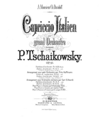
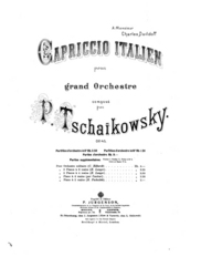
I’m pretty sure one of these is the title page of the original edition. I think they might both be – the first one as published in Germany, the second as published in Russia. There might also be covers from France and England. Not sure.

I’m including this because, as with book covers, I feel it’s useful to see the design elements originally associated with a work. I think pretty visually, and seeing an illustration, or even just type design like this, really helps me get aesthetically oriented to the whole stylistic world that the work comes from. As I’ve probably said on this site in the past, I don’t think it’s right to present old art as though it’s evergreen and can be repackaged any which way. Whether something appears “timeless” to us reflects more on our attitudes than on it, or on the time from which it comes. The only reliable way to have access to the past is to go out and meet it; it can’t be expected to come meet us. At least to meet it halfway. Seeing a book cover sometimes makes it instantly clear where I’m going; so too with music, maybe. Though decorative covers aren’t quite as ubiquitous in music. Still, even these relatively straightforward designs send certain signals.

I would have included the original covers for the prior selections but I couldn’t find them online. These were scanned by the Eastman School of Music, and come from here, where you can download the full score, the score of the composer’s own 4-hand piano arrangement (also 1880), and the score of a 2-piano arrangement by Eduard Leontyevich Langer (1835-1908), “a pianist colleague at the Moscow Conservatoire, whose ineptitude in making piano transcriptions was to cause Tchaikovsky so much exasperation” (quote from here).

Anyway, this was random number 359. Capriccio italien is a pretty dumb piece and its inclusion in the Essential Canon of Classical Music is mysterious. It’s not the warhorse of programming that it seems once to have been, so I’m not sure it can even be justified in terms of ubiquity. Who out there really loves this piece these days, or even thinks about it? It’s been recorded many many times, but I think only because it makes a good space-filler on an album of other Tchaikovsky works, and seems easy to play.

But maybe not easy to play well. Yet again I’m struck by how unsatisfying the recordings were. The piece is all about catchy tunes and corny fun, and it seemed fair to wait for a performance that really brought the catchiness and fun to life. But nearly every conductor seemed content to let it die on the vine, taking the score at its pedestrian word and not adding anything. The slow first theme, which in my imagination should be lusty and operatic almost to the point of comedy, falls totally flat in nearly every performance I heard, with the triplets coming out lazy and even instead of petulant and snappy. The whole score is clearly made up of tunes that PT thought were hummable; the least an orchestra could do is play them like they wanted to hum them.

Actually, all I really wanted from a performance of this piece is for it to sound like an old cartoon score, where dinky popular and traditional tunes have been thrown together and orchestrated and are played with gusto and a total lack of artistic ambition. The second theme here seemed like it come from a Carl Stalling depiction of Italy, and for all I know it may have been used that way. But if the Warner Brothers orchestra played it, they would have given it some kick!

The piece is actually just like those Liszt Hungarian Rhapsodies, only Italian, and with perhaps a slightly more agile sense of orchestration, but considerably less overall flair. The few connecting and developmental passages are rather weak, as I think Pyotr himself acknowledged, and in the end we don’t really come away with a sense of having gotten anywhere. The tempo and character transitions need a lot of goosing from the conductor; without adding a lot of accelerandos and rallentandos they don’t make enough sense. Unfortunately none of the conductors did that.

Apparently the actual inspiration was not Liszt but Glinka. But I don’t know those pieces so I can’t comment on that.

It’s a tourist piece, based on stuff Tchaikovsky took in while he was staying in Rome. The intro is a bugle call he could hear from the Italian cavalry barracks near his hotel room. I like the idea of taking some noise you hear every day on your vacation and making it the entrance gate to a work of art. With that in mind, the introduction is actually quite effective – the bugle call is played bare in the trumpets, exactly as he heard it, but then is magically joined by the rest of the whole orchestra, converted into something glorious as it passes through the gate of perception and into the interior world of the artist. Or something. For that to come across, though, the opening few bars have to be played like an actual bugle call – without too much expression and not too broadly. No conductors made that choice either.

There are about four themes – 1. the operatic one, 2. the dippy ice cream truck / Popeye one, 3. the suave, jaunty one (my favorite), and then, after the brief return of the operatic one, 4. the tarantella, which has at least one good part. Then a clumsy, would-be-triumphant return of the ice cream truck / Popeye theme leads into a middling coda of the “whipped into a frenzy” type, which actually undercuts its own frenzy in a couple places.

So: this is a deeply unambitious, “lowbrow” piece, and isn’t even a particularly fine specimen of that type. That said, it still gives off a sense of genuine good cheer, these tunes are pretty catchy, and I am able to imagine a really rollicking performance of this piece that delights me, even if I’ve never actually heard it. If someone started humming this I’d join in. But “essential canon” are strong words and this is quite obviously a lightweight. That’s okay by me, though – it still feels like I’ve tossed at least a spadeful of cultural literacy on to the pile.

The official four-hand version, by the way, is mostly very easy and potentially fun to play, but then has some really tricky scales in the middle. I would say fudge them – this was never going to sound good on a piano anyway. Though it looks like those crazy Labeques have recorded this version all the same.

Per Dubal:

London Symphony Orchestra, Rozhdestvensky: IMP Classics IMPPCD 875
St. Louis Symphony Orchestra, Slatkin: CA 09026-60433-2

I couldn’t readily find either of those. Note that the obscure link above is the only indication I can find anywhere on the web that the IMP Classics release ever existed. (Though a different release of the same recording can now be gotten here fairly easily.)

My favorite of the eleven recordings that I could find, see below, was the Czech Philharmonic / Karel Ančerl. It’s not particularly clean but at least events progress in a way that makes sense to me. Somewhere out there, I believe, there is an even better recording.

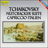
tchaik45-1.jpgtchaik45-2.jpgtchaik45-3.jpgtchaik45-4.jpgtchaik45-5.jpgtchaik45-6.jpgtchaik45-7.jpgtchaik45-8.jpgtchaik45-9.jpgtchaik45-10.jpgtchaik45-11.jpg

Chicago Symphony Orchestra / Daniel Barenboim. Deutsche Grammophon 445 523-2. 1981.
Bavarian Radio Symphony Orchestra / Lorin Maazel. RCA 09026-68471-2. 1995.
Philharmonia Orchestra of London / Placido Domingo. EMI 5 55018 2. 1993.
New York Philharmonic / Leonard Bernstein. Sony SMK 61556. 1960.
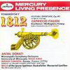
Minneapolis Symphony Orchestra / Antal Dorati. Mercury 434 360-2. 1955.
Orchestr Ceská Filharmonie / Karel Ančerl. Supraphon SU 3680-2. 1965.
“London New Philharmonia Orchestra” / “Laurence Gordon Siegel”. Intersound CDQ 2027. Released 1988.
Berliner Philharmoniker / Herbert Von Karajan. Deutsche Grammophon 463 614-2. 1966.
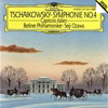
Berliner Philharmoniker / Seiji Ozawa. Deutsche Grammophon 427 354-2. Released 1989.
Orchestre symphonique du Montréal / Charles Dutoit. Decca 466 419-2. 1986.
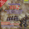
Cincinnati Pops Orchestra / Erich Kunzel. Telarc CD-80541. 1988.

September 10, 2007

Harry Potter and the Deathly Hallows (2007)

by J.K. Rowling

My plot for the seventh book was this:

To undo the magic linking him to Voldemort, Harry Potter must die. He has to pass through the curtain in the Department of Mysteries and descend into the land of the dead, a Greek underworld type place, with a river Styx and the shades of characters long-gone – but no grand Lord Hades reigning over it all, just eerie primal magic of some natural kind – the basic mysterious forces of the universe. However, there are some kind of personified figures of fate – Norns or something – and Harry, in trickster fashion, first has to summon them and make some kind of wager or deal to ensure his being able to return from the land of the dead, something nobody has ever before managed to do. In a heart-rending scene, he meets his parents, and Sirius, and whoever else, and impulsively tries to bargain for their souls as well. Ultimately they can’t join him – for some reason it would work out that they could be saved but only by canceling out Harry’s original purpose in entering the land of the dead, and thus forfeiting the fight against Voldemort – the lesson being: losing things that we love is simply the price of fighting the good fight, no matter how much magic we have.

A darker alternate was that Harry’s only way of walking through the land of the dead and returning would be to create his own Horcrux, killing some bad guy but in the process souring his soul forever. In the end he’d be able to mostly mend himself on magical terms, but would still become a darkened, compromised adult, like everyone who must take the burden of fighting evil. His final rite of passage into adulthood would thus be descending into the grey between good and evil, in order to protect the world; and he would finally be able to commiserate with Dumbledore, who would be revealed to have made similar compromises that somehow explained the Snape situation.

I guess I was looking for a noir ending, or something with a poignant mythological resonance. It seemed like she had been heading in that direction. But the series actually ended back where it began, with the simplest colors and the most Saturday-morning-cartoon-worn tropes. She seemed to know the book needed a feeling of compromise, but she gained it only by killing off a few sympathetic characters, and even that was never quite given the chance to sink in. The tale of Harry Potter ends, like so many disappointing video games, with a boss battle not qualitatively different than any other battle, and somewhat less interesting than much that has gone before. Then the credits roll.

My comments last time about J’s converting the epic into the technical continue to apply, with the added sadness that now the technicalities no longer really make any kind of intuitive sense. They also may not even make technical sense, though the rules have gotten so fuzzy-edged that it’s hard to know how to navigate her labyrinths of technicalities. And I’m not inclined to try. I would rather have thrown out all kinds of babies in the bathwater and been given something bold and compelling in the end. But that would have been dissatisfying to many, I’m sure. She obviously felt obliged to give a shout-out to every misbegotten bath-baby from the entire series, but a string of shout-outs just leaves us feeling like we haven’t really been there, we haven’t really found out what happens to anyone. Was that really the last time I’ll hear from Hermione? I’m not convinced; maybe I never really knew her. I think the frantically good-natured effort to give everyone what they came for is going to sap away some of the life from the preceding books, retroactively. But I don’t plan to be rereading any of these anymore.

I absolutely enjoyed the entire process of reading this series – it was truly a delight. But make no mistake, this needs to be classed as a guilty pleasure, not a proud one. Participating in a mass phenomenon is a thrill; seeing people of all types reading de-covered copies of this giant book about wizards on the subway never got old. But it fades fast, as it did after every installment, and now that it’s over I’m not sure I’ll ever have any reason to stir up the embers again.

I think the notion of J.K. Rowling and the Harry Potter phenomenon will linger on in my mind – and if I may prophesy, in the culture at large – for much longer than the content of books themselves. In this last volume I was more aware than ever of this non-writerly, pleasant but ordinary woman, gamely taking on the task of entertaining everyone in the whole world. Like someone’s mom somehow organizing an international 100 million person game of pin-the-tail-on-the-donkey. How did we get here? How did this end up happening? Of course I have to approve.


J.K. Rowling (2005) by Stuart Pearson Wright

September 9, 2007

Family Plot (1976)

directed by Alfred Hitchcock
screenplay by Ernest Lehman
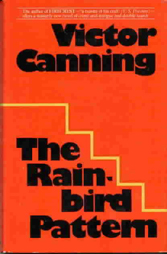
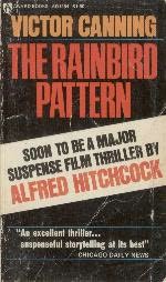
after the novel The Rainbird Pattern by Victor Canning (1972)

Hitchcock’s final movie. I’d heard that this was “a return to form for Hitchcock” and “slight but entertaining” and “a cute comedy-mystery” and the like. But it actually was pretty shameful stuff. That it was stupid was not really a surprise; what was sad was that it seemed actually sloppy, unprofessional. Hitchcock was very old and not doing too well by the time he made this, so I can’t hold it too much against him that it feels unpolished and vague; but Ernest Lehman was only 60, would go on to live almost 30 more years, and has no excuses. His screenplay (which Wikipedia tells me won an Edgar award for mystery writing!) is dumb not only in its larger structure but also in the details of each dialogue. Nearly every scene consists of two characters swapping summations of the current state of affairs, peppered with embarrassing less-than-double-entendres. When Eva Marie Saint says “I’m a big girl,” and Cary Grant says, “Yes, and in all the right places*” we cringe a little (don’t we?), but roll with it because it’s Cary Grant and he surely knows what he’s saying. When Bruce Dern says – oh god, something about peering into his crystal balls, or something, I’ve blocked it out – we cringe again, deeply, and this time, because it’s just Bruce Dern, we have no other recourse. My point here is that Ernest Lehman was always a bit adolescent when it came to sex, but at least in the 50s everything felt oblique to begin with, so a little snickering and turning red about sex seemed like just what the doctor ordered. Now it’s 1976 and it just seems immature that Ernie is still snickering and turning red. The movie revolves around two totally boring, low-chemistry long-term couples, both of which frequently resort to contorted metaphors and winking to talk about the prospect of potentially having sex. Which they do not, by the way, do at all in this movie, even off-screen, so the talk is just in there because Ernie felt it was mandatory. Which is also a bit sad.

There is a workable premise here, which is: our bumbling heroes are arbitrarily entrusted with the task of finding a long-lost heir to a great fortune, about whom nothing is known. Meanwhile, we the viewers find out that this long-lost heir is now in fact a nefarious criminal. What will happen next? From this premise, any number of things could happen that would be interesting, and I guess one or two of those things did ultimately happen, but they turned out not to be interesting after all.

Both the bad guy, William Devane, and his partner, the totally unsexy doofus-faced Karen Black, have more or less no screen charisma, though I’ll grant Devane that he has intriguingly weird teeth. Bruce Dern seems convinced he is playing a colorful character, and he certainly does do a lot of fidgeting, but of negligible interest to the audience. Barbara Harris fares the best, which isn’t saying much, by piling on the ham in her ham sandwich role. But wait, who are these people, again? A fake psychic and a cab driver and a what? Eh, forget it, I don’t care.

There is a pretty good runaway car sequence, shot more or less identically to the one in North By Northwest, but with somewhat better footage. But no music and no Cary Grant so it’s about even. There’s also one nice shot, a long shot of a cemetery, where two figures walk in parallel down different paths toward their convergence. It was interesting, but a little depressing, to find out that this one shot that struck me as attractive had actually been laboriously planned out by Hitchcock, with the paths specially constructed for the film, so as to suggest the lines in a Mondrian painting. Yes, I guess it sort of did look like that, but knowing how much thought and effort went into that one moderately interesting shot, I feel far less pleased by it. Couldn’t some of that effort have been redistributed into the rest of this silly movie?

Music is by John Williams, not quite so on-the-ball as with Jaws the previous year. The themes are cute, and harpsichord and piano on melody lend a certain 70s period flavor that I enjoyed. But as usual, he has a tendency to lay it on just a little thicker than he realizes – anyway, thicker than this eggshell of a movie can withstand. I had occasion to hear some of this music in advance of seeing the movie, and it primed me for something fun and dated, in the vein of the early Columbo episodes that Beth so enjoys. But Columbo, for all its sleepy hokum, has a certain degree of formulaic rigor. This just rolled around. Poor Hitch.

Trailer 1 and Trailer 2. Links work right now, anyway.

Covers of the first edition, and the pre-movie tie-in edition, of the book – is it possible that anyone, anywhere, has read this? – upon which. For those who are wondering, “Mrs. Rainbird” is the name of the rich old lady who wants her missing heir found. Now you see.

rainbird.jpg rainbird2.jpg

* presumably i.e. principally the breasts.