


According to the 2014 edition of the “1000 Greatest Films” list at They Shoot Pictures, Don’t They?, which purports to be the aggregation of all other such lists, the Criterion films thus far fall as follows:
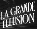
1. Grand Illusion: 39
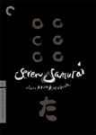
2. Seven Samurai: 10
3. The Lady Vanishes: 573
4. Amarcord: 77
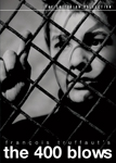
5. The 400 Blows: 23
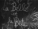
6. Beauty and the Beast: 234
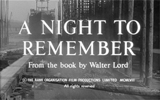
7. A Night to Remember: —
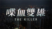
8. The Killer: 685
9. Hard Boiled: —
10. Walkabout: 408
11. The Seventh Seal: 70
12. This Is Spinal Tap: 348
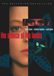
13. The Silence of the Lambs: 537
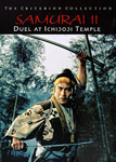
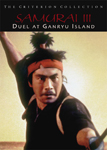
14, 15, 16. The Samurai Trilogy: —
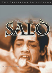
17. Salò, or the 120 Days of Sodom: 186
18. The Naked Kiss: —
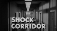
19. Shock Corridor: 570
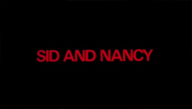
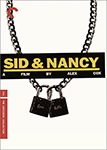
20. Sid & Nancy: —
21. Dead Ringers: 488
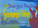
22. Summertime: —
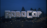
23. Robocop: — (2012 list: 764)
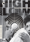
24. High and Low: 327
25. Alphaville: 391
26. The Long Good Friday: —
27. Flesh for Frankenstein: —
28. Blood for Dracula: —
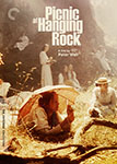
29. Picnic at Hanging Rock: 515
30. M: 49
31. Great Expectations: 447
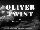
32. Oliver Twist: —
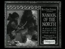
33. Nanook of the North: 246
34. Andrei Rublev: 25
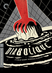
35. Diabolique: 624
36. The Wages of Fear: 251
37. Time Bandits: —
38. Branded to Kill: 742
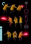
39. Tokyo Drifter: —
40. Armageddon: —
41. Henry V: 647
42. Fishing With John: — (N/A?)
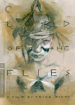
43. Lord of the Flies: —
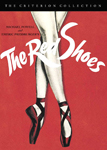
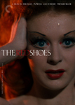
44. The Red Shoes: 154
45. Taste of Cherry: 410
46. The Most Dangerous Game: —
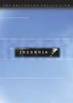
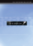
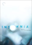
47. Insomnia: —
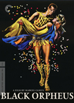
48. Black Orpheus: 667
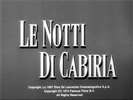
49. Nights of Cabiria: 176
50. And the Ship Sails On: — (2011 list: 949)
51. Brazil: 225
Or, put the other way:
10 Seven Samurai
23 The 400 Blows
25 Andrei Rublev
39 Grand Illusion
49 M
70 The Seventh Seal
77 Amarcord
154 The Red Shoes
176 Nights of Cabiria
186 Salò, or the 120 Days of Sodom
225 Brazil
234 Beauty and the Beast
251 The Wages of Fear
246 Nanook of the North
327 High and Low
344 This Is Spinal Tap
391 Alphaville
408 Walkabout
410 Taste of Cherry
447 Great Expectations
488 Dead Ringers
515 Picnic at Hanging Rock
537 The Silence of the Lambs
570 Shock Corridor
573 The Lady Vanishes
624 Diabolique
647 Henry V
667 Black Orpheus
685 The Killer
742 Branded to Kill
2012: 764 Robocop
2011: 949 And the Ship Sails On
None of
7. A Night to Remember
9. Hard Boiled
14, 15, 16. The Samurai Trilogy
18. The Naked Kiss
20. Sid & Nancy
22. Summertime
26. The Long Good Friday
27. Flesh for Frankenstein
28. Blood for Dracula
32. Oliver Twist
37. Time Bandits:
39. Tokyo Drifter
40. Armageddon
43. Lord of the Flies
46. The Most Dangerous Game
47. Insomnia
42. Fishing With John (N/A?)
is invited to the party.
By contrast, here is my personal critical ordering (as done just now with minimal deliberation):
5. The 400 Blows
34. Andrei Rublev
35. Diabolique
51. Brazil
12. This Is Spinal Tap
49. Nights of Cabiria
10. Walkabout
6. Beauty and the Beast
11. The Seventh Seal
42. Fishing With John
4. Amarcord
50. And the Ship Sails On
44. The Red Shoes
1. Grand Illusion
30. M
31. Great Expectations
26. The Long Good Friday
29. Picnic at Hanging Rock
48. Black Orpheus
3. The Lady Vanishes
45. Taste of Cherry
46. The Most Dangerous Game
24. High and Low
2. Seven Samurai
37. Time Bandits
22. Summertime
32. Oliver Twist
19. Shock Corridor
47. Insomnia
36. The Wages of Fear
20. Sid & Nancy
7. A Night to Remember
13. The Silence of the Lambs
39. Tokyo Drifter
9. Hard Boiled
18. The Naked Kiss
38. Branded to Kill
40. Armageddon
14, 15, 16. The Samurai Trilogy
21. Dead Ringers
41. Henry V
8. The Killer
28. Blood for Dracula
43. Lord of the Flies
33. Nanook of the North
23. Robocop
25. Alphaville
27. Flesh for Frankenstein
17. Salò, or the 120 Days of Sodom N/A
Comparing this list to the ostensible critical consensus list above, we find that apparently by my estimation, the most overrated of these movies are Nanook of the North and Alphaville, and the most underrated are Diabolique and The Ship Sails On.
Sure.
But wait, there’s “more.” It remains to reveal why I have chosen to pause for these obsessive festivities at this particular point, after 51 films.
Indulge me this alternate trophy case.
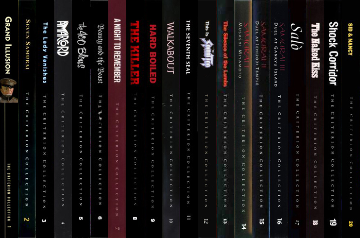

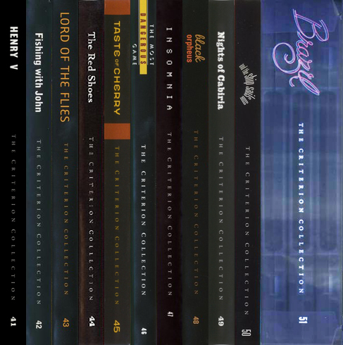
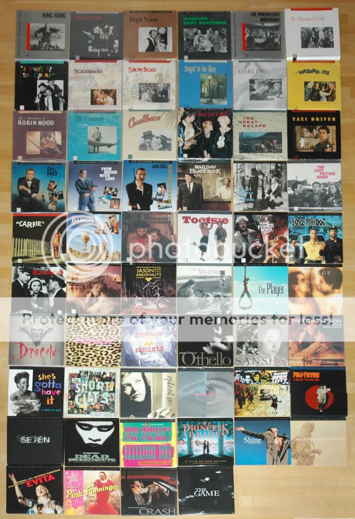
And from the front, tiny:


Those are the original spines and covers of titles 1–51, as they appeared upon release, beginning March 31, 1998, and running through the fall of 1999. These comprise the entirety of the releases designed to Criterion’s first DVD cover template:

With #52 they introduced the second template, a considerable ensleekening of the same basic idea:

This lasted until 2006 and #341. #342 is the first title with the third template, the longest-lived and still in use today, courtesy of the all-powerful “Paula Scher of Pentagram”:

(If you’re wondering what number they’re up to now: #703 The Freshman was released on March 25.)
To obsess over this a little bit further — which is, after all, what they want us to do: Criterion does not release these exactly in “spine #” order. The numbering is apparently assigned early enough in the production process that delays can cause projects to fall out of order in the queue, sometimes far out of order. As it turns out, one of their longest-delayed titles was #1, Grand Illusion, which was put off for nearly two years because a better film source was located. It didn’t become available until November 1999, around the same time as #62. So its cover wasn’t actually designed until after the second template was already in effect. If you scroll back up you’ll see that it’s different from the rest.
You’ll also see that it has an all-around snazzier cover than most of the other first 51 releases. With the exception of the last of them, the very showy Brazil translucent slipcase 3-disc extravaganza, the packaging design of this first year’s releases does not yet seem to be the priority and hallmark that it has since become for Criterion. Certainly if you go back and look at the laserdiscs that they had been releasing since 1984, the cover designs are completely ordinary.
It seems as though the heavy design investment in the Brazil packaging marked the arrival of a new strategy, and that the sleeker branding of the new template that followed it is another manifestation of the same. To my surprise I can’t find the history of this epochal business decision documented online, despite its obvious geek appeal as a subject, but maybe I just haven’t searched hard enough. Anyway, Steve Jobs gets all these accolades for having made a fortune by betting on design above all; whoever steered Criterion to put its money into art direction was just as inspired, in a distinctly different sort of market. I mean, I don’t know the numbers. I just know that when you go to Barnes & Noble DVD department today, in the age of the digital download, “The Criterion Collection” gets its own aisle, on par with “Comedy” or “Children.” I think it’s the only brand in the entire store that gets treated like a genre unto itself. Design is why.
I have very deeply mixed — well-nigh tortured — feelings about design and its power, and Criterion is a perfect object for them to play on. But to dig into that now would be premature, because we haven’t yet gotten to that era of Criterion’s identity. The all-black spines and the frequently gawky covers seen above are the company in its adolescence, not yet a woman. So I guess I’ll save my sound and fury about design for our next pitstop, 20 years from now.
Suffice it to say, for now, that by the way I am delighting absurdly in ordering these rows of rectangles, and above all in investing myself in the numbered list (oh god yes the numbered list!), I am revealing the psychological opportunity that was essentially dropped in their lap, and that they were savvy enough to seize, but I am also revealing the roots of my ambivalence.
All old news, round these parts.
What remains at present is to address the fact that Criterion has complicated my perfect rows of rectangles by reissuing and redesigning their editions of many of these films, years later, but retaining the same spine numbers. Of the 51 titles above, only 13 are currently in print in the same editions/the same packaging. 14 of the others are simply out of print, generally because rights agreements expired. A full 23 of them were replaced by improved versions: completely new releases in new transfers with new features and new packaging, products of a much later period within the DVD age. Whenever possible I watched the newest and best version — the old ones are, in fact, frequently not of great quality, 1998 having been very early days for DVD. So of course I am going to have enumerate each of them.
To start with the dullest and most pointless: if you totaled up that breakdown in the previous paragraph, you noticed that there is 1 missing. That’s this guy, which mysteriously on later pressings had the second template replace the first on the cover, without anything else about the product changing (as far as I’m aware). Maybe for a minute they considered doing that for all of them, but then decided against it.
Next dullest: these here Samurai — remember them? — were gathered into a box set (good call; who’s going to want just part 2?) and got similar template upgrades in the process (plus they eliminated that Papyrus-y title font, of doubtful ethnic sensitivity. Another good call). The box is at right.


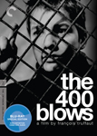
Now we move on to the four that were genuinely rereleased in better transfers in the era of the second template, 1999—2006. Since I didn’t start watching my way through these until 2008, I got to see the new and improved editions of each of these four. These new covers are all improvements (though the loss of the 50s title treatment on The 400 Blows is disappointing).


(People who are really up on their Criterion OCD will know that there is actually yet another 400 Blows design from this era, as part of the “Antoine Doinel” boxset (spine #185, containing #s 5, 186, 187, 188). But I consider that as merely a component of release #185, only numbered “5” for old time’s sake and never sold individually as such. I thus am not addressing it here. I realize that I may lose some subscribers over this but we have always been guided by principle here at Broomlet. Today’s decision continues that fine tradition. Broomlet proudly embraces the spirit of the 21st century, in which no-one is excluded. However nothing matters more to us than your opinion. We want to hear from you! Please fill out a survey on your way out and let us know if there’s anything we can do to improve your experience.)
When the era of Blu-ray came around and necessitated high-resolution issues of otherwise old products, these same four releases, having already been brought up to a higher standard both internally and externally, simply had to have their designs adapted to current template.
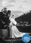


However you’ll see that in the case of Beauty and the Beast they did take the opportunity to rework it, using the same basic components for something tonally rather different. This then, I believe, is the single example in their catalog of a title with three different covers: a 90s, 00s, and 10s edition. It can be easy for me to forget how different those three decades have felt, but these Beauty and the Beast covers have it nicely mapped out for me. If I’d seen the 2013 cover back in 1998, I would have thought it looked lopsided and arid and completely uncool, some clueless Soviet stab at elegance. Sterility chic hadn’t yet been invented; I couldn’t yet conceive of the general public, or even the pretentious few, feeling aspiration or desire for bloodlessness, for an icily soothing stasis. Nowadays of course the Apple Store cleantopia is axiomatic, and tweaked or drained color is de rigueur for movies.
That is all a bad thing, right? It seems like a bad thing. But there is another part of me now that thinks the box looks pretty cool and would probably look especially cool next to many other boxes of the same dimensions.
Moving on.
(No wait, before I move on. To be more fair (to me in 1999), I wouldn’t really have thought this looked clueless and Soviet. I would have recognized the asymmetry and cold as notions of high-fashion intellectual-aesthetic stylishness revived from earlier in the 20th century. And I probably would have found that remarkably historically-aware and exciting, the way I felt about Rushmore in 1998: “Wow, the aesthetic vigor of decades past doesn’t have to be dead after all! We can do it all again if we like!” So it wasn’t that I couldn’t yet feel the aesthetic; I just couldn’t yet imagine that in only a decade, Rushmore would have brought about so complete a renovation of popular aesthetics that these same gestures would be rendered completely ahistorical, drained of their vigor, turned into mere anxiousness and compulsion.
Okay, NOW moving on.)
Brazil is now being sold in a single-disc edition (and Blu-Ray) with the third template on a cover that might look like it was completely redesigned. Actually, it’s the same illustration that was always on the first box of the set, once you took it out of the translucent blue slipcase. (Now that you know what to look for, you can sort of see him there, winging it, even in this tiny image.)

So here, at last, are the interesting ones, the nineteen (+one box) that were completely upgraded and redesigned after the Pentagram rebranding, at the (still ongoing) height of the company’s fixation on design.
On my screen the width can handle five at a time so I’m doing them five at a time. Hope this looks right for everyone else.


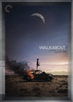
Of these five, I saw the new version only of Amarcord. A Night to Remember and Walkabout weren’t reissued until after I’d watched them, but I do regret not having taken the time to seek out the superior editions of Seven Samurai and The Lady Vanishes, neither of which looked too hot on the old editions that I watched. Those are the only cases where I watched an old version by negligence rather than necessity. But there’s no time to look back now; not when I still have 650 titles to go.

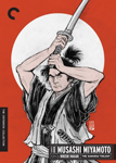
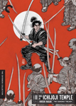
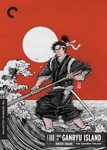
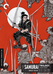
The Samurai Trilogy, you’ll be happy to hear, is now only sold as a set. I missed out on all of these reissues, unfortunately.


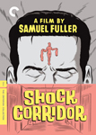
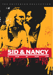
The two Samuel Fuller titles with the new Daniel Clowes covers I missed out on, too. The rest I got to see in their new versions. (Well, except I opted out of Salo. But it was the new version that I opted out of.)

All of these I watched recently enough to get to see the updated versions.
That’s it. You made it!
So here at the bottom I’d like to announce: going forward I’m going to include the cover in each of my Criterion posts. The covers are irrelevant to the films but very important to what’s going on here. Whether I like it or not.
Update! on the occasion of preparing the post for #52–100.
It’s three horrible years later and naturally Criterion has seen fit to revisit a few titles from spines #1–51 in that time, meaning that the rundown of the cover designs is now less than exhaustive. Naturally I’m going to rectify that.

Soothing, isn’t it.