Yearly Archives: 2007

December 17, 2007

Another little piece

Written half an hour ago in about 5 minutes. Wrapped it up before it got anywhere so that I could go back to what I was doing.

There’s some mysterious crackling in my soundboard every now and then, these days, and I couldn’t figure out how to make it go away for the occasion, so it’s in there.

Another little piece.

December 13, 2007

People Talking About Video Games

I’ve written a couple times before and will no doubt write again my thoughts about video games. I think video games in general are interesting as a still-young cultural phenomenon, and that many video games, seen from this point of view, are interesting in themselves.

But these days there are, rather suddenly, a lot of people out there talking about video games – holding conferences, publishing symposia, interviewing each other, spending money on it – and the whole appeal of investigating the what and wherefore of the form has been a little soured for me by the fact that most of what these people say is so totally nerdy. The supposed intellectual curiosity behind it always seems phony, like a posture intended to redeem geeky fannishness in the eyes of the disapproving. But of course the disapproving will never be impressed by that sort of thing. These people seem to be driven by the hope that if they can jury-rig the facade of an academic establishment (“Video Game Studies”), the world (i.e. their parents) will apologize for doubting the value of their time spent playing those games. In any case, the kind of discourse I’ve encountered doesn’t generally feel intellectually sincere or open-minded – not nearly so sincere and open-minded as it makes pains to project.

So anyway, this morning (well, now that I’m actually posting this, it was two days ago) I was reading a back-and-forth on Slate about video games, and the point of departure was one guy’s claim that this game, “BioShock,” was an admirable artistic step forward for video games, which led into some discussion of whether video games had yet produced a “Citizen Kane.” Follow the link and read a little about the game in question to get a sense of what we’re talking about here.

Here are my thoughts. The quality of art is the quality of its relationship to life. Art rises in our esteem the more it seems to us to be right about something outside itself. That something can be a something that only exists in our minds – our fantasies, our instinctual responses to colors, all the primal abstractions that govern us, etc. That something can also be part of our world-understanding – how people behave, how the world works, etc – i.e., everything. The deeper the understanding evinced by the art, the better it seems. This may seem like a limited definition but I think it accomodates all sorts of things – really fine light entertainment has to be right about what delights us – and the subject of “what delights us” is just as real a subject as “what love is” or “how power isolates a man” or whatever. What isn’t as real a subject for art is mutants in a dystopian underwater city, et al. You can trace these things back to their origins in human experience and human fantasy, but you have to follow them around several tight curves and by the time you get to the point of origin, you can no longer see “BioShock” from where you stand.

The stuff of culture, passed from one mind to the next, is just as subject to the slow work of Habit as any other behavior. Over time, with enough exposure, memes (that word again!) get washed smooth by the currents of society – or tumbled smooth by the rock-tumbler of society, if you prefer – until they are no longer actual valuable items for barter, but mere cultural currency, paper money purportedly representing actual thought and feeling stored in some Fort Knox of thought and sentiment. Though I’m not sure there is any Fort Knox out there – I think a good deal of the originating thought and sentiment is actually lost in the tumbling process, and we’re left pushing paper dolls at each other. Mixing metaphors, in my opinion, is only a sin if the mixture is potentially misleading or distracting.

To be a nerd is to be a paper-doll aficionado. Superhero comic books might still feed certain actual human fantasies, but only at some animal subconscious level – the conscious mind of the comic book fan is drawn not to what the explosions and mutants might mean, it is just drawn to the explosions and mutants, in-themselves. The nerd is interested in amassing paper money because he loves paper.

“Escapism” doesn’t mean escape from realistic thought into fantastic thought – it means escape from thought. All thought is necessarily about reality, to some degree. Escapism is relief from your cares and worries, not from the actual things your cares and worries are about; all you have to do for that kind escape is close the door. People like to divorce themselves from the meanings of things.

So of course tons and tons of culture is produced out of mere paper, by and for paper-lovers, who may or may not know consciously why they surround themselves with paper. When they need to defend themselves, they might point out that every piece of paper corresponds to something wholesome in Fort Knox, but they don’t really feel it – it’s just a historical fact they read somewhere and can call on if need be.

This brings us to “ambitious” nerd culture, which takes these ephemeral foundations and then, with great pride, adds a cherry of referential meaning on top. Batman might, on a particularly award-winning day, have to deal with universal themes of disillusionment and psychological struggle or whatever, and yeah, that might be “about” human experience, in its way – but our buying this comic book about a bat-man in the first place is still dependent on its blessedly distant relationship to the things of this world. So self-congratulation for maturity seems a little undeserved.

And so: video games have made huge strides in their artistic quality in many ways having to do with the senses, with aesthetics. The sculptural, architectural part of videogame art is real and exciting – many experiences I’ve had with video games, of being in some place with a particular and unified textural and spatial feeling, have been as strong and real as any other kind of artistic experience I’ve had. But the dramatic, conceptual, theatrical and cinematic aspects of those same video games are still entirely within the paper world of nerddom, and show no signs of life. Artistic progress will not be made by adding would-be “depth” value to games built unreflectively from nerd-currency. I await the game that truly and completely knows itself, all the way down to its roots in human experience; then we will have something to talk about. I don’t think it will happen for a while yet.

I could have tried to attend to my own various pretensions and shortcomings here, but that would just have mucked up what I was trying to say. Consider them acknowledged and a source of concern.

November 27, 2007

786.4 again

Part one and part two of this horrifically open-ended exercise.

Samuel Adler (1928-): The Sense of Touch (1981) (age 53)
Subtitle: “Eight short pieces introducing the young pianist to techniques used in twentieth-century music.” Commissioned by Clavier magazine. Samuel Adler is not the only composer who thought to try his luck at the Mikrokosmos game – a potentially lucrative game, I guess – relatively speaking – but it is a harder game than it might seem at first and he does not win. Each piece is preceded by a list of descriptives (like “Mixed staccato and legato, single notes in both hands, variable dynamics between hands, time changes, many accidentals”) – hey, just like in Mikrokosmos! – which pretends to some kind of pedagogical planning. But naming characteristics of a piece does not the piece of any educational value make. Or of musical value make either. These are some seriously sense-and-form-deprived twiddles. I know well the composing trap of losing your sense of the pacing and sticking all your moments so close to one another that they don’t register – Adler seems to be deep in that trap at all times. Things just happen and then other things happen. It’s really remarkable how little a sense of rhythm he has for someone who obsessively writes all these meter changes. Seems like a smokescreen. I hope no young pianist ever had to play these. 12 minutes in all. No recording.

Samuel Adler: Thy Song Expands My Spirit (1980) (age 52)
Subtitle: “A tribute to Aaron Copland on his 80th birthday.” This is the best of the three Adler scores on the shelf, but none of them is any good. But this is the best. It makes some I think explicit references to textures and sounds from Copland’s music, albeit in a totally scattershot way that adds up to nothing. One could also point out that Adler generally uses textures vaguely stolen from Copland so maybe we shouldn’t even give him credit for that, but there’s a big high bell-ringing 10th in octaves at the beginning and end that’s pretty unmistakable. After a slow introduction that almost has some potential (because it’s imitating Copland), it devolves into bip bip bip dibby dibby dibby like all his other pieces, which I have a really hard time reconciling with that lame-ass inspirational title. (Yes, I see, it’s from Leaves of Grass.) Then at the end, very suddenly, thy Copland bells again. Incoherent. I could make a seriously tasteless comment about Alzheimer’s but I’m not going to. I certainly hope that’s not what Samuel Adler was going for! This is about 4 minutes (marked c. 3’30”). No recording.

I recognize Adler’s compositional style; I’ve composed this way too: Sometimes I feel lazy but still want to be “composing” – I don’t want to think hard about harmony, which doesn’t flow naturally to me, and I don’t want to have to keep track of structure, which doesn’t fall into place naturally for me. But I still want to be making stuff up, so I just let my brain do what it’s willing to do and no more. This yields a lot of goofy junk but at least I’m writing, right? Right. So Samuel Adler seems to have no other mode of composition, and his brain is even lazier (and/or less fluent in anything) than mine, which is no good because who am I and then who is he? These scores smell strongly of “don’t look back.” I would be shocked if there was a single note in these pieces that he took serious time weighing against alternatives. If he did, if this is all conscientious and I’m being a dick about it, I must say it is completely opaque to me. What could he possibly be trying to say with this language of endless twiddling? I guess that thy song expands his spirit.

Enough bashing Samuel Adler. Of all people.

Denes Agay (1911-2007): Mosaics: Six Piano Pieces on Hebrew Folk Themes (pub. 1968) (age 57)
Agay’s name is familiar from a thousand books like “The Joy Of Best-Loved Student Anthology Recital Favorite Piano Classics For Best-Loved Students compiled and edited by Denes Agay.” Born in Hungary, moved to the US during the war, lived in New York. Reported to have been the best daddy in the world. His work as an anthology editor far overshadows his compositions at most libraries, but here’s a little stash of Agay originals. The style of this set is first and foremost that of the Bartók “For Children” arrangements, second and secondmost that of, um, sixties sub-classical. By which I mean, like, Harvey Schmidt. I have no problem with either aspect, though the latter has dated more than the former. The writing is pleasantly straightforward to play, and the music is always doing something good-natured. The semi-commercial quality is, to me, charming. Musically, they feel and sound like children’s pieces but they’re a little harder technically than you’d expect from the extremely innocent affect. Just as Bartók’s pieces were a refinement of the standard pedagogical fare, these feel like a refinement (but less so than Bartók) of the standard 60s pedagogical fare, with folk tunes again, appropriately enough. Yes, there are a few scattered “Hebrew” touches but for the most part this is American divided by Bartók. Looks like there was once an obscure LP recording of this and some other Agay piano music, but long gone and good luck finding it. I clock it at about 10 minutes.

Denes Agay: Serenata Burlesca (pub. 1968) (age 57)
Again, totally unpretentious, innocent, plain and simple piece, but not inane. Has aged perfectly well. Sort of a “Till Eulenspiegel” type thing but with very simple textures. This music is by a “classical music” guy and has nothing particularly slick about it, but nonetheless feels to be from that “other” stream of composition in the 20th century, the commercial one that produced movie and TV scores and The Fantasticks etc. I hate it when people say that this commercial music is “just borrowing” ideas from classical music. It is what it is, I think, perfectly sincerely; “real” classical music borrows just as often. The difference is not the degree of authenticity, it’s the degree of artistic ambition. The ambition of movie music is just to be what it needs to be; so too this kind of piece aims only to be what it says it is, a Serenata Burlesca, using the sounds that struck its composer as appealing. Very easy ones, and why not? 2.5 minutes. Also on that LP.

Okay, fine, so the title is a little affected. But that’s just the way these things are done. Take it up with the culture at large.

Denes Agay: Seven Pieces (pub. 1969) (age 58)
These are even better. They’re actually simple enough for students, and have even greater charm than the preceding pieces. Similar in style and content to the Kabalevsky children’s pieces, and I would say just about as good. These in fact sound a lot more like Kabalevsky than like Bartók. They get harder as they go until the last one is genuinely intermediate; the last two pieces are also the best. About 8 minutes of music here. This one’s not even on that LP.

Denes Agay: Sonatina Hungarica (pub. 1967) (age 56)
More Bartók. I’m reminded of the Christmas Carols. I would say it’s derivative of them, but again, it doesn’t feel like it’s claiming otherwise. Who would waste their time pointing out that, you know, Harry Potter is derivative?* The fact that this stuff is all 100% good-natured simple fun is, however, a little more of a liability when he’s aspiring to a longer form – yes, even a sonatina counts as a longer form – and there are parts here where it starts to feel a little too dippy for a little too long. But of course that’s very subjective – all these pieces are constantly wobbling on the thin line around dippy-town. It depends on your mood. When I first set these on the piano the other day, when I wasn’t in as good a mood, they all seemed deeply, hopelessly dippy. But now I’ve opened my heart to it and found that they’re actually all pretty good, dippiness be damned. I wish there were more Denes Agays out there writing music that just aimed to be, you know, some fun music. Actually, I think there were and are lots of them. But the only way to dredge them up is to grind through every score on the shelf, apparently. These scores had never even been entered into the electronic catalog and caused some trouble at the checkout. The Sonatina is on the LP, by the way. Also about 8 minutes.

François Dagincourt [d’Agincourt] (1684-1758): Pièces de clavecin (1733) (age 49)
edited by Howard Ferguson (pub. 1969)
There is a rather unlikely choice in alphabetization at play here; most catalogs and reference sources list him under D. Your choices, in order of google popularity, are: d’Agincour, d’Agincourt, Dagincour, Dagincourt. Grove gives preference to Dagincourt. This volume is the complete extant harpsichord works – four “ordres” (like Couperin) of short pieces, mostly on dance forms. Also like Couperin, they are very heavily ornamented. 18th century ornaments are a real challenge for me – they give the music its character and yet also obscure it. They have to be handled exactly exactly right. Managing them is a bit like the trick of imparting just the right inflection to a jazz lick so that it reads as characteristic; getting the whole genre to “sound” depends on very very fine details of execution. Each of the four ordres takes about half an hour, and after my two hours or so playing through all these, I had become entirely drawn into their world of antique charm. It took some doing but I surprised myself, seeing as this isn’t really my usual fare. Once accustomed to the limitations and tendencies of this genre, you hear that Dagincourt is quite playful and has a fine sense of how to lightly shake a conventional phrase into being distinctive and flavorful. There are some more ambitious numbers but the range of ambition isn’t as broad as with Couperin (or with Bach, of course). I offer here a single very modest piece (“La Courtisane”) to give a sense. Aren’t the shifting phrase lengths delightful? Also included is the all-important table des agréments. Not until dealing with this book did I really process the idea that 18th-century trills begin on the upper tone – i.e. not the written tone. The complete collection of pieces has recently been recorded in its entirety by a woman who lives near me, in two volumes, one and two. You can listen to quite a few samples there. Her playing is intelligent, but many of the quirky charms I found as I played through it seem to disappear into the folds of “harpsichord rubato,” at least to my ears. I think I have a particularly low tolerance for rubato – what she does is quite restrained as these things go.

Maria Teresa Agnesi (1720-1795): Sonata in G
Maybe 3 minutes, single movement. This is one of the many publications of the Hildegard Publishing Company, dedicated to reprinting works by women composers, regardless of quality. Hard to say whether this ends up working for or against prejudice. Maria’s little sonata movement is totally undistinguished and rather inelegant, like a passing job of the “write a classical sonata movement” exercise from a beginning music theory course. Could be worse, I guess. Hildegard has the first page of the score online for your perusal. Peruse and see for yourself. Also someone has made a midi file of it. And look, there actually is a recording.

Roy E. Agnew (1891-1944): Fantasie Sonata (1927) (age 36)
Grove on Roy Agnew: “one of the few Australian composers to achieve international recognition in the first half of the 20th century.” This piece, a single-movement sonata, is 90% Scriabin and 10% Debussy; the hybrid is not particularly convincing. Scriabin’s late music only works because of its fanatical rigor – imitations, and there are many, tend to be loose and stringy by comparison, as is the case here. Chord spelling in this score is confusing and/or confused and there are almost no cancellation accidentals, so it’s not a pleasant read. The notation also adds to an impression that the sounds were arrived at haphazardly. It’s not a terrible impression of Scriabin – a good performance could be pleasant. But I’m not sure what you can get here that isn’t better in the real thing. My favorite bits are the parts that deviate the furthest from Scriabin, like the top of the development. I estimate about 11 minutes but who knows. Thanks to the National Library of Australia, the score (to this and all the subsequent Agnew pieces) is available here! For all of them, you can browse the pages, or click on “Print” to get a PDF of the whole thing.

And wait – this added later – I just found out it gets better! Hear the composer’s own performance, in its entirety! Here! It comes out just under 10 minutes, so I wasn’t too far off.

Roy E. Agnew: Sonata Poeme (1935) (age 44)
This and the next two pieces are bound into a single volume, presented to the library by Mr. Andor Foldes (pianist and conductor, 1913-1992). To my ears this is, quite explicitly, Scriabin’s Sonata No. 4 translated into British. With some Hollywood thrown in. And a little erratic. And not entirely pianistic. If that sounds good to you, you may enjoy it. Score at National Library of Australia is here.

Oop, and this one has a recorded performance too. So I can say with confidence that this piece is about 8 minutes long.

Listening to the man perform his own pieces, they seem different to me than when I played through them – a good deal vaguer about what they’re saying. He seems to subscribe to the “habitually frantic” school of romantic pianism, which I guess makes sense of some of the writing – maybe sense should be in quotes – but this kind of flailing-as-poetry leaves me pretty cold. He sounds like he was a good enough pianist to know what he was doing, so I’m going to assume these are definitive interpretations and that my problem is with the compositions themselves.

Roy Agnew: Toccata Tragica (1921) (age 30)
Score here. More flailing-as-poetry. This time there’s not even much of a motivic justification for what’s going on – it all seems fairly directionless and improvisatory. A very basic ABAB structure and only 5 minutes of music makes the flailing A section sound all the more arbitrary. The B section just sort of sits and simmers in its own juices. I’m not sure I buy “Toccata” or “Tragica.” Maybe Toccata in the old sense of an improvisation. I don’t think this one has a recording out there.

Roy Agnew: Dance of the Wild Men (1919) (age 28)
The score. At least one recording exists. It says about 3 minutes and I concur. This was my favorite of the Agnew; his spastic tendencies are at least partially justified by the title, and it builds up to a satisfying “primitive” refrain right out of Max Steiner, with the delightful indication “bang.” Seems like the title indicates an imitation of Ornstein, whose “Wild Men’s Dance” is supposed to have made a big splash in the teens. But Ornstein’s flailing is really, murderously, machine-gun brutal, whereas Agnew can only manage King Kong. So if there’s an influence, it doesn’t reflect well on Agnew, who has drastically diluted it. If there’s not a connection… well, the criticism still holds.

Miguel del Aguila (1957-): Conga (1993) (age 36)
Miguel del Aguila has a MySpace page where you can hear some clips. He also has a homepage. You can email him if you want. At this page, which may soon cease to exist, you can hear clips from an orchestral version of the present work, retitled Conga-Line in Hell, in which the piano part is essentially intact. Both versions, and another one, have been recorded; see the composer’s pages for details. This is an obsessive post-minimalist breakdown on several standard conga figures. Hearing them shuffled together, and with a beat taken out or added here and there, is fun enough, but that’s a pretty superficial kind of fun for 10 minutes of music. Maybe it’s more interesting in the orchestrated version, but for solo piano it runs thin by the end, which is a shame because there are cute ideas here. Including (the guy at that page linked above agrees with me on this) a recurrent overt reference to the West Side Story Mambo. Well, almost cute. I want to like it because why not, but nothing about it quite works well enough. Post-minimalist anything-goes is actually a pretty tough gig to impress with, and many pieces from the past 20 years strike me as flimsy in the same ways: the materials seem artificially, frustratingly limited, despite the fact that the composer also shows himself to be almost indiscriminately open to whimsy. When a work manages to seem both disconcertingly free and disconcertingly constrained, that to me is a sure sign of insufficient craft. That really sums up the compositional shortcomings of pretty much all my various musical peers, too. And let’s not forget myself.

If you can’t be true to the logic either of rigor or of fantasy, what are you being true to? I think you have to be true to something or nobody’s going to want to listen.

Added later: I’ve now heard the recording off this CD. Good performance but didn’t change my impression of the piece.

Miguel del Aguila: Sonata No. 2 (1988) (age 31)
Recording available, samples (and the possibility of purchasing mp3s for download) at amazon. That guy doesn’t seem to be playing it very well though. This is, by my estimation, a slightly better piece, but still marred by the same problems as the above, particularly the first movement, which runs out its little idea on the first two pages and then expands it needlessly into 7 minutes (or 8 on that CD). It’s sort of a stilted Latin ostinato (there are names for these things) that reminded me a little of Camargo Guarnieri, but with much less color. Again, the materials seem to have been intentionally drained of any real fantasy, despite being essentially fantastic. The second movement isn’t particularly Latin at all – it’s some kind of Porgy and Bess blues material spun out lazily in ways that seem to aspire to bitonal weirdness but are actually pretty dull and/or gawky. The third movement is the best and is pretty much a conceptual retread, or a pretread, of the Conga above. It’s mostly better, and certainly better scaled. He chooses to throw in a little “12th Street Rag” thing at the top. None of it is brilliant exactly but I had some fun playing through the shifting meters. Not sure I’d care to listen. In total this is about 15 minutes.

In every movement I get the sense that his ear for the idiom he’s riffing on is actually much less sophisticated than the act of riffing would suggest. Which is often my impression with John Adams, who eventually proved me right with that really embarrassing, unacceptable “pop musical theater” thing he wrote. I think Aaron Copland admitted that for all his “jazz-derived” pieces, he knew very well he didn’t have a sense for actual jazz, and had to get Leonard Bernstein to write the 8 bars of jazzy piano in Rodeo for him. You can hear that in his Piano Concerto and other pieces – he knows exactly what he’s talking about, but that’s genuinely as close as he can get to it. Whereas music like this present piece seems to me to claim a more knowing, post-modern relationship to its sources, more akin to ownership. I don’t think it lives up to that.

Let me take this thought a step further: why do so many “serious composers” seem to be such terrible musicians? You know what I mean. Like why do they have such a tin ear for the vernacular? I love Copland, don’t get me wrong, but I feel like the fact about him that he couldn’t work out how to write a jazz piano part shows through in every bar he wrote. Shostakovich is given all kinds of credit for being fluent at writing light music – doing that arrangement of “Tea for Two” and all that – and certainly he could do it better than most 20th century serious composers probably could have, but his light music is frequently stiff in a snarky way. People might savor that now but is it really because he wanted to imbue everything he did with “artistic distinction,” which is the opposite of naturalness? I don’t buy that. I think he was a little stiff at his craft. Like that “Tea for Two” arrangement, let’s admit it, wouldn’t pass muster in Hollywood; it’s too blocky. The fact that William Bolcom can actually write, with musicianly understanding, in a variety of popular styles, to me shows through in his serious music as a kind of marked confidence and fluency. Gershwin was the king of his popular styles and then had to struggle uphill from there to gain any kind of comparable skill in a very closely related “serious” style; it takes a lot of work to attain mastery of any given musical language. Why do so many composers of the twentieth century get away with attaining mastery only of, as it were, their own domains, and no actual human languages at all? I don’t mean they should have to master classical counterpoint before they write twelve-tone; I mean they should be versed in a living musical tradition before they pursue mastery of dead ones, or try to concoct their own.

This goes for performers, too. Doubly. To take an example that I’ve encountered several times – if a classical pianist can’t play jazz-inflected rhythms like he actually speaks the language – jazz rhythms being a ubiquitous, living, genuinely human language, as easily picked up as, say, English – why on earth should I trust him to play the dead language of Mozart, or the minotaur half-languages of so many 20th century composers? A person who never had occasion to learn any human language is the wrong person to hire as a translator! Or as an author.

There’s a flip side to this argument but it makes itself; “…far from dead…” “…it is their first language…” etc. That side is a lot weaker. The reader is free to construct his/her own counterarguments. I suggest Klingon and/or Gertrude Stein as cases, but that’s me, and I’m going to let this drop.

Miguel del Aguila: Toccata (1988) (age 31)
Don’t think it’s been recorded. 5 minutes-ish. A bangy alternating-hands figure – like the other pieces, reminiscent of Ginastera – that drifts up and down the keyboard, flipping from one dynamic level to another, failing to cohere into anything dramatic. The most purely minimalist of these pieces. Pretty much just an exercise in steering a certain type of energy as it gallops forward. Could have steered it better. But at least it’s only 5 minutes, so the single not-quite-idea can sustain your superficial attention for the whole piece, pretty much.

Basically: these Aguila pieces are fun, but fun so ill-crafted that it’s not really that fun. From his list of upcoming performances and commissions, it seems like his career is going reasonably well. I guess these pieces are “accessible,” in the sense of “safely programmable.” They reveal themselves immediately and thrash rather than grow. So what’s to access?

Okay, there’s only one more, and then we’re done. I pushed through this far because after this one we hit the expanse of Albéniz, into which I may or may not continue. In any case he obviously calls for a separate entry, so this last piece seemed like the proper demarcation.

Tor Ahlberg (1913-): Liten Svit (1943) (age 30)
Onlly bio of Tor Ahlberg I can find. This seems to be the most uncommon score thus far – only a very few copies in worldcat; I don’t think Tor Ahlberg’s music has ever reached very far outside Sweden. No recordings as far as the internet can see. Basically, you will never encounter this piece. You know what I say to that? You wanna know what I say to that? Here you go. This is a violation of Swedish copyright. If you like this piece, buy it. It’s not obvious how you would go about doing that. I dare you to buy it. I think someone on this page might be able to help you. Maybe.

I have to assume – and yes, a Swedish-English dictionary just bore me out on this – that “Liten Svit” means “Little Suite.” Each of the four movements is only two pages and lasts about 2 minutes, for a total of about 8. The latter three are after the style of what I suppose is the Hindemith school, though I don’t know enough about Swedish composers to know how the chain of influence might actually have worked. They’re superficially neoclassical but the angularity of the sound is “tart” a la Busoni (say) rather than “dry” a la Stravinsky; Ahlberg’s various quirks seem to have been arrived at intuitively and are fairly raw. But it’s the first movement that’s the oddest of all – the right hand spins out pentatonic hanging gardens while the left leads it through several inexplicably awkward harmonic excursions. Is the opulent effect being intentionally subverted or does he not know what he’s doing? Or is the effect not supposed to be opulent at all, but something even weirder? It ends with undeniable crystal sparkles, so some degree of opulence seems intentional. Perhaps the right hand is supposed to hover somewhere in between the wash of Debussy and the filigree of Chopin. I’m not sure it succeeds because I’m not sure what it’s doing – which I guess is itself an indication that it’s not succeeding – but in any case, it’s certainly an interesting little slice of obscurity.

Okay! Back to the library with the lot of you.

* Oh, did I?
November 3, 2007

Rainer Maria Rilke: Selected Poetry

Rainer Maria Rilke (1875-1926)
The Selected Poetry of Rainer Maria Rilke, edited and translated by Stephen Mitchell (1982; this edition Vintage, 1989)

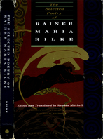
Roll #8 gives me 1645, which is the last of four Rilke selections. I fall back to the first: “Selected Poetry (including the Duino Elegies).” Bloom specifies that he means the collection translated by Stephen Mitchell so that’s what I bought, brand new at Barnes & Noble. It doesn’t look brand new anymore, see above, because it was shuttled around in various bags and eventually had wine spilled on it – how literary! It had the opportunity to get so beat up because I took a long time with it.

It took a long time.

Here follows some stuff I wrote months ago while I was still in the middle of reading it. Even though I wasn’t yet finished, it’s written in the past tense because I thought it would serve as the basis for my eventual entry here… which I suppose it is now doing, but only in quotation marks. Or rather, between these horizontal lines:


This was heavy going, not because anything was obscure, but because real emotional understanding of the poems required me to find my way to his philosophical head-space at every sitting, and that often wasn’t a place I wanted to go. He was talking about the big issues – life, death, and meaning – and seeing them in a cold, modern, sober way… but without the consolations of sobriety! He writes about the terrifying indifference of the real world, and the ways we hide from it and create our own homely ideas of beauty and meaning (same as Camus, same as many people in the past hundred fifty years) – but he writes about these seemingly post-Romantic ideas from within a resolutely Romantic framework. The indifference of the universe and the painful absoluteness of death and the illusions under which we live – all this stuff is treated via gods and visions and mythic figures, and all of it is made extremely personal to the poet. The life of the writing is emotional struggle, cast in basically religious terms. To the Romantic mind, this indifference of the universe to human affairs is absolutely shattering – almost incompatible, really. It’s pretty much the exact antithesis of the Romantic, which tells us that the emotions of the individual should be the basic frame of reference. Seems like once you can see the forest for the trees, that will inform the way you talk about trees. But Rilke is constantly in both frames at once, determinedly writing about what’s outside the cave but only in the language of shadows. He writes about philosophy but never lets the pain out of sight. That’s why it was hard reading – because to be comprehending it meant finding my way back to that pain.

It didn’t seem like I was being brought toward pain because Rilke specifically thought that was the right way to think about these things – it just seemed like the only way he was capable of thinking about them.

The Plague moved me because it was a vision of how life must extend beyond the losing battle against meaninglessness. Rilke only offered (me) a sort of update on the creepy old 19th-century Tod und Verklärung type attitude: that only when we admit defeat, when we surrender to philosophical death, only then will the portals of transcendent beauty be opened to us. And the saints and Orpheus and a nymph with a vase and the whole gang will all be there. I get what he’s saying, and he’s saying it better than almost anyone else I’ve ever read – but all that Tristan und Isoldery is a serious distraction.

I guess what I’m really saying is: the standard task of adjusting for the work’s period/culture of origin was in this case burdensome because the subject matter is too important to me. As period pieces, as art, these are very beautiful and I was deeply, truly, impressed by them. As communication from human to human about life, there’s a bit of a generation gap, and so the lecture started to grate. Because the meaning of life is still a sensitive subject. As in I KNOW, MOM, yes, we’re still trying to figure out how to think about death! Enough about Orpheus, Mom! Nobody talks that way anymore! I’m going to my room.

Rilke’s most famous poem has him (or you, really) looking at an “archaic torso of apollo” and as the poem ends, realizing in a flash “You must change your life.” Yes, this is what art can do to a person. But Rilke’s art does not – it seems to me – endeavor to do for me what the torso did for him. His art is not an example to show us the way (or even, like the torso, simply shame us) – it’s a picture of him, looking about at the world in very fine-grained consternation. And yes, we all have reason to look about in consternation – the struggle and the frustration are there for all of us – but he paints that struggle with such fervor and craft that you’d think he thought he was getting something done other than just naming it.

This art is exquisitely put together, of great aesthetic value, serious-minded, has every reason to exist, but can’t really do anything for me. It doesn’t offer me any solace or advice, and it also doesn’t slap me hard in the face with something I’ve been denying. It takes things that I know, that are difficult and sad, and simply works them toward beauty. But beauty itself isn’t in such short supply in this world that I personally need to seek it out in the form of things that are merely difficult and sad.

This was a rewarding reading experience in that I was exposed to it and it is admirable, and that it is one of the well-made things that’s out there on this earth, and now I’ve seen it. But it was not rewarding in re: my soul, and if not that, why couldn’t it have been about pirate treasure? I hope my next book is about pirate treasure.


I even edited out a bunch of it, if you can believe that.

Anyway, I’m afraid I must now go on to say still more, because the preceding was written before I had properly finished with The Duino Elegies, Rilke’s acknowledged masterpiece and the star attraction of the book. Their 60 pages took me much longer than the rest of the book because they are that much richer; they are worked out at greater length and depth than anything else here. Though some of the above was written in response to the first of the ten elegies, by the time I was done I felt they actually addressed my complaints; they felt like a hard-earned opening out of Rilke’s worldview, exactly the “reach beyond” that I had felt was lacking. There was a sense that his ego had finally dropped out of view and that he was writing to save the world rather than to show off. This is indeed a fine line, in the arts, but crossing it makes all the difference. In his really excellent introduction, Robert Hass writes that some of the early poems “just slightly… tend to congratulate the poet and his reader for having feelings and experiencing beauty.” I appreciated his having said it. The Duino Elegies, however, read deeply, cannot be confused with self-promotion; they are a heartfelt effort to grapple with weight and to do a philosophical service. And there really is no reading them shallowly. That, again, is why this took so long.

I must admit to having lost touch with the depths of these poems in the months since I made the effort; I’m flipping through them now to refresh my memory but it’s not an experience so easily refreshed. What I retain is a sense of a rich, savory melancholy, converting to and from deep thought. A bit like this – (which, good lord, was destroyed in a fire last week??!!) – but a really superb visual mood analogue is this painting, about which one of the Elegies was explicitly written, back in a time when to see this tremendously famous Picasso, you had to be lucky enough to know the lady who owned it and be invited to stay in her living room, staring at it, while you work on a poem.

Stephen Mitchell, who we last encountered as someone whose translation of Gilgamesh I didn’t read, has here done a job of translation that I would call “good.” The English is readable, unpretentious, and conscientiously enough matched to the German, which appears opposite, that one can more or less easily read the originals using the translation as guide. Which is what I considered myself to be doing. However, Mitchell’s efforts to exactly preserve the meaning of complicated interlocking ideas are, on occasion, both overly apparent and unsuccessful. Untranslatably elegant German conceptual arrangements are rendered in solutions that are often ambiguous, in ways I don’t think he foresaw. There were quite a few places where I had to retranslate the German myself before I realized that he intended some meek little “as” or “for” to function as a crucial logical connector. There was also at least one place where, on translating it myself, I realized that he had gotten something wrong in the meaning; the speaker rather than the addressed was the actor in a sentence, or something of that sort. Also – and it’s probably too much to ask – but his English is not actually beautiful. When the ideas were rich and intimate I wanted to be surrounded by rich and intimate sound; sorry, only on the German side of the page. The English feels like it has been worked out carefully rather than fluidly. It reads like exactly what it is; a great poet translated by a smart, touchy-feely guy who likes translating.

This is a fine and admirable volume and I’m not saying I think there are better translations out there to be had.

This has been long enough. There is much more to be said about Rilke but I’ll either say it in the comments when people write in to complain, or we’ll all just agree to let it go unsaid.

As for the sample poem. One of the last things Rilke wrote (“May or June 1925”), and one of the last things in this book, is this odd “trilogy,” which as you’ll see from the subtitle, he wrote expressly with the intent that it would be set to music by Ernst Krenek, then 25 years old. Krenek did it the next year, only a few months before Rilke’s death. Don’t know what Rilke thought of the settings, but as they were the ultimate realization of his wishes for these poems, it’s odd – at least to me – that they are far far more difficult to come by than the text itself, which is in every bookstore. So I’m putting them up here even though it’s a copyright violation; again my justification is that the fairly exclusive readership here puts a very real limit on the potential scope of damages to Universal Edition, which I estimate at $0 if not less. When this site gets featured on the news, I’ll take it down, along with the Absil.

The score.

That’s my scan of the New York Public Library copy. It seems to be a first edition, and judging by the pencilling on the cover, someone seems to have at one point taken it to the 15th floor (of the Steinway Building?) to the office of the League of Composers to give to Mrs. Reis so that Mr. Bamberger could play from it during the concert. That is, the concert on February 27, 1938 at the Cosmopolitan Club, at which Mr. Krenek himself played his Suite for Piano. Too bad they didn’t get him to sign this score while they had him there. This opus has been recorded; you can buy this or this if you want to hear it. Or just listen to the samples from the first link to get an idea.

Anyway, the score contains the German; here’s Mitchell’s English. For what it’s worth, this is hardly one of the most successful (or ambitious) poems in the collection, but it is very much characteristic. I think it shows up Mitchell’s weaknesses, too. Krenek does a reasonable if dated job of trying to make something respectful and intelligent out of it but he illustrates the text too literally, and overall misses the pensive quality that seems essential to Rilke. His opening page comes the closest, I think.

O LACRIMOSA
(trilogy for future music of Ernst Křenek)

I

Oh tear-filled figure who, like a sky held back,
grows heavy above the landscape of her sorrow.
And when she weeps, the gentle raindrops fall,
slanting upon the sand-bed of her heart.

Oh heavy with weeping. Scale to weigh all tears.
Who felt herself not sky, since she was shining
and sky exists only for clouds to form in.

How clear it is, how close, your land of sorrow,
beneath the stern sky’s oneness. Like a face
that lies there, slowly waking up and thinking
horizontally, into endless depths.

II

It is nothing but a breath, the void.
And that green fulfillment
of blossoming trees: a breath.
We, who are still the breathed-upon,
today still the breathed-upon, count
this slow breathing of earth,
whose hurry we are.

III

Ah, but the winters! The earth’s mysterious
turning-within. Where around the dead
in the pure receding of sap,
boldness is gathered,
the boldness of future springtimes.
Where imagination occurs
beneath what is rigid; where all the green
worn thin by the vast summers
again turns into a new
insight and the mirror of intuition;
where the flowers’ color
wholly forgets that lingering of our eyes.

October 26, 2007

The Deptford Trilogy

by Robertson Davies

Fifth Business (1970)
The Manticore (1972)
World of Wonders (1975)

Fifth Business
Taking a break between the heftier tasks of my Western Canon reading with something pleasant that goes down smooth. This presented itself for entirely circumstantial reasons – it had just been given to Beth as a gift and was on the kitchen table – but turned out to be perfect.

I had read nothing by Davies and had heard his name but not these titles, even though Fifth Business, I now see, is fairly prominent. I won’t say anything about what these books are about because my great delight in reading them has been to have absolutely no idea what I’m reading, and I wish the same to you.

Reading a lot of chew-before-swallowing dense stuff, I had forgotten what it was like to drink a tall cool glass of sheer storytelling. I don’t think this could have been more refreshing. And that’s not to say it’s frivolous; there’s an intelligence behind it – or rather in it, present on the surface – that keeps it feeling wholesome and worthy. A tall cool glass of fresh tomato juice. Or something Canadian that’s more apropos. My attention was kept wholly, but not because it was tied up in contemplating the mild symbolical underworld of the book – simply because it was being told a story, and with great ease. The book is a page-turner despite having no clear goal and seeming essentially like an improvisation. In fact it was exactly that improvisatory, story-spinner quality that drew me onward; the rhythmical alternation of exposition with development drove continuously like a skipping stone. It really hardly mattered what the book was about; stories are themselves interesting. This is, not coincidentally, the meaning of the book itself, more or less: life is a story, and stories are marvelous. Fifth Business is not the only book I’ve read with that spirit and message, but it was the book where the combined skill and attitude of the author seemed most appropriate to conveying it. In a very mild, good-natured, Canadian way.

I’ve used the word “mild” a couple times here, but “congenial” is the word that kept coming to mind while I was reading. Davies is professorial in the coziest way; the text is as thoughtful as intelligent dinner-table conversation, and underneath it are some things perhaps a bit more thoughtful yet, but we are only exposed to that layer in deft, shallow swoops. This feels like both a form of mystery and a form of, for want of a better word, good manners.

The Manticore
Can’t be as wholeheartedly enthusiastic about this one, even though I did basically enjoy it. Our eccentric professor author indulges at greater length his own particular blend of theological who’s-to-say and imprecise glancing back and forth from real life to myth, under the all-too-explicitly-stated auspices of Jungian analysis. The whole thing careens unnervingly toward pedantic flakiness several times and there are serious lapses in “show-don’t-tell.” Furthermore the elegant relationship between form and content in the previous book now becomes a liability – it’s remarkably easy to point out the ways that a man’s real life reveals eternal mythic themes when that man is in a book that you are writing. Also, while the first book packaged its endless stream of narrative into a fairly minimal bookend device, this one keeps cheerfully jumping in and out of its devices as though it’s perfectly likely that someone might, if prompted, actually speak or write a long, long, long book-like narrative. That might be part of the point but I wish it hadn’t been. Still and all, the strengths of the previous book are all here, in company with the new weaknesses, and much of it is still excellently readable. I was even willing to humor the man his Jungian talk, for the most part, so long as he kept it lively. Which he didn’t always.

This is a sequel in the Back to the Future Part II vein; it riffs on the preceding book by running in almost-but-not-quite parallel to its events. That in itself is fun, and is a satisfying extension of the best aspects of the first book – I coasted through the lesser passages on the momentum of my satisfaction with the overall conception.

World of Wonders
Even the overall conception falters a few times on the way to the finish line. The idea that a mystery from the first book is left hanging(ish) through to the end of the third seems more like a nagging back-burner responsibility for the author rather than any kind of natural motivating force. This book is also a Back to the Future Part II on the first book (rather than a Back to the Future Part III), even more directly so, and it mostly sidesteps the second one. All three main narratives are in parallel. This time the telling is staged sort of as an after-party, where the characters, who no longer seem to have any capacity to be involved in real conflict, chat it up amiably about the past. The flimsy pretexts for the storytelling are again subjected to too much attention, and the whole thing feels phonified. A bit like Back to the Future Part II. And again, maybe that’s part of the point. Anyway, the storytelling itself that makes up the bulk of the book is still delightful as ever. The Dickensian depictions of various antiquated forms of showbiz (I’m not really giving anything away there – look at the covers!) are really enthralling. Then at the end an unimpressive loose-end-tying ceremony is tacked on, at which point I was perfectly ready to go home.

But my having happily read all 820 pages in 11 days – 11 busy days – has to be taken as some kind of recommendation.

I suspect I will begin to forget the entire contents rather quickly now. Fun while they lasted though. I’ll certainly remember the tone and flavor of it – or the flavor of the reading experience, really, which was my real pleasure here, above and beyond the book. After some time has passed I’ll be pleased to pick up another by Robertson Davies, who seems like he was a right character, with an excellent flair for drama and storytelling, if not necessarily novels per se.

But not right now. Back to the Western Canon. By the way, this is being reported entirely out of order. I actually read The Deptford Trilogy this month, whereas I’m many months (I think four books?) behind in posting about the Western Canon reading. Should get around to it soon.

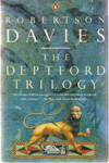
Before I go, let’s take an exhaustive look at the covers. That sounds fun, right?

first FB.jpg first TM.jpg first WOW Canada.jpg first WOW US.jpg
First editions, released several years apart. World of Wonders seems to have had a different cover in the US, seen at right. The orange lettering seems to be a running theme even though these are otherwise unrelated. Fifth Business is certainly unattractive; I don’t mind the concept, vague as it is, but couldn’t it have been made to look at all good? The Manticore has a “gimme” cover design built in – this image is described in the text, functions metaphorically, and explains the title. So of course pretty much every edition actually shows a manticore on the cover. The green light is a little unnecessarily creepy. The Canadian World of Wonders, with its mechanical dove (? or is it a dove made out of pocket-knives?), is superficially surrealist in a way that has more to do with 1975 than with the book. Art by David Craig. The US edition is a dull attempt at period, which makes sense enough for the content but would probably make the book feel more boring than it is. At least to me. The face in the middle is unhelpful. Realistic character faces are generally much too leading; if they’re there, we’re going to believe in them. If that’s what’s intended, I’m all for it, but it’s rarely what’s intended. Outside children’s books.

1971 Signet FB.jpg
An early Signet edition. As Beth said, the Signets of that era all look the same, and having read the book I can tell you that this cover is laughable. Not only is it cliche, but it runs almost directly against the spirit of the story; in fact the story rather specifically calls this sort of hero-centrism into question. This particular formula lives on in movie posters of the Drew Struzan variety, or at least it did well into the 90s. On the other hand the cliche allows the cover to be easily ignored; reading a Signet is psychologically as close as possible to reading a stripped book.

1975 FB.jpg1975 TM.jpg1975 WOW.jpg 1975 TRILOGY.jpg
The first matching set, paperbacks from the mid-70s. At right is a slipcase box in which they could be bought together. Each has one clear iconic image, more decorative than illustrative, and heavy emphasis on the type design. I like all of that. Very 70s choices in the typefaces but I enjoy them and don’t think they detract at all. Also, it’s kind of cool that they chose to have the styles of the three images be different from one another.

Unknown TM.jpg 1977 WOW.JPG
The one on the right I know is the 70s UK paperback, published by W.H. Allen; I’m not sure when this Manticore is from so I’m sticking it here. The Manticore is badly laid out, has bad color design, and an ugly, off-putting illustration. World of Wonders is really crazy – that sculpted head, if I understand what I’m seeing, is an object that figures in Fifth Business and isn’t really mentioned in World of Wonders, and over its shoulder seems to be a little manticore face, also not mentioned in World of Wonders. I can’t tell what that is over the other shoulder. Anyway, I don’t think this illustrator read the book. Furthermore, this cover is totally freaky and looks like it’s going to be about the occult, or lost treasure, or ideally both.

1979 TM.jpg1979 WOW.jpg
These are, I believe, W.H. Allen hardcover editions from the late 70s. These are much too trippy/Dali for almost any book that isn’t extreme fantasy, and they give very much the wrong impression. The artist seems to have chosen the skeleton, which if I recall is just a dream image mentioned in passing, because it suited his style rather than because it suited the cover. Can’t find the Fifth Business equivalent.

1980 FB.jpg1980 TM.jpg1980 WOW.jpg
Circa 1980. These seem to have inherited some details from the prior Penguin set, but of course the overall effect is very very different. These have not dated well, which is not to say they’re not still appealing in their own way; but they would be a serious distraction from the text, putting a very particular “period” slant on it. I was actually struck by how undated the books felt in the reading; this kind of Yellow Submarine meets Pac-Man thing would sour that. Also – even at the time, I imagine – these play up the childish, fanciful side of things a bit too much. The books aren’t as candy-like as this.

1983 FB.jpg1983 TM.jpg1983 WOW.jpg 1983 TRILOGY.jpg 1983 TRILOGY B.jpg
1983 or so they got these new covers by Anne “Bascove” Bascove, whose style is very familiar, though I’m not sure whether I’ve actually been seeing her work for years, or whether she’s just one of a school of illustrators that I blend together. Or whether she is the original and has spawned a school of imitators. Anyway, someone at Penguin seems to have felt that she had nailed the Robertson Davies vibe, because she did the first edition covers for his subsequent books, and for the reissues of pretty much his entire output. I tend to agree; the balance between children’s-book mystery and dignity (and what I might call “business casual” sensuality – you know, like in coffee shops and Barnes & Noble) is a fine match for Davies’ style. The designs are also sensitive to the content; they are intelligent – the surreal touches correspond to the meanings of the books, rather than to details plucked for their design value – and generous to the reader in that they neither give away anything nor pose real riddles. They are bold as designs and images, and aesthetically astute, and yet extremely soft-spoken in terms of pre-emptive meaning. The more I think about it the more impressed I am with what these accomplish.

80s FB.jpg80s TM.jpg
Redesigns. I can’t figure out how these relate chronologically to the versions above; can’t find the World of Wonders equivalent, either. These look nice enough but I think the previous editions are better overall; the type design on the author’s name isn’t actually ugly here but it takes up more attention than it’s worth, as do the borders. The gray editions were a bit more to the point, to my eye. These read as “deluxe” editions of some kind, and maybe that’s what they are.

1992 FB.jpg1992 TM.jpg1992 WOW.jpg 1992 TRILOGY.jpg
Redo of the Bascove covers circa 1992, with a new illustration for the combined edition. I know I shouldn’t like these as much, what with the addition of press quotes and the pointless boxes, but circa 1992 was a formative time for me in terms of book-browsing, book-purchasing, and book-cover-noticing, and these are very solidly of that time, design-wise, so I feel comfortable with them. They look the way that I expect books to look, still.

1996 Australia FB.jpg1996 Australia TM.jpg1996 Australia WOW.jpg 90s TRILOGY.jpg
Mid-90s editions, from Australia I think, maybe UK too. As you can sort of see, these are designed to fit together somewhat, a secret surprise that I generally enjoy although in this case it doesn’t look like it would yield that much satisfaction. The conception here, of whimsical primitivistic iconographic “cuttings” at play in abstract art space, is standard fare for, among other soulful things, CDs sold at Starbucks, and generally annoys me. Unfortunately I have to concede that it’s more than appropriate here, and perhaps encapsulates everything I found tiresome in the latter two volumes. Had it had this cover maybe I wouldn’t even have liked the first volume as much. A little too conceptually exposed, just like the books.

The combined edition at right isn’t part of this set but it’s more or less contemporary with it. I don’t mind that cover at all; I think a little marble and quasi-heraldic pomp is suitably noncomittal (it goes without saying that 800 pages deserves pomp) and a good enough backdrop for the book itself, which is earthy enough to stand out against it but fantastical enough to sympathize with it.

Penguin FB 1.jpg Penguin FB 2.jpg Penguin FB UK.jpg
Here are a few stand-alone editions of Fifth Business. The first one here (and its direct descendant in the middle, soon superceded by a new original painting, see below) is the only example in this whole survey of the pre-existing-painting school of book cover design. I love original book cover illustrations and designs, so I feel odd saying this, but I find stock art covers, when they’re well-chosen, to be extremely effective. Since one knows that the image is not an intentional illustration of the book, one is more able to carry its aesthetic world over to the book as much or as little as one chooses; it prettifies and adds to the book as a cover should without inserting its nose too far into the author’s business, which as I keep saying is always a risk with covers. On the other hand stock art covers can be, and often are, too timid. I think this one is. It’s a Canadian town, no doubt, but that’s about it, and this is a particularly unassertive painting to begin with. While we’re on the subject, I think that the people at the Modern Library Classics series have really mastered the art of the stock image cover design. Gabrielle Bordwin, I salute you.

The third version here is a UK cover very much in keeping with the current ones below; my comments there.

2005 UK FB.jpg2005 UK TM.jpg2005 UK WOW.jpg
Current UK editions. These are stylish in themselves but the sense of obliqueness, and of chill, is unsuited to the spirit of the books. Also, the relevance of the first one to the content of the book would not be apparent to the reader for a long time, which to my mind is a mistake; the cover always comes first for a reader and it should be designed to function that way. For the designer to intentionally throw down his own enigma at the outset is presumptuous overreaching; things like that make me feel quietly aware, while reading, that I am excluded from the club of those who have finished the book and actually know what the cover means, and that sense of exclusion can poison the reading experience. The Manticore has a face, which as I’ve said is generally a bad idea, but in this case it’s clear that this photograph of a face is not meant to actually be the character; it’s a post-post-modern (?) reference to the idea of the character, and to the idea of people in general, and their faces. Well, that’s not helpful either.

2006 US FB.jpg2006 US TM.jpg2006 US WOW.jpg 2006 US TRILOGY.jpg
Current US editions. Lest it be said that I think book covers are getting worse, I like these a lot and I admire the choice to commission this particular painter because the style seems very nicely matched to the books. However, the spookiness factor is way, way too high on that first one. I like that this manticore is clearly a symbolic, expressionist manticore. And the supersized head on World of Wonders creates a nice atmosphere like a children’s book, though it might not be as obvious to a reader that this too is expressionistic and there will not be any supersized head in the story.

The combined edition here at right is what I actually held in my hands and read. The artist has done similar paintings for current editions of the two other “Trilogies” by Davies. Having read the book I can say that this (and his style in general) is a touch too shadow-and-sparkle mysterious for this book written in, as Davies calls it, “The Plain Style.” But the idea of an empty stage with lush curtains is an excellent cover concept, totally suited to the subject matter, and I think its perpetually unresolved sense of foreboding was helpful in pushing me forward as I read. So maybe it’s actually a good thing that the cover is more mysterious than the book; at any rate it accomplishes something. Unfortunately the type design is cloddish and seriously mars the atmosphere. But all in all I was pleased holding the book, and pleased by how it looked and what it seemed to promise. Maybe something a little more childish than what it actually contained.

October 16, 2007

Order of operations

When I write as I’m thinking, the thoughts appear on the page in the order that they produce one another; each thought poops out the next one. This tends to create a long string of sausages, often redundant, but hard to edit because each sausage hangs on the one that precedes it.

When I write after having had the whole chain of thoughts, I try to cut it down to the most interesting one, the last one, and justify it only so far as it needs to make sense. But that ends up being like trying to arrange a string of carts with a horse way at the back; all logic flows upstream. This is irritating to read because without the forward tug that made the thoughts come into existence in the first place, the thoughts don’t seem worth having.

Writing is very easy for me when I am able to keep pace eloquently with my thoughts; I trust that my thoughts naturally have a congenial narrative impulse. But when I am not in motion myself, I have a poor sense of how to lay track. My only recourse is to return to the starting point and attempt to make the journey again; repeatedly, with decreasing returns. This goes for music too and absolutely for fiction.

I am led to imagine that real writing is done from the side of the road, unmoving, with a hardhat, but I can’t seem to do that. Nor am I much good at creating things in reverse as I retrace my steps from conclusion to premise; they are always clearly marked as having been invented upside-down, like writing done in a mirror or with the left hand.

My best hope would seem to be of increasing my actual technical fluency so that when the moment of experience is upon me, my writing hand is working efficiently the whole time, and at most only one or two retreads are necessary to fill in the gaps. But that may not be enough to allow me to capture anything really complicated. It is frustrating to feel that my best self may always be beyond my ability to express.

Everyone everywhere feels exactly the same way, no doubt.

In encountering a truly talented writer saying rich things truly well, I think that these things are still only very remotely like the actual thoughts the writer was having at the time. They are just sentences. So too poems, no matter how adept. Communicating a thought is like trying to limn a subtle and complex image of shade and color always in motion, by framing it, standing outside the frame, and plotting straight lines to pass through the frame that maybe correspond in some rough way to what’s under them.

By way of illustration in game and puzzle form, here are Qix and Paint-by-Numbers.

It will no doubt come as no surprise to my most attentive readers – i.e. me – to hear that I have risen from bed in a state of near-sleep to write this.

October 15, 2007

Beethoven: Concerto in D Major for Violin and Orchestra, Op. 61 (1806)

Ludwig van Beethoven (1770-1827)
Opus 61: Violin Concerto

composed: 1806 (age 36)
published: 1808
first performance: Vienna, December 23, 1806 (Franz Clement, soloist; the composer conducting the Theater an der Wien orchestra)
dedicated to Stephan von Breuning

145. This is the biggest cultural gorilla so far, and I’m ashamed to say I’d never heard the whole thing before. No, wait, not ashamed. Just not proud.

Beethoven’s music, in my experience, is for the most part not superficially very attractive. To enjoy it I must travel inward, and that takes repeated listening. During which slow process I had many conflicting thoughts about the piece, most of them inane. The best one I think was this:

Beethoven gets credit for plumbing the depths with music that feels totally unadorned, made up of very simple materials. The bareness puts us directly in the presence of the mystery of all music, a mystery that we can more easily gloss over when music is busier and provides more distraction. Beethoven harnesses the inherent strangeness of melody and harmony, of all musical sound. “Strangeness” is here interchangeable with “profundity.” That fact is interesting in itself.

They say that Beethoven’s music expresses the aspirations of the human spirit, and it certainly seems like Beethoven himself thought of it that way, but to me the emotional impulse in a piece like this is as abstract as the beauty of architecture. Musical elegance might remind one of life, but the principal appeal is the mystery of its non-signification, of elegance being its own reward. Elegance detached from being. As I said here, the peculiar status of musical things that are neither objects nor signifiers of other objects. Beethoven – especially in this piece – dispenses with most gestures toward human life and language, and leaves us alone in the room with only the unblinking sphinx face of musical beauty itself.

This could be said about Bach, too, but the beauty in Bach is of intricate woven patterns, like a geometric tessellation. Beethoven has nothing particularly geometrical about him; he superficially seems always to be saying fairly childish human things. Except that humans would never actually say them. In this piece, who could possibly be initiating that queasy four-note figure that follows the first melody? Certainly not a person; not even some personification of “fate.” The notes sound to us like real fate, like an actual message from the universe, because they are music and music never quite seems to come from people, when we are given the room to reflect on it. Beethoven’s skill is for leaving the room, for stepping aside.

I say all this as a partial explanation of what people seem to find in Beethoven, but I myself don’t always find it. Often the simplicities sound to me exactly like things humans would say, particularly humans around 1810 with bad senses of humor and no social skills. Sometimes I feel rather uncharitable indeed toward Mr. Beethoven. Maybe all this glorious sphinx-faced profundity is just the unintentional result of a composer with a striking lack of natural talent applying himself with incredible intensity to sterile materials. But beside the fact that that’s near-sacrilege, it’s also hard to reconcile with Beethoven’s increasing knack for achieving that “deep” effect as he matured. It would seem that he did in fact know what he was achieving. Nonetheless there is a mysteriously fine line between sphinx-like universality and cloddish sterility, and it is not always immediately obvious to me which side of that line I’m listening from. We are presented, in liner and program notes, with the fact that the Violin Concerto was not considered successful during Beethoven’s lifetime, that it was criticized for being bland and repetitive, as one of those “just goes to show how wrong people can be” tidbits. For my part, I can hear exactly what Beethoven’s hopelessly history-bound contemporaries were talking about. It’s an awfully repetitive piece with a lot of conventional busywork for the violin. I can also hear that it is potentially compelling in a certain expansive, sepiatone way. On rare occasions I can even hear it as profound. At least the first and second movements. But that impression is still a relatively rare and fragile one, susceptible to being sneezed away. Considering the scope of this piece’s reputation – the most noble of all concerti, or whatever – I still feel like I haven’t quite made contact. But I’ve listened many times.

I think Beethoven is a great deal less universal than the guidebooks tell us.

Comments: My favorite part of the whole work is the ominous centerpiece of the first movement’s development, when we seem to be suddenly below decks, in the quiet heart of a creaking, slowly rocking ship. The first and second themes in the first movement are oddly similar in character, making for a certain degree of monotony. There’s also a to-me-gratuitous third repetition of much of the exposition, which doesn’t help matters. The second movement is one of those Beethoven specialties where solemn repetition and decoration makes a simple idea increasingly uncanny. I know some find this movement a very deep example of that idea, but to me this has a very mild effect compared to some of the piano sonatas.

I think there’s something about being aware of the constant challenge of intonation, on the violin, that tends to yank me out of the ethereal realms, so to speak. It is an instrument that sounds like hair, whereas I want music built this way to sound like stone. This is perhaps why my favorite recording of those I heard – and this is more sacrilege – was the recording of the piano concerto arrangement that Beethoven did the next year. The piano is much more impersonal, much less susceptible to human wavering, which this piece doesn’t seem to have a place for. Also, Beethoven wrote cadenzas for that version, which he never did for the violin version. The Kreisler cadenzas that I heard repeatedly (I think I heard Joachim and Auer cadenzas too) are nothing special, if you ask me, whereas the Beethoven piano cadenzas (with timpani!) are bold and wacky and well worth hearing. The obscure Piano Concerto Op. 61a was a much more endearing companion, to me, than the great Beethoven Violin Concerto Op. 61. But maybe I just haven’t heard the right recording yet.

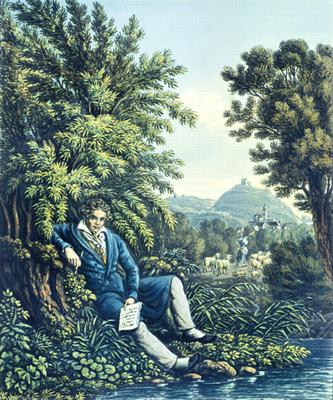
In lieu of a photo of Beethoven at age 36, here’s an evocative 19th-century illustration I found of Beethoven thoroughly nestled in an unearthly pastoral. This picture amuses me but I also feel that its rich oddness is in some ways entirely apt.

beethoven.jpg

Dubal said:

Heifetz, NBC Symphony Orchestra, Toscanini: RCA 60261-2-RG
Kennedy, North German Radio Symphony Orchestra, Tennstedt: EMI Classics CDC 54574
Grumiaux, Royal Concertgebouw Orchestra, Davis: Philips 420348-2
Menuhin, Philharmonia Orchestra, Furtwängler: EMI Classics CDH 69799

The Grumiaux release is, as you can see from the link, long forgotten, but the recording is now available as this. I was able to obtain, as it turned out, none of those, so I’m willing to believe that my ambivalence about the piece is simply due to not having heard a good enough recording. I’ll continue to seek out new versions. The ones I heard are below. As I said, my favorite was the piano one, but among the violinists, I’d have to go with Heifetz.

This thing where I find all the album covers and put them here is getting tedious. Follow the links to amazon and see for yourself what they look like.

Maxim Vengerov, London Symphony Orchestra / Mstislav Rostropovich. EMI 3 36403 2. 2005.
David Oistrakh, Moscow Philharmonic Orchestra / Kyril Kondrashin. BBC BBCL 4127-2. 1965.
Itzhak Perlman, Philharmonia Orchestra / Carlo Maria Giulini. EMI 5 66952 2. 1980.
Jascha Heifetz, Boston Symphony Orchestra / Charles Munch. RCA 09026-61742-2. 1955.
Isaac Stern, New York Philharmonic / Leonard Bernstein. CBS MYK 37224. 1959.
Bronislaw Huberman, National Orchestral Association / Leon Barzin. Arbiter 115. 1944.

And the piano version:
Jenő Jandó, Nicolaus Esterházy Sinfonia / Béla Drahos. Naxos 8.554288. 1997.

Scores here currently include the full score, two piano/violin reductions, and a 4-hands arrangement.

September 18, 2007

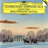
Tchaikovsky: Capriccio Italien, Op. 45 (1880)

Pyotr Il’yich Tchaikovsky (1840-1893)
tchaik1877.jpg

Opus 45: Capriccio italien

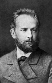
composed: 1880 (age 39-40, see above)
published: 1880
first performance: Moscow, December 18 [old 6], 1880 (Nikolai Rubinstein conducting the Russian Music Society [?])
dedicated to Karl Davidov (cellist, and director of the St. Petersburg Conservatory)

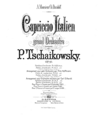
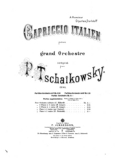
I’m pretty sure one of these is the title page of the original edition. I think they might both be – the first one as published in Germany, the second as published in Russia. There might also be covers from France and England. Not sure.

I’m including this because, as with book covers, I feel it’s useful to see the design elements originally associated with a work. I think pretty visually, and seeing an illustration, or even just type design like this, really helps me get aesthetically oriented to the whole stylistic world that the work comes from. As I’ve probably said on this site in the past, I don’t think it’s right to present old art as though it’s evergreen and can be repackaged any which way. Whether something appears “timeless” to us reflects more on our attitudes than on it, or on the time from which it comes. The only reliable way to have access to the past is to go out and meet it; it can’t be expected to come meet us. At least to meet it halfway. Seeing a book cover sometimes makes it instantly clear where I’m going; so too with music, maybe. Though decorative covers aren’t quite as ubiquitous in music. Still, even these relatively straightforward designs send certain signals.

I would have included the original covers for the prior selections but I couldn’t find them online. These were scanned by the Eastman School of Music, and come from here, where you can download the full score, the score of the composer’s own 4-hand piano arrangement (also 1880), and the score of a 2-piano arrangement by Eduard Leontyevich Langer (1835-1908), “a pianist colleague at the Moscow Conservatoire, whose ineptitude in making piano transcriptions was to cause Tchaikovsky so much exasperation” (quote from here).

Anyway, this was random number 359. Capriccio italien is a pretty dumb piece and its inclusion in the Essential Canon of Classical Music is mysterious. It’s not the warhorse of programming that it seems once to have been, so I’m not sure it can even be justified in terms of ubiquity. Who out there really loves this piece these days, or even thinks about it? It’s been recorded many many times, but I think only because it makes a good space-filler on an album of other Tchaikovsky works, and seems easy to play.

But maybe not easy to play well. Yet again I’m struck by how unsatisfying the recordings were. The piece is all about catchy tunes and corny fun, and it seemed fair to wait for a performance that really brought the catchiness and fun to life. But nearly every conductor seemed content to let it die on the vine, taking the score at its pedestrian word and not adding anything. The slow first theme, which in my imagination should be lusty and operatic almost to the point of comedy, falls totally flat in nearly every performance I heard, with the triplets coming out lazy and even instead of petulant and snappy. The whole score is clearly made up of tunes that PT thought were hummable; the least an orchestra could do is play them like they wanted to hum them.

Actually, all I really wanted from a performance of this piece is for it to sound like an old cartoon score, where dinky popular and traditional tunes have been thrown together and orchestrated and are played with gusto and a total lack of artistic ambition. The second theme here seemed like it come from a Carl Stalling depiction of Italy, and for all I know it may have been used that way. But if the Warner Brothers orchestra played it, they would have given it some kick!

The piece is actually just like those Liszt Hungarian Rhapsodies, only Italian, and with perhaps a slightly more agile sense of orchestration, but considerably less overall flair. The few connecting and developmental passages are rather weak, as I think Pyotr himself acknowledged, and in the end we don’t really come away with a sense of having gotten anywhere. The tempo and character transitions need a lot of goosing from the conductor; without adding a lot of accelerandos and rallentandos they don’t make enough sense. Unfortunately none of the conductors did that.

Apparently the actual inspiration was not Liszt but Glinka. But I don’t know those pieces so I can’t comment on that.

It’s a tourist piece, based on stuff Tchaikovsky took in while he was staying in Rome. The intro is a bugle call he could hear from the Italian cavalry barracks near his hotel room. I like the idea of taking some noise you hear every day on your vacation and making it the entrance gate to a work of art. With that in mind, the introduction is actually quite effective – the bugle call is played bare in the trumpets, exactly as he heard it, but then is magically joined by the rest of the whole orchestra, converted into something glorious as it passes through the gate of perception and into the interior world of the artist. Or something. For that to come across, though, the opening few bars have to be played like an actual bugle call – without too much expression and not too broadly. No conductors made that choice either.

There are about four themes – 1. the operatic one, 2. the dippy ice cream truck / Popeye one, 3. the suave, jaunty one (my favorite), and then, after the brief return of the operatic one, 4. the tarantella, which has at least one good part. Then a clumsy, would-be-triumphant return of the ice cream truck / Popeye theme leads into a middling coda of the “whipped into a frenzy” type, which actually undercuts its own frenzy in a couple places.

So: this is a deeply unambitious, “lowbrow” piece, and isn’t even a particularly fine specimen of that type. That said, it still gives off a sense of genuine good cheer, these tunes are pretty catchy, and I am able to imagine a really rollicking performance of this piece that delights me, even if I’ve never actually heard it. If someone started humming this I’d join in. But “essential canon” are strong words and this is quite obviously a lightweight. That’s okay by me, though – it still feels like I’ve tossed at least a spadeful of cultural literacy on to the pile.

The official four-hand version, by the way, is mostly very easy and potentially fun to play, but then has some really tricky scales in the middle. I would say fudge them – this was never going to sound good on a piano anyway. Though it looks like those crazy Labeques have recorded this version all the same.

Per Dubal:

London Symphony Orchestra, Rozhdestvensky: IMP Classics IMPPCD 875
St. Louis Symphony Orchestra, Slatkin: CA 09026-60433-2

I couldn’t readily find either of those. Note that the obscure link above is the only indication I can find anywhere on the web that the IMP Classics release ever existed. (Though a different release of the same recording can now be gotten here fairly easily.)

My favorite of the eleven recordings that I could find, see below, was the Czech Philharmonic / Karel Ančerl. It’s not particularly clean but at least events progress in a way that makes sense to me. Somewhere out there, I believe, there is an even better recording.

tchaik45-1.jpgtchaik45-2.jpgtchaik45-3.jpgtchaik45-4.jpgtchaik45-5.jpgtchaik45-6.jpgtchaik45-7.jpgtchaik45-8.jpgtchaik45-9.jpgtchaik45-10.jpgtchaik45-11.jpg

Chicago Symphony Orchestra / Daniel Barenboim. Deutsche Grammophon 445 523-2. 1981.
Bavarian Radio Symphony Orchestra / Lorin Maazel. RCA 09026-68471-2. 1995.
Philharmonia Orchestra of London / Placido Domingo. EMI 5 55018 2. 1993.
New York Philharmonic / Leonard Bernstein. Sony SMK 61556. 1960.
Minneapolis Symphony Orchestra / Antal Dorati. Mercury 434 360-2. 1955.
Orchestr Ceská Filharmonie / Karel Ančerl. Supraphon SU 3680-2. 1965.
“London New Philharmonia Orchestra” / “Laurence Gordon Siegel”. Intersound CDQ 2027. Released 1988.
Berliner Philharmoniker / Herbert Von Karajan. Deutsche Grammophon 463 614-2. 1966.
Berliner Philharmoniker / Seiji Ozawa. Deutsche Grammophon 427 354-2. Released 1989.
Orchestre symphonique du Montréal / Charles Dutoit. Decca 466 419-2. 1986.
Cincinnati Pops Orchestra / Erich Kunzel. Telarc CD-80541. 1988.

September 10, 2007

Harry Potter and the Deathly Hallows (2007)

by J.K. Rowling

My plot for the seventh book was this:

To undo the magic linking him to Voldemort, Harry Potter must die. He has to pass through the curtain in the Department of Mysteries and descend into the land of the dead, a Greek underworld type place, with a river Styx and the shades of characters long-gone – but no grand Lord Hades reigning over it all, just eerie primal magic of some natural kind – the basic mysterious forces of the universe. However, there are some kind of personified figures of fate – Norns or something – and Harry, in trickster fashion, first has to summon them and make some kind of wager or deal to ensure his being able to return from the land of the dead, something nobody has ever before managed to do. In a heart-rending scene, he meets his parents, and Sirius, and whoever else, and impulsively tries to bargain for their souls as well. Ultimately they can’t join him – for some reason it would work out that they could be saved but only by canceling out Harry’s original purpose in entering the land of the dead, and thus forfeiting the fight against Voldemort – the lesson being: losing things that we love is simply the price of fighting the good fight, no matter how much magic we have.

A darker alternate was that Harry’s only way of walking through the land of the dead and returning would be to create his own Horcrux, killing some bad guy but in the process souring his soul forever. In the end he’d be able to mostly mend himself on magical terms, but would still become a darkened, compromised adult, like everyone who must take the burden of fighting evil. His final rite of passage into adulthood would thus be descending into the grey between good and evil, in order to protect the world; and he would finally be able to commiserate with Dumbledore, who would be revealed to have made similar compromises that somehow explained the Snape situation.

I guess I was looking for a noir ending, or something with a poignant mythological resonance. It seemed like she had been heading in that direction. But the series actually ended back where it began, with the simplest colors and the most Saturday-morning-cartoon-worn tropes. She seemed to know the book needed a feeling of compromise, but she gained it only by killing off a few sympathetic characters, and even that was never quite given the chance to sink in. The tale of Harry Potter ends, like so many disappointing video games, with a boss battle not qualitatively different than any other battle, and somewhat less interesting than much that has gone before. Then the credits roll.

My comments last time about J’s converting the epic into the technical continue to apply, with the added sadness that now the technicalities no longer really make any kind of intuitive sense. They also may not even make technical sense, though the rules have gotten so fuzzy-edged that it’s hard to know how to navigate her labyrinths of technicalities. And I’m not inclined to try. I would rather have thrown out all kinds of babies in the bathwater and been given something bold and compelling in the end. But that would have been dissatisfying to many, I’m sure. She obviously felt obliged to give a shout-out to every misbegotten bath-baby from the entire series, but a string of shout-outs just leaves us feeling like we haven’t really been there, we haven’t really found out what happens to anyone. Was that really the last time I’ll hear from Hermione? I’m not convinced; maybe I never really knew her. I think the frantically good-natured effort to give everyone what they came for is going to sap away some of the life from the preceding books, retroactively. But I don’t plan to be rereading any of these anymore.

I absolutely enjoyed the entire process of reading this series – it was truly a delight. But make no mistake, this needs to be classed as a guilty pleasure, not a proud one. Participating in a mass phenomenon is a thrill; seeing people of all types reading de-covered copies of this giant book about wizards on the subway never got old. But it fades fast, as it did after every installment, and now that it’s over I’m not sure I’ll ever have any reason to stir up the embers again.

I think the notion of J.K. Rowling and the Harry Potter phenomenon will linger on in my mind – and if I may prophesy, in the culture at large – for much longer than the content of books themselves. In this last volume I was more aware than ever of this non-writerly, pleasant but ordinary woman, gamely taking on the task of entertaining everyone in the whole world. Like someone’s mom somehow organizing an international 100 million person game of pin-the-tail-on-the-donkey. How did we get here? How did this end up happening? Of course I have to approve.


J.K. Rowling (2005) by Stuart Pearson Wright

September 9, 2007

Family Plot (1976)

directed by Alfred Hitchcock
screenplay by Ernest Lehman
after the novel The Rainbird Pattern by Victor Canning (1972)

Hitchcock’s final movie. I’d heard that this was “a return to form for Hitchcock” and “slight but entertaining” and “a cute comedy-mystery” and the like. But it actually was pretty shameful stuff. That it was stupid was not really a surprise; what was sad was that it seemed actually sloppy, unprofessional. Hitchcock was very old and not doing too well by the time he made this, so I can’t hold it too much against him that it feels unpolished and vague; but Ernest Lehman was only 60, would go on to live almost 30 more years, and has no excuses. His screenplay (which Wikipedia tells me won an Edgar award for mystery writing!) is dumb not only in its larger structure but also in the details of each dialogue. Nearly every scene consists of two characters swapping summations of the current state of affairs, peppered with embarrassing less-than-double-entendres. When Eva Marie Saint says “I’m a big girl,” and Cary Grant says, “Yes, and in all the right places*” we cringe a little (don’t we?), but roll with it because it’s Cary Grant and he surely knows what he’s saying. When Bruce Dern says – oh god, something about peering into his crystal balls, or something, I’ve blocked it out – we cringe again, deeply, and this time, because it’s just Bruce Dern, we have no other recourse. My point here is that Ernest Lehman was always a bit adolescent when it came to sex, but at least in the 50s everything felt oblique to begin with, so a little snickering and turning red about sex seemed like just what the doctor ordered. Now it’s 1976 and it just seems immature that Ernie is still snickering and turning red. The movie revolves around two totally boring, low-chemistry long-term couples, both of which frequently resort to contorted metaphors and winking to talk about the prospect of potentially having sex. Which they do not, by the way, do at all in this movie, even off-screen, so the talk is just in there because Ernie felt it was mandatory. Which is also a bit sad.

There is a workable premise here, which is: our bumbling heroes are arbitrarily entrusted with the task of finding a long-lost heir to a great fortune, about whom nothing is known. Meanwhile, we the viewers find out that this long-lost heir is now in fact a nefarious criminal. What will happen next? From this premise, any number of things could happen that would be interesting, and I guess one or two of those things did ultimately happen, but they turned out not to be interesting after all.

Both the bad guy, William Devane, and his partner, the totally unsexy doofus-faced Karen Black, have more or less no screen charisma, though I’ll grant Devane that he has intriguingly weird teeth. Bruce Dern seems convinced he is playing a colorful character, and he certainly does do a lot of fidgeting, but of negligible interest to the audience. Barbara Harris fares the best, which isn’t saying much, by piling on the ham in her ham sandwich role. But wait, who are these people, again? A fake psychic and a cab driver and a what? Eh, forget it, I don’t care.

There is a pretty good runaway car sequence, shot more or less identically to the one in North By Northwest, but with somewhat better footage. But no music and no Cary Grant so it’s about even. There’s also one nice shot, a long shot of a cemetery, where two figures walk in parallel down different paths toward their convergence. It was interesting, but a little depressing, to find out that this one shot that struck me as attractive had actually been laboriously planned out by Hitchcock, with the paths specially constructed for the film, so as to suggest the lines in a Mondrian painting. Yes, I guess it sort of did look like that, but knowing how much thought and effort went into that one moderately interesting shot, I feel far less pleased by it. Couldn’t some of that effort have been redistributed into the rest of this silly movie?

Music is by John Williams, not quite so on-the-ball as with Jaws the previous year. The themes are cute, and harpsichord and piano on melody lend a certain 70s period flavor that I enjoyed. But as usual, he has a tendency to lay it on just a little thicker than he realizes – anyway, thicker than this eggshell of a movie can withstand. I had occasion to hear some of this music in advance of seeing the movie, and it primed me for something fun and dated, in the vein of the early Columbo episodes that Beth so enjoys. But Columbo, for all its sleepy hokum, has a certain degree of formulaic rigor. This just rolled around. Poor Hitch.

Trailer 1 and Trailer 2. Links work right now, anyway.

Covers of the first edition, and the pre-movie tie-in edition, of the book – is it possible that anyone, anywhere, has read this? – upon which. For those who are wondering, “Mrs. Rainbird” is the name of the rich old lady who wants her missing heir found. Now you see.

rainbird.jpg rainbird2.jpg

* presumably i.e. principally the breasts.