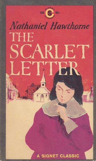
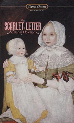
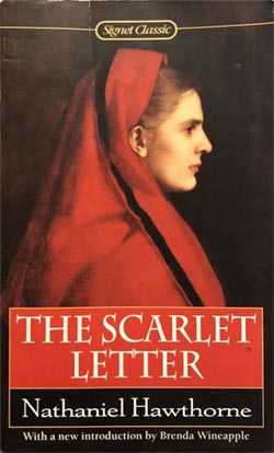
CD8, 50¢, August 1959. Cover artist unknown. 254 pp.
An ardent young woman, her cowardly lover and her aging, vengeful husband — these are the central characters in this stark drama of the conflict between passion and convention in the harsh, Puritan world of seventeenth-century Boston. Tremendously moving, rich in psychological insight, this tragic novel of shame and redemption reveals Hawthorne’s concern with the New England past and its influence on American attitudes. From his dramatic illumination of the struggles between mind and heart, dogma and self-reliance, he fashioned one of the masterpieces of fiction. “The one American literary work which comes as near to perfection as is granted a man to bring his achievements.” — Arnold Bennett
With a Foreword by Leo Marx
A book whose genuine greatness has been nearly eclipsed by its status as a classroom staple. In some ways this is as hard a work to “see” as the Mona Lisa.
There’s no mystery why it’s a fixture of the curriculum: it’s short, direct, thematically “American” on many levels, very famous, and it exhorts the reader to engage in interpretation. It casts itself as an icon, a prompt, which is just what English teachers love. Discussing the meanings of any and all aspects of The Scarlet Letter seems to be exactly what The Scarlet Letter wants. This is what it’s for, right?
Yes, in a certain sense. But I suspect this actually makes it less suitable for didactic use, because that certain sense is inevitably obscured in the classroom, where “interpretation” isn’t a spontaneous impulse of the spirit, it’s an institution and a duty. (And a perspicacity competition. Raise your hand if you understand what I meant by that.) Hawthorne’s explicit appeals to symbolical feeling can be all too easily mistaken for just another homework-happy grownup assigning essays by edict of the Supreme English Department — just the sort of thing the book is supposed to be about escaping from.
Glancing through The Scarlet Letter‘s thousands of Goodreads reviews, I find that there’s a pretty broad teenage consensus. Namely: the story’s all well and good, but the writing is EYE ROLL UGH STOP. The most “liked” reviews are mockery of Hawthorne’s supposed longwindedness: how much pointless description there is, how many needless words recounting how things looked and what people did even when it so obviously doesn’t matter and obviously nobody cares JUST GET ON WITH IT OMG THIS BOOK I LITERALLY CAN’T.
That came as a surprise to me! But I think I know what they’re responding to, beyond just underexposure to 19th century diction. The story is fundamentally a miniature, a tale, whose “natural” size is really very short, yet Hawthorne has treated it at full length. The question is the nature of that treatment. If you’re only reading it to pass a quiz, indeed, you might feel a bit ill-used, because most of the prose clearly won’t be on the quiz. Most of what makes the book worthwhile isn’t quizzable.
Hawthorne’s tone of address is subtly a wonder. It’s what makes the book a glowing masterpiece. He’s never entirely telling the story: he is meditating on it and within it, and his meditation takes the form of writing it. The unspoken premise is that he stumbled across this thing whole in his imagination, and now he’s marveling at it just as we are. (The in-book premise is that he stumbled across it in an attic, which amounts to the same thing.) Just having access to the tale is itself miraculous to him; he’s like someone magically transported into a painting, able to see the backs of the heads, reporting wryly on it all. The events float by with the portent and symmetry of a lucid dream.
Or the inverse metaphor: he turns each scene over and over in his hands. A great deal of what he wants to put across is that this is a tale, a small gleaming thing, to be pored over in its every detail exactly because it is small and perfect. Each aspect of the story is framed as an appeal to knowing recognition: yes, it would have to be just so, wouldn’t it. The book is simultaneously the stained-glass window and the tourist fascinated by it.
I think in his view, the stained-glass window is Olde New England: a mysterious historical past with a forbidding and opaque character, which he’s trying to penetrate but can never claim to truly know. But he’s haunted by this particular past because he has ancestral roots in it, which gives it a vital sense of dread for him. He fears to see himself reflected in it, and/or scorned by it. The dream of this story is initiated by asking himself “who am I? what am I?” So his relationship with local history is inseparable from his relationship with his own psychological attic and the images he finds there.
This is his relationship with “tales” generally. He frequently addresses the reader as though talking to a fellow writer, assuming that we share his capacity to take pleasure in being simultaneously outside and inside a fiction, to relish the sculptural quality of the work as it takes shape under the chisel, and/or as it emerges unbidden.
All Hawthorne’s writing is an extension of his notebooks in which he jotted down hundreds of fleeting inspirations about as-yet-unwritten stories, in which this or that symbolic thing might happen, e.g.
Meditations about the main gas-pipe of a great city,–if the supply were to be stopped, what would happen? How many different scenes it sheds light on? It might be made emblematical of something.
Some very famous jewel or other thing, much talked of all over the world. Some person to meet with it, and get possession of it in some unexpected manner, amid homely circumstances.
To poison a person or a party of persons with the sacramental wine.
An old looking-glass. Somebody finds out the secret of making all the images that have been reflected in it pass back again across its surface.
A woman to sympathize with all emotions, but to have none of her own.
Half the pleasure of each inspiration is pondering the fineness of the hypothetical story qua story. Wouldn’t it be wonderful for there to be such a story! Within The Scarlet Letter Hawthorne says “isn’t it wonderful to participate in the working-out of such a story?” And then: “And isn’t that part of the story, in a way? Aren’t these characters themselves participating?”
The question of whether the reader knows Reverend Dimmesdale’s secret is a prime example. Hawthorne never tells; nor does he engineer any real deception. His deadpan is so utter that it constitutes announcement by omission, to the sophisticated reader to whom Hawthorne addresses himself, but not to “the reader” as an abstraction. The notion of “does the reader know yet?” is something Hawthorne wants to share with us; it’s part of the wonder of stories, part of their worship. He draws out the deadpan indefinitely, because the idea of the hidden, the unspoken, is part of what he venerates. It’s the essence of stained glass.
The book is really about what he’s doing: encountering this book. It worked out marvelously for his purposes that it turns out to be, of all things, The Scarlet Letter, a timeless classic that everyone knows. What a coup!
Hester is burdened with a symbol that becomes open-ended, and then its open-endedness itself becomes the burden. Perhaps the scarlet letter means a transcendental thing that contradicts its societal meaning? Or perhaps the concept of “sin” somehow loops all the way around, and the moral scheme perceived by the Puritans is the grand scheme, even as it works in mysterious ways? Or perhaps perhaps perhaps perhaps any number of other things suitable for discussion in Mrs. Fleming’s fourth period English class? Hawthorne suggests a great many “perhaps”es — for the sake of “perhaps,” the pleasure of “perhaps.”
The thing he seems to actually believe is that fiction is an expression of philosophical reality precisely because it is a twilight realm in which “symbols” and “moral systems” are revealed as mere semiotic objets to be shuffled around and delectated under the rubric of “perhaps.” This freedom of the writer and the reader is the true reality, which Hawthorne allows his characters to perceive dimly as the ineffable truth hiding behind and beyond their fate-ridden fairy-tale paradigm, and endlessly complicating it. The irreducibility is what Hawthorne finds beautiful, the eternal incompleteness of taking two-dimensional moral slices of a three-dimensional universe. And this is his rebuttal to his Puritan ancestors: it’s not that you were wrong, it’s that being right isn’t possible; it’s not the nature of life, and you were in denial about that.
At the very end he muses: “It is a curious subject of observation and inquiry, whether hatred and love be not the same thing at bottom,” because both are forms of passionate dedication. Unspoken but implicit is the even broader reflection on good and evil, both of which are expressions of a moral order. Good and evil are both the business of the town. There’s no name for what goes on in the woods, i.e. in art, i.e. in life.
Hawthorne’s lengthy autobiographical introduction — another thing teenagers hate — tends to be treated as an inessential appendage; I’ve seen several prefaces that outright advise the reader to skip it. But I think that’s wrong. The work takes its meaning in relation to the real world, and in the introduction Hawthorne explicitly gives us a point of departure for that relation. I was grateful for the added dimension it gave to my reading.
He frames the whole thing as his fantastical way of grappling with his feelings about his stultifying “The Office” day job, surrounded by dullards to whom he can’t relate, despite sharing a hometown and a heritage. They’re the types of everyday ordinaries who perceive themselves to be, at best, characters in some drama — perhaps occasionally aware of the power and ambiguity of a mysterious symbol, but never once considering the fourth wall. They believe in the painting. Whereas Hawthorne can see the backs of the heads. Whatever lonely religion that is, it’s what he’s preaching.
I don’t need to talk about what goes on. It’s The Scarlet Letter, obviously.
Detective Kinsey Millhone takes on her toughest case yet, in a quaint New England village where everyone’s a suspect — even the handsome young preacher. She thinks she’s got the investigation in the bag, but when local law enforcement turns against her, and then an old lover with a secret suddenly turns up at her doorstep, Kinsey’s forced to admit that this time… she might be in over her head.
Here’s a passage. Dimmesdale goes to the scaffold of shame in the middle of the night when no one can see, and by astounding coincidence Hester and Pearl happen to pass by. He asks them to join him, and they all stand together on the platform, holding hands in the darkness.
“But wilt thou promise,” asked Pearl, “to take my hand, and mother’s hand, to-morrow noontide?”
“Not then, Pearl,” said the minister, “but another time!”
“And what other time?” persisted the child.
“At the great judgment day!” whispered the minister,—and, strangely enough, the sense that he was a professional teacher of the truth impelled him to answer the child so. “Then, and there, before the judgment-seat, thy mother, and thou, and I, must stand together! But the daylight of this world shall not see our meeting!”
Pearl laughed again.
But, before Mr. Dimmesdale had done speaking, a light gleamed far and wide over all the muffled sky. It was doubtless caused by one of those meteors, which the night-watcher may so often observe burning out to waste, in the vacant regions of the atmosphere. So powerful was its radiance, that it thoroughly illuminated the dense medium of cloud betwixt the sky and earth. The great vault brightened, like the dome of an immense lamp. It showed the familiar scene of the street, with the distinctness of mid-day, but also with the awfulness that is always imparted to familiar objects by an unaccustomed light. The wooden houses, with their jutting stories and quaint gable-peaks; the doorsteps and thresholds, with the early grass springing up about them; the garden-plots, black with freshly turned earth; the wheel-track, little worn, and, even in the marketplace, margined with green on either side;—all were visible, but with a singularity of aspect that seemed to give another moral interpretation to the things of this world than they had ever borne before. And there stood the minister, with his hand over his heart; and Hester Prynne, with the embroidered letter glimmering on her bosom; and little Pearl, herself a symbol, and the connecting link between those two. They stood in the noon of that strange and solemn splendor, as if it were the light that is to reveal all secrets, and the daybreak that shall unite all who belong to one another.
This is an obvious special effect, but that’s my point: Hawthorne makes no disguise of the fact that a special effect is now being applied, because of course it must, because the tale-image demands it, and he knows the reader can see that as well as he. “It was doubtless caused by one of those meteors” — ha ha, wink wink, “doubtless,” because of course we know that it was really caused by PARABLE ITSELF. The actual lighting effect is thrillingly worked out — “black with freshly turned earth” seals it wonderfully — but the real strength is the feeling of inevitability, of intrinsic image-necessity that can be bent by neither Hawthorne nor the characters nor the gods. “And there stood the minister” — of course! Implicit in “and there stood” is “of course.”
And this “of course” becomes the actual flash of “unaccustomed light” for the reader. Here is the symbol; gaze on it. Just picturing it gives it power; it is and must be reckoned with. That’s how symbols work.
Try to find something phony or vague to pick apart in this image! You can’t. It is iron. Nearly the whole book is iron.
Cover time. I think we can all agree this is the good part.
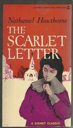
CP650, 75¢, 1974.
CQ910, 95¢, 1976.
CY1067, $1.25, 1977.
CW1188, $1.50, 1979.
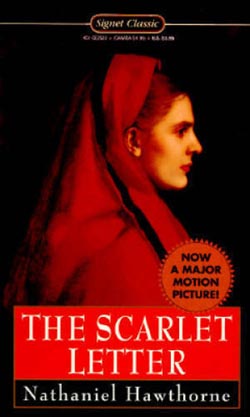
70s rebranding of the 1959 cover. As with many of the other Signet launch titles thus far, this has some graphic charm but as an illustration is… not great. (Pop quiz, kids: what’s missing from this picture of Hester? Hint: it has to do with her clothes, which, while we’re on the subject, are not supposed to be purple.) As usual, the illustration had to be recreated after the first print run, seen at the top of this post. (First edition points: her index finger is extended; her hair does not show inside the “R” of “LETTER”).
The introduction by Leo Marx is very nicely done and would be a fine handrail for a standard high school reading of the book, though it assumes the reader knows the entire plot already and doesn’t mind it spoiled. It really ought to be an afterword.
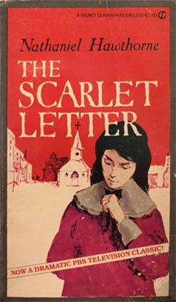
CW1232, $1.50, 1979.
CE1431, $1.75, 1981.
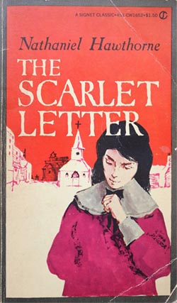
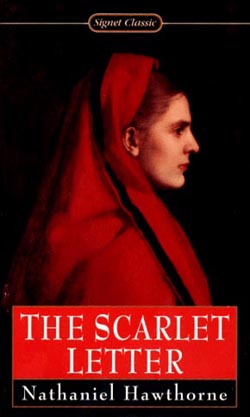
CW1652, $1.50, 1982? (price drop!)
Five years later and finally someone notices that they forgot to remove “A SIGNET CLASSIC” from the bottom when they added it at the top. Meanwhile, someone from PBS apparently has lunch with someone from Signet and this banner ends up getting slapped on some copies. (Sounds like the TV version may actually have been pretty good. It’s not available online.)
CW1652, $1.50, 1983?
CE2350, $1.75, 1988?
CE2522, $1.95 (later $2.25), 1991?
The 80s revamp, starring Mrs. Elizabeth Freake. I generally like the 80s covers, but this one doesn’t quite satisfy. Yes, the painting offers a sense of authenticity and touches on several of the keywords, and I do enjoy the weight and mystery that the dark background puts across. But there’s no getting around the uncanny awkwardness of the early American style, which ends up being the dominant impression. Sure, Hawthorne writes about the Puritans with an eye to their uncanniness, but ultimately he’s the painter of this book, not they, and his point is certainly not that they were haunted-house people with inscrutable ghost eyes. To the contrary.
Furthermore: this wealthy blond woman with her wealthy blond baby, in cheery unlettered clothing, is clearly not Hester Prynne. The best she can be is a gesture in the direction of the aisle in which you’ll find Hester Prynne, if we have any in stock.
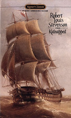
The title type seems to be a custom job, like the one on Kidnapped. The mildly gothic feeling is about right, but it seems like the treatment wasn’t designed around this image, which has crunched it unfortunately small and made the T-ligature look pretty weird.
CE2522, $2.95 (later $3.95), date unknown (prior to 1995!)
The 90s: now with new, less deformed Hester! There seems to be a misapprehension about what a “letter” is — some type of robe, maybe? — but at least this woman is plausible casting. Though, honestly, I don’t buy it: Hester is all feeling, whereas this woman has the vacant look of a professional model posed and painted by a technician with no real dramatic sense. The 19th century was rife with those guys.
What painter am I panning here? Good question! Signet doesn’t identify the image, but I found it: this is Fabiola by Jean-Jacques Henner (1829-1905).
(Or so says “Superstock,” anyway. I usually like to get a more authoritative source than that, but this particular painting is in private hands and very poorly documented online. Complicating matters is the fact that not only did this artist churn out year after year of variations on the same subject, one of them actually became a sort of folk icon and was copied by countless amateurs. It turns out the world is absolutely swimming in Fabiolas a la Henner. Choose wisely!)
Jean-Jacques Henner should feel free to take this as a compliment: I think his painting from 120 years ago is too modern and photo-realistic and slick for this book. Oh well.
On the subject of oh well: title typeface is Charlemagne; author typeface is Berkeley Old Style.
(The major motion picture being touted is of course the 1995 Demi Moore version.)
2608, $3.95, 1999.
New introduction by Brenda Wineapple.
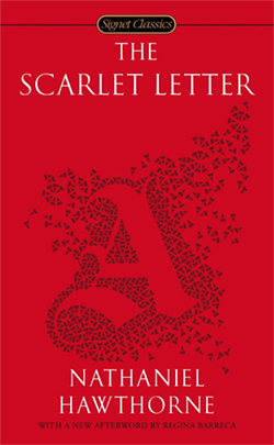
3135, $3.95, 2009.
The 21st century pounces. No more people, no more history; no more time, no more place. Never again! From here on out it’s just design, baby! Perfectly smooth and clean and empty, to suit your perfectly smooth and clean and empty lifestyle. We know what the customer wants: a rectangle that they can sort into a rainbow with their other rectangles, on their rectangle-shelf.
As for the actual design: it’s the easy way out, but I’m sort of relieved they finally got around to it. I’m not sure why it’s butterflying together out of little fragments (or are those supposed to be a digital-age take on the cracked surface of an ancient leather-bound volume?) and I don’t think it’s quite right by Hawthorne for it to be an asymmetrical blackletter character. But all in all: yeah, a big red A. You got it.
(Note that at some point they squeezed an “s” into the logo cartouche and turned “Signet Classic” to “Signet Classics.” After 35 years. It probably ought to have been that way all along.)
New afterword by Regina Barreca. Typeface is Garamond.
3135, $4.95, 2021
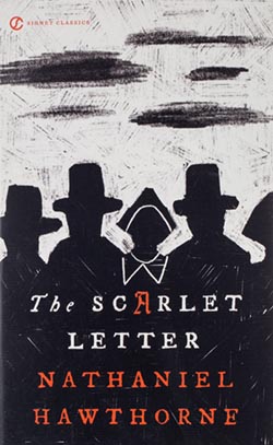
Oh-ho! What’s this? The 2020s covers have begun to arrive!
It turns out these are momentous times for the Signet Classics. The catalog has been culled — both Kidnapped and The Return of the Native have gone out of print since I wrote about them — and the remaining titles are apparently being given makeovers to try to actually meet the market.
Both this one and the one for Animal Farm (see below for update) are by Kaitlin Kall. I can and will snark at these covers in a minute, but there’s no denying that they’re far more suave and graphically intelligent than the 2008-9 versions were. Those looked like someone cranked them out in 30 minutes apiece in Photoshop and their editor said “fine.” These look like they went through an actual design process, over a couple days, with thoughts and discussion and revision and an eye for balance, impact, etc. Way to go!
And, hey, look up in the corner! They’ve re-instituted the 70s logo after 40 long years in exile. I entirely endorse that choice, and I feel almost moved by it. It’s incredibly rare for a brand to simply bring back something old: not self-consciously milk it for nostalgia, or make a big defensive show of “updating” it, just put it back to work because it was perfectly good and still is. Taste is not actually a forward march, and it’s okay to acknowledge that! Wow! What a great feeling.
[Edit: Oh, I guess that logo had still been hanging out on the spine this whole time. I forgot about that. Okay, nevermind. Not a Christmas miracle after all.]
As for the cover: the A in the title becoming the A on Hester’s chest is such a natural conceit that I’m surprised I’ve never seen it done before, so kudos to Kaitlin. But then the rest, sigh, is a wishful lie. That The Scarlet Letter is actually primitivo brutale, an ominous crayon drawing by a child who saw a Babadook. We live in a bipolar time where our entertainments are alternately primal horrors or infinite digital escapes. Nobody cares about mere passion anymore; nobody even really believes in the possibility. Everything’s either the fucking red pill or the blue pill. The Scarlet Letter probably falls on the dark side of center, right? So hooray, that’s a green light: go ahead and make it be a demon-scratched totem from a pre-civilized culture!
(Probably the actual idea is supposed to be that 17th-century America was a rough-hewn society, and that the novel is about the uneasy relationship between human ideals and the untamed moral wilderness. But look at those faceless silhouettes! Look at the corroded text! I’m not imagining this.)
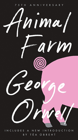
Meanwhile it turns out that Animal Farm is chick lit! Who knew? Adorbs.
Of course, Kaitlin had her reasons. Like I said, I have to grant these covers their professionalism. But the game is unabashedly about selling pigs in pokes; it really doesn’t matter what’s actually between the covers, or whether the buyer wants it: the poke is the product. And the customer basically knows it! We enter this contract willingly.
It’s like the old saying: “a book sucks but not gonna lie its cover lowkey slaps.”