Nikolai Leskov (1831–1895)
The Enchanted Wanderer and Other Stories (1865–1887)
(selected and) translated by Richard Pevear and Larissa Volokhonsky (2013)
Roll 36:
990: Nikolai Leskov. Under which there is only a single entry:
991: Tales
The recent Vintage Classics edition happens to be the longest and most inclusive Leskov collection ever assembled. Upon learning that this was my next assignment, I strolled to a local bookstore and bought it.
Here’s my review:
The very slightly rough finish of the cover’s paper stock is a great tactile pleasure. It somehow perfectly complements the particular thickness and heft of the book, which is slightly denser than the average paperback. Furthermore, the edges of the spine have an excellent sturdy sharpness. The book is thoroughly satisfying to the touch. For the year that I spent inching my way through this volume’s 576 pages, I never stopped enjoying the sensation of holding it in my hand.
Naturally, it feels best when it’s closed.
It was hard to leverage the tactile pleasure into enthusiasm for the reading. Flopping the book open to reveal its rather thin, cheap pages and struggling to attend to its text always felt like a betrayal of my happy relationship with its sculptural qualities. Must I ruin everything for myself? Why couldn’t I just enjoy this rectangle for its excellent tactility? Why couldn’t I simply let it be the object it was born to be?
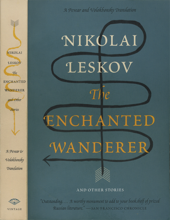
Well, because it was in fact born to be a book, and to be read. It isn’t my fault that the outside isn’t spiritually of a piece with the inside. That’s squarely on the heads of the publisher and star cover designer Peter Mendelsund. The attractive cover is a lie, and a deliberate one. Albeit perhaps only subconsciously.
What can I possibly mean by a “subconsciously deliberate” lie? I mean the lie of design as a whole, so I guess the time has come to release some of my long-deferred ranting about design.
What makes a designer tick is the thrill of converting what is into what is splendid. This purports to be cultural altruism, as though designers were the civic beautification committee, serving the populace, making the world a more hospitable place. But usually the only thing they’re really serving is an addiction to splendidness, and their only compass is whether they’ve gotten their fix.
Designers pride themselves on their ability to parse everything into a fashionable form. To them, this feels innocent: “it’s only interpretation,” they think, “not interference.” The thing-itself after all remains pure; they’re simply housing it, and with their finest craftsmanship: what could be more respectful? A conscientious cover designer goes in search of a thing that he thinks is more honorable than mere marketing: a real perspective, a legitimate standpoint from which the material can be flattened into something modish and sleek.
But rather than being more honorable, this is actually far more insidious than mere marketing, because interpretation is interference. Parsing is in fact the most intrusive possible act, since it impinges not on the work (which, yes, is durable), but on the reader. The designer who selects a “point of view” and asserts it with graphic force is stealing the reader’s freedom. That this point of view is usually chosen solely for its potential to accommodate the designer’s compulsion for splendidness, to rationalize that same old obsessive modishness and sleekness, only adds insult to the injury.
And it is a real injury, because a cover cannot be denied. It is psychologically impossible to simply disregard a cover. A book is like any other inanimate object: it is its appearance.
I have no reservations about saying that covers have always had a tremendous impact on my experiences of reading, comparable to the impact that the music on the radio has on my experiences of car trips. For a time in my life I was driven by embarrassment to delude myself that covers were “just covers,” but in truth, the outward appearance of a book has always been at the emotional root of every reading experience. Reading is a devotional process, and the book is the icon.
Peter Mendelsund has certainly done many eye-catching covers, but taken as a whole his work seems to me thoroughly overconceptualized, clever-clever, and not to be trusted, especially not with established works. I utterly hate his Joyce covers. Every time I see the new Ulysses on a bookstore shelf, it pains me to think that this is now the standard American edition, and that anyone who buys and reads it for the first time will be buying and reading The Peter Mendelsund Show, with its very specific and banal ideas flamboyantly interposed. I would be embarrassed to think of the ghost of James Joyce finding out about these designs, which seems to me a pretty good criterion for determining whether a cover is in good taste.
That Mendelsund has written a heavily-designed book about the act of reading just seems to me like a symptom of the reflexive self-attention that subsumes real feeling. This guy doesn’t just like reading, says the book, he knows reading, and wants to explain it to you. That mindset seems to me a liability for a visual artist.
His Leskov cover is a close relative to the Joyce covers. The “point of view” seems to be: Leskov’s stories are eccentric, human, meandering. They run insouciant rings around their own 19th-century mantle of dignity. The arrow of narrative (a fletched arrow with folktale connotations, subtly bringing out the romance of “enchanted” and “wanderer”) defies all expectation and asserts its own hand-drawn personality with deadpan magnetism. Formal inventiveness, wit and whimsy, in tensile balance with an underlying classical elegance. Surely herein is something intellectually stimulating, wry, clever, hearty, a bit mysterious, and above all timely and chic. Naturally. I mean just look at it; look at the colors, look at the post-modern winking! And it’s by star designer Peter Mendelsund!
From the publisher’s copy on the back: “…seventeen tales, some rooted in oral tradition, others cast as sophisticated anecdotes… Innovative in form and rich in wordplay, the narratives unfurl in startlingly modern ways.”
Now, these statements are all technically true (though only a few of the stories have wordplay, and “startlingly modern” is highly debatable)… but note that they are essentially analytical, academic types of claims, not claims about experiential value. “These are things that are true of the book.” But what is the book like? The marketing copy doesn’t venture to say.
The deliberate lie of the cover is that it relates exclusively to these conceptual claims about the work and not to the work itself. Mendelsund renders these analytic observations into a slick aesthetic presentation, with a generic “cultured bibliophile” flavor, deriving nothing from the flavor of reading the actual stories. The cover, like so many covers, is actually selling the cocktail conversation about Leskov, not Leskov himself.
Having cracked the lovely shell, opened the book and read it, I now know there was a reason for this! Leskov’s work is very much from long ago and far away. But being literate enough to know and talk about Leskov is timeless. Naturally they’re going to pitch the latter over the former. Here’s the one critical blurb on the front cover of the paperback, from the San Francisco Chronicle: “Outstanding… A worthy monument to add to your bookshelf of prized Russian literature.”
Exactly! Just think of it, on your bookshelf! Just think how it will look, being there, possessed and mastered by you. Just think how you will prize it! A worthy monument indeed.
I however alternated prizing it, as described above, with reading it, as described below.
This is the first Pevear and Volokhonsky joint I’ve visited, and I’m sorely disappointed. For the past 15 years, Barnes & Noble & Friends have been telling me in no uncertain terms that P+V are a superstar dream team who have valiantly reclaimed Russian literature from fusty old Constance “Public Domain” Garnett and given it back its vigor, its precision, its spice, its bite. “Not your grandma’s Dosteyevsky!” It never occurred to me to be cynical until now.
The translators’ note begins: “Leskov is notoriously difficult to translate.” It then lays out P&V’s approach to the problem with allusion to a quote by Jacques Maritain:
“The first duty of a translator … is always to respect the word itself that the author has used … and to seek its exact equivalent.” [Maritain] was not advocating a slavish literalism; he was defending the full meaning, meaning also the way of meaning, of the original.
I don’t want to get too deeply into the philosophy of translation, but the above seems like a terrible, gaping fallacy. Aspiring to convey “the full meaning, meaning also the way of meaning” is a vague and lovely ideal that bears no necessary relationship to the much more dubious ideal of seeking “exact equivalents” to individual words. By implying that these two attitudes are intuitively linked, P&V reveal the very bias they are trying to reassure us against.
But you don’t have to take my word for it! Let’s read some Leskov. This excerpt comes from early on in the very long title story, The Enchanted Wanderer (or Очарованный странник, if you insist). The story is a picaresque narrated by, and very much in the voice of, its supremely earthy protagonist. He is among other things a master of horses; here he is setting the stage for recounting a carriage accident:
У него дышловики были сильные и опористые: могли так спускать, что просто хвостом на землю садились, но один из них, подлец, с астрономией был — как только его сильно потянешь, он сейчас голову кверху дерет и прах его знает куда на небо созерцает. Эти астрономы в корню — нет их хуже, а особенно в дышле они самые опасные, за конем с такою повадкою форейтор завсегда смотри, потому что астроном сам не зрит, как тычет ногами, и невесть куда попадает.
David Magarshack (1961, available from Modern Library):
My father’s shaft horses were strong and very reliable when it came to getting a firm foothold on the road: they had a way of taking the carriage down by just sitting on their tails in the roadway. One of them, however, was a real villain of a horse with a predilection for astronomy: it was enough for his reins to be pulled in with some force for him to throw up his head at once, and confound his eyes if he wouldn’t start scanning the skies! These astronomers are truly the worst kind of horses you can get, and especially between the shafts they are a real danger! An outrider must be constantly on his guard against a horse with such a habit, for an astronomer, of course, does not look where he’s putting his feet down and he usually gets himself and everybody else in a terrible mess.
Ian Dreiblatt (2012, Melville House):
[My father’s] shaft horses were strong and reliable; they had a way of easing the cart down an incline by sitting on their tails in the middle of the road. But one of them was a real blackguard, disposed to astronomy: just rein him in for a minute and he’d throw his head back, and, well bless his soul, cast his gaze to the heavens like he was scanning the stars! These astronomers! Basically, there’s nothing worse, and especially between the drawbars, that’s where they’re most dangerous. An outrider’s got to keep a close eye on an astronomer horse: on their own they can barely put one foot in front of the other, and they’re always causing all kinds of problems.
And finally, Pevear and Volokhonsky (2013):
[My father’s] shaft horses were strong and reliable: they could make the descent simply by sitting on their tails, but one of them, the scoundrel, was into astronomy — you only have to rein him in hard, and straightaway he throws his head up and starts contemplating deuce knows what in the sky. There’s no worse harness horses than these astronomers — and they’re most dangerous especially between the shafts, a postillion always has to watch out for horses with that habit, because an astronomer doesn’t see where he puts his feet, and who knows where they’ll land.
This excerpt should make apparent why Leskov is so difficult to translate. The voice and spirit of the tale-teller are absolutely of the essence — they are, in fact, the whole reason for the story — but those things are inextricably caught up in nuances of idiom and dialect that can have no exact equivalents in other languages.
The soul of this particular excerpt is not so much in the joke itself (of calling a horse who looks upward an “astronomer”) as in the author’s observation of such a joke in its natural habitat, the affectionate ethnography implicit in having rendered this particular flavor of raconteurism into print. This, it seems to me, is Leskov’s thing: a journalistic sensitivity to modes, tones, cadences, attitudes of speech. The stories are all about character types, and the principal artistic offering is their personal presence.
You may well feel that the P&V translation is the best of the three above… but what’s important to acknowledge is that it is still no good. There is no heart beating in this English, only in the Russian that it points back to.
Which curse does he use? “Confound his eyes?” “Bless his soul?” “Deuce knows what?” The particular flavor of the particular curse is everything to this story; such stuff makes up the essence of Leskov’s work! And yet there is no right answer, because he uses none of these, he uses some Russian colloquialism, which carries some kind of real living juice that we can only guess at. The “juice” in each of these translations is just borrowed junk that can’t be invested in; it doesn’t come from the character or the author. So the whole thing falls down dead, the breath of life sucked out of it.
The best a translator could do would be to take on Leskov’s entire creative task again, reimagining the character and his mode of expression from the ground up. That of course couldn’t be a very strict translation, but it might at least be readable. Dreiblatt, above, dared to venture a very little of this (“These astronomers! Basically, there’s nothing worse”), but that kind of half-measure ends up frustrating more than satisfying. In any case, Pevear and Volokhonsky, with their pride in fidelity above all, are absolutely not the people for this job, and I have to wonder what job they are the people for.
Upon googling I was pleased to find that outside the walls of Barnes & Noble, there are indeed other P&V skeptics. This page provided what seems to me a nicely illustrative case, taken from their translation of Doctor Zhivago. A critic (Donald Rayfield) complained that their word-for-word attitude had created some clumsy and lifeless English, and gave as example the line of dialogue “‘Ah, spit on the rugs and china, let it all perish.’” Pevear wrote back:
The Russian could be paraphrased as ‘don’t bother about the carpets’, as Rayfield suggests, but why give up such an expressive phrase as ‘spit on’, which also happens to be what Pasternak wrote? The norms of English surely don’t call for such levelling.
Surely I don’t need to explain what’s so stubborn and absurd about this attitude, which is in evidence everywhere in the text. P&V write not in real English but in a make-believe Englishized-Russian, for make-believe Englishized-Russian readers, and apparently are genuinely unaware of the difference. The difference is everything! Especially in this work.
Reading it was like squinting. I was always trying to make out what it had once been and what that might have been worth. That’s not what pleasurable reading is like.
But I think that’s only half to do with the language divide. The other half is the historical and cultural divide. After having read about half the stories, I came across some reference to Leskov that said he was like a Russian Mark Twain. This seemed extremely apt and helped me a great deal, both in imagining what kind of flavor might be hiding behind the text, and in forgiving myself for what I couldn’t decipher. Can you imagine trying to convey the juice of Mark Twain, the particular savor and pungency of that world, to someone from deep China with only the very roughest impression of America? That’s who I was to Leskov. He was regaling me in some way that was surely full of the smells of smoke and hay and wood, but only if you already have the context to plug in to. To me it was the sound of foreignness celebrating itself with a grin and a knowing look, in all its incommunicable subtleties.
The reading inspired morbid thoughts about the transience of all cultural context. The nuances that make life feel like life are the very first thing to go. In another century, the charms of Mark Twain may well become completely inaccessible. We forget the realities of our own pasts, of the feelings we’ve already experienced; so how can we ever hope to feel the ones we haven’t? The “historical record” isn’t even good enough for us to fully piece together what it must have really felt like to be alive only a few decades ago in our own country. At any further remove, the question of what it was like to live in a given culture seems to me shrouded in permanent and near-complete darkness. (This is why, as I’ve been telling people, I would really love to see a fully-inhabited HBO-style show about ancient Uruk and the bread economy, just for the thrill of seeing the question answered at all. It wouldn’t have to be even remotely accurate to give that rush of exploring completely new empathetic possibilities.)
Leskov knew and loved what it was like to be alive in mid-19th-century Russia. He wrote exactly of and within those nuances of “what things are like” that probably felt most vital and alive in the moment, the ones that long ago withered and died and can’t be recovered. The stories act as though they’re about human universals, but they’re really only about human universals as manifested in this very particular milieu, a milieu in which Leskov spent his whole life and nobody alive today has spent even a minute. (But at least people who speak Russian have a tradition of looking back on it, as we Americans do of imagining that we “get” what it was like to whitewash a fence.)
So my experience of Leskov was mostly of disconnect. At the very start I was enjoying the rich sense of foreign cuisine and just the simple pleasure of reading any new thing. But after 100-some pages the novelty mostly wore off. After that, I occasionally got a touch of enjoyment from some facet of what I laboriously construed the stories to probably be, but never from the text itself, never from the stories as they unfolded under their own steam.
Then in the last week of reading I suddenly had a sense of touching back down, becoming attuned to some of Leskov’s mayflies after all. In part I think this was my own personal progress; the year spent with Leskov on my nightstand happened to be a year of changing outlook, for me, and it’s possible that only at the end of that year had I opened my windows wide enough to smell 150-year-old cut grass. In part I think it was Leskov’s progress; the stories were in chronological order, and I think the later ones really were more bold in their casualness, and more emotionally open. And maybe it was just chance. Anyway, I ended on a pretty good note.
I was going to run down the stories and point out the interesting ones but I think we’re good here.
Basically, if you are intrigued by Russia and Russianness, already have a way of going there in your imagination, any of these stories might well be deeply appealing to you. But if you are like me and are just reading to encounter things and hear what they have to say about themselves, you will be left on the outside. This is why Leskov remains, and surely will always remain, lesser-known outside of Russia. These things usually happen for a reason.
Leskov backward is Voksel. I have had this thought pretty much every time I saw this book for the past year, but this is the first time I am acknowledging it to myself.
I’d like to fully sort out my thoughts on both the cover-art and translation issues, but that’s too difficult a task on a Monday morning crowded with other stuff. But I would like to ask: Okay, so what should the cover art have looked like? A taciturn monochrome? An inoffensively classy period painting? I can see why you hate the Joyce cover, but this looks like a very nice (and, okay, handsomely prestigious) thing to own, and what’s so terrible about that?
After about 10 minutes of Google imaging, I propose this 1871 painting, which could easily be cropped so as to be genuinely attractive and engaging, and which to my eye gets across the tone, and a hint of the substance, all while being genuinely of the time and place. If the painting doesn’t appeal to you, the work probably won’t either, and vice versa. Everything’s above board.