by Robertson Davies
Fifth Business (1970)
The Manticore (1972)
World of Wonders (1975)
Fifth Business
Taking a break between the heftier tasks of my Western Canon reading with something pleasant that goes down smooth. This presented itself for entirely circumstantial reasons – it had just been given to Beth as a gift and was on the kitchen table – but turned out to be perfect.
I had read nothing by Davies and had heard his name but not these titles, even though Fifth Business, I now see, is fairly prominent. I won’t say anything about what these books are about because my great delight in reading them has been to have absolutely no idea what I’m reading, and I wish the same to you.
Reading a lot of chew-before-swallowing dense stuff, I had forgotten what it was like to drink a tall cool glass of sheer storytelling. I don’t think this could have been more refreshing. And that’s not to say it’s frivolous; there’s an intelligence behind it – or rather in it, present on the surface – that keeps it feeling wholesome and worthy. A tall cool glass of fresh tomato juice. Or something Canadian that’s more apropos. My attention was kept wholly, but not because it was tied up in contemplating the mild symbolical underworld of the book – simply because it was being told a story, and with great ease. The book is a page-turner despite having no clear goal and seeming essentially like an improvisation. In fact it was exactly that improvisatory, story-spinner quality that drew me onward; the rhythmical alternation of exposition with development drove continuously like a skipping stone. It really hardly mattered what the book was about; stories are themselves interesting. This is, not coincidentally, the meaning of the book itself, more or less: life is a story, and stories are marvelous. Fifth Business is not the only book I’ve read with that spirit and message, but it was the book where the combined skill and attitude of the author seemed most appropriate to conveying it. In a very mild, good-natured, Canadian way.
I’ve used the word “mild” a couple times here, but “congenial” is the word that kept coming to mind while I was reading. Davies is professorial in the coziest way; the text is as thoughtful as intelligent dinner-table conversation, and underneath it are some things perhaps a bit more thoughtful yet, but we are only exposed to that layer in deft, shallow swoops. This feels like both a form of mystery and a form of, for want of a better word, good manners.
The Manticore
Can’t be as wholeheartedly enthusiastic about this one, even though I did basically enjoy it. Our eccentric professor author indulges at greater length his own particular blend of theological who’s-to-say and imprecise glancing back and forth from real life to myth, under the all-too-explicitly-stated auspices of Jungian analysis. The whole thing careens unnervingly toward pedantic flakiness several times and there are serious lapses in “show-don’t-tell.” Furthermore the elegant relationship between form and content in the previous book now becomes a liability – it’s remarkably easy to point out the ways that a man’s real life reveals eternal mythic themes when that man is in a book that you are writing. Also, while the first book packaged its endless stream of narrative into a fairly minimal bookend device, this one keeps cheerfully jumping in and out of its devices as though it’s perfectly likely that someone might, if prompted, actually speak or write a long, long, long book-like narrative. That might be part of the point but I wish it hadn’t been. Still and all, the strengths of the previous book are all here, in company with the new weaknesses, and much of it is still excellently readable. I was even willing to humor the man his Jungian talk, for the most part, so long as he kept it lively. Which he didn’t always.
This is a sequel in the Back to the Future Part II vein; it riffs on the preceding book by running in almost-but-not-quite parallel to its events. That in itself is fun, and is a satisfying extension of the best aspects of the first book – I coasted through the lesser passages on the momentum of my satisfaction with the overall conception.
World of Wonders
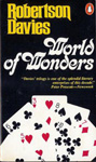
Even the overall conception falters a few times on the way to the finish line. The idea that a mystery from the first book is left hanging(ish) through to the end of the third seems more like a nagging back-burner responsibility for the author rather than any kind of natural motivating force. This book is also a Back to the Future Part II on the first book (rather than a Back to the Future Part III), even more directly so, and it mostly sidesteps the second one. All three main narratives are in parallel. This time the telling is staged sort of as an after-party, where the characters, who no longer seem to have any capacity to be involved in real conflict, chat it up amiably about the past. The flimsy pretexts for the storytelling are again subjected to too much attention, and the whole thing feels phonified. A bit like Back to the Future Part II. And again, maybe that’s part of the point. Anyway, the storytelling itself that makes up the bulk of the book is still delightful as ever. The Dickensian depictions of various antiquated forms of showbiz (I’m not really giving anything away there – look at the covers!) are really enthralling. Then at the end an unimpressive loose-end-tying ceremony is tacked on, at which point I was perfectly ready to go home.
But my having happily read all 820 pages in 11 days – 11 busy days – has to be taken as some kind of recommendation.
I suspect I will begin to forget the entire contents rather quickly now. Fun while they lasted though. I’ll certainly remember the tone and flavor of it – or the flavor of the reading experience, really, which was my real pleasure here, above and beyond the book. After some time has passed I’ll be pleased to pick up another by Robertson Davies, who seems like he was a right character, with an excellent flair for drama and storytelling, if not necessarily novels per se.
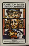
But not right now. Back to the Western Canon. By the way, this is being reported entirely out of order. I actually read The Deptford Trilogy this month, whereas I’m many months (I think four books?) behind in posting about the Western Canon reading. Should get around to it soon.
Before I go, let’s take an exhaustive look at the covers. That sounds fun, right?

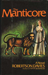
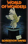
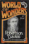
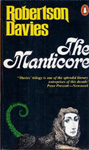
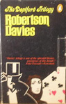
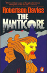
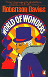
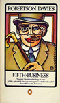
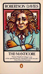
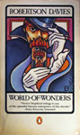
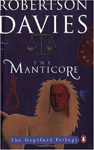
First editions, released several years apart. World of Wonders seems to have had a different cover in the US, seen at right. The orange lettering seems to be a running theme even though these are otherwise unrelated. Fifth Business is certainly unattractive; I don’t mind the concept, vague as it is, but couldn’t it have been made to look at all good? The Manticore has a “gimme” cover design built in – this image is described in the text, functions metaphorically, and explains the title. So of course pretty much every edition actually shows a manticore on the cover. The green light is a little unnecessarily creepy. The Canadian World of Wonders, with its mechanical dove (? or is it a dove made out of pocket-knives?), is superficially surrealist in a way that has more to do with 1975 than with the book. Art by David Craig. The US edition is a dull attempt at period, which makes sense enough for the content but would probably make the book feel more boring than it is. At least to me. The face in the middle is unhelpful. Realistic character faces are generally much too leading; if they’re there, we’re going to believe in them. If that’s what’s intended, I’m all for it, but it’s rarely what’s intended. Outside children’s books.
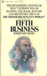
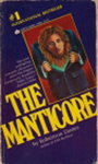
An early Signet edition. As Beth said, the Signets of that era all look the same, and having read the book I can tell you that this cover is laughable. Not only is it cliche, but it runs almost directly against the spirit of the story; in fact the story rather specifically calls this sort of hero-centrism into question. This particular formula lives on in movie posters of the Drew Struzan variety, or at least it did well into the 90s. On the other hand the cliche allows the cover to be easily ignored; reading a Signet is psychologically as close as possible to reading a stripped book.
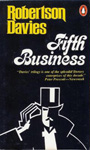
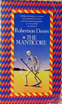
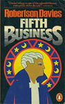
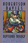
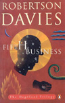
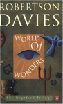
The first matching set, paperbacks from the mid-70s. At right is a slipcase box in which they could be bought together. Each has one clear iconic image, more decorative than illustrative, and heavy emphasis on the type design. I like all of that. Very 70s choices in the typefaces but I enjoy them and don’t think they detract at all. Also, it’s kind of cool that they chose to have the styles of the three images be different from one another.
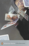
The one on the right I know is the 70s UK paperback, published by W.H. Allen; I’m not sure when this Manticore is from so I’m sticking it here. The Manticore is badly laid out, has bad color design, and an ugly, off-putting illustration. World of Wonders is really crazy – that sculpted head, if I understand what I’m seeing, is an object that figures in Fifth Business and isn’t really mentioned in World of Wonders, and over its shoulder seems to be a little manticore face, also not mentioned in World of Wonders. I can’t tell what that is over the other shoulder. Anyway, I don’t think this illustrator read the book. Furthermore, this cover is totally freaky and looks like it’s going to be about the occult, or lost treasure, or ideally both.
These are, I believe, W.H. Allen hardcover editions from the late 70s. These are much too trippy/Dali for almost any book that isn’t extreme fantasy, and they give very much the wrong impression. The artist seems to have chosen the skeleton, which if I recall is just a dream image mentioned in passing, because it suited his style rather than because it suited the cover. Can’t find the Fifth Business equivalent.
Circa 1980. These seem to have inherited some details from the prior Penguin set, but of course the overall effect is very very different. These have not dated well, which is not to say they’re not still appealing in their own way; but they would be a serious distraction from the text, putting a very particular “period” slant on it. I was actually struck by how undated the books felt in the reading; this kind of Yellow Submarine meets Pac-Man thing would sour that. Also – even at the time, I imagine – these play up the childish, fanciful side of things a bit too much. The books aren’t as candy-like as this.
1983 or so they got these new covers by Anne “Bascove” Bascove, whose style is very familiar, though I’m not sure whether I’ve actually been seeing her work for years, or whether she’s just one of a school of illustrators that I blend together. Or whether she is the original and has spawned a school of imitators. Anyway, someone at Penguin seems to have felt that she had nailed the Robertson Davies vibe, because she did the first edition covers for his subsequent books, and for the reissues of pretty much his entire output. I tend to agree; the balance between children’s-book mystery and dignity (and what I might call “business casual” sensuality – you know, like in coffee shops and Barnes & Noble) is a fine match for Davies’ style. The designs are also sensitive to the content; they are intelligent – the surreal touches correspond to the meanings of the books, rather than to details plucked for their design value – and generous to the reader in that they neither give away anything nor pose real riddles. They are bold as designs and images, and aesthetically astute, and yet extremely soft-spoken in terms of pre-emptive meaning. The more I think about it the more impressed I am with what these accomplish.

Redesigns. I can’t figure out how these relate chronologically to the versions above; can’t find the World of Wonders equivalent, either. These look nice enough but I think the previous editions are better overall; the type design on the author’s name isn’t actually ugly here but it takes up more attention than it’s worth, as do the borders. The gray editions were a bit more to the point, to my eye. These read as “deluxe” editions of some kind, and maybe that’s what they are.

Redo of the Bascove covers circa 1992, with a new illustration for the combined edition. I know I shouldn’t like these as much, what with the addition of press quotes and the pointless boxes, but circa 1992 was a formative time for me in terms of book-browsing, book-purchasing, and book-cover-noticing, and these are very solidly of that time, design-wise, so I feel comfortable with them. They look the way that I expect books to look, still.
Mid-90s editions, from Australia I think, maybe UK too. As you can sort of see, these are designed to fit together somewhat, a secret surprise that I generally enjoy although in this case it doesn’t look like it would yield that much satisfaction. The conception here, of whimsical primitivistic iconographic “cuttings” at play in abstract art space, is standard fare for, among other soulful things, CDs sold at Starbucks, and generally annoys me. Unfortunately I have to concede that it’s more than appropriate here, and perhaps encapsulates everything I found tiresome in the latter two volumes. Had it had this cover maybe I wouldn’t even have liked the first volume as much. A little too conceptually exposed, just like the books.
The combined edition at right isn’t part of this set but it’s more or less contemporary with it. I don’t mind that cover at all; I think a little marble and quasi-heraldic pomp is suitably noncomittal (it goes without saying that 800 pages deserves pomp) and a good enough backdrop for the book itself, which is earthy enough to stand out against it but fantastical enough to sympathize with it.


Here are a few stand-alone editions of Fifth Business. The first one here (and its direct descendant in the middle, soon superceded by a new original painting, see below) is the only example in this whole survey of the pre-existing-painting school of book cover design. I love original book cover illustrations and designs, so I feel odd saying this, but I find stock art covers, when they’re well-chosen, to be extremely effective. Since one knows that the image is not an intentional illustration of the book, one is more able to carry its aesthetic world over to the book as much or as little as one chooses; it prettifies and adds to the book as a cover should without inserting its nose too far into the author’s business, which as I keep saying is always a risk with covers. On the other hand stock art covers can be, and often are, too timid. I think this one is. It’s a Canadian town, no doubt, but that’s about it, and this is a particularly unassertive painting to begin with. While we’re on the subject, I think that the people at the Modern Library Classics series have really mastered the art of the stock image cover design. Gabrielle Bordwin, I salute you.
The third version here is a UK cover very much in keeping with the current ones below; my comments there.

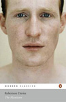
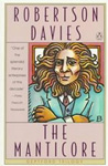
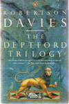
Current UK editions. These are stylish in themselves but the sense of obliqueness, and of chill, is unsuited to the spirit of the books. Also, the relevance of the first one to the content of the book would not be apparent to the reader for a long time, which to my mind is a mistake; the cover always comes first for a reader and it should be designed to function that way. For the designer to intentionally throw down his own enigma at the outset is presumptuous overreaching; things like that make me feel quietly aware, while reading, that I am excluded from the club of those who have finished the book and actually know what the cover means, and that sense of exclusion can poison the reading experience. The Manticore has a face, which as I’ve said is generally a bad idea, but in this case it’s clear that this photograph of a face is not meant to actually be the character; it’s a post-post-modern (?) reference to the idea of the character, and to the idea of people in general, and their faces. Well, that’s not helpful either.

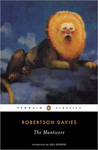
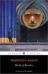
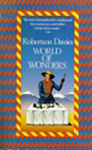
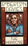
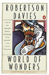
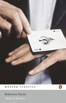
Current US editions. Lest it be said that I think book covers are getting worse, I like these a lot and I admire the choice to commission this particular painter because the style seems very nicely matched to the books. However, the spookiness factor is way, way too high on that first one. I like that this manticore is clearly a symbolic, expressionist manticore. And the supersized head on World of Wonders creates a nice atmosphere like a children’s book, though it might not be as obvious to a reader that this too is expressionistic and there will not be any supersized head in the story.
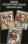
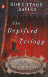
The combined edition here at right is what I actually held in my hands and read. The artist has done similar paintings for current editions of the two other “Trilogies” by Davies. Having read the book I can say that this (and his style in general) is a touch too shadow-and-sparkle mysterious for this book written in, as Davies calls it, “The Plain Style.” But the idea of an empty stage with lush curtains is an excellent cover concept, totally suited to the subject matter, and I think its perpetually unresolved sense of foreboding was helpful in pushing me forward as I read. So maybe it’s actually a good thing that the cover is more mysterious than the book; at any rate it accomplishes something. Unfortunately the type design is cloddish and seriously mars the atmosphere. But all in all I was pleased holding the book, and pleased by how it looked and what it seemed to promise. Maybe something a little more childish than what it actually contained.