Monthly Archives: July 2005

July 29, 2005

Computer Games: The ideal labyrinth

This entry develops on an idea from this entry.

You’ve heard this one before:

Reader, suppose you were an idiot. And suppose you were a member of Congress. But I repeat myself.

-Mark Twain

Why didn’t Twain just say “All members of Congress are idiots”? Because, of course, that wouldn’t have been clever. And yet what he says is essentially equivalent in meaning. Only the most trivial logic is necessary to determine that he has, in fact, said that all members of Congress are idiots. If B = A implies B = C, then A = C. (B is “you,” A is “a member of Congress” and C is “an idiot”) This is a close relative of the old “transitive property” from middle school math: If A = B and B = C, then A = C. It’s not just math, it’s in our guts. Your subconscious can work this stuff out and chew gum at the same time.

The statement “Congress is made up of idiots” is not clever and the Twain quote is clever simply because the meaning of the Twain quote has been thinly disguised with a simple transitive property shuffling.* Twain of course wants us to get what he’s saying immediately, so it’s not really disguised. On the other hand, he doesn’t want us to get what he’s saying immediately immediately – he wants it to be clever.

This is what it means to say that one has to “get” a joke, whereas one hopefully doesn’t have to “get” a sentence. The “getting” is what makes the joke entertaining, as can easily be demonstrated by ruining jokes:

A guy walks into a bar with a 12-inch pianist and has it perform for the bartender. The bartender asks him where he got it. “Well,” he says, “I found a genie in a lamp and made a wish.” “You wished for a 12-inch pianist?” “No,” says the guy, “I wished for a 12-inch penis, but I guess the genie misheard me!”

The joke has been obliterated by turning the trivially indirect into the actually direct. Oblique = clever.

Jokes and witticisms are just an example of a general principle that I was going to call the “intransitive property” but that’s too stupid. Whatever its name should be, the principle is this: indirectness, even the most trivial indirectness, creates a powerful illusion of substance. The transitive property seems to suggest that the indirect can have an exact equivalent in the direct, but as far as the human response goes, the indirect is irreducible. When John Lennon sings “one and one and one is three,” he manages to surprise and amuse us with the profoundly obvious.

What does this have to do with computer games? Lots and lots. But one more concept first.

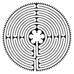
In current usage, a “labyrinth” is a single twisty path like this, with no branching. It might seem convoluted, but you can just follow it from beginning to end without any opportunity to go wrong.

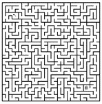
A “maze,” on the other hand, is a complicated map like this, with lots of branching. It offers the problem but hides the solution, and you have to work it out. It is, in short, a puzzle, and requires puzzle-solving thought.

Being at the beginning of a labyrinth is informationally equivalent to being at the end – unlike being at the beginning of a maze, you have nothing left to learn. All you have left to do is follow the path. And yet this “informational equivalence” does not detract from the fact that people find the experience of being in a labyrinth comparable to the experience of being in a maze. It feels somehow “puzzly.” It feels like you’re doing something, to walk a labyrinth. It’s fun, in a way that walking a long straight line isn’t.

You see what I’m saying. Just like with jokes, it is the convolutions that create the sensation of substance. A topographic analysis would suggest that a labyrinth goes nowhere, but the experience is different. The illusion of content is strong.

So, finally, to my point:

Computer adventure games are all about the problem of turning a story into a game. There are some fundamental, definitional incompatibilities between the two: stories progress of their own volition in a pre-determined direction (otherwise, they’re not stories); games progress due to a player in an undetermined direction (otherwise, they’re not games). The situation is more complicated than that (and I’ll write about it in more depth some other time), but for most designers, the basic problem is: how to block up a story so that it won’t “go” without a player, and/or how to limit or “fix” a game so that it goes somewhere in particular.

Common wisdom has it that adventure games usually solve this problem by filling the stories with “puzzles,” but I put it to you that adventure games aren’t full of puzzles; they’re really full of labyrinths: tasks that pose no actual challenge and nonetheless feel like meaningful participation. It’s actually a brilliant, elegant solution to the problem of making a fundamentally linear process (the telling of a story) reminiscent of an open-ended, non-linear one (the playing of a game): employing that strange principle of indirectness.

Real puzzles do appear in games, of course. Frequently (a little too frequently, if you ask me) a character will come across a door locked with a real puzzle; some kind of wire-routing puzzle or a combinatorial button-pushing puzzle, or something like that. Those are puzzles – you look at them and you know what you want to do but you don’t know how to do it until you’ve done some specialized thinking.

And I think it’s a clear indication of how little actual “puzzling” there is in games that these experiences stand out as blatantly self-contained. The bottom line is that posing a real, thought-worthy puzzle requires establishing a very rigorous set of abstract constraints. That’s why they don’t really mesh well with non-abstract stories and have to appear as puzzle locks, etc. (“This house was built by a crazy man who was obsessed with puzzles!” is a standard computer game cop-out.)

Labyrinths – fake puzzles, fake obstacles – are the real stuff of adventure games. Games are full of conversations where the interaction consists of clicking on every possible option. That’s not puzzle-solving, and it doesn’t take thought. Why do players put up with this? Because the player feels, however irrationally, that there’s a substantial difference between interactivity and non-interactivity – even trivial interactivity. Within limits, of course; if the same conversation menu were replaced with a single button called “next topic,” I think that would cross the line into tediousness for most players. There are lots of games that don’t quite pull it off, and their conversation menus do seem like mere tedium. The labyrinth is too reminiscent of a straight path. Adventure games, for the most part, have been exercises in the art of dressing up trivial interactivity to most effectively suggest meaningful interactivity.

Back when I played The Secret of Monkey Island (1990) – a real landmark in the history of that art, a triumph of deliberate, calculated obviousness – I only got “stuck” once, and that was because I overlooked a perfectly reasonable hotspot (clickable, active area) on my initial assessment of a room and then had to search absolutely everywhere until I found my oversight. But that was my slip-up, not theirs. The game carefully made it possible for me to be continuously progressing forward. At every obstacle, it indicated – gently, indirectly, but unambiguously – where to go next. And I wouldn’t have wanted it any other way.

I’m not at all saying that’s the best possible way for adventure games to work. I’m just saying that’s the way most games aspired to work, and we should acknowledge that we’re not talking about a puzzle-based experience; we’re talking about a peculiarly effective pseudo-puzzle experience. That’s an important distinction, because making a good game on that model means designing not a good maze but a good labyrinth.

What makes an ideal labyrinth? I’m not sure. It’s all tied up in there somewhere – the amount of trivial obliqueness that makes a joke funniest; the amount of superficial indirectness that makes a quip cleverest.

I worry that a lot of attempts to build story games in this tradition are doomed because the designers don’t recognize what kind of trick it is they’re trying to pull. In fact, I think it’s one of the causes of the death of that tradition that only a few designers really knew what the name of the game was. The others thought they were actually giving the player options and challenging him with puzzles. So, designers, listen: coaxing your player through a simple labyrinth is a legitimate game design strategy. Even if the players don’t think that’s what they want, they like it; it works. Start by admitting to yourself that that’s your dirty little secret, and then be intelligent about dressing it up and heightening the illusion. Monkey Island and its friends were all about dressing. They weren’t fundamentally about freedom or non-linearity or any of that; they lived off the potency of elegantly superficial gestures toward freedom and non-linearity.

Okay, that’s enough for now, but this topic stretches in many directions. More to come.

* Okay, obviously there are other reasons why Twain’s quote is clever. One is that he is employing and then betraying a stock rhetorical device (“suppose you were an X”), much in the manner of “Take my wife…please!” Another is that by placing “idiot” first, he actually whimsically suggests not that all members of Congress are idiots, but that all idiots are definitionally members of Congress – an absurdly unnecessary overstatement of a case that is already exaggerated. But the main crux of the cleverness is as argued above; namely, that it is oblique.

July 29, 2005

The Phantom of the Opera (1925/1929)

directed by Rupert Julian
screenplay by Elliott Clawson
after the novel Le Fantôme de l’Opéra (1910) by Gaston Leroux

79 min.

This movie has a complicated history in addition to having been a complicated collaboration, and the credits above don’t really do justice to any of that. But oh well. You can go read about it on one of the thousand “Phantom of the Opera” fan sites out there.

(1925/1929) because the original 1925 release of the movie was heavily reworked with new material for a re-release in 1929, and that’s the version that’s generally seen, sort of. It’s the version I saw last week, anyway. Sort of. Like I said, check your local library for details.

People say that this movie is still creepy, that it has remained effective as horror, etc. That’s sweet to say, but it’s misleading. To watch an old movie sympathetically, especially as stiff and stagy a movie as this, you have to accommodate all the dated mannerisms and absurdities; you have to translate from the dead filmic language of the era. That translation process, to me, sometimes feels like internal amplification: the movie shows me something that, because it is so dated, imparts only a very slight emotional effect to me, and then I intentionally amplify that emotion so that I can see it as important. The amplification is my responsibility, and no matter how subconsciously I do it, I’m always quite capable of not doing it. What I’m saying is that since this movie is inescapably of its time, it feels fundamentally harmless. Real horror needs to feel threatening. I always felt that I was much, much less frightened than the people on screen. I don’t think that’s true for, say, Dracula (1931) or Nosferatu (1922), which each contain moments that still manage to have a true, sustaining creepiness.

But The Phantom of the Opera definitely has stuff in it that’s aged very well. Lon Chaney’s phantom face was both effective as “horrible” and also kind of fun to look at; I kept hoping we would see more of it. The movie seemed most alive when his ugly face was on screen. The version we saw had a very attractive restoration/recreation of the original “hand-tinting” of his red cape in the scene on the rooftop. The sheer intensity of that unearthly billowing blotch of color was also still pretty exciting.

The effect of the movie is pretty well summed up by the scene (apparently famous but I’d never seen it before) when the phantom is first unmasked. Suspense builds up and then with a calculated suddenness, his pruny face is screaming right at the camera.

It’s clearly a bald attempt to scare everyone as much as possible, and it’s fun and exciting as such. On the other hand, it’s basically the facial equivalent of the venerable word “Boo!” and about as effective. “Boo!” isn’t horror, it’s “horror,” and so is this movie. It’s showmanship circa 1925, and that’s fun to see. But while the source story seems to contain a note of actual subterranean creepiness, this movie is pretty much just a melodrama about a crazy man who kidnaps a pretty girl.

Of course, I’ve never read the source material, and I didn’t know much about it until I started poking around online a few days ago. It’s really pretty schlocky stuff! Somehow Hollywood had tricked me into believing that The Phantom of the Opera was some kind of literature and that “Gaston Leroux” pretty much just meant “Victor Hugo.” But no. Gaston Leroux was a potboiler schlockmeister! I guess I could have guessed that from the presence of a character named “Raoul.” Not to mention “Erik.”

The first editions of Le Fantôme had several charming illustrations by André Castaigne that were quite explicitly restaged in the movie. You can see them all linked from this page. The picture below, of the first American edition, was pulled from Abebooks.com, where it’s going for $1450.

Here are the jackets of a few other Leroux works found on Abebooks (as well as the “Photoplay” edition of Phantom and a pulpy later one). I must admit my curiosity is piqued. A brief bio online ends with these tantalizing sentences:

In the novella The Burgled Heart (tr. 1925) Leroux employed supernatural elements – the astral body of a French woman is abducted by an English artist. The Kiss that Killed (tr. 1934) and The Machine to Kill (tr. 1935) featured a vampire and a robot as murderers.

I saw The Phantom of the Opera at an outdoor screening, which was cool, accompanied live by the Alloy Orchestra, who I tend to think are a bit overrated. I’m glad that they do this sort of thing, and I even like that they use unusual instrumentation – the musical saw was an excellent choice for The Phantom, I thought – but as film composers they just aren’t so hot. For The Phantom, they did what anyone would do: they wrote a lugubrious little main theme featuring organ (natch) under a musical saw “ghostly voice” melody. Musically it sounded like something out of Amélie. It wasn’t bad, as far as it went, but though it sounded like it might well portray a “Phantom of The Opera,” it didn’t live very comfortably with this particular movie itself. In fact, they had the phantom playing it during his scene at the organ, despite the fact that he is explicitly shown to be playing “Don Juan Triumphant,” the opening bars of which are shown on the screen – typical fanfares and such. The intertitles have him saying something like, “Listen! It is the triumph of love! But underneath, do you hear it? A note of warning!” Meanwhile the Alloy Orchestra is rocking away confidently at their cobwebby variation on “Zelda Dungeon.”

The end of the movie (in this version) is a big chase through the streets of Paris. Alloy resorted to pounding on their gongs and anvils whenever it was time to indicate action, which maybe works for a minute, but not for three minutes. Monotonous accompaniment is a disservice to the picture – it’s like the music is saying, “well, this is all basically the same kind of stuff, building up.” I felt like Alloy was making the scene boring. If I’ve learned anything from John Williams, it’s that good action scoring treats every stupid little thing like it’s a big deal. Star Wars would fall completely flat on its face if that music wasn’t there telling us that every explosion matters. Or else it takes the long view and portrays it all as epic. Alloy could easily have made the phantom’s final chase into the height of tragedy by playing truly against the action and having the musical saw sing over it all. But no; they chose to play the action in the dumbest way possible. I was frustrated.

I was also frustrated that all the opera and ballet performance scenes were scored with that same crappy fake-classical synthesizer junk you hear all over the place. You know, the bad fake oboe sound and the bad fake pizzicato sounds twiddling around ineffectually. That stuff always makes me feel like I’m drinking discolored post-Froot Loops milk. Uugh.

By far the best modern scores for silents are those by Carl Davis, and I see he did one for the Phantom. I want to see that and compare.

One last thing: at this showing, the second projector burned out spectacularly in the middle of the movie, with a puff of smoke, and so after that point, we had to stop and wait for a minute or two during reel changes. That was a throwback I’d never really thought about before, but I enjoyed it. It took me back to a time when movies were still finding their own feet, formally. This movie had chapters! It was like turning the page to see what happens next, or waiting for the next installment of a serialized novel. To their credit, Alloy improvised appropriately through the breaks, which strongly suggested operatic “scene change music”, or even vaudevillian scene change music. I think it would actually be a nice thing for a group like Alloy to intentionally work in: brief, pre-composed musical interludes between reels. There’s something classical and satisfying about formal divisions like those when they’re done wholeheartedly.

Afterthought, a few hours later: it’s not really right for me to dismiss the unmasking scene as “not actual horror,” when it would have, I’m quite sure, scared all the willies out of me when I was younger. I’m still quite susceptible to the “scary face in your face!” school of scares. A movie that has a scary enough face lurking somewhere in it is for me completely suffused with horror, because it is indeed “threatening.” So my sense that this movie wasn’t really scary was due primarily to my comfort with Lon Chaney’s pig-nose and puffy cheeks. But that’s just me, and me as I am now. If you think his face is scary, the movie works, because it has that weapon and uses it pretty well. And yes, the makeup has aged well; as I said, there’s something magnetic about that face. So I understand why people say this movie retains power. It’s a credit to Lon, who designed the makeup himself.

July 28, 2005

Gabriel Knight: The Beast Within (1995)

designed and written by Jane Jensen
film directed by Will Binder

developed for PC and published by Sierra On-Line

For those of you who don’t know what this is, this is a computer game. This is the second of three “Gabriel Knight” adventure games put out by Sierra between 1993 and 1999. I’d played the other two already. If you read websites that discuss computer adventure games (and there’s no reason why you should) you’ll find that these games are much-beloved – though the term “much-beloved” means little on the internet, where it seems that every cultural misbirth has a thriving community of passionate fans. For my part, I played a lot of these sorts of games when I was younger, and I’m still very much interested in how people have solved the problem of combining a game with a story component. So, yeah, I’ve read a lot of websites about these games, and though it seems clear that the writers are generally horrible geeks, I take their recommendations seriously. The geeks roundly recommend Gabriel Knight: The Beast Within. Not just the geeks, in fact: check out the press quotes at the designer’s site, including an “A-” from Entertainment Weekly and praise from Billboard, Rolling Stone, Time Out New York, and others. Obviously, I had to eventually play this one. So I played it.

What the nostalgic geeks specifically say about this game is that it was one of the very best of the “full-motion video” games. There was a trend in the mid-90s to build games around huge video clips. Why did game designers do this? Pretty much “because they could.” CD drives had become standard and suddenly games could have hundreds and hundreds of megabytes worth of data. I think the thinking went something like, “We’re always trying to promote games by calling them ‘interactive movies.’ Now that we have all this extra storage space, we can just put actual movies right in the game! One giant leap closer to real interactive movies!” But this is stupid, as anyone who’s ever played a computer game can tell you.

One reason that it’s stupid is that the interaction between “story” and “game” is already a delicate and awkward one – this will be the subject of an eventual entry – and extended movie clips, no matter how lovely they might look, are fundamentally non-interactive and thus unsatisfying, because they ruin that balance.

Also, and more obviously, it’s stupid because the video clips inevitably didn’t look lovely at all. It takes a lot of money to make film look “right.” Even the best acting can come across as a little flat when it’s on video, or even on that lesser film stock that I think of as “miniseries-grade.” So imagine the emotional impact of bad acting captured sloppily on compressed computer video. Now imagine buying a “game” and finding that the experience of playing it consisted primarily of watching such video. That’s why “full-motion video” games were bad.

So fine, this game might in fact be one of the best of the form, but who cares? It’s all still a grotesque mistake. In fact, it’s not even interesting for me to complain about the foolishness of the video-based design, or the production values, or the acting – ggguh – or any number of other things like that. That stuff goes entirely without saying. (Though it is, truly, embarrassing to watch.)

What was a surprise to me was that the game didn’t redeem itself in other ways. I sort of went into this expecting that, sure, the video itself will be sub-soap-opera and ugly to look at, but the game could still be fun. But it wasn’t.

Here’s the part of the review where I tell you what the game’s about. The game’s about Gabriel Knight, and if you played the first game (Gabriel Knight: Sins of the Fathers) you know that Gabriel Knight is a contrived protagonist who has recently learned that he is the last of a long line of ancient European ghostbusters. He’s a lovable cad, or so the games tell us over and over, though he rarely does anything truly lovable or caddish. He has an assistant, Grace, with whom there is a great deal of very potent sexual tension, or so the games tell us over and over, though in fact there isn’t any. But Gabriel Knight does indeed have flowing, Fabio-esque hair. (Google gives me 641 hits for “Fabio-esque.”) Basically, he’s just a slightly romance-noveled-up version of every cardboard dude who ever “get rope”d his way through an adventure game. The game designer, however, seems to think she’s got real character interest on her hands, and in every one of these games, irritates me by spending a lot of time trying to wring drama out of it. I cringe to think of all these internet people who seem to have actually cared whether “Gabriel Knight” and “Grace Nakimura” would ever sleep together. I guess there are people for whom there can never be enough Mulders in this world, nay, nor surfeit of Scullys. Google gives me 0 hits for “surfeit of Scullys.”

For these very same people there can never be enough Da Vinci Codes, and so it’s fitting that Gabriel Knight author Jane Jensen (don’t look now but I think she herself might be one of those people) builds her plots out of that same mixture of encyclopedia research and public domain schlock. Now, it may sound like I’m writing off all manner of Indiana Jonesery, but I actually get a kick out of it when it’s done well. I actually really enjoyed the trashy mix in the first Gabriel Knight game, which basically combined the “secret conspiracy Temple of Doom” concept with the “New Orleans is the home of voodoo” stuff. It worked in a nice, by-the-book way, and when at the end of the game I finally got to go down the secret elevator right in the middle of New Orleans and infiltrate the vast underground hounfour I sincerely thought, “cool!”

On the other hand, the third Gabriel Knight game (Gabriel Knight: Blood of the Sacred, Blood of the Damned – I know, it’s hard even for me to believe I played a game with that title) typified the worst excesses of this sort of would-be-historical casserole. It took the Dan Brown/Foucault’s Pendulum elements (you know, Templars, The Priory of Sion, bullshit) and mixed in… vampires who seek to drink the blood of Christ’s descendants. The climax included a sanctimonious 3D computer rendering of the crucifixion, among other tasteless things. An “if you want to learn more” bibliographical note in the manual uncritically recommended checking out the infamously skeevy book Holy Blood, Holy Grail. It all left a pretty bad taste in my mouth.

This, the second episode, is not so tasteless as the third but not half as palatable as the first. The concept: werewolves, in Germany. The mysterious death of Ludwig II of Bavaria (of Neuschwanstein fame) is easily explained when one realizes that he had recently been bitten by a werewolf and thus was one. He commissioned Richard Wagner to write an opera that, when the sound was refracted through a series of crystal chandeliers, would cause his attacker to be revealed by causing him to transform into a wolf right in the opera house. However, this plan was never put into action and the opera was lost. Gabriel Knight, asked to investigate a wolf-related killing, becomes involved with a men’s club run by an aristocratic werewolf (the son of Ludwig’s attacker), is eventually bitten by another werewolf and ultimately has to put on Wagner’s lost opera in order to kill the head werewolf to save his eternal soul. Which he does. He does not however sleep with Grace until the third game.

This stuff is, unfortunately, stupid in a non-standard way and thus hard to swallow even if you’re ready for silly junk. I mean, seriously, an opera (by Wagner, no less)? Maybe if you convinced me that the opera had some sort of spell in it, but this is just some singing. As a classical music person, I was of course looking forward to seeing how the game’s abominable composer would tackle the “previously unknown opera by Wagner” problem. I’m sorry to say that the opera is neither impressive (as if!) nor astonishingly bad an any kind of fun way. It’s just your typical klunky fake-classical synthesizer writing that doesn’t have anything to do with Wagner; exactly what you’d expect. But it is actually sung, in an excruciatingly long and chintzy-looking video, by trained singers in silly costumes.

Ms. Jensen has, as usual, done a poor job of integrating her research (about Germany, Ludwig II, etc.), typified by one particulary egregious portion of the game in which Grace is forced to go to several museums and look at every exhibit. A couple of game-relevant lies are mixed in among the exhibits, but mostly it’s just information from tourist guidebooks, repackaged and made tedious in an all-too-obvious attempt to be “intelligent.”

The game is completely riddled with the classic adventure game puzzle-plot-structure flaws.

1) Plot-progressing game events that are triggered by unrelated actions. i.e. a phone call that you won’t receive until you’ve looked at a certain painting in another location. This is a lazy way for the designers to force-order a linear series of plot events. It just creates a lot of worthless dead time for the player, who must frequently resign himself to exhaustively doing absolutely everything possible until he hits upon the action that happens to trigger the next segment of the game. (And even then, he may not realize what he’s accomplished and will have to exhaustively check every corner of the game to see if anything’s changed.) This is sometimes known as “thrashing” in the adventure-game-criticism world. A lot of thrashing in this game. Gabriel Knight 3 was worse. All three games are pretty bad about it.

2) Actions that only make sense in retrospect and are thus unguessable. i.e. purchasing a cuckoo clock for the sole purpose of placing it behind a plant and setting the alarm to distract an attendant so you can search his desk when he goes to investigate the sound. Prior to the point in the game involving this puzzle, the cuckoo clock store is closed. Then it silently becomes open when the puzzle arises, but the player must click on it whenever he passes in order to notice this. There is no way to test the sound of the alarm in advance, nor is there any indication that a distracting sound is called for. We do not even know that we need to search the desk. The game only shows us that the desk attendant is slightly annoying and that there is a locked door elsewhere in the building. From the player’s point of view, buying a cuckoo clock, setting it to go off, putting it in the plant, waiting for the desk attendant to go check on it, searching his desk and finding the key, and then unlocking the locked door…this series of actions is simply unguessable and therefore must be arrived at by: thrashing.

3) Interactivity that is not thought-based. i.e. clicking on every possible choice in a dialogue “menu” in order to have a conversation. Or, again, clicking on every exhibit in a room at a museum. Sure, it’s interactive insofar as, if left unattended, the game will not play out the way a movie would. But 90% of the player actions in this game are, truly, merely part of the absolutely necessary campaign of clicking on everything presented as clickable. No, really, NINETY PERCENT. This is interactive in the same sense that a filmstrip projector is interactive.

The game is, in fact, a lot like a filmstrip. I was reminded several times of Hypercard. When the designers decided to go with the full-motion video approach, I guess they figured that the actual interactive portions of the game might as well be almost static, since every reasonable action would have a full video to go with it. The upshot of this dumb decision is that when the video is over and you’re returned to “the game,” you’re basically looking at a crappy still image. At the end of every video clip, the actors solemnly step back to their static positions and hold still in order to “match” the frozen absurdity of the subsequent game screen.

Okay, yeah, and the acting and dialogue. Whew. Gabriel, who was lazily voiced in the other two games by actual actor Tim Curry, is here portrayed by a guy who looks remarkably like Conan O’Brien mugging his way through a skit. Here’s a picture of him doing his trademark “thing where he scrunches up his lips” to show that he is reacting to something; in this case, to having looked out a window and seen some trees.

Grace is whiny, constantly attempts a “sarcastic” delivery that doesn’t work, and outright shrieks with maniacal rage delivering lines apparently meant simply to show frustration. I don’t have a picture of her, but here’s her hands with what WorldCat suggests must be Richard Wagner: Paraphrasen und Transkriptionen aus seinen Bühnenwerke, Schott, 1982.

The other item in this picture is purportedly Cosima Wagner’s diary, out of which Grace, who does not speak German, is conveniently about to read in perfect English. Don’t get me started about the German in this game.

The game took me around 12 hours of play (and that’s with frequent, shameless online cheating), which I spread, because I had little patience for it, over many many weeks. 12 hours is considered a short game (and spending any longer on this game just means spending more time thrashing around, because I saw absolutely everything there was to see, most of it repeatedly), but in the real world, it’s a long damn time, and there’s just no excuse for it. In closing, and to summarize, this was not a good game.

I know that, in light of how beloved this game is among geeks, some of my disgust here may read a bit like Harold Bloom’s review of Harry Potter. But I think condemning this game is actually important. No, seriously. There are a lot of people out there who, like me, are disappointed that the video game industry has so thoroughly turned its back on the design concepts of the “adventure game” genre. If we really want there to be new adventure games, or at least a further development of the underlying ideas, we need to acknowledge that most of the old adventure games were utter crap. This game was, in every essential, trash, and anyone who’s not an adventure game geek would see that immediately. That’s an important test. Video game designers would do well to keep in mind what a non-gamer might think of their wares. This has always been a blind spot for the industry, probably because of the analogous social blind spot for the many nerds who compose it.

Why did Entertainment Weekly give it an A-, then? I’m going to guess it’s because back in 1995, the people writing about video games, even for major publications, were just video game geeks. They mostly still are. So the standards reflected by game reviews in Rolling Stone are no higher or more “mainstream” than the standards reflected by game reviews in Nerd Porn Monthly. Maybe lower, in fact. They just don’t know what they’re talking about. Game players, please: hold games to as high a standard as you can! The standard of your non-gamer friends is so much higher than you can possibly imagine…and yet if games get that good, they will, finally, be a giant leap closer to movies. Not in style, but in scope and audience. Those are the things that actually count.

…um…

And yet, and yet, every game has its “thing going on.” It’s the strange and powerful effect of video games that they force you to live in them no matter how little there’s a “there” there. This game wasn’t a there at all, and yet I feel I’ve been there, and I can all-too-easily imagine myself, years and years from now, thinking, in that knee-jerk nostalgic way my generation knows so well, “hey yeah, remember Gabriel Knight 2? Remember all that crappy video? Oh yeah, that was so fun and quaint and crappy! I’d love to see that again sometime.” But I’m going to militate against that kind of thinking. Because that kind of thinking creeps down, backward through time, until one day it hits the present, and you suddenly have no standards because everything can be, potentially, indulgent nostalgia. And you can’t tell the difference between irony and sincerity and good and bad, and you end up wearing an A-Team T-shirt and saying that everything is “awesome” and the next thing you know everyone is in hell.

At the end of the closing credits of this game, Sierra mentions the use of these patents: 598,174; 658,297; 5,377,997; and 5,430,835.

5,377,997 is the message-handling system underlying the main game engine. Here, for your edification, are figures 2 and 3 of that patent, which *spoiler alert!* reveal what is behind the bush.

5,430,835 is image-to-sound synchronization routines, apparently primarily used for lip-sync purposes, though there was no lip-sync in this game. I always kind of wondered how animated games managed the lip-sync. I might go back and read that one.

598,174 is a Dress Stay, patented by Mr. John Byfield of Chelmsford, Massachusetts on February 1, 1898. He writes, and I quote, “The advantages of this stay are its strength and lightness, it being very strong in proportion to its weight. It not only yields inward or outward, but laterally also, whereas the ordinary style of stay does not yield laterally.”

658,297 is a Water Wheel, patented by Mr. John Williams Taylor of Atlanta, Georgia on September 18, 1900. He writes, and I quote, “It is the object of my invention to provide several important improvements in the class of turbine water-wheels. … My improvements pertain more particularly to gates which are made sensitive and easy working and so arranged exteriorly to the wheel and chute-box and so supported as to work without friction and wear with the parts the gates inclose; also, to a construction and arrangement of parts for operating the gates simultaneously in opposite directions, lengthwise of the chute-boxes, and wheels proper.”

July 24, 2005

Classical music reviews

Seems like any time you read a classical music review, it’s a review of a performance or a recording rather than a review of a work. There are huge reference books out there that look like they’re going to be the classical music equivalent of those big video guides, but they’re not; they’re actually just guides to recordings. They don’t say whether or not the music itself is any good (or else they just say the standard worthless stuff about how transcendently wonderful it is). There are also lots of “comments about some classical works” appreciation-style books, but they aren’t review-y in the “two-and-a-half-stars” sense. Generally the implication is that every work mentioned is fundamentally worth your while.

One of my many fantasy web resource ideas is: IMDB-ish sites for every major artform – literature, drama, music, poetry, etc. Every work would have stats and pictures and links to related works, and, most importantly, posted reviews by readers. Amazon sort of offers this kind of thing, but it’s specific to editions and releases rather than to works themselves, which means it’s not quite the proper resource for finding out whether, say, Britten’s piano concerto is any good. Allmusic is pretty impressive as a database, but it doesn’t really offer work reviews per se.

It seems clear to me that the general public indifference to high art is in great part the result of the snobbish taboo on talking about “good” and “bad.” I think it would be a really valuable service to audiences and to the arts themselves for there to be resources presenting stuff like “this piece takes itself too seriously and it goes on too long,” and “this painting is really pretty” as valid responses. People may disagree over how many stars a movie deserves, but the whole notion of “how many stars?” doesn’t generally get challenged. I think that’s a reflection of how comfortable we all are with the idea that we go to the movies to satisfy ourselves, and that some movies satisfy us more than others. Not so with the high arts. People might still believe that some paintings are better than others, but “better” usually just means “more refined” in some vague way and is hard to differentiate from “more important.” Generally I think that outside the context of an explicit historical thesis, the idea of certain works being “important” is dangerously close to pure pretension. Or else it’s the equivalent of saying that celebrities are more “important” than one’s friends.

Actually, my gut reaction is that it would be vulgar and pandering (and/or merely frivolous) to rate paintings with a “how many stars?” system, but I think that reaction on my part is just a symptom of how severe the problem is. Don’t we look at paintings for satisfaction? How is that satisfaction different from what we want out of movies?

Of course, going to a museum does offer another kind of satisfaction: the satisfaction of seeing oneself being so cultured as to be at a museum. That’s a pass-fail sort of satisfaction; I tend to feel that the reason we’ve abandoned the “how many stars?” attitude is because we’ve abandoned the hope of being satisfied by the works themselves. We just want to know that we did something classy. Status satisfaction rather than aesthetic satisfaction.

Classical music is dead to most people today because they can only imagine it offering status satisfaction — something in the manner of Mme. Verdurin, the status satisfaction of professing to be ridiculously overwhelmed by ridiculously overwhelming greatness — and most people today don’t put a high premium on that sort of status satisfaction. The status games played in contemporary music culture are about authenticity and persona. People aren’t into saying how sensitive to the music they are; they’re into saying how much they identify with it. It’s about demonstrating what you’re like rather than how good you are.

You could take this further and say that that’s in fact related to fundamental changes in the art itself, but I’d like to think the fundamentals of aesthetic satisfaction don’t actually change all that much. I think the social roles of the arts change, and certain types of art obviously serve better in different social cultures. But if you can find a way to forget about status and pretense, I think the pleasures of music are pretty much the same ones they’ve always been. Of course, people don’t generally like to forget about status and pretense (they certainly didn’t in Mozart’s time either). I suppose one could worry that “aesthetic pleasure” is doomed to be the recreation of a few antisocial types. But that idea doesn’t really hold water – obviously, people take real aesthetic pleasure in things all the time. Like, for example, movies. People really genuinely love movies, even though they have to watch them in the dark, where it’s hard to demonstrate status. I think the “how many stars?” system is proof of the sincerity. So it’s possible, and that’s why I hold out hope for the other arts as well.

Also, I don’t really see any reason why classical music can’t be repackaged to offer superficial identity-demonstrating rewards as well. It has just as much surface variety as contemporary rock – more, in fact. “Yeah, man, I’m all about Bartók. Mozart is for fags.” Hopeless classical music nerds already do this sort of thing, and the difference between “nerdy” and “acceptable” is just the slightest shift in standards. You’ll notice that pretty much everyone knows who Gollum is, these days. I guess that took many millions of dollars to pull off, but they did indeed pull it off. Way to go, guys!

July 22, 2005

Style, art, flavor, fantasy, etc.

I’ve been reading Tristram Shandy on and off and am finally reaching the end, after many months. Apart from Shakespeare, I think it’s the oldest piece of fiction I’ve ever read (written 1759-1767). The prose style, naturally, is thoroughly antiquated. In a childish way, I keep feeling a little proud of myself for being able to make sense of it, for being able to feel the human experience coming through this stuff that on the surface seems so foreign and dated.

When reading something like this, style ends up being like a strong flavor, an aura that sits heavy and mysterious over the whole affair. When I read Alice’s Adventures in Wonderland as a kid, the peculiarities of the Victorian language made the fantasy that much more pungent; it had a particular smell to it, a particular something. When you’re really young, all books seem this way, because all language still has the characteristics of “style” – nothing is truly transparent. Eventually, certain styles become so familiar that they cease to have an effect – like wearing tinted glasses so long that you don’t really perceive the tint anymore. Common language usage doesn’t “smell” like anything; it smells like water.

Art that uses the common, odorless language of its medium, the style of the times, communicates through content. I can still be moved by words even if the words don’t have that thickness, that mystery of being used in a peculiar way. I can be moved because of what they describe. This is what pre-20th-century art was. Paintings moved us for what they portrayed and how well they portrayed it; novels moved us for what happened in them and how well it was conveyed. The fairy-tale strangeness of style was part of it too, but always, always secondary. Foreignness arose naturally, when styles grew old and became extinct, or when styles were taken from parallel cultures – exoticism and neo-whateverism. Artists would look to the past or other cultures for that rich flavor of “style.”

When they realized they could create it themselves, that was the break. Reading Ulysses (another book where I felt proud of myself for understanding the life behind the words) there’s definitely a pungency in the use of language, a scent in the air, but it’s entirely the author’s. It’s the art: what if this had been a way of speaking? What if this had been the world at one time? A bit like the concept of “fantasy” art and literature, but fantasy of style, rather than content.

Perhaps this happened in poetry first. I wouldn’t know. I’ve never been very able to appreciate poetry; I think because that certain flavorful “otherness” is often the point and yet it’s accomplished with so few words that I don’t feel confident in my footing. It feels like climbing a rickety ladder into a fairy-tale rather than walking through a gate.

So-called “fantasy” art and literature is, to me, the same as all other literature except more extreme. Which is usually an indication of crudeness and lack of restraint, which is indeed why most “fantasy” is awful.

July 18, 2005

Psychonauts (2005)

Tim Schafer, creative director
Erik Robson, lead designer

developed by Double Fine Productions for Xbox and PC
ported to PlayStation 2 by Budcat Creations
published by Majesco Games

This was the first time in several years that I’ve bought and played a recently-released video game. I’ve recently had an upsurge in interest in video games in general and have played several games in short succession, including this one. They’ve all provoked a lot of different thoughts about the subject, and in the course of playing Psychonauts, I was frequently thinking about larger gaming issues. For various reasons, Psychonauts is a good starting point for lots of different discussions about video games in general. But for right now I’m just going to try to review the game itself, and save the broader discussion for another time.

One more general note, though. Most video game reviews tend to focus on somewhat technical aspects of the game design: whether the interface is intuitive, whether there are glitches like 3D objects passing through each other, whether the “load” and “save” functions are helpful or frustrating, etc. etc. I just mention it because I am intentionally going to try to keep the focus away from the technical, even if that means the review feels incomplete. In my view, technical problems like these are a symptom of the immaturity of the video-game form – really basic design questions still need to be resolved by games as a whole. Imagine movie reviews in 1915 being all about whether too many intertitles are distracting, or whether painted backdrops are too fake-looking – those questions are important, but they’re not where the art’s at. On the other hand, they’re the reason that most of today’s games will probably be forgotten as technically insufficient, just like the movies of 1915. BUT THIS IS ALL FOR ANOTHER TIME!

Okay: if one can simply accept the state of the form and of the industry, Psychonauts is an excellent piece of work. It is intelligent and ambitious without being ground-breaking, and can you blame them? If I were a game developer and I wanted to be good and stay in business, I would aspire to make something like Psychonauts. Like the people at Pixar, the people at Double Fine Productions deserve to be immensely proud of themselves. They stayed within the lines and filled them with great stuff.

Better said, they stayed within the technical lines. The game doesn’t make any steps toward resolving the general technical questions mentioned earlier, though it deals with them all thoughtfully. What it does is take all that standard “video game” stuff and use it do something with some actual character. Summer camp for psychic kids is a cute idea that’s right up there with boarding school for wizard kids. Atmosphere and plot are built right in. The plot progression is, in fact, just like a Harry Potter book: the first part is mostly concerned with the everyday challenges of psychic camp (earning psychic merit badges, a campwide scavenger hunt, dealing with counselors and fellow campers), while the second half is a fight against a truly threatening plot. Unlike J.K. Rowling, Psychonauts opts not to take itself very seriously even in this section, and in general the game tries to make each new character or concept as goofy as possible. In retrospect, that makes the game’s plot seem a bit like a mere assemblage of eccentricity, but in the course of playing the game, it’s probably a smart choice: every time the plot progresses, there’s a sense of new, unexpected worlds opening up. I found myself grinning, at one point, when something that had initially seemed like a jokey whim revealed itself to be the basis for several entire levels. I was surprised and delighted that the game had all along been holding this stuff up its sleeve, so to speak.

Still, I’m a bit sorry that the camp and the campers end up being a sideshow to the sillier, more frenzied main thrust of the game. Not to give anything too serious away, at about the halfway point, the game pretty much leaves the camp behind for crazier, cartoonier settings like a monster’s lair, an abandoned insane asylum, and a mad scientist’s laboratory. Part of the success of Toy Story was that it managed to keep the entire story believably within the world of toys and suburban kid-dom; the mad scientist’s laboratory there was the neighbor kid’s bedroom; the journey into the unknown was a drive to the local pizza place. Harry Potter manages to have all his adventures right at Hogwarts Academy. Psychonauts lets itself get a little too loose and squanders some of the charming camp atmosphere it establishes. Given the extremely flexible premise they establish, wherein different levels exist in the minds of different characters, you’d think they could find more coherent ways of providing variety.

On the other hand, a distinct difference between Psychonauts and either Toy Story or Harry Potter is that Psychonauts is a video game and requires, according to most reviews, at least 12 hours of play time. (For my part, I spent 19 hours, with a fair amount of sidetracking from the main story to collect unnecessary doodads. A special bonus is promised for those players who do a whole lot of extra busywork, and I, intending to achieve that special bonus, did a good chunk of it, though not nearly all. Having finished the game and surveyed the remaining busywork, I estimate another 5 or 6 hours at least for the “optimal ending,” for a total of ~25 hrs.) 12 hours, which is generally considered a very short game, is a long, long time to spend doing anything, and one of those general questions about video games is: “what is worth doing for this long?” I can’t blame the designers for wanting to get more than just the camp in there. I just think they could have come up with a way to do it that would have allowed players to take the story more seriously.

The “explore mental worlds” gimmick is smart, because it allows for extremely varied level design, but the real treat, for me, was that they actually take advantage of other aspects of the concept. A level that takes place in the mind of a cool, logical, well-composed character consists of running around a perfect cubic planetoid floating in a void. As he becomes less able to control his emotions, bits of stuff from his childhood pop out of holes in the cube while his internal “censors” (business-suited, bespectacled fellows with red stamps) run around shouting “no! no! no!” Eventually the “boss” emerges – an enormous, monstrous baby that bursts, Hulk-like, from its adult clothing. That the designers have dropped this Freudian stuff onto the video game format – that the inner child is a “boss” – seems almost like a parody of video games. But it also is a video game.*

In a later level, the “boss” announces his attacks as he makes them, in a simultaneous parody of dubbed Japanese fight scenes and of standard “level boss” tropes. “Haaard-to-avoiiid…AREA ATTACK!” he shouts as he executes a typical hard-to-avoid area attack. I laughed out loud. Again, a clever parody of the very thing it was.

There are also places where the cleverness isn’t conceptual commentary, it’s honest-to-goodness cleverness. In the first level (also available as the demo), there’s one point where, as you pass through a tunnel between two areas, gravity takes an unexpected 90-degree turn. Now, playing a game like this, in-game gravity isn’t just decorative; you’re intimately aware of it as you maneuver. Feeling it yanked out from under me, on a level-design lark, I thought, “wow, that was a new and delightful sensation they managed to offer me.” Little did I know that it was just a preview of some really wild world-distorting that goes on later in the game. The most remarkable example – which I found, to my surprise, was truly, almost disturbingly disorienting – didn’t even involve any abuses of gravity. But it went well beyond the usual weakblooded tributes to Escher. Strong, memorable stuff.

What do you do in Psychonauts? Run and jump, climb and swing, bop things, pick things up, and, of course, watch pre-rendered movies. You also gradually learn how to zap things, set things on fire, bounce around on a ball of energy, turn invisible, create a shield, etc. etc. There are a few items that you can “buy” with other items, a few items you can hold on to and use in various ways, and a few items and characters that will respond in new ways if you do the right thing to them. For this reason, the game has been described as having “adventure elements,” and I suppose it does. But so do lots of running and jumping games, to an only-slightly-lesser degree. I don’t tend to think that this game was fundamentally any type of “hybrid” – it was just a running and jumping game that was more creative and more successful than most at incorporating story elements.

The game looks really lovely, at least on the PC (and, I gather, Xbox) – though I actually played it on the PS2, where the graphics don’t get quite as much fancy smoothing and shading, and where, additionally, the loading times were much slower. The visual design of just about everything is lively and done with great care. One sequence, set in a mental world of black velvet paintings, was aesthetically one of the most involving areas I’ve ever experienced in a video game. For me it went well beyond black velvet, and in fact reminded me of my fascination, as a child, with this Picasso, (L’Atelier, 1955), which I always sort of wanted to be inside.

Psychonauts offers, if not exactly that, something similarly enveloping.

* Okay, well, I seem to be the only person who thought that boss was a baby/inner child. The game refers to it only as a “mega-censor” and on second consideration, I see that the wild babyish face might just have been a typical “monster man have small brain, big muscles!” touch. But I prefer my original take. The psychological image of a monstrous baby in a suit is a good one, and I really wanted to attribute it to this game.

July 18, 2005

Charlie and the Chocolate Factory (2005)

directed by Tim Burton
screenplay by John August
after the book by Roald Dahl (1964)

115 min.

First some comments about the material.

Roald Dahl’s children’s books often feel improvised, which is part of their charm. A bit like Lewis Carroll, he makes up something whimsical and then watches it play out for a bit, then something else whimsical, etc.: episodic diversion. I remember that Matilda surprised me, when I first read it in 5th grade, for being so oddly paced. (I also remember that as being the first time I felt the warm satisfaction of confidently and seriously reading a book intended for younger children.) It doesn’t seem like Roald Dahl concerned himself, in these stories, with “pacing” per se. They find balance in other ways.

Charlie and the Chocolate Factory is a particularly eccentric construction. Unlike Alice, who drifts away from reality on page 2 and by the next page is already down the rabbit hole, Charlie takes a very long time to get to the candy. Charlie’s home life and the golden ticket hunt, which clearly serve an expository function, take up a remarkably large chunk of the book. The factory tour itself, when it finally starts, seems to be both a candy-praising parade of nonsense and a one-by-one cautionary tale about parenting; not the most sensible combination, really. I’ve never quite bought the “lessons” in the book, since the moral order they imply is pretty well contradicted by the chaotic orgy of candy in which they are staged. Violet Beauregarde gets her comeuppance because she chews gum all the time – and she receives it in the form of wonderful, magical gum! The difference between Violet’s gum and Willy Wonka’s gum is just that we hate Violet; the only moral distinction drawn in the book is between kids who keep quiet and kids who annoy Roald Dahl. Augustus Gloop isn’t there to make a case against gluttony; he’s there because there’s a large audience for hating fat people and wanting to see them die.

Of course, he doesn’t really die, but that’s just Roald Dahl’s gift to the audience, so that we can, ahem, have our cake and eat it too. He slips it in at the end for those of us who felt a little guilty at enjoying death.

Readers enjoy Roald Dahl, I think, because he wholeheartedly indulges meanspiritedness in his fantasies, just like most people. Wanting to see annoying people die is right there alongside wanting to fly – good fun in the land of make-believe. And I’m all for it.

The movie itself:

The movie itself was good, but troubled because it was neither a faithful adaptation nor a coherent original vision. The first part, pre-Wonka, was the closest in spirit to the book. I thought the scenes of Charlie and his family were pretty near perfect in every way. Most of the time, when a movie tries to create a fairy-tale atmosphere, it misses the point by pushing that atmosphere in your face as a marvel to behold. It is a strength of Edward Scissorhands as well as this movie that they give the fantastic elements no more than their due camera time and emphasis. There were no Lord of the Rings shots (as far as I can remember) where the CGI camera swooped and glided through space, wallowing in the fantasy. Though the opening sequence, a long animated trip through the automated chocolate production line, was close, and in my opinion a mistake.

The big problem here is Willy Wonka. It’s tempting to say, “oh, Johnny Depp’s doing something crazy again!” but obviously he isn’t the only one accountable for what the movie itself seems to acknowledge is a conspicuously weird characterization. Tim Burton long ago established that he thinks it’s funny/interesting to juxtapose completely different aesthetic worlds and watch them undercut one another. Edward Scissorhands and The Nightmare Before Christmas (not technically directed by Burton, I know) take this clash of aesthetic worlds as their subject matter, which is why they’re among his most emotionally successful films. Pee-Wee’s Big Adventure, too, is all about the wacky incompatibility of Pee-Wee with various genre scenarios.

So it felt suitably Tim Burton, to me, when a lot of mysterious atmosphere would be casually punctured by Johnny Depp’s screwy little Willy Wonka voice, a bit like Corky St. Clair’s attempts at stern manliness in Waiting for Guffman. The role of Willy Wonka is comparable to Bugs Bunny, or God: all-powerful wizard with an only-semi-explicable agenda. This movie filled that role with a character who kept betraying the atmosphere of his magic kingdom by being easily flappable, preoccupied, and, though ostensibly responsible for the magic, apparently also a bit bewildered by it.

I could justify this atmosphere-puncturing in several ways: 1) The movie, with giant sets and twinkling music, oversells fantasy that is much more matter-of-fact in the book; the flawed and confused Wonka brings it all down a notch. 2) The movie creates a character where none existed; the book’s Willy Wonka is little more than a personification and narrator of the surrounding whimsy, whereas the movie shows us just what sort of person would choose to cut himself off from the world and live in Candyland. 3) Willy is portrayed as damaged and fragile to fit in with the new storyline in which he is reconciled with his dentist father. This storyline allows the movie to have at least one character arc that resolves, something lacking from the original book but absolutely necessary. 4) The movie’s Wonka is just an additional funny note that doesn’t alter the basic workings of the story.

But I don’t think any of these is true. As I said earlier, the original book is eccentrically constructed and lives off its own peculiar sense of balance. Trying to “fix” that just leads to trouble: Johnny Depp’s Wonka-as-fragile-freak just doesn’t make any sense. This guy doesn’t know how to accomplish anything; the final scenes of the movie show that his whole scheme has been fairly half-assed and that he probably had nothing at all to do with the pseudo-moralist punishments of the various other children. In fact the movie gets several laughs out of meta-jokes, where Willy Wonka remarks on how frequently he seems to be having flashbacks, or seems uncertain how it is that his factory can have an entire wing devoted to fixing the puppets that broke earlier in the tour. It’s not his movie; he just works here. The screenwriter’s sense of whimsy gets in the way of Roald Dahl’s, and so too, I would say, do Tim Burton’s and Johnny Depp’s.

Gene Wilder’s extremely distinctive characterization in Willy Wonka and the Chocolate Factory (1971) might not have been quite what’s in the book, but it solved the problem of keeping a flesh-and-blood character both ambiguous and all-powerful. That movie feels, like the book, like it might well be a tale told by Willy Wonka. Not this one.

But: the casting and design is all excellent, and for the most part this is really delightful. Lest that get lost in my complaining.

Last bit of complaining: the songs are a huge miscalculation. Dahl’s somewhat tedious rhymes are a clear reference to Struwwelpeter and all the dignified tradition of merciless poetry meant to scare kids straight. As I said, he twists it to his own ends: rather than “the sin of greed leads to hell,” his songs say “I hate horrible gum-chewing brats, they deserve to die,” which is a sort of joke, though I fear he may have taken himself quasi-seriously.

The 1971 movie understood this and provided some original, suitably nursery-rhyme-ish songs in the same tradition, to serve the same function (Dahl’s actual poems go on at great length and would be unendurable if sung). However, the new movie makes a garish point of not offering us nursery rhymes of morality. Instead, it presents selections from Dahl’s poems set in a variety of intentionally goofy pop-pastiche styles. The text-setting is awkward and very little can be understood. The numbers are staged as overblown dance numbers in keeping with the stylistic references (60s folk, techno-Latin, etc.) It seems like Danny Elfman thought “You know what would be cool? If I did this!” But 1) the audience is still aware of what actually belongs there, and this isn’t it, so this comes off as a pointless “hey, look at what we’re doing!” stunt, and 2) Danny Elfman chose to do something he doesn’t do very well.

I remember that upon leaving The Nightmare Before Christmas, my father remarked that Danny Elfman’s songs were “primitive,” and he meant it admiringly. Elfman has a knack for memorably blocky, bold musical choices. His orchestrations (by Steve Bartek) are always beautifully polished while the music itself is unapologetically disorderly. It makes for great incidental music, and in The Nightmare Before Christmas, it produced songs that, though far from elegant, seemed quite suitable for stop-motion skeletons to sing. But the man has no rigor, and text-setting requires rigor. These songs were kludgy and embarrassing, moreso because they made such a point of being wrong for the story to begin with.

Cover of the first edition:

July 18, 2005

Megaphone Brand Name

Port-a-Bellow

Nowadays, when you think up a pun, you can just do an internet search and find out how original you are. I am the only person on record who thought this was worth typing.

July 14, 2005

Batman Begins (2005)

directed by Christopher Nolan
screenplay by Christopher Nolan and David S. Goyer
story by David S. Goyer
based on characters created by Bob Kane

141 min.

Ugh. I try to be careful about which “big” movies I spend money and time on, but this one had been so well reviewed! And yet.

I don’t feel like faking a coordinated line of argument here. In summary: the movie’s flaw was that it was made out of junk. So I’m just going to mention some of the junk.

Thought is for those who think. This phrase occurred to me while being annoyed by tons of irritating “dark” pseudo-thought. A typical “serious” superhero-comic trick is to employ concepts like “honor” and “justice” and “the self” as though they are sacred, overwhelming, and difficult – and thus worthy of totally cool visuals! – but not to have any consistent attitude toward these things, and in fact to freely change their definitions from scene to scene so as to allow a continuous stream of these effects.

To give away the first part of the movie, as a demonstration of its total lack of interest in having a point: Bruce Wayne learns a bunch of ninja-type wisdom from a bunch of ninja-types who encourage him to use fear as power, by first conquering his own fears. Then the ninja-types turn out to be crazies who want to destroy Gotham City in the name of cleansing human culture. The turning point is when the ninja-types ask Bruce to show his dedication by killing an imprisoned murderer. Bruce says no, that he will fight for justice but will not be an executioner. Then, because he has realized that these ninja-types are bad guys, he BURNS DOWN THE BUILDING KILLING EVERYONE (presumably including the murderer). Then he goes on to become Batman, following the philosophy of the crazy bad ninja-types. They later show up with a plan based on using fear as power which Batman must stop because it is evil.

Making a confusion stew out of “philosophy” is easy. Then just hang black billowing drapes all over it and give everyone stony expressions. Brilliant!

The fight scenes looked like murky confusing crap to me. This seems to be a trend in movies today. Maybe it just reflects that I am getting out of touch with the acceptable speed of editing, but I think in this case it was due to crap.

Number of times that someone cleverly repeats someone else’s line from earlier in the movie back at them in a different context: I think eight.

I’m getting tired of this “making of a legend” stuff, like “ooh, so that’s how he found the bat cave! ooh, so that’s how he found the batmobile!” That’s all well and good for something jokey like Young Sherlock Holmes, which lives well outside the actual reputation-making canon of Sherlock Holmes himself, but I feel like a Batman movie would do better to spend its time demonstrating why Batman is a character worthy of legend and not just some comic book schlock. That’s snotty of me – it was, after all, called Batman Begins, and his reputation is pretty darn well-established. But fleshing out a sketchy character shouldn’t mean fleshing out the history of his costume. It was cute in Indiana Jones and the Last Crusade, because it was put where it belongs, as a throwaway at the very beginning. It was a cute in Spider-Man, but mostly because it had a punchline. I don’t need to see that stuff anymore. “Origin story” shouldn’t have to mean the nerdy game of finding justifications for the absurd details.

I HATE mindless movie “jokes” wherein someone comments earthily on how remarkable the premises of the movie are. E.g. the Batmobile appears and CGI drives over a bunch of police cars, and then the guy watching says “I have got to get me one of those!” Oy. This movie had that joke relentlessly.

Also, in general, if you have a movie that’s all about a kid who rides on a flying artichoke, it is lazy and irritating to include a bewildered policeman talking into his radio saying “Well, it looks a kid…but he’s RIDING ON A FLYING ARTICHOKE!” This movie had the bewildered policemen in it, frequently.

Both of these quasi-jokes try to get mileage out of the audience feeling like, “yeah, we’re all on Batman’s team but you’re not, silly rabbit, so we feel pretty darn good about ourselves when you envy him, or are astounded by him.” Total bottom of the barrel tactics, appealing to our desire to feel superior to outsiders. Yes, that’s really how I see it.

The second part of the movie revolves around a plot to activate a powerful microwave emitter that vaporizes all water in the vicinity. It turns out only to affect water in pipes; people are unharmed by it. I’m not one to complain about scientific errors in stupid movies, but even as comic book pseudo-science, this is no good, because the idea that a microwave oven can be deadly is something people ENJOY knowing. Urban legends about exploding cats and everyday paranoia about standing too close to the microwave oven are commonplace. You should build your pseudo-science in keeping with stuff like that, not against it!

Michael Caine just sells his “well, sir, I’m Michael Caine” act to any movie that has use for it, doesn’t he. Ditto Morgan Freeman. When their two characters had a brief exchange, it felt for a moment like we might have entered some movie-neutral zone from which we could enter ANY OTHER MOVIE. Katie Holmes smirks whenever she needs to look thoughtful and I’ll bet she does that in real life too; it’s not a bad trick for reality, though it’s weak for movies. Christian Bale has the right quality for this role, which is to say he barely registers as a personality, only as a set of traits. Tom Wilkinson is very reliable at making something out of his time onscreen and I always enjoy watching him. Gary Oldman might as well have been a non-name actor. The Scarecrow guy was doing some cheesy stuff throughout, but given the nature of his role it was actually pretty well handled. Liam Neeson delivered his lines very much as he did in The Phantom Menace, so I was imagining that he didn’t think much of the movie, but maybe I was just projecting. I’m not sure he’s as good and serious an actor as you might be led to believe by his demeanor.

Many scenes called to mind the movie that Adaptation becomes in its last act – a reasonably well-made version of a soulless, hacky script, an assemblage of complete phoniness. This was a Donald movie.

The music, oddly, was a collaboration between Hans Zimmer and James Newton Howard and managed to be utterly trashy in the extreme. Hans Zimmer’s beloved pounding drums set the tone for pretty much every scene. I think James Newton Howard sometimes has a nice touch but it wasn’t in evidence here at all.

July 14, 2005

Dumbo (1941)

directed by Ben Sharpsteen
written by Joe Grant and Dick Huemer
after the book Dumbo, the Flying Elephant by Helen Aberson and Harold Pearl (1939)

64 min.

Movies like Dumbo are the reason that attributing a movie to the “director” and “writer” as above is silly. It implies that the director is the person most generally responsible for the creative quality of the finished product, but of course that’s not really how a movie like this is made. The credits for Dumbo also include “Directing Animators,” “Supervising Animators,” “Story Development,” and “Story Direction.” Many movies, but animated movies in particular and Dumbo moreso than other animated movies, are the products of large collaborations, where leadership only exists as an organizational necessity, not a creative reality.

That’s actually part of what I took away from this viewing. I had forgotten how short, how casual, and how varied Dumbo was. I don’t think any other animated feature is quite so blatantly composed of sequences that really look nothing like one another. Set pieces like the tent-raising, the circus parade, Casey Junior, and the pink elephants all look and feel like completely different films from one another, and all of them also like completely different films from the style of the “story” scenes. I had forgotten how flat and cheap those scenes look compared to the other early Disney films. Apparently Dumbo was intentionally made as quickly and easily as possible, and it shows, if you’re looking for it.

But that’s not a bad thing. Unlike Fantasia and Snow White, which aspire to fineness with a weirdly tangible fervency of purpose that I guess was Walt’s own, Dumbo feels like a feature-length effort – well, almost feature-length – by the same team of goofy guys who made all those Mickey Mouse shorts. It felt to me like a lower, jazzier art form than the shining thing Disney himself apparently envisioned, a form that was the direct descendent of “Steamboat Willie” and “Lonesome Ghosts” etc., without the intervention of “beauty” or “quality” in quotes. While Snow White has a whiff of the European and the literary about it, Dumbo is completely American and even retains a little of that bad-for-your-teeth quality that is so characteristic of early cartoons. People talk about how moving the “Baby Mine” sequence is, but they forget that when the camera takes time off from Jumbo and Jumbo Junior, it goes to cute “gag” shots of hyenas, hippos, etc. I thought of Gilbert Seldes’ “The Seven Lively Arts”: the lack of pretension makes it invigorating. The emotions are more poignant because they’re part of such an unassuming package. The movie wanders around with no interest in the laws of pacing, the animators do what they like until the story seems done, and then it’s done, 64 minutes later. I thought it was great.

The music is excellent; really, really good. That’s part of what makes the haphazard thing hang together – the music is doing something charming (and charmingly orchestrated) pretty much nonstop for all 64 minutes. Those male-chorus musical numbers made a huge impression on me as a child and that “Look Out For Mr. Stork” sound is still pretty much inseparable from the world of children’s books. I haven’t seen this movie in many years, but I’ve continued to hear the “Pink Elephants” instrumental running in my mind all that time. I should get this soundtrack album.

Now, I had thought for years that Dumbo was the first Disney feature based on an original story, but today I learn that I was wrong – Dumbo is based on the book Dumbo, the Flying Elephant, by Helen Aberson and Harold Pearl, published in 1939 by Roll-a-Book. Roll-a-Book was a novelty: the book was printed on a scroll in a box with a viewing window; you turned a wheel to progress the story. Naturally, when I heard about this, I thought, “I need a picture of that to put under the review!” But get this: NO COPIES ARE KNOWN TO HAVE SURVIVED. That’s right, the first edition of Dumbo is a completely lost item. If you’re like me, that makes you fantasize about finding it at a yard sale. Good luck, everyone!

Roll-a-Book appears in WorldCat only as 2 copies of a single title, Roll-a-Book for boys and girls No. 1 – The Lost Stone of Agog: A Fast Moving Adventure Story, featuring the Dare twins, by Gertrude Buckland Smith, with “roll-a-color illustrations” by Eleanor Schaefer. 22 cm. 1938. Mentioned nowhere else online. I’d love to see a picture of that, too.

However, a non-rolling edition of the original Dumbo was reprinted in 1941 prior to the release of the movie, apparently in a small run. A thorough summary with a good amount of the text is available here. Anyone got an image? I’d be much obliged.